Imperial China’s “Seawater, River, Cliff” Inspires Vacheron Constantin Métiers d’Art

Artful homage to a symbolic motif.

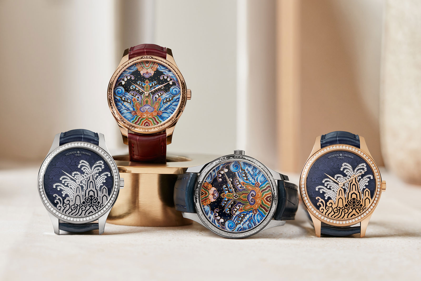
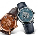
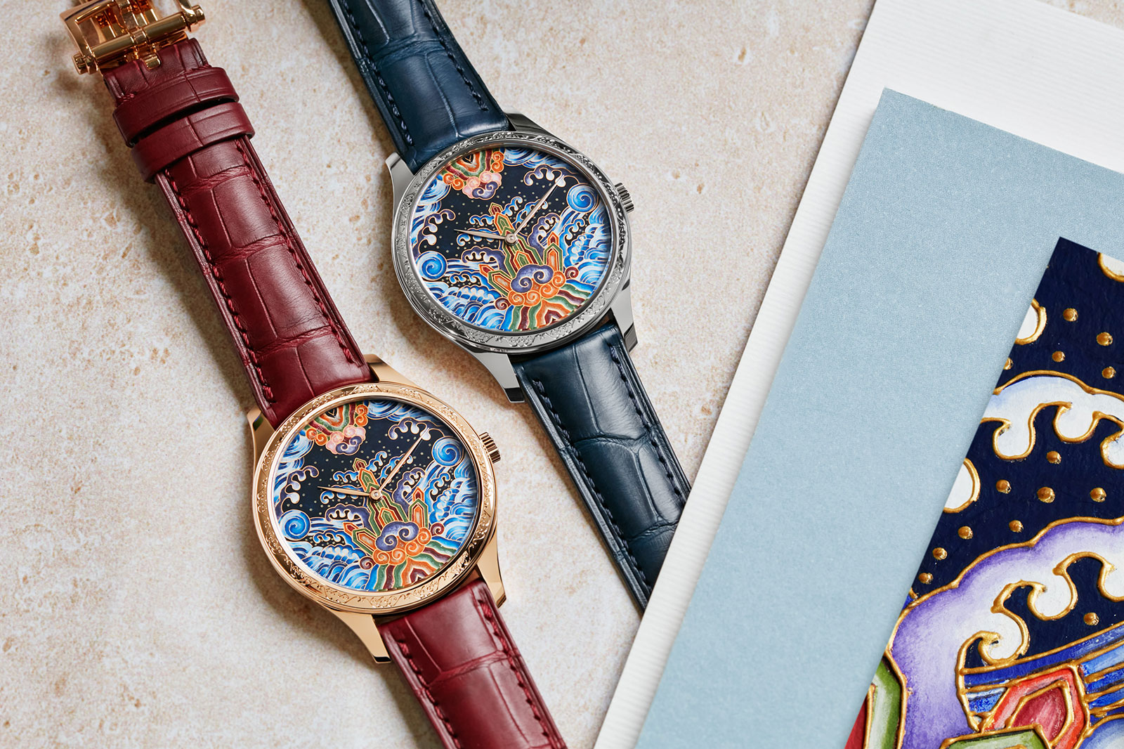
Continuing its recent run of watches dedicated to great art and ancient cultures, Vacheron Constantin (VC) now turns to the decorative symbolism of Imperial China. The Métiers d’Art Tribute to Traditional Symbols “Eternal Flow” and “Moonlight Slivers” are a pair of elaborately decorated watches inspired by 海水江崖纹, or “seawater, river, and cliff”, a highly symbolic motif employed during the Ming and Qing dynasties.

Executed in a variety of decorative techniques, the dials of the Métiers d’Art pair are subtle reinterpretations of the traditional motif. “Eternal Flow” is rendered in vivid cloisonné enamel and the more striking of the duo. “Moonlight Slivers”, on the other hand, is set with diamonds but presents a more restrained, stylised take on the pattern.

“Eternal Flow”

Initial thoughts

VC has a good track record at reproducing art on its watch dials. The Les Cabinotiers “Thunder God” and “Wind God” is a prime example of that. The Tribute to Traditional Symbols are similarly successful, though each of the pair is distinct from the other.

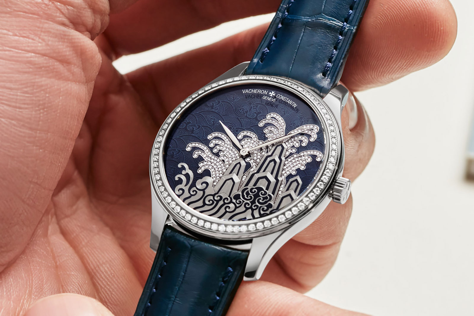
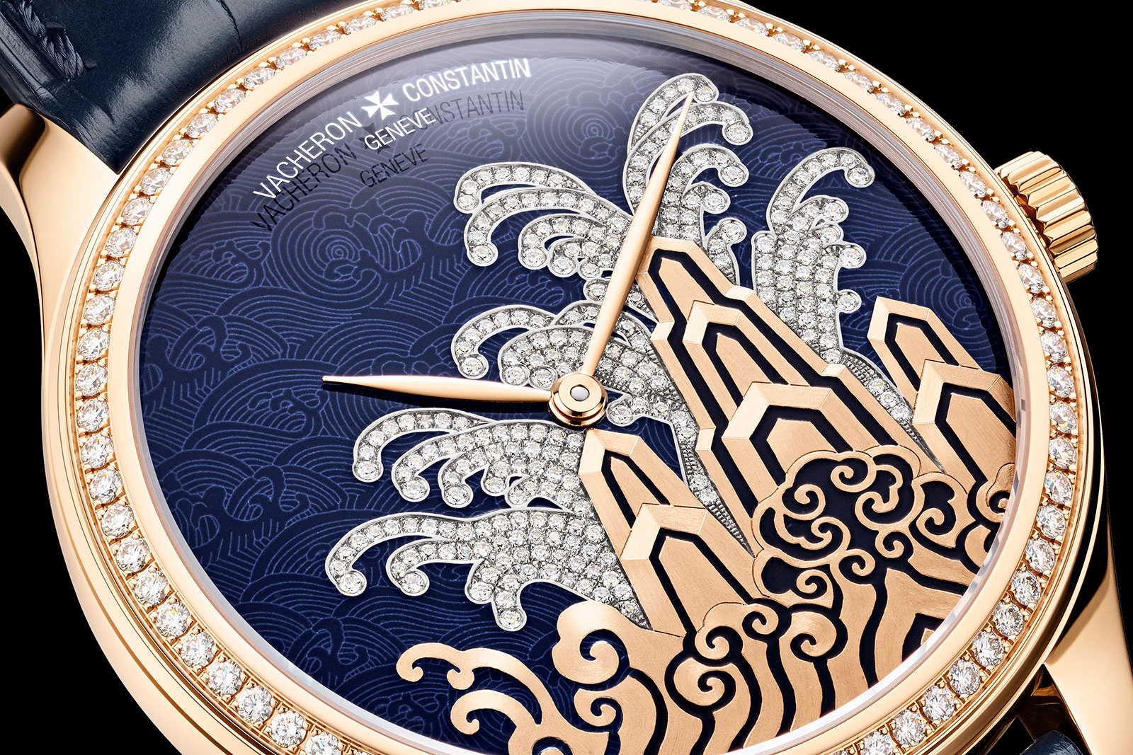
“Moonlight Slivers” is almost low-key with its dark blue enamel, though the diamond setting gives it a bit of glamour. It also feels more modern. At a distance the motif appears almost geometric and abstract, particularly in this monochromatic execution.

“Moonlight Slivers”

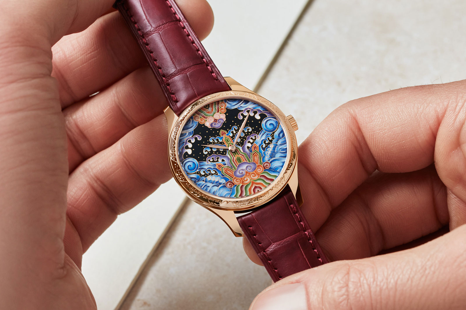
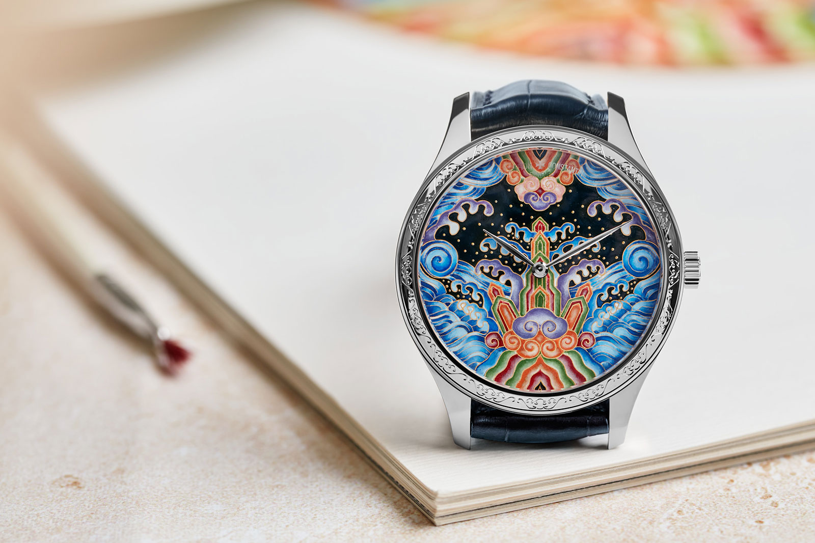
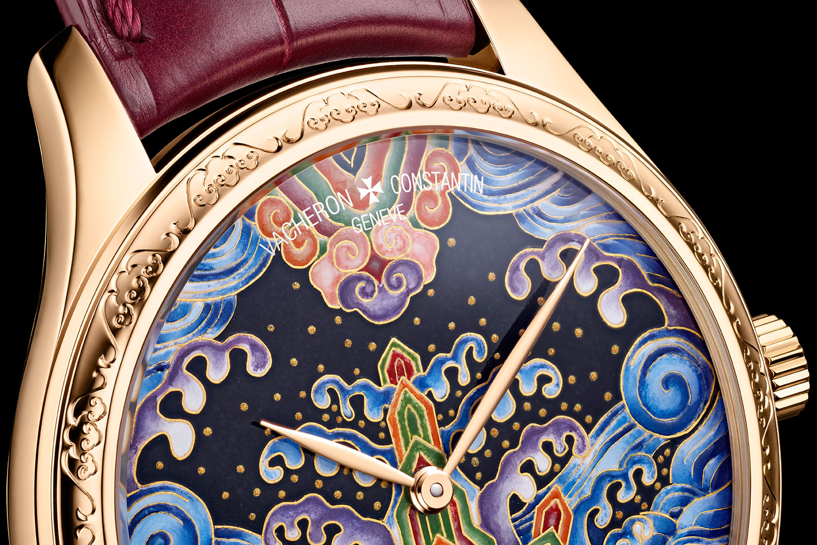
In contrast, “Eternal Flow” is full Technicolour with the Imperial robe motif in all its glory. It’s almost too much and verges on being kitschy chinoiserie but I like it for a few reasons.

For one, the pattern replicates the style of the historical original. At the same time, the enamel work is excellent (and mostly likely in-house though the dial is unsigned). Although the dial bear the name of a “celebrity” enameller, the work is evidently top quality.

“Eternal Flow” in both pink and white gold

More broadly, the Tribute to Traditional Symbols duo continues VC’s focus on arts, culture, and ancient civilisations with its Métiers d’Art watches. This helps set the brand’s offerings apart from the competition, which often turn to more diverse or modern themes (Patek Philippe’s Rare Handcrafts marquetry surfer comes to mind), or motifs specific to the brand itself (like Cartier’s many animals).

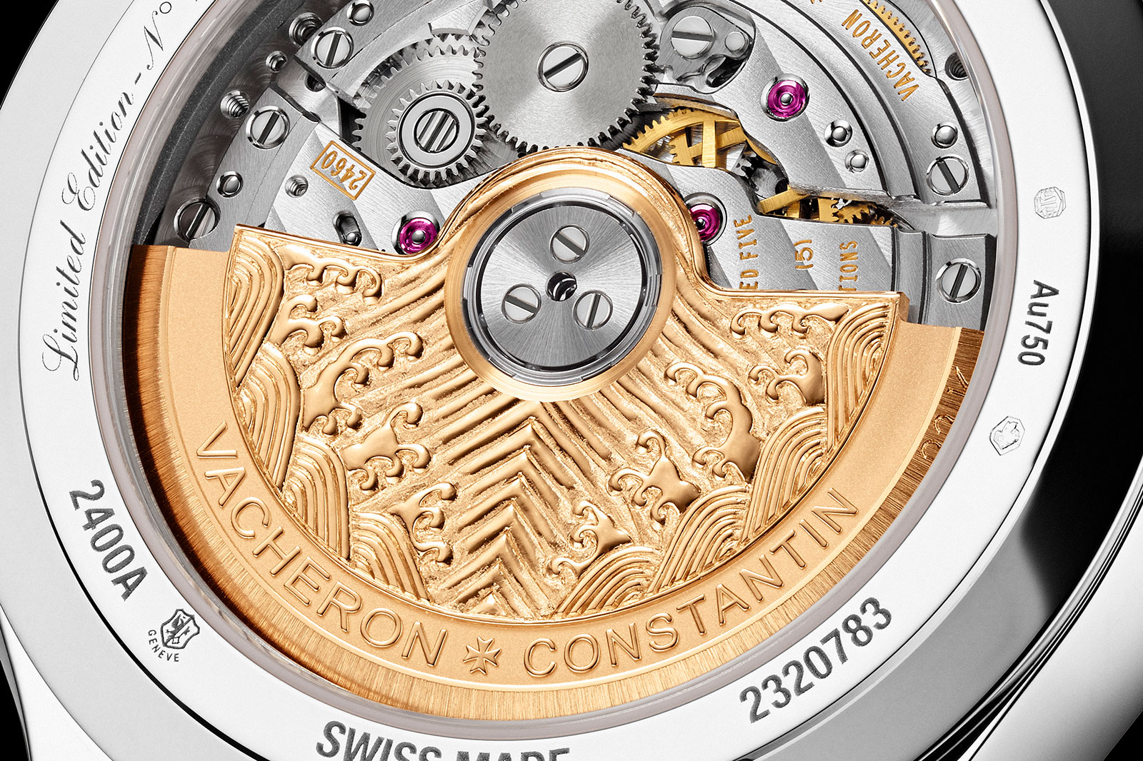
Both models are fitted with a relief rotor bearing the “seawater cliff” motif

海水江崖纹

Translates literally as “seawater, river, and cliff pattern”, 海水江崖纹 is most often found on the hems and cuffs of Imperial robes starting with the Ming dynasty and especially the Qing dynasty.

Though the pattern evolved over time, the motif is fundamentally comprised of two parts: “seawater”, representing the imperial dynasty, and “river and cliff” that represents the country. Together they represent eternal peace in the universe, presided over by the emperor.

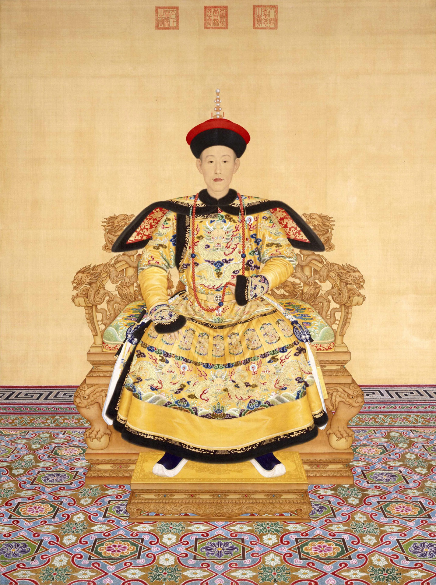
A 1736 portrait of the Qianlong Emperor by Giuseppe Castiglione, with the emperor’s robe showing the “seawater cliff” pattern on its hems and cuffs. Image – The Palace Museum, Beijing

Both the Métiers d’Art “Eternal Flow” and “Moonlight Slivers” take inspiration from the Qing dynasty motif with diagonal waves, vertical cliffs, and spreading waves. According to Vacheron Constantin, the dial designs were created with the assistance of a former Associate Research Librarian of The Palace Museum in Beijing, Song Hanyang.

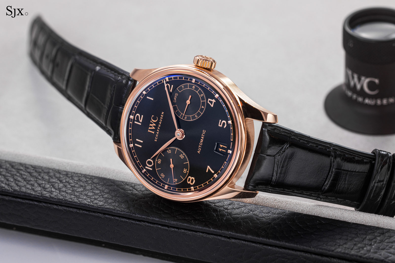
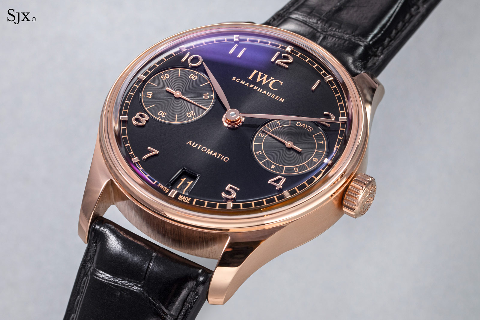
“Eternal Flow” and “Moonlight Slivers” share the same 38 mm case – in either 18k white or pink gold – that contains the in-house cal. 2460. Each, however, is decorated with varying techniques and feels entirely different from the other.

“Eternal Flow”

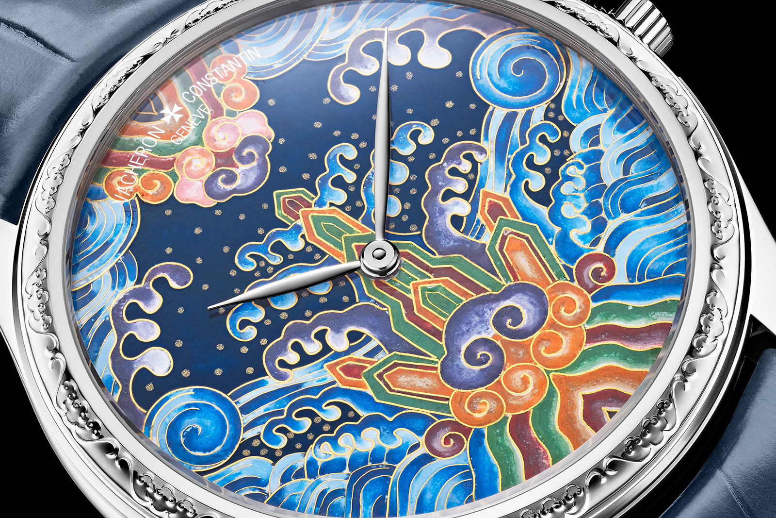
The more colourful of the pair is “Eternal Flow”. Its dial is entirely in cloisonné enamel and depicts the “seawater cliff” pattern against a star-studded night sky.

Interestingly, the cloisonné technique itself is a nod to ancient Chinese artisanal techniques. Specifically, the dark blue background is a reference to “Jingtai Blue” (景泰蓝), a cloisonné technique particularly popular during the reign of the Jingtai Emperor of the Ming dynasty.

The cloisonné dial of “Eternal Flow” with a background inspired by “Jingtai Blue”

According to Vacheron Constantin, 220 individual gold wires of varying lengths were cut and shaped by hand before being soldered individually to the dial, a process that takes some 50 hours. The wires form the cells to accommodate the enamel, which require another 70 hours of repeated painting and firing in an oven.

Once complete, the cloisonné dial is gently lapped to give it a smooth surface that is then further covered with a layer of clear fired enamel for protection.

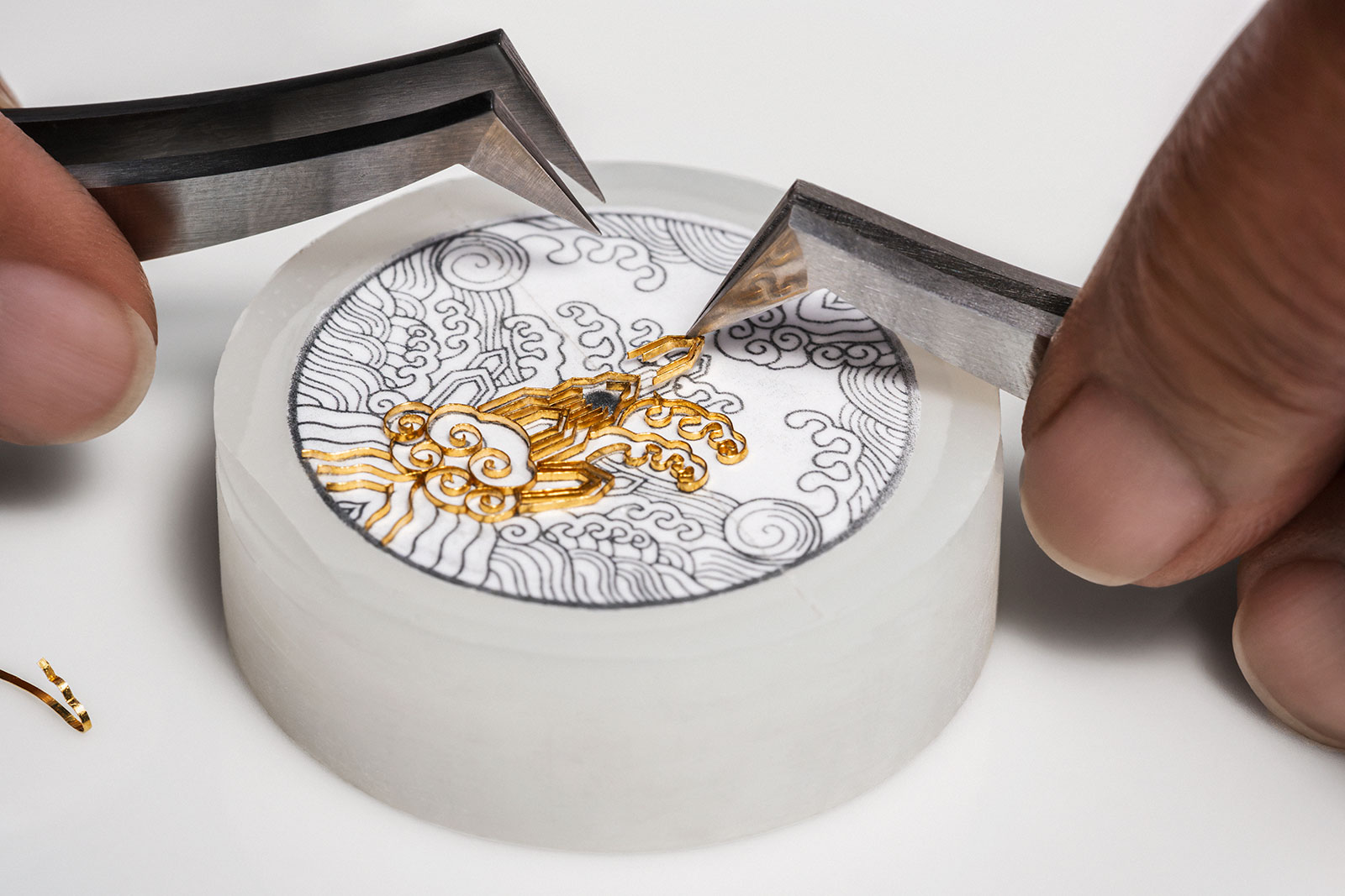
Applying the gold wires to the dial

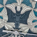
“Eternal Flow” is further accented by hand engraving in the bezel that depicts a repeating stylised bat motif.

Bats are a homonym for good fortune in Mandarin, and a five-bat motif represents the five fortunes: health, wealth, longevity, virtue, and a peaceful or timely death.

The hand-engraved bezel

“Moonlight Slivers”, on the other hand, is more elaborate in employing more decorative techniques, but more muted in terms of style.

“The aim [of the Moonlight Slivers dial] was to achieve a depth effect on a monochrome base,” says Christian Selmoni, Style and Heritage Director at VC, ” Engraving… with recessed enamelled and gemset parts… accentuate the 3D effect, which is achieved here using a ‘flat wash’ uniform layer of paint in a single colour.”

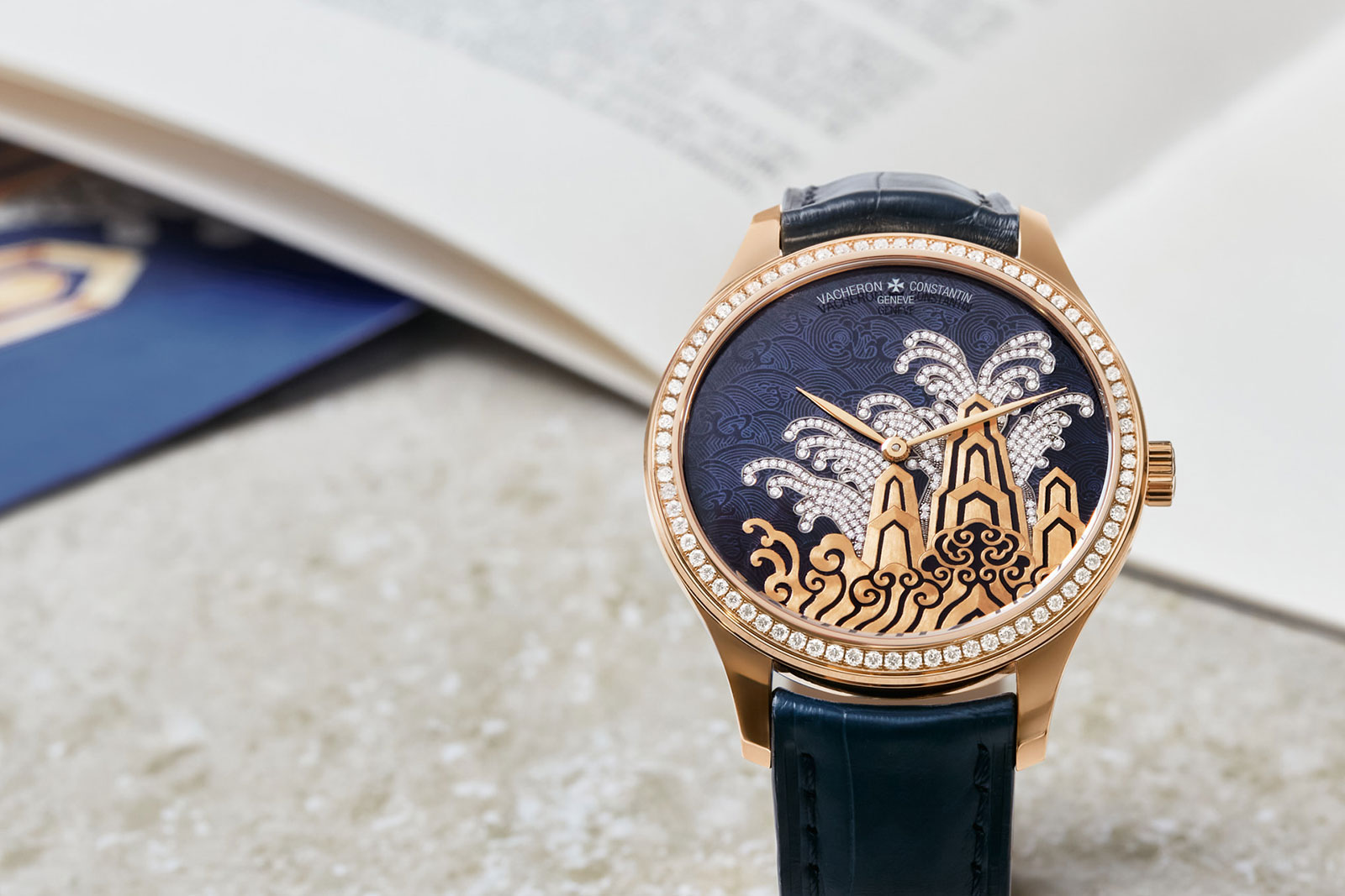
“Moonlight Slivers” in pink gold, with a dial appliqué to match the case

The dial base is dark blue fired enamel that is artfully engraved with a stylised wave motif in a manner similar to grisaille enamelling. But the engraved lines are then filled with white enamel that is also fired, creating more prominent lines for the waves.

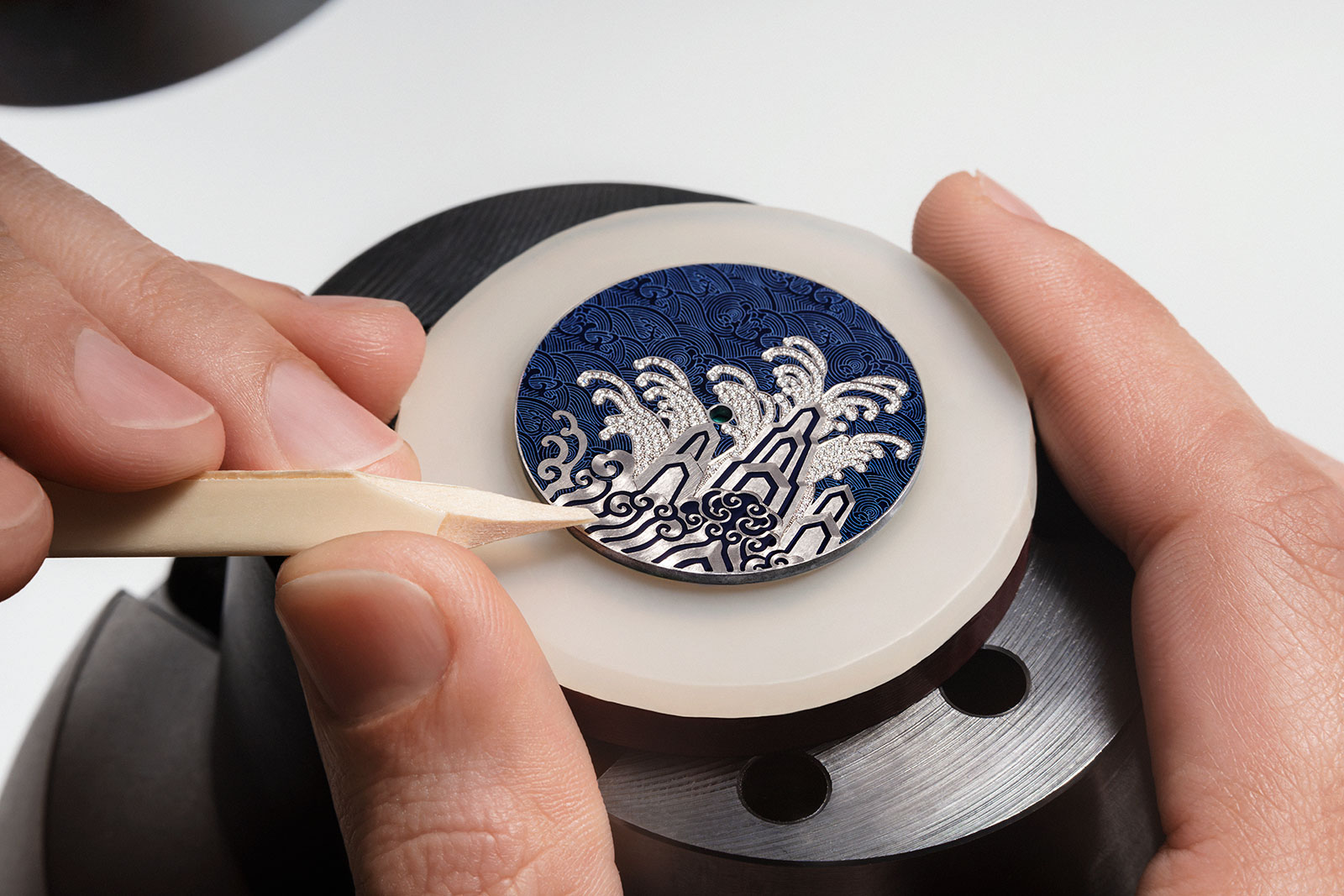
The second part of the dial is the solid-gold appliqué with the cliffs and waves that’s hand engraved and then enamelled with the champleve technique.

And the finishing touch is 239 brilliant-cut diamonds set into the waves above the cliffs, which are actually channels engraved on the dial base. Another 74 brilliant-cut diamonds are set on the bezel, which are meant to represent moonlight over the sea.

Both watches share the same movement, which continues the decoration on the dial. It’s the cal. 2460, an in-house movement that’s long powered the brand’s time-only Métiers d’Art models. Here it’s dressed up with a 22k gold rotor that’s been cast with a relief “seawater cliff” pattern to echo the dials.

Although simple in functional terms, the cal. 2460 has a refined, elaborate construction. The calibre is now almost 20 years old, having been introduced in 2005, so it makes do with a relatively short power reserve of 40 hours, unlike VC’s newer movements that have longer running times.

The cal. 2460


Key facts and price

Vacheron Constantin Métiers d’Art Tribute to Traditional Symbols “Eternal Flow” and “Moonlight Slivers”
Ref. 2400A/000R-H024 (Eternal Flow pink gold)
Ref. 2400A/000G-H023 (Eternal Flow white gold)
Ref. 2405A/000R-H022 (Moonlight Slivers pink gold)
Ref. 2405A/000G-H021 (Moonlight Slivers white gold)

Diameter: 38 mm
Height: 9.88 mm
Material: 18k pink or white gold (Moonlight Slivers set with 74 brilliant-cut diamonds on bezel)
Crystal: Sapphire
Water resistance: 30 m

Movement: Cal. 2460
Functions: Hours and minutes
Winding: Self-winding
Frequency: 28,800 beats per hour (4 Hz)
Power reserve: 40 hours

Strap: Alligator leather strap with folding buckle

Limited edition: 15 pieces each
Availability: Now at Vacheron Constantin boutiques only
Price: Price on request

For more information, visit Vacheron-constantin.com.


Update August 14, 2024: Added link to interview with Song Hanyang.

Back to top.

You may also enjoy these.

Up Close: IWC Portugieser “7-Days” Automatic 42 Ref. 5017

Thoughtful improvements for a better watch.

IWC recently facelifted the entire Portugieser line, and along with it the flagship Portugieser Automatic 42 “7 Days”, now in its fourth generation. Though the tweaks are cosmetic but significant, with an attention to detail that results in clear aesthetic enhancements. Compared to the earlier generation ref. 5007, the new Portugieser has a sharper, more refined appearance, while also feeling slightly more compact.

Initial thoughts

Though the overall design is mostly unchanged over the earlier generation, Portugieser 7-Days immediately looks and feels different in the hand. It looks a little bit shinier, slightly more polished, as if more effort was put into making it look like an expensive watch.

The appearance is subtly different yet instantly obvious, and is the cumulative result of small improvements to the case, dial, and crystal. The improvements are particularly evident compared to the first generation Portugieser ref. 5000 launched in 2000, which feels almost like a vintage watch from another era. The improvements are incremental and hardly imaginative, but they are well done.

Granted not everyone might like the polished new look. The lacquered dial, for instance, has an obvious glossy finish. But most of the improvements are more subtle, particularly on the case that now has a slimmer profile and improved finishing.

Importantly, the revamped Portugieser is priced almost exactly the same as its predecessor ref. 5007 (the increase is a few hundred dollars). It is arguably a better value proposition than the earlier generation, because the level of execution of the external components is superior.

That said, I do wish IWC had done something bigger. The original Portugieser 7-Days was a landmark at its launch 24 years ago, and long enough time has passed that the concept should be radically reimagined.

The Portugieser 7-Days circa 2000 that was the first-ever automatic watch with week-long power reserve

Extending the power reserve to 10 days while slimming the movement, for instance, would be a a major step forward. That would naturally come with a substantially higher price tag, but a pricier watch would be acceptable if it was substantially superior and still maintained a healthy price-to-performance ratio.

The freshly facelifted Portugieser Automatic 42 and Portugieser Chronograph

Nips and tucks

The new Portugieser is offered with a range of dials, including the traditional silver with gilt numerals, along with fresh colours like the champagne shade labelled “Dune”. All of them, however, have the same finish lacquered finish that produces a lustrous surface with visible depth. This gives the new dials a more polished look that easily catches the eye – credit also goes to IWC’s dial supplier for the work.

The dial starts out as a standard brass blank that’s finished with radial sun-ray brushing before galvanic treatment that creates the metallic colour – this is pretty much the industry standard for dial making.

But instead of a single or maybe double layer of clear lacquer, the dial is covered with 15 layers of lacquer. The lacquer is then ground down so the dial is the right thinness, then lapped to create a smooth surface with a pronounced glassy finish.

At the same time, the sub-dials are milled, through the lacquer and the brass base, and then stamped. As a result, the two registers are considerably recessed.

The printing as well as appliqués are then done on top of the lacquered surface, so they appear to float. This effect is subtle at a distance but adds depth to the dial up close. This is especially apparent with the large IWC logo below 12 o’clock.

But the thickness of the clear lacquer layer is best illustrated by the date window, which is ringed by an obvious lacquer border. The border isn’t obvious at a distance and on the dark dials it’s practically invisible, but under magnification it looks slightly untidy. This is inevitable, however, due to the vicoscity of lacquer and the 90-degree corners of the date window.

Like the dial, the case retains the same design as before but has been reworked to be slimmer, even though the movement inside remains the same. The impact of this is quite substantial, as the watch looks and feels thinner on the wrist. It also has a bit more of a vintage aspect with the highly domed crystal (though the glossy dial finish instantly gives it away as a modern watch).

The case middle remains the same height, but the case back and bezel have been thinned. At the same time, the sapphire crystals on the front and back are more domed than before. As a result, the case is one millimetre slimmer but can still accommodate the same thick cal. 52011.

A side effect of the reworked case is that it is lighter, because the bezel and back are flatter, while the case middle has been thinned as well. This doesn’t mean anything in terms of the user experience, though in the gold models it implies less gold is used for the case so the material cost of a gold case is less now than compared to the earlier generation – which means it costs less to produce.

The weeklong movement

On display through the reworked case back is the cal. 52011. It’s part of the 52000 family, the second-generation seven-day automatic after the original cal. 5000/5001/5101.

Though it shares the same power reserve and trademark Pellaton winding mechanism, 52000 family was constructed from the ground up as a new calibre, and not based on its predecessor. The original cal. 5000 was an ambitious movement that was perhaps over-engineered, yet also inefficient and flawed in several respects, including a single mainspring and overly heavy rotor.

The cal. 52011

The redesigned Pellaton mechanism with its characteristic double pawls, now entirely in wear-resistant ceramic

The 52000 family addressed all of its predecessor’s shortcomings. It was conceived with the goal of stable timekeeping over a week, which explains many of its features.

The most obvious differences between the two generations are the barrels – two in the 52000 and just one in the cal. 5000 – and the balance wheel that is noticeably smaller in the 52000 family. The twin barrels running in parallel deliver more consistent torque over a week, while the smaller balance wheel requires less energy to run.

The twin barrels are visible under the open-worked barrel bridge

The cal. 52011 in the new Portugieser is essentially identical to that in the earlier model, but with an upgraded escapement that’s more resistant to magnetism according to IWC. Though IWC didn’t specify the magnetism resistance, it is likely to be modest given that the balance is still attached to a conventional alloy hairspring.

The brand hasn’t revealed much about the escapement, but a visual inspection reveals the escapement parts to be skeletonised. This indicates they are made of a  non-ferrous alloy via LIGA or equivalent lithography-moulding technique. LIGA components are now common in watchmaking, but still useful because of their properties, namely lightness and magnetism resistance.

The skeletonised escape wheel and pallet lever are visible just under the balance

Being mostly unchanged from before, the cal. 52011 looks exactly the same. The reworked case back also affords a better view of the movement, as the case back ring is narrower.

The cal. 52011 has an aesthetic that’s typical of IWC’s modern movements – mechanical with exposed moving parts and finished with clean, industrial decoration.

The decoration is attractive and complements the design, though some of the finer details could be done better. A handful of components, for instance, are tumble- or chemically polished, which is basic for a relatively high-end movement.

But overall, the cal. 52011 is a solidly constructed movement that is good looking, and lives up to IWC’s history as a movement engineer.


Key facts and price

IWC Portugieser Automatic 42
Ref. IW501708 (white gold/Horizon Blue)
Ref. IW501707 (rose gold/Obsidian)
Ref. IW501705 (steel/Dune)
Ref. IW501701 (steel/Silver Moon)
Ref. IW501704 (steel/blue)

Diameter: 42.4 mm
Height: 13 mm
Material: Steel, white, or rose gold
Crystal: Sapphire
Water resistance: 50 m

Movement: Cal. 52011
Features: Hours, minutes, seconds, date, and power reserve
Frequency: 28,800 beats per hour (4 Hz)
Winding: Automatic
Power reserve: 168 hours, or seven days

Strap: Alligator with folding clasp or steel bracelet

Limited edition: No
Availability:
Now at IWC boutiques and retailers 
Price: US$13,500 (steel), US$14,500 (steel with bracelet), US$26,700 (rose gold), or US$27,800 (white gold)

For more, visit IWC.com.


Back to top.

You may also enjoy these.

Squale Introduces the 1521 Marina Militare

An Italian navy edition.

To celebrating its 65th, Squale turns once again to the Italian navy for a dive watch collaboration: the 1521 Marina Militare. A tribute to the vintage 1521 model supplied to the divers of the Italian navy – officially known as the Marina Militare – in the 1980s, this limited edition bears the navy logo on the dial and the naval coat of arms on the case back.

The rest of the watch is classic 1521 with its angular “Von Büren” case reminiscent of 1970s dive watches – that’s because Squale was historically also a supplier of cases to other brands that included Blancpain and Doxa.

Initial thoughts

Although vintage re-issues are common with micro-brands, few have true historical basis. Squale, however, does as it was both a supplier of dive watch cases to notable brands as well as suppliers of watches to the Italian navy. Even though the design of the isn’t novel or creative – it is a vintage reissue after all – the historical navy connection sets this apart from its peers.

The dial, bezel, and strap feature orange accents

Priced at US$1,430, 1521 Marina Militare is affordable and priced comparably to past Squale models. Like many watches in this price range it’s powered by an  inexpensive Sellita SW 200-1. It’s priced similarly to most of the micro brand competition, but the Marine Militare connection makes this little a more interesting.

Retro and orange

The 1521 Marina Militare reproduces the vintage “Von Büren” case that is best known for having been employed by Blancpain in its Fifty Fathoms “Bund” made for the German navy. Distinctive with its angular lug form and a recessed crown at four, the case is in 316L stainless steel case. It measures 42 mm in diameter and 12.5 mm in thickness.

The radially brushed dial has applied hour markers and baton hands. In the style of certain vintage dive watches, the minute hand is filled with orange Super-Luminova to distinguish it from the hour hand. At the same time, the seconds hashmarks, Marine Militare logo, and 15-minute segment on the bezel are also in orange to match.

The navy logo in orange

The solid case back bears the Marina Militare coat of arms in relief. Underneath is an Elaborè-grade Sellita SW 200-1 – that’s one step up from the basic, no-frills version of the movement – that beats at 28,800 beats per hour (4 Hz) and offers 38 hours of power reserve.


Key facts and price

Squale 1521 Marina Militare
Ref. 1521MARINA.MIBK

Diameter: 42 mm
Height: 12.5 mm
Material: Stainless steel
Crystal: Sapphire
Water resistance: 500 m

Movement: Sellita SW 200-1 Elaborè
Functions: Hours, minutes, date, and seconds
Winding: Automatic
Frequency: 28,800 beats per hour (4 Hz)
Power reserve: 38 hours

Strap: Black microfibre with pin buckle; additional black rubber strap

Limited edition: 500 pieces
Availability: Now at Squale online store and retailers
Price: US$1,430 excluding taxes

For more, visit squale.ch


Back to top.

You may also enjoy these.

Welcome to the new Watches By SJX.

Subscribe to get the latest articles and reviews delivered to your inbox.