Voutilainen watches are well loved for their dials, which are made in-house and offered with a myriad of finishes – primarily guilloché or enamel – as well as numerous colours and appliques.
But unconstrained freedom leads to hesitation, and too many choices make a decision difficult. American psychologist Barry Schwartz, writing in The Paradox of Choice, notes that consumers are often happier having to choose from fewer options, rather than more.
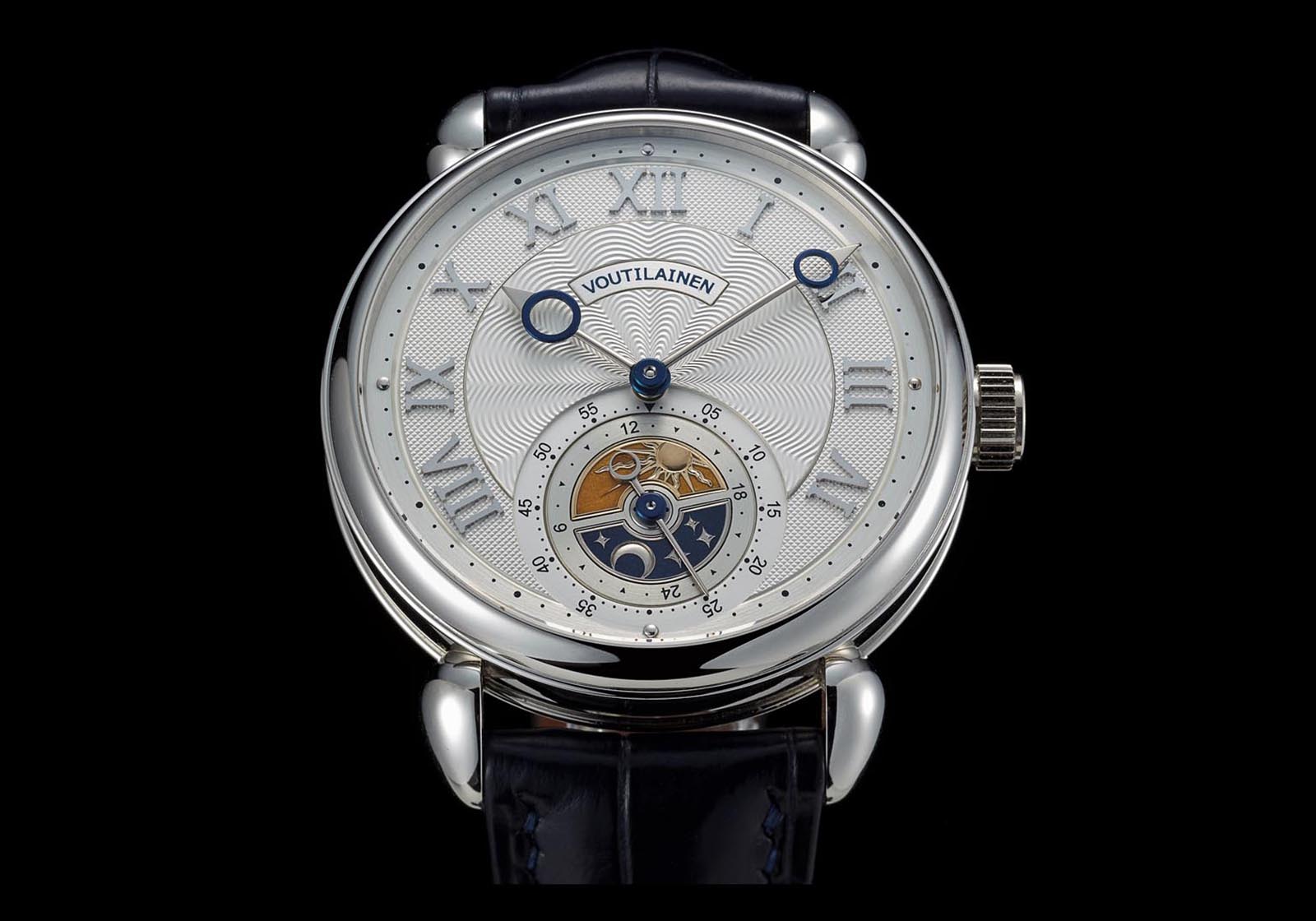
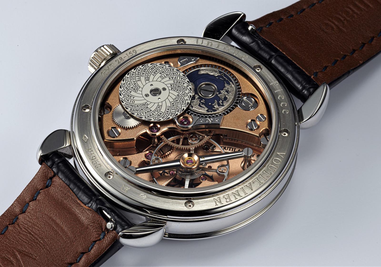
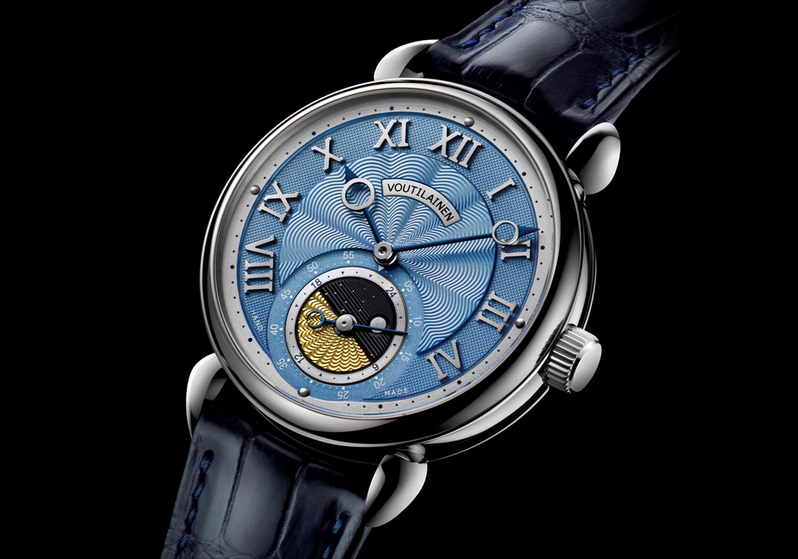
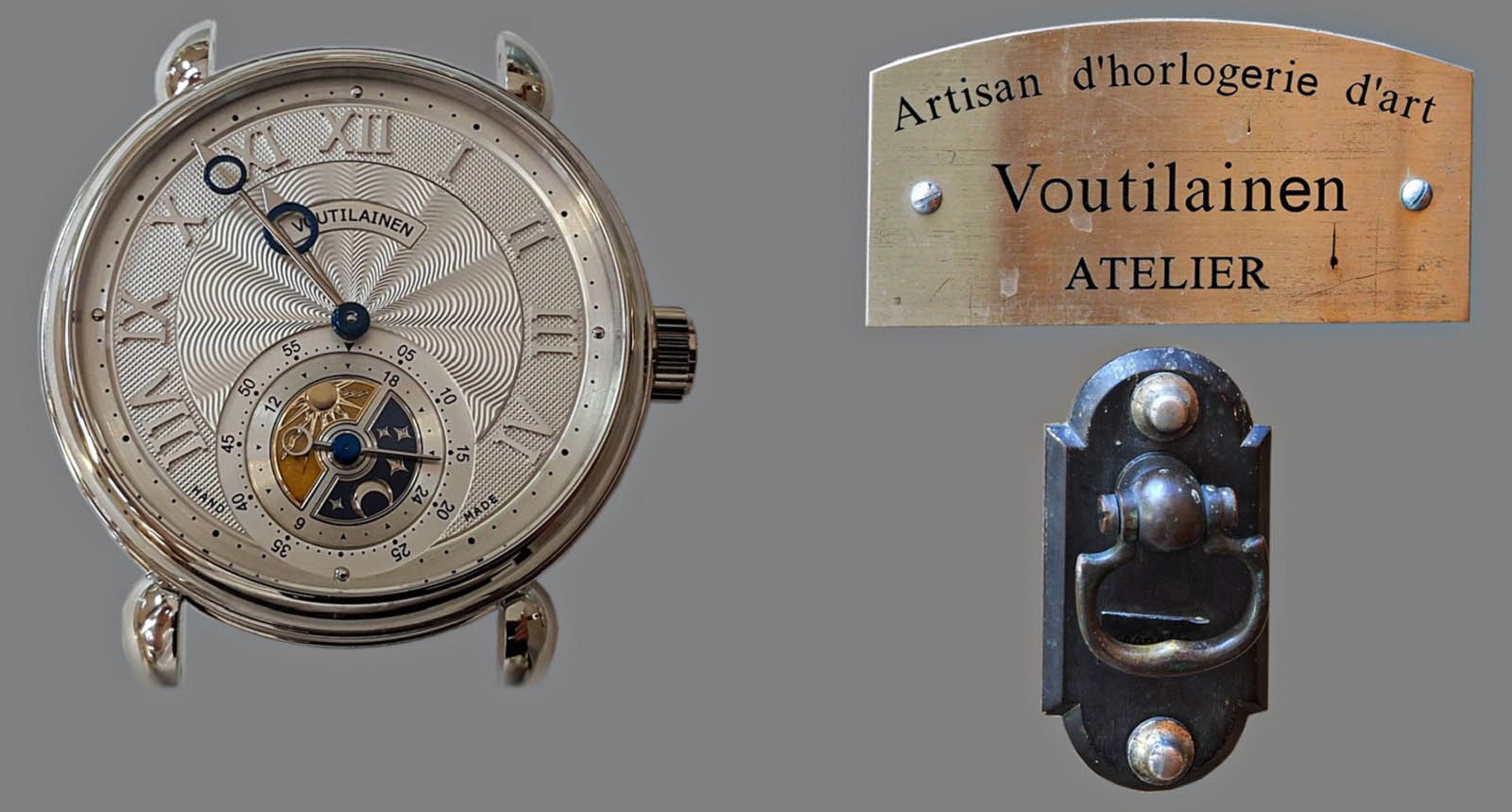
The author’s custom GMT-Villes
But in my own collecting, perhaps the opposite is true. When I work with an independent watchmaker on a custom or bespoke watch, exploring the abundance of possibilities is the main attraction, particularly when I can specify the details face to face with the watchmaker himself.
Investing sufficient time to figure out my goal makes the process of choosing not a task to be feared, but an enjoyable journey leading to the unique piece. This is my story of commissioning the GMT-Villes from Kari Voutilainen (which happened slightly before I embarked on a similar project with Andreas Strehler).
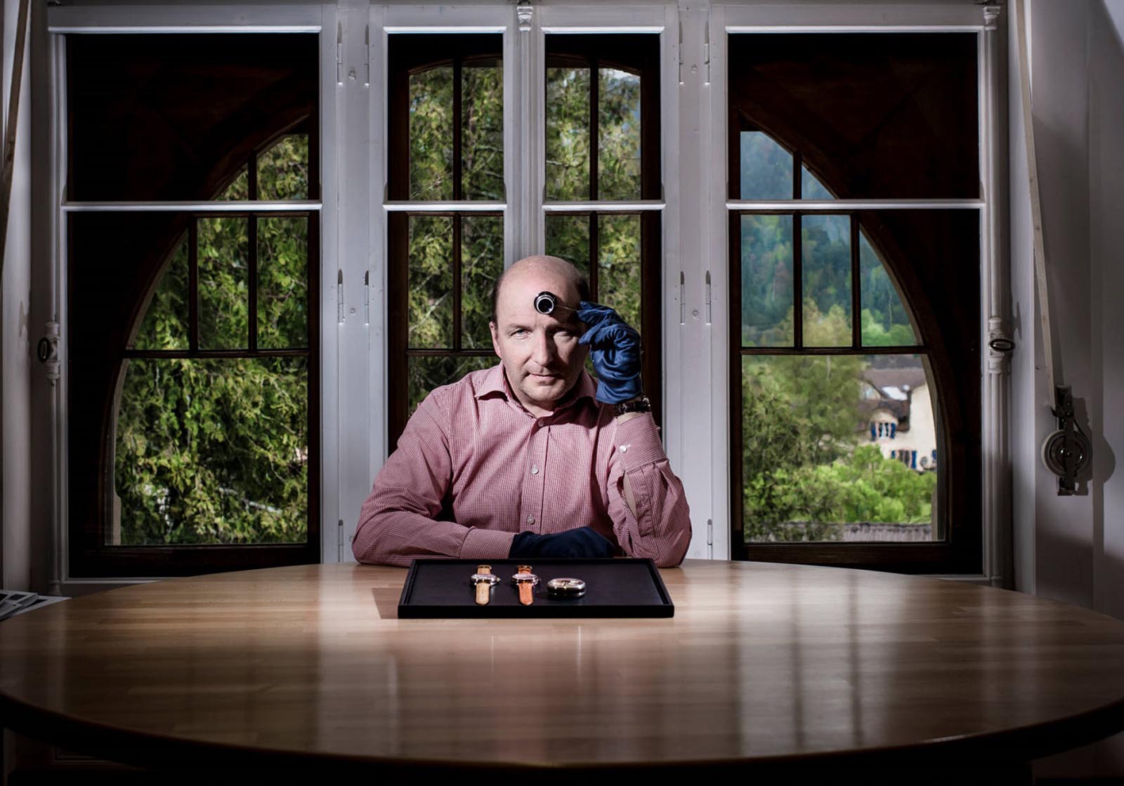
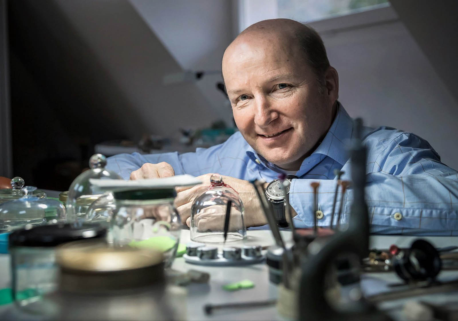
Kari Voutilainen in his showroom. Image – FHH
The beginning of custom work
After setting up his own workshop in 2002, Kari, then 40 years old, made his debut as an independent watchmaker with the Masterpiece series of wristwatches, starting with Masterpiece 6 unveiled at Baselworld in 2005. The Masterpiece watches were all one-off minute repeaters relying on rebuilt and finely decorated vintage ebauches made by LeCoultre or Louis-Elysee Piguet.
Amongst the options Kari offered for the Masterpiece watches was a second time zone, a petite complication I am fond of. The second time zone took the form of a discreet day and night disc, hand-engraved by frequent Voutilainen collaborator Eddy Jaquet and inset as a sub-dial on the guilloché dial, managing to combine form with function.
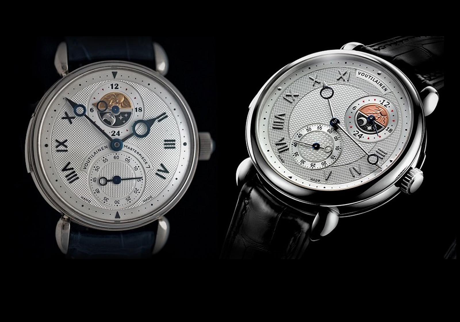
Masterpiece 7’ decimal repeater (2007) and Seven Sisters minute repeater (2013)
To free himself from the uncertainty imposed by unreliable parts suppliers, Kari acquired his first CNC milling machine in 2007. This enabled him to unveil his own movement in 2011, the cal. 28 inside the Vingt-8 wristwatch – produced mostly in-house – which took three years to develop.
Despite being produced in series, Kari remained flexible enough to be able to execute not just custom decoration, but also movement modifications. As a result, all complications later added to the base cal. 28 began as commissions from clients.
It didn’t take long for a client to commission a cal. 28 with a second time zone. The resulting unique piece, the Vingt-8 Zodiac, adhered closely to the styling of the Masterpiece minute repeaters, featuring the same day and night time zone sub-dial.
Vingt-8 based “Zodiac” GMT unique piece (2013). Image – Voutilainen
The foundations for what became a serially produced Vingt-8 GMT were also laid as a result of a client’s request for a cleaner dial, without the somewhat oversized hand for the second time zone found on the Masterpiece and Zodiac watches. So Kari redesigned the second time zone dial, replacing it with a rotating disc integrated into the subsidiary seconds.
Despite seeming like a superficial adjustment, the revamped second time zone display required modifying more than 70 components, or about a third, of the cal. 28. The resulting watch became the GMT-6, which featured a co-axial pusher in the crown that advances the second time zone disc in one-hour increments.
The GMT-6 was the watch I wanted – being a collector of multi-time zone watches – but with additional complications, a cities disc as well as a quick-set function.
GMT-6. Image – Voutilainen
What I had in mind was a disc with reference cities for the 24 primary time zones, which would be connected to the second time zone display on the dial.
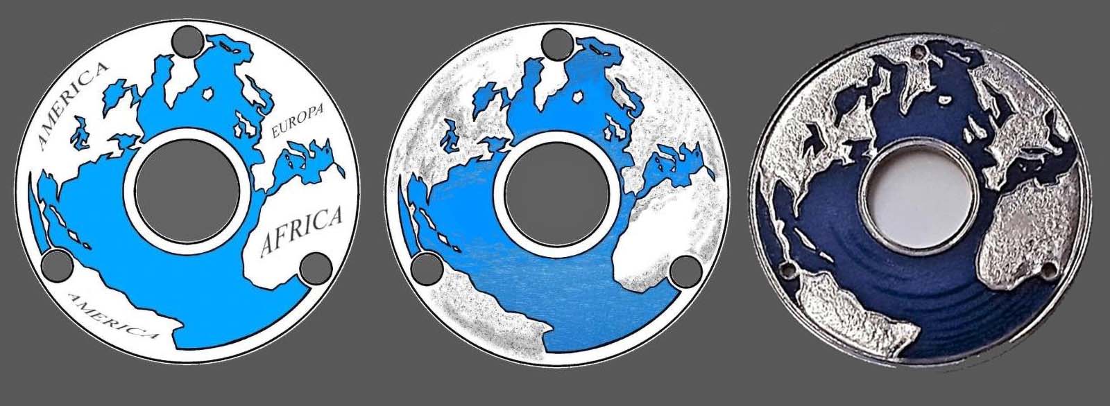
Jaeger-LeCoultre first introduced this set-up in 1990 with the Geographique, which is still in production in modified form, and other brands soon followed, including A. Lange & Söhne with the Lange 1 Time Zone.
However, I didn’t want to sully the well-proportioned dial of the GMT-6 with a cities disc on its periphery, so the disc had to go on the back.
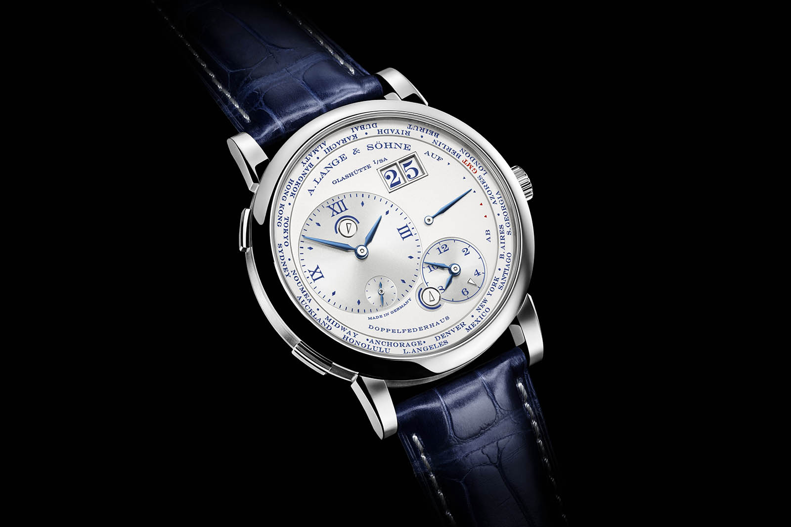
Lange 1 Time Zone. Image – A. Lange & Söhne
To find out if such an idea was viable, I arranged to see Kari at Baselworld. After hearing my idea, Kari swiftly agreed, which left me taken aback. We agreed to continue discussions at his workshop in Môtiers sometime after the show, while in the meantime he would work on the possible execution for my idea.
Mastering the paradox of choice – the dial
Kari’s polite and charming personality is legendary amongst watch enthusiasts. A potential customer is definitely not overwhelmed with sales talk.
During our first meeting, his demeanour seemed reserved at the start, but he was actually waiting to hear what I had to say.
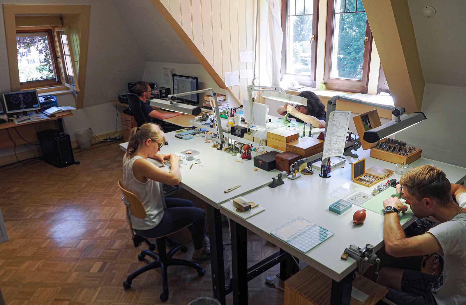
Eventually I received a guided tour of the workshop that introduced me to his way of building watches, starting with the guilloché department in the basement. This was recently enlarged considerably to meet growing demands for engine-turned dials from the dial factory he also owns.
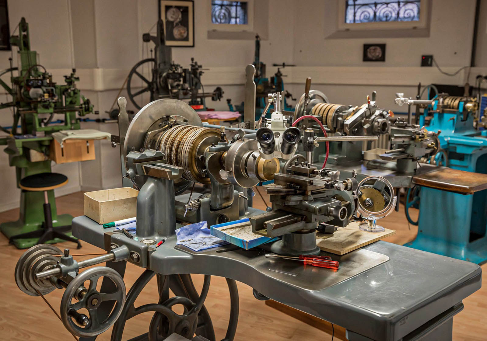
Atelier room with engine turning machines for the guilloché engravings. Image – Reto Albertalli/retoalbertalli.com
When new guilloché patterns are developed, the work processes and settings for the rose-engines are carefully noted down – for each and every motion of the graver. A brass dial sample is attached to each production note, which together are almost a catalogue of dials.
However, Kari doesn’t show customers the full assortment of dial samples, instead he asks the client what he wants. When I learned later such a catalogue existed, I was a bit miffed that Kari had concealed the information, which I thought would have aided in my selection of the dial.
But I understood why he does it – he fears overwhelming customers with a plethora of choices, especially when they are not explicitly asking for it.
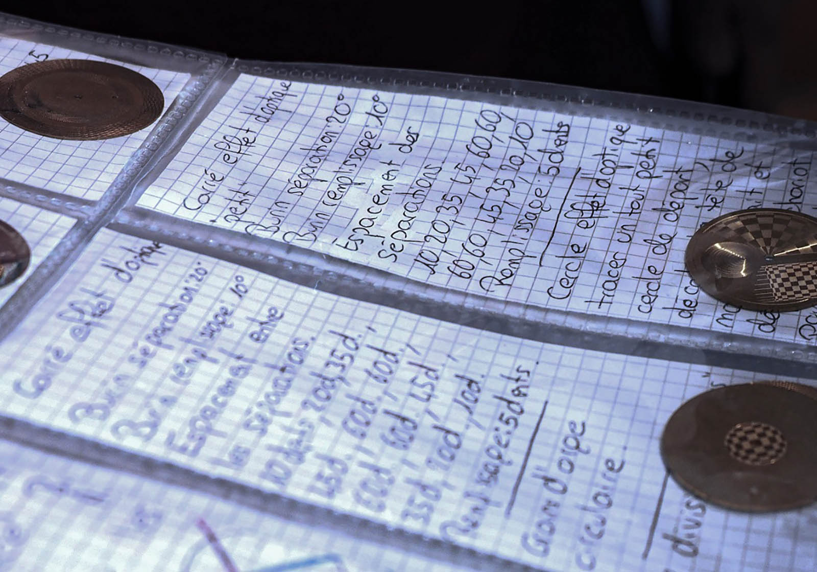
The “catalogue”. Image – author
Galvanic treatments to colour dials are in-house at his dial factory, Comblémine. When it comes to the surface treatment of dials, the customer is best served by depending on guidance from Kari. The choices are wide and confusing: it is not just the nuances of different colours, but also the various processes used to apply them.
And how the dials look when finished also depends on their preparation (for example, dry or wet blasting as pre-treatment) and the type of clear protective lacquer that forms the final layer of the dial.
With the customer describing as best as possible what is desired (shiny or matte, solid or pastel colours, and so on), Kari then proposes a dial design that is feasible. References to existing watches made it easy for me to define the colour of my choice – frosted silver.
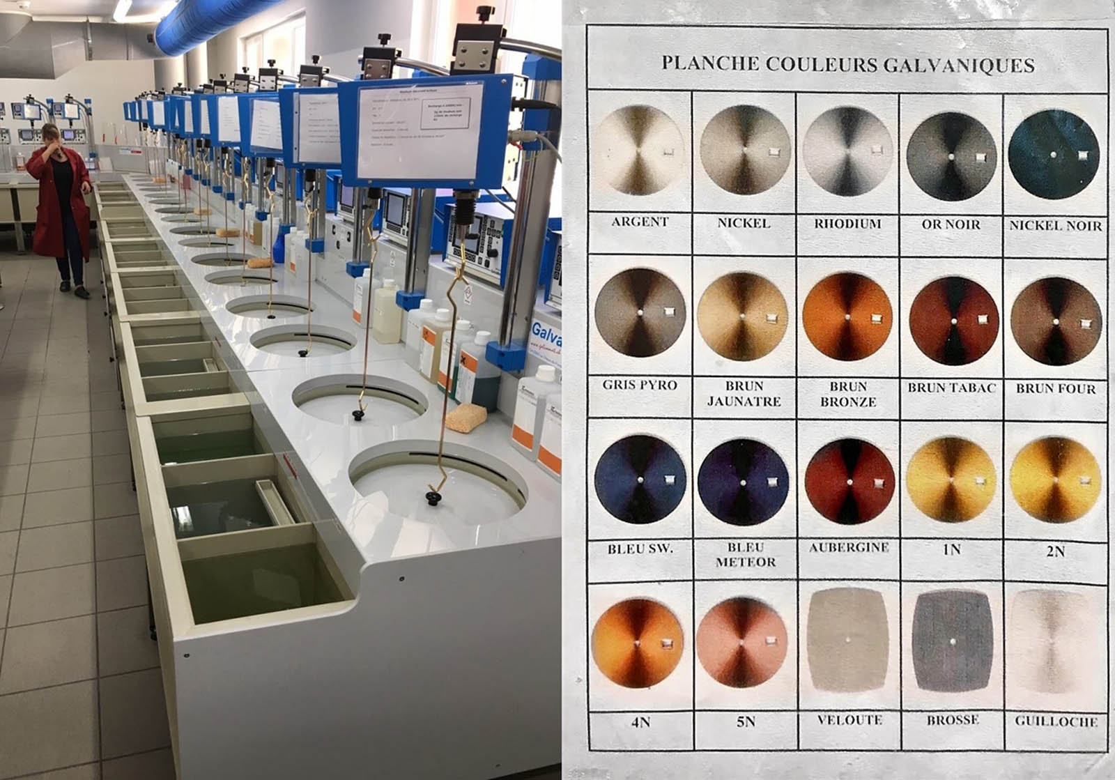
The Comblémine dial factory does not only dial decoration with mechanical processes and painting, but also the galvanic treatments to create colours. Image – author
Kari is also able to produce his own enamel dials, but with some limitations – not all colours can be produced, and certain colour combinations, such as the purple-blue and orange below that I like, are unavailable because they have been already used on unique pieces.
Bespoke watch like this GMT-6, with an enamelled dial centre inspired by the paintings of Victor Vasarely, are a favourite of Kari. Image – Voutilainen
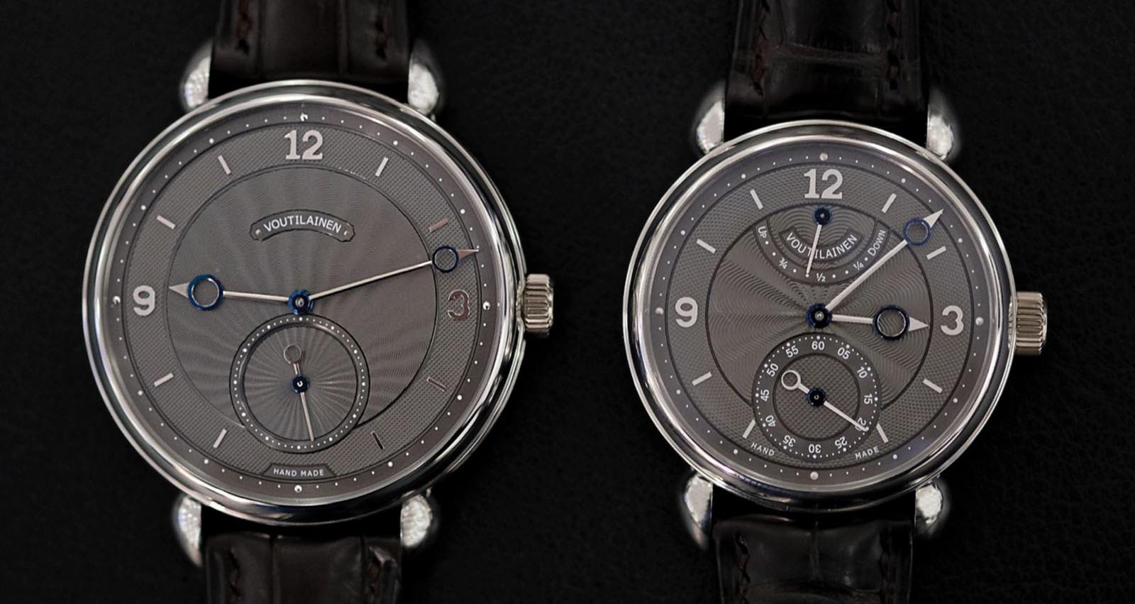
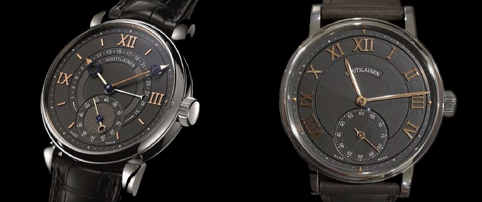
I have long been amazed by the chameleon-like adaptability of the Vingt-8’s dial design. The customer’s freedom of choice when it comes to the dial results in distinctively different looks for what is essentially the same watch.
The two GMT-6 models below for instance show how a differing guilloché and applied indices can lead to a thoroughly modern design. Even the choice of dial colours affects the perception of size, with the more muted grey dial appearing bigger.
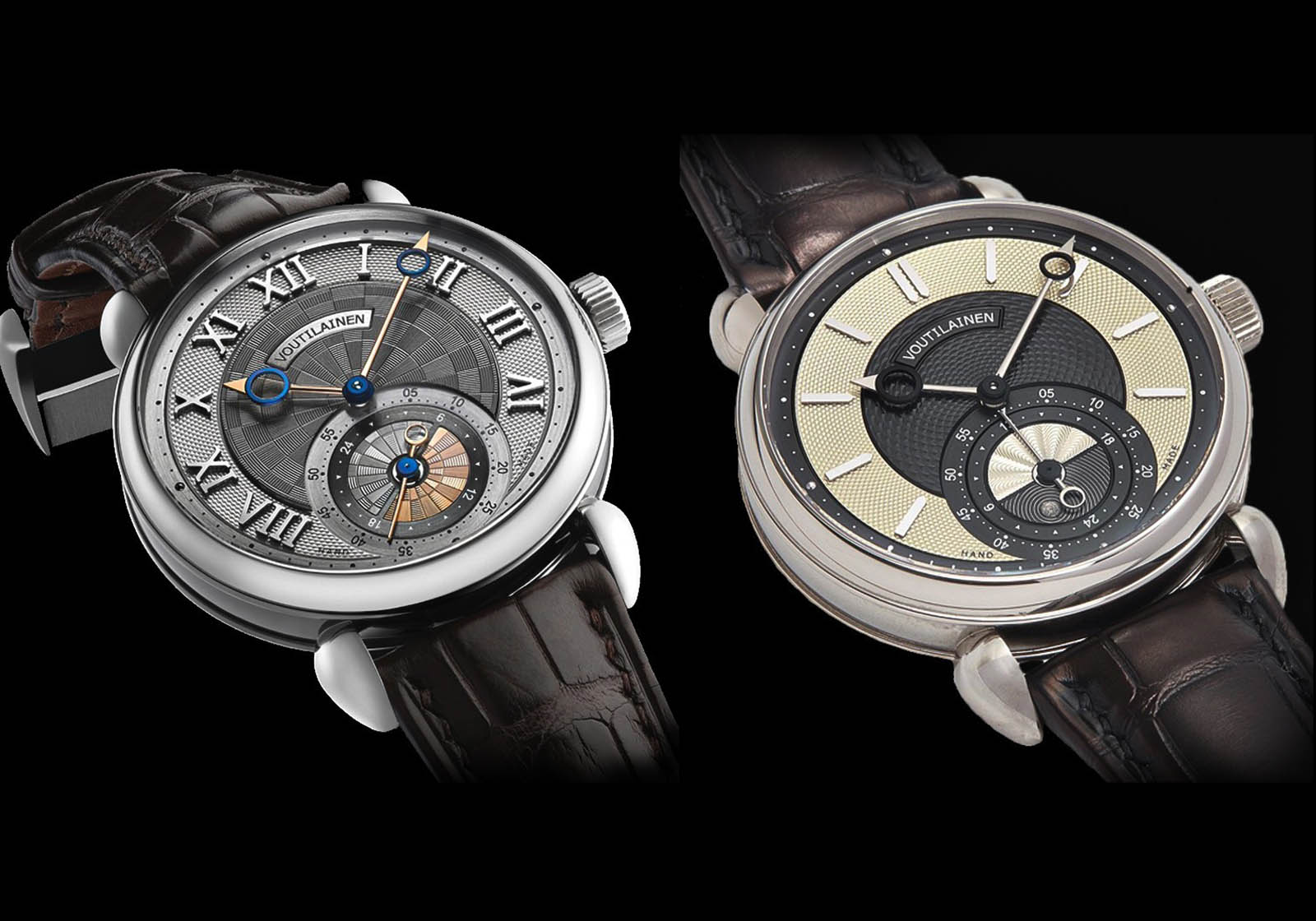
Two GMT-6 demonstrating the influence of details for a ‘modern’ visual impression. Images – Jérôme Boudry (left) & A Collected Man
Kari offers to illustrate proposals, what helps to give a general impression. I had not asked for one because the colour scheme I had in mind for my watch was simple enough, and the sheen created by the surface treatment of the dial and other important but irreproducible details, like shadows created by the guilloché, cannot be realised in renders.
3D renders. Illustration – Voutilainen
To determine the details of my watch, I brought along samples of what I would have liked to our meeting, but at first concealed them. In my earlier phase of collecting, I was generally keen to commission a true “signature” watch, one that has been designed and decorated the way a watchmaker would do it for himself, though that would later evolve as you discover below.
Kari, however, was clandestine at this stage, and then at lunch, he admitted he never tries to move a customer in a certain direction when designing a watch. As would be my experience, he instead builds upon ideas from the customer. Kari’s style is to pick up on even the vaguest hints from the client, rather than spoil him with too many options, leading to indecisiveness.
For me, the internet helped affirm my design decisions with less hesitation. The web enabled me to amass a photo collage of my preferences, which quickly revealed the style I gravitate to. This forms a useful starting point for the watchmaker, which can then be refined in further discussion.
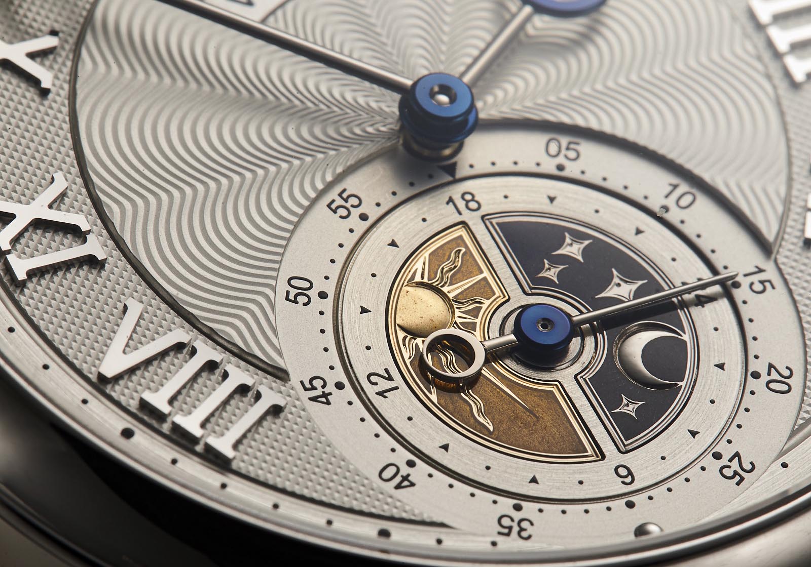
Personally, I love Kari’s dials done in multi-colour combinations, particularly when blue is dominant. But there was a GMT-6 that I was always drawn to: a custom piece combining a silvery-white dial centred on a beautiful engraving by Eddy Jaquet that shows the landscape near Zermatt with the Matterhorn in the background. The bright, silver canvas offers a distinctive contrast for the day and night disc in gold and dark blue.
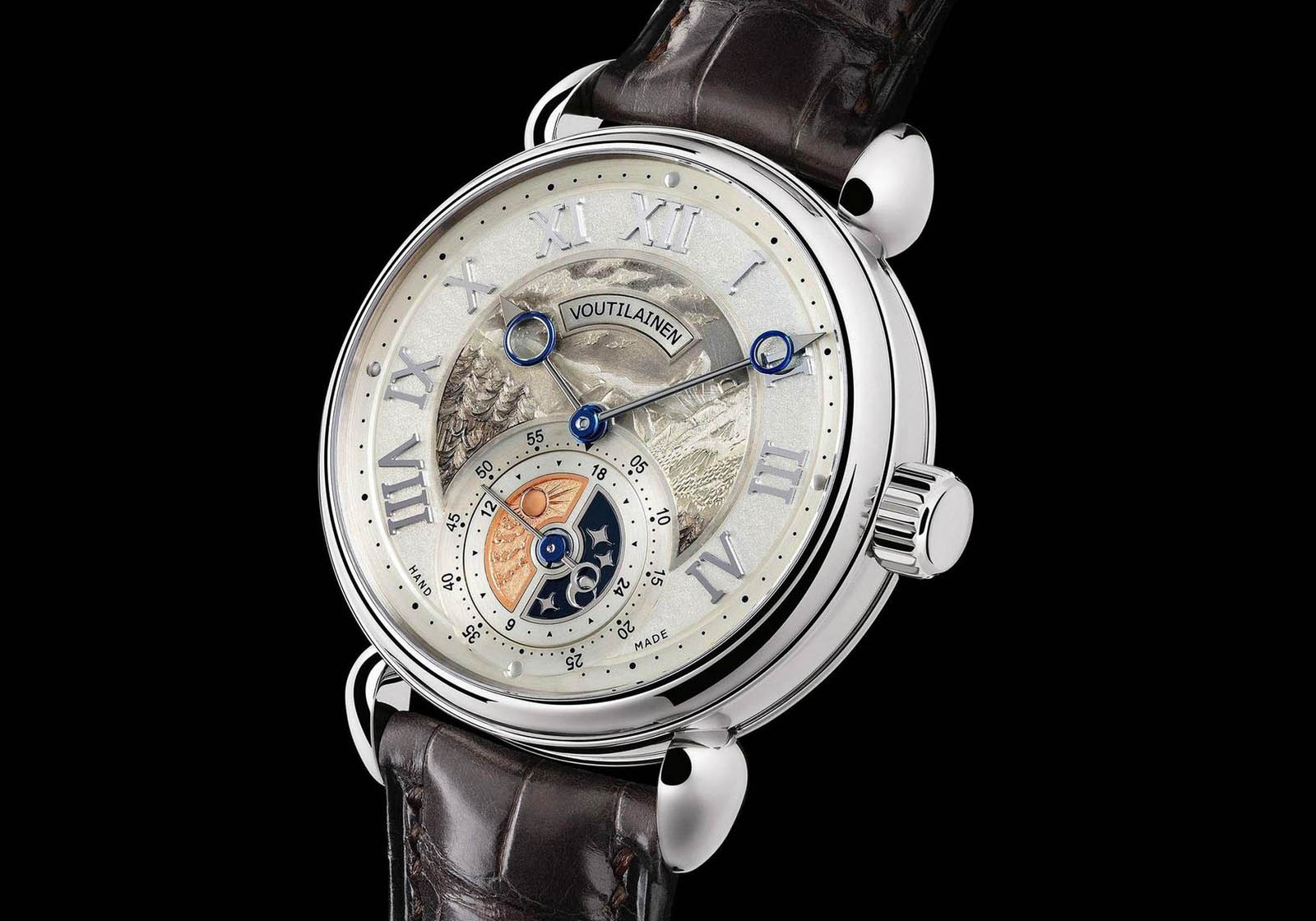
The custom GMT-6 “Matterhorn”. Image – Voutilainen
As much as I like the hand engraving on this watch, I wanted a traditional guilloché, which exemplifies Kari’s speciality. But, I wanted a similar silver-white dial as the starting point.
Originally I had wanted a sunray guilloché for the centre of the dial with 24 divisions, or slices, but that was reduced to 12 because it would have been too busy otherwise; yet another decision where I relied on Kari’s judgement.
The choice of hour markers was the next step after deciding on the base colour. Kari favours Arabic numerals rather than Romans, but in a specific layout: only when just three hour numerals are used and arranged horizontally, with the others being batons. This matches my own design preference.
But on the silver dial I wanted, a full array of numerals was needed to fill up the dial and balance the visual weight of the prominent day and night disc, and here I didn’t like the Arabic numerals.
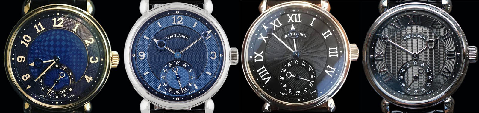
A comparison of numeral types
Having settled on Roman numerals, the next question was how the “IV” and the “VIII” are aligned. The logical way would be the layout of the third dial from left in the photo above, with the two numerals arranged radially outwards. But for some reason rotaing “IV” and “VIII” (as on the watch on the far right above) just looks better to me. It is the default alignment for Kari when a customer has not specified otherwise; at the same time it shows how little details that the watchmaker knows best can make a difference to the overall look.
The numerals on my watch are made of rose gold, a material Kari prefers, because machining such appliques with a diamond-tipped tool also simultaneously polishes the surface, so they require less finishing than white gold that contains palladium for colour but also makes it harder. The colour of the rhodium plating of the rose gold appliques also matches the colour of the platinum case better than white gold, which can be either more greyish or yellowish than platinum.
The little details extend to the form of the guilloché pattern itself. Kari has also precisely shaped the individual “hills” of the Clous de Paris, or hobnail, guilloché on the dial, creating a tiny flat plain on the top of each “hill”. This requires absolute precision and a perfectly flat dial plate, otherwise irregularities visible to the naked eye show up after the slight skimming the dial receives during finishing.
And to remove all burrs resulting from the engine-turning, the final step is a blasting process using fine glass beads. Even the blasting is a manual process requiring a lot of experience and skill, as overdoing it may round off the defined edges and create an unwanted matte surface instead.
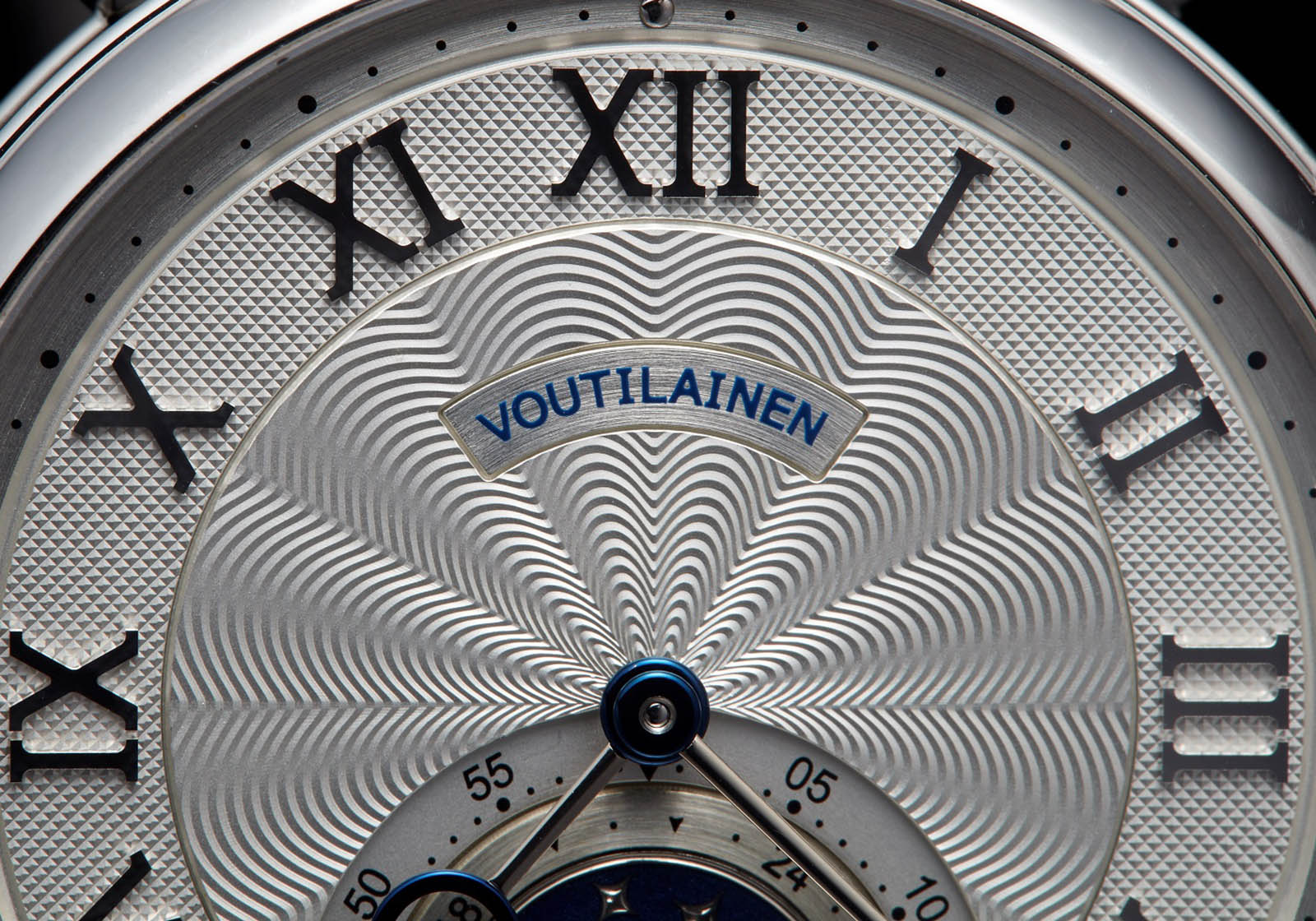
Detail of the dial on the author’s GMT-Villes
The precision of the dial is not solely the result of hand-work. The raw blanks for the dials are stamped from sheets of metal. And the channels separating the different guilloché, essentially borders framing each pattern, are cut by a CNC machine.
But these mechanical techniques do not detract from the hand-work, but rather enhance it. In fact, the production process requires a lot of time just for the logistics of moving the dial from one work station to another within the workshop, and between the workshop and the dial factory nearby.
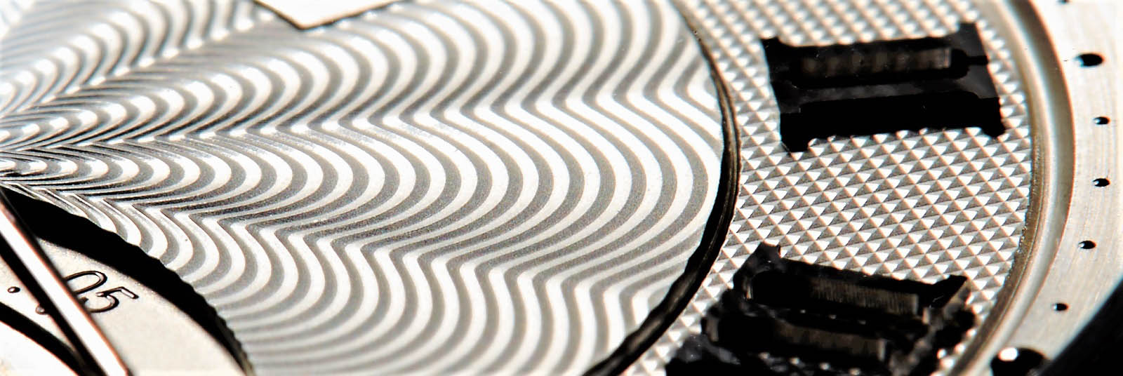
More dial detail on the GMT-Villes
Hands are another signature of Kari’s work. Gold hands are solid gold, in any of the colours of gold, while blue hands are heat-blued steel. But the gold hands are usually two-tone, with heat blued steel rings fitted over the gold body.
The time it takes to produce and finish such tiny parts explains why such details are only found in artisanal crafted watches. Kari travels the world extensively because he understands how difficult it can be for clients to grasp such details without an explanation from the maker.
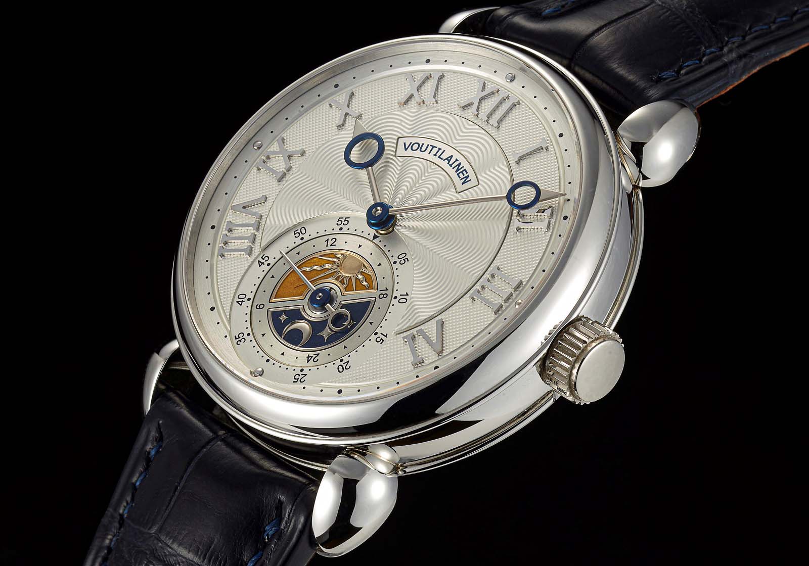
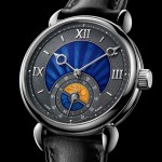
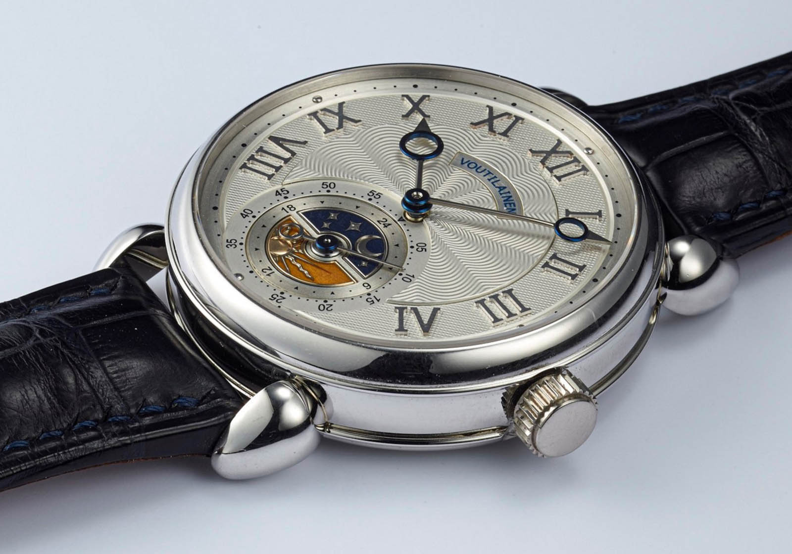
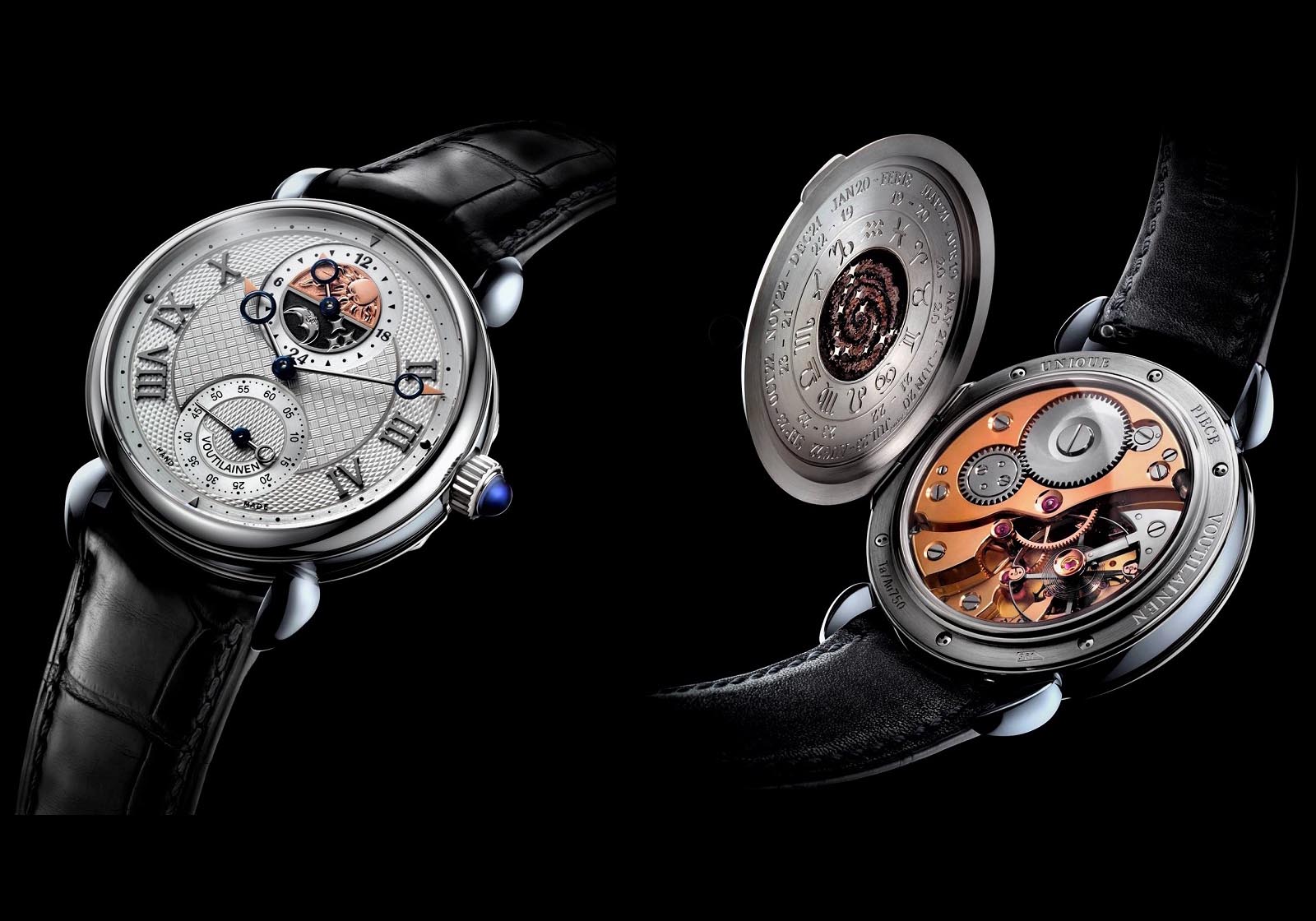
A more formal portrait of the GMT-Villes
At the time I was ready to finalise the order, Kari began to apply guilloché to the day and night disc of the GMT-6, replacing the engraved motifs of earlier models that were done by Eddy Jaquet. This was because getting the hand engraving finished in good time was increasingly challenging due to Mr Jaquet’s bulging order book. Not all customers are prepared to wait for the artisan to complete his job.
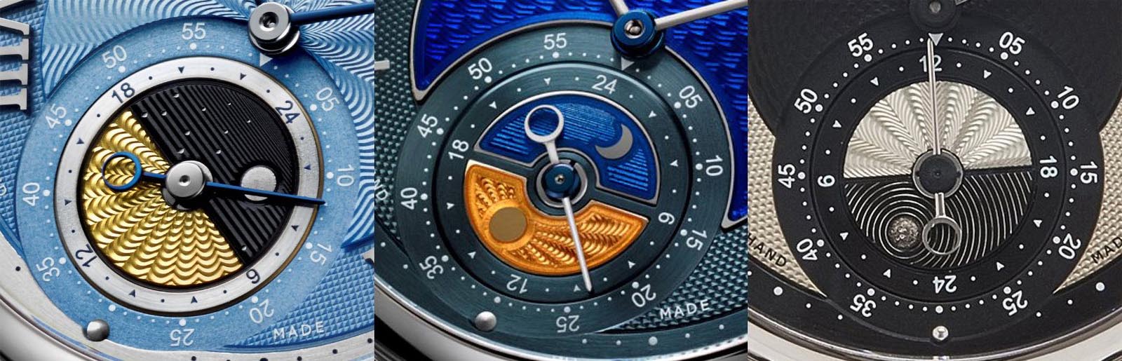
Comparing day and night discs
I much preferred the hand engraving of Eddy Jaquet as found on older examples of the GMT-6, primarily for the interesting contrast they provide against the rigid and formal lines of the guilloché on the main dial. But my taste does not run to human faces, so the hand engraving had to be of an object.
An early example of Mr Jaquet’s engraved disc
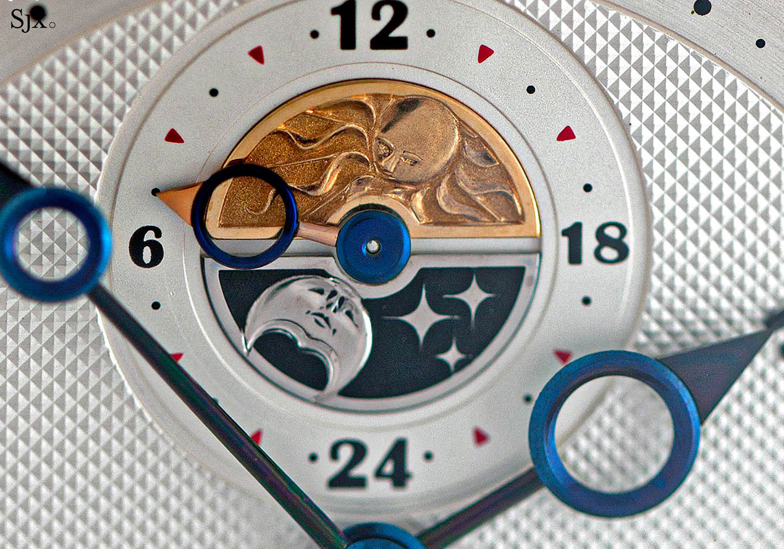
These engraved inserts are made of gold – yellow gold to depict day and white gold for night. The latter is galvanic plated in dark blue, with the raised moon and stars then polished to remove the plating and reveal the white gold underneath.
.jpg)
While waiting for the engraver to work his magic, Kari offered me a translucent enamel to fill the recesses of the hand engraving, adding visual contrast to the rest of the dial. Of course, I gratefully accepted.
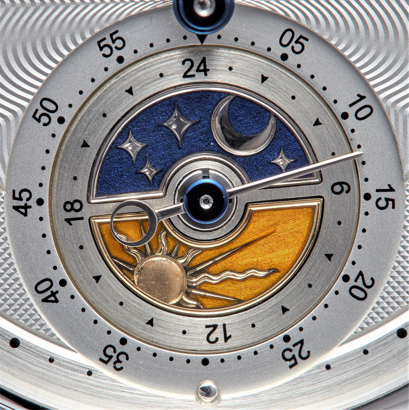
The day and night disc on the GMT-Villes, filled with fired translucent enamel
The combination of Mr Jaquet’s hand engraving with the champlevé enameling of Inès Hamaguchi, another artisan Kari uses frequently, became a highlight of the decoration on the watch. I particularly admire the clever way the moon and stars have been engraved in preparation for the layers of enamel, creating an unusual deep relief within a sea of translucent enamel.
The rest of the dial is sterling silver and is hardened before being engraved to create very precise lines in the guilloché. When the mechanical treatment was completed, the dial received a silver galvanic plating to create a surface appearance that is as close as possible to the sparkling frosted finish created from heat treatment that was often employed by Breguet. And to finish, a thin layer of clear lacquer sealed the surface to prevent oxidisation.
Keeping the signature look – the case
Kari has often stated he is a watchmaker first, and not a designer, but he designs all of his watches. This approach might lead to details that appear quirky, at least initially, but in my opinion results in likeable and interesting watches.
Kari’s aesthetic sensibilities are quite traditional, right down to the basics. For instance, he prefers smaller case sizes. Not only do they fit his own wrist better, but according to him, a 39mm case works best with a 30mm movement in terms of proportions – a quality he prioritises.
And he also believes a smaller dial makes it easier to create a balanced layout. As a result, he also offers a 37mm case. That being said, he has acquiesced to the occasional client who wants a larger case, and also makes his cases in 44mm.
When Kari creates a watch with a 44mm diameter case (left), the cal. 28 is reworked by enlarging the bridges and base plate so it fits the case without a spacer
With Kari’s preference for smaller cases, I was initially a bit concerned because such watches don’t look good on my wide wrist. But my worries were unfounded. Kari’s case, despite being classical, manages to have great presence.
That’s evident when comparing an Urban Jürgensen Ref. 3, which has a similar case shape, with a Voutilainen, showing how Kari has refined the classical shape of the case into something much more modern. The different proportions and reshaped lugs transform the Voutilainen into a bold, yet elegant design.
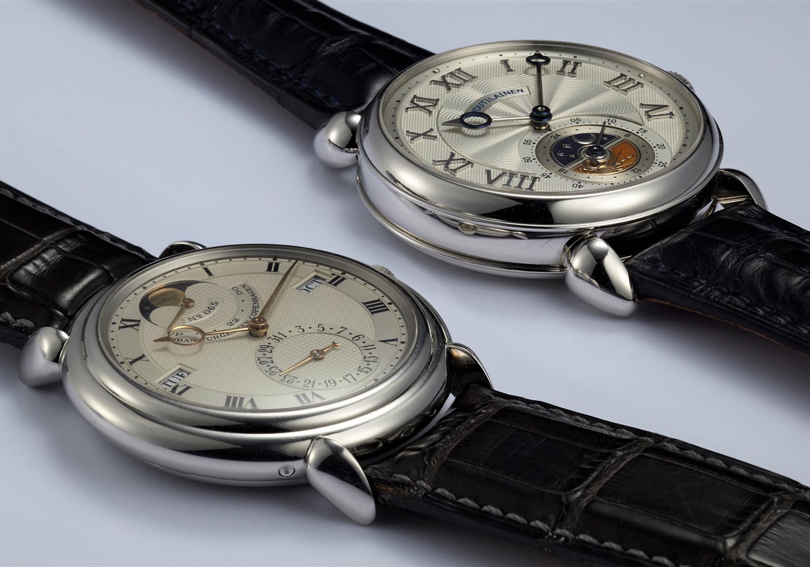
Urban Jürgensen Ref. 3 – 38mm by 9mm, next to the Voutilainen GMT-Villes – 39mm by 12.2mm
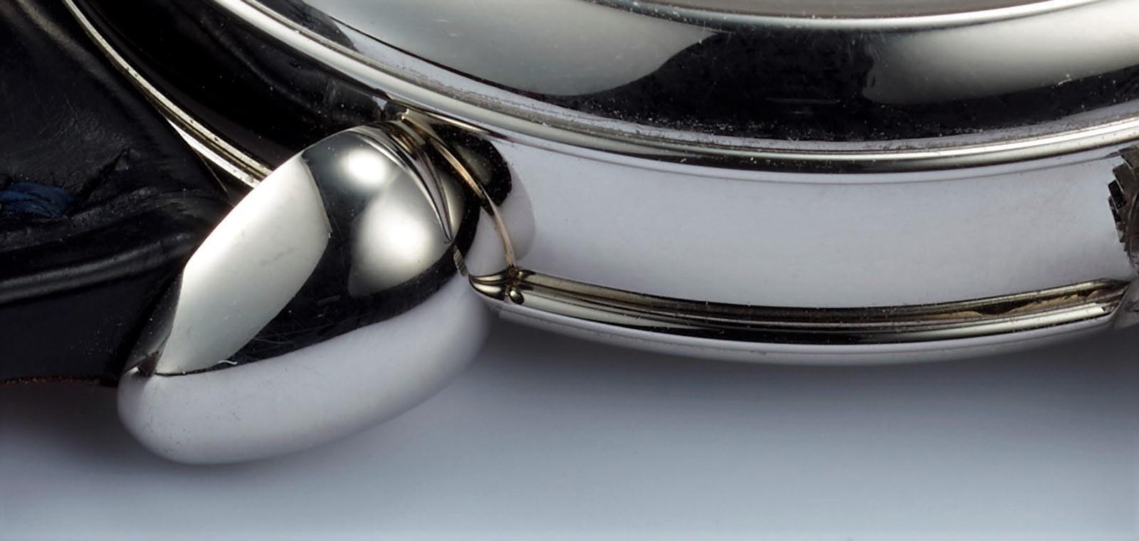
On the subject of lugs, Kari’s signature teardrop lugs are admittedly not to everyone’s taste. But Kari has a fondness for them, having being inspired by a 1950s Movado he owns. Conveniently, such lugs maintain their shape well over time and even after polishing – a crucial quality as longevity is especially important to Kari.
Another example of Kari’s emphasis on longevity is the protruding ridge of the bezel and back that protect the polished case band from scratches and dings.
According to Kari, damage to the large, flat surface of the case band is most unsightly, but small dings on the ridges are much less noticeable. And the three-piece case can also be disassembled into bezel, middle and back, allowing easy refinishing of each part while maintaining the distinct case shapes.
The lugs on the GMT-Villes
But as is the norm with Kari’s work, customer requests are accommodated. He has created watches with different lugs or simpler hands. But when all of Kari’s trademark elements are substituted with a client’s request, then the Voutilainen is barely recognisable as one.
As for myself, I like Kari’s modernised, traditional shapes and had no desire to change anything.
The 217 QRS model was presented with a modernised shape of the tear drop lugs (left); a customer wanted something even more functional, leading to simplified lugs and hands (right)
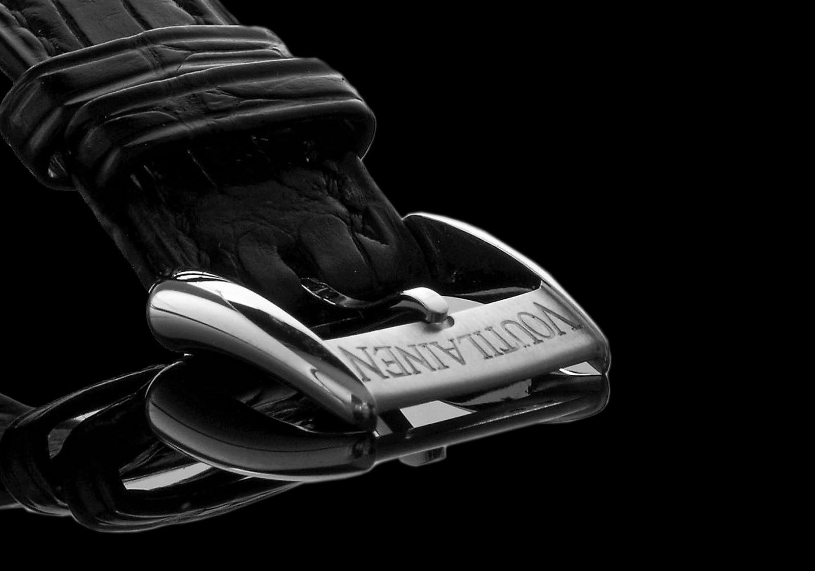
The GMT-Villes buckle
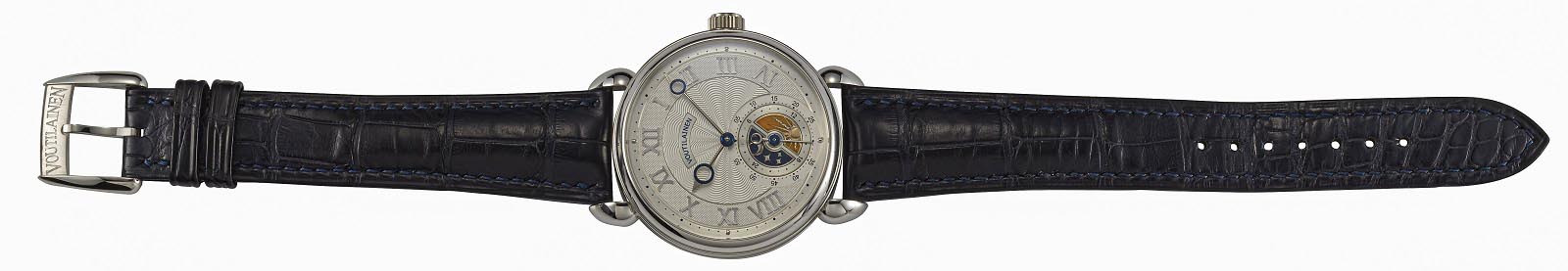
When the first email arrived from Kari with a concept for my bespoke time zone watch, which Kari nicknamed the GMT-Villes, I only wanted to change one detail: a platinum case instead of white gold, because I prefer its heft and colour.
Contrary to popular belief, Kari does not reserve steel and titanium cases only for special or limited editions; customers ordering bespoke watches can request cases in those alloys.
Technical solutions – the movement
When it comes to movements, Kari does not compromise. He does not use modules, and instead all complications are integrated, usually into the base plate. That’s possible because the cal. 28 is versatile enough to be used as a base for varied complications, without needing to design a new movement from scratch each time.
Kari at his bench. Image – Reto Albertalli/retoalbertalli.com
Kari’s goal when designing the cal. 28 was a robust movement of classical design. Thus, the cal. 28 is relatively thick at 5.6 mm, and built on three levels. Space for additional complications was designed into the base plate, under the dial. Also, German silver, or maillechort, being harder than brass, is used for the base plate and bridges.
The design philosophy behind the movement was described by Kari in his book, Kari Voutilainen Horlogerie d’Art, as being centred on “a respect for longevity as well as precision, based on classical watchmaking tradition”. A very large balance wheel “allowing [for] excellent regulation of the watch within strict tolerances” is a main feature.
Additionally, Kari wanted the movement to have a proprietary escapement. The desire for his own escapement stemmed from his goal of producing all parts himself with his own CNC milling machine. In contrast, a regular Swiss lever escapement would require specialised machines, such as a wire erosion machine to fabricate the pallet fork.
Thus, rather adventurously, Kari opted for a patented double wheel escapement design that provides direct impulse to the balance. The inspiration came from the “natural” escapement that Abraham-Louis Breguet invented but never perfected, leaving him to abandon the idea after 1810.
While not feasible in Breguet’s time due to primitive manufacturing technology, the execution of a friction-free, double wheel escapement is possible now thanks to the precision of modern machines and tools.
To add a bit of mystery to the design of the movement – this is entirely for aesthetic purposes – the transmission wheels are placed out of sight, and hidden under the dial. This is a visual flourish – there are less advantages to such a setup and more room for error, making it simply a demonstration of his watchmaking and production capabilities.
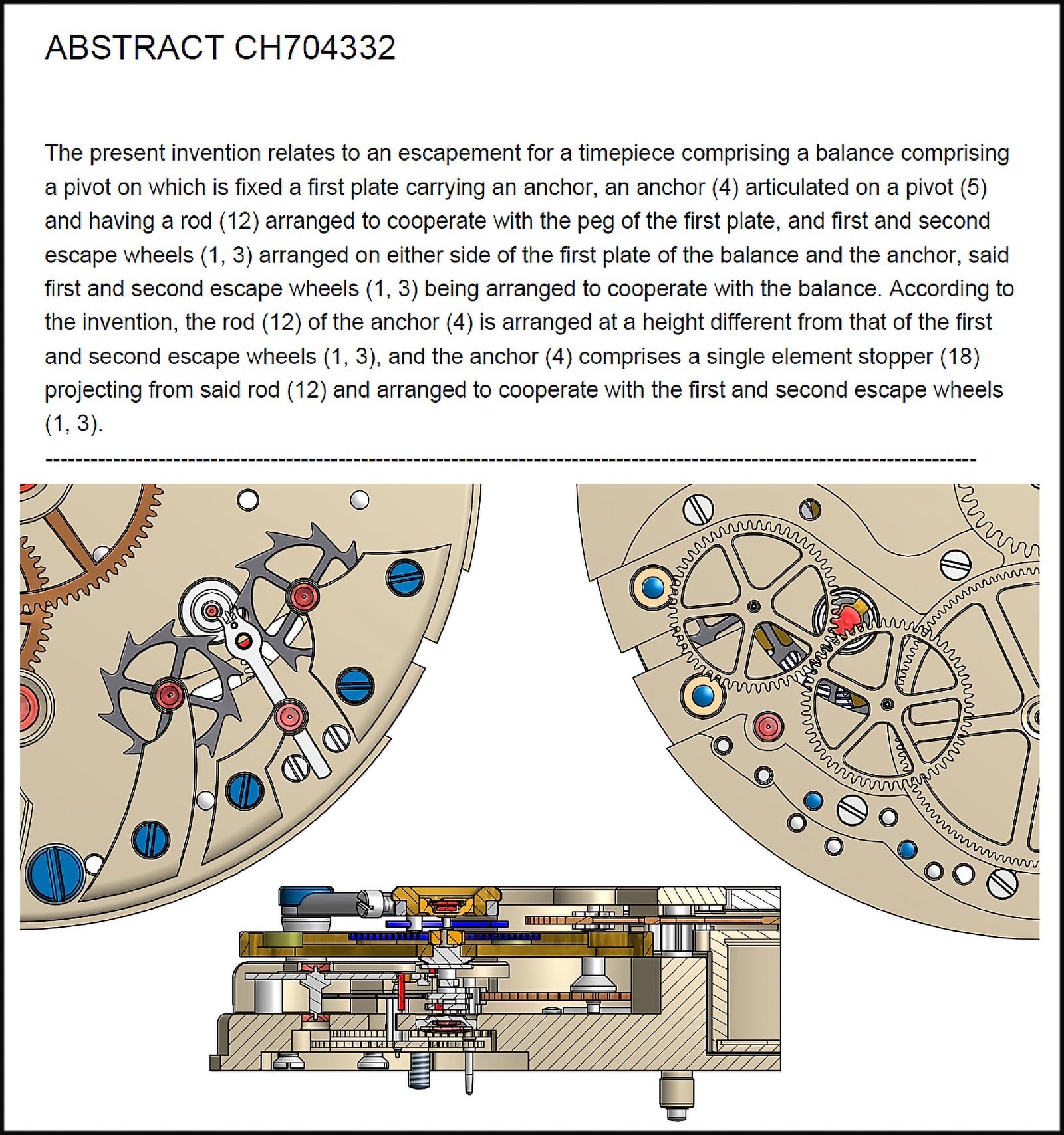
An extract from the patent for the double-wheel escapement in the cal. 28
The spare space under the dial allows for added complications, such as a retrograde date or power reserve indication, with the latter often combined with a second time zone. What I wanted however, also required a transfer of information between the front and back of the movement.
Illustrations – Voutilainen
To accommodate customer wishes for bespoke complications, Kari employs two full-time constructors in his workshop. One of them, Guillaume Meyer, was entrusted with my request for the cities disc on the back of the movement. This required a modification of the base movement in order to transfer information from the GMT disc on the dial to the cities disc on the back.
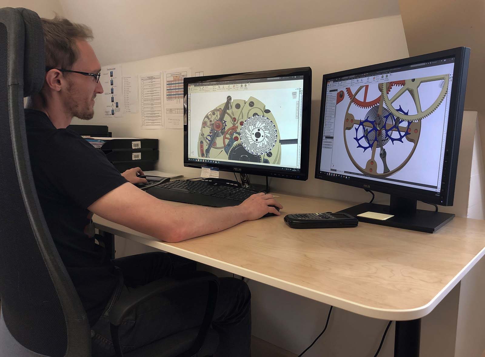
Guillaume Meyer. Image – Voutilainen
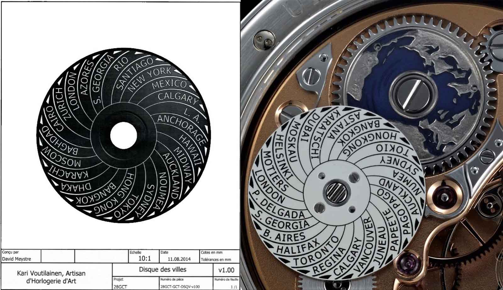
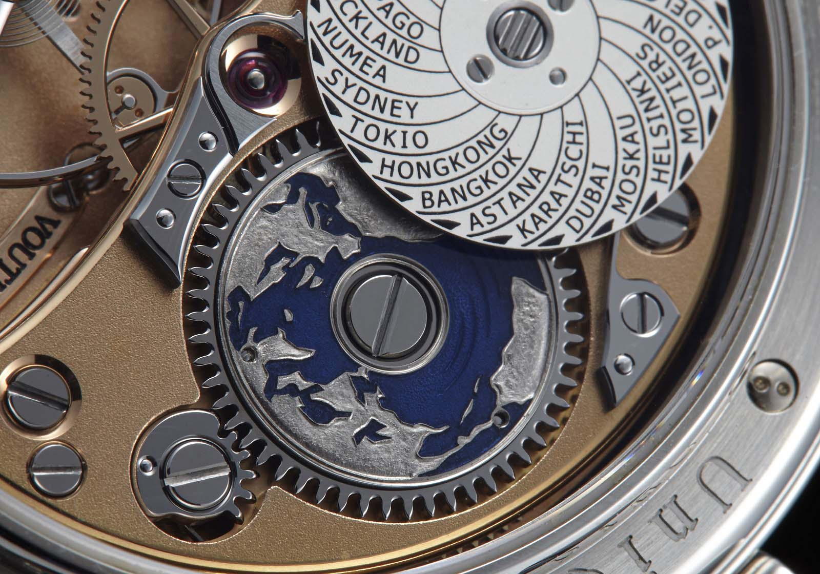
Fortunately ,the solution did not require a major overhaul of the construction – the following diagram compares the dial sides of the standard cal. 28 GMT (left) with the modified time zone GMT movement. The information transfer was accomplied with the addition of a transmission wheel at five o’clock that connects the GMT disc to the 24 cities time zone disc via a long shaft.
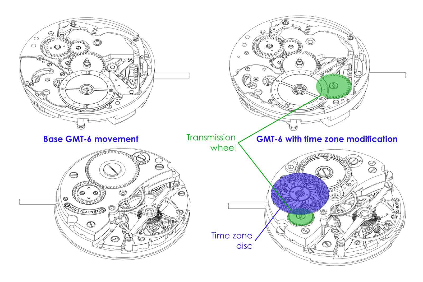
Comparing the GMT-6 and the GMT-Villes movements. Diagram – Voutilainen
This transmission wheel is located near the keyless works, and has a ratchet-type clutch that decouples the time zone disc when the crown is wound clockwise in its second position, allowing the secondary time display to be adjusted without advancing the cities disc.
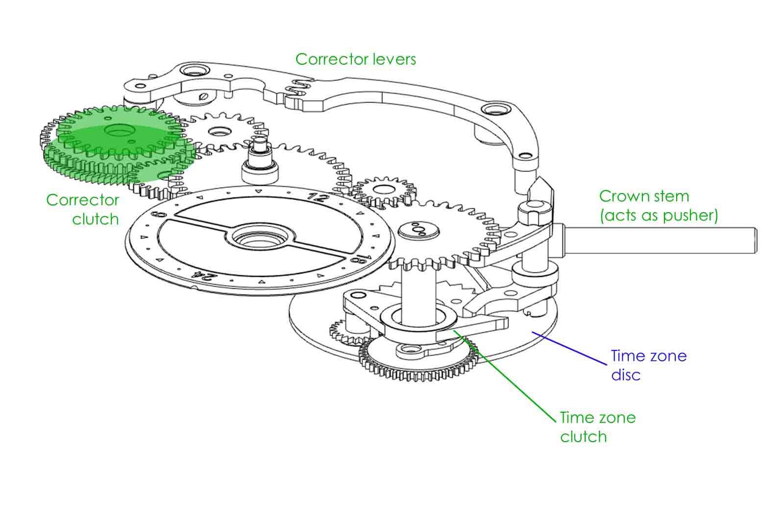
The gear train of the GMT discs and the cities disc. Diagram – Voutilainen
Once the cities disc and second time zone are synchronised, the crown pusher is used to set the correct city and second time zone. The base mechanism from the GMT-6 is retained – it uses a set of geared levers, which impulse a correction clutch wheel at 11 o’clock, moving the disc one hour forward with each push. This clutch is necessary to allow changing of the time zone without disturbing the going train of the movement and the local time display.
Simultaneously, the crown pusher also engages the cities disc clutch, which moves the city disc one hour forward, or eastward in other words.
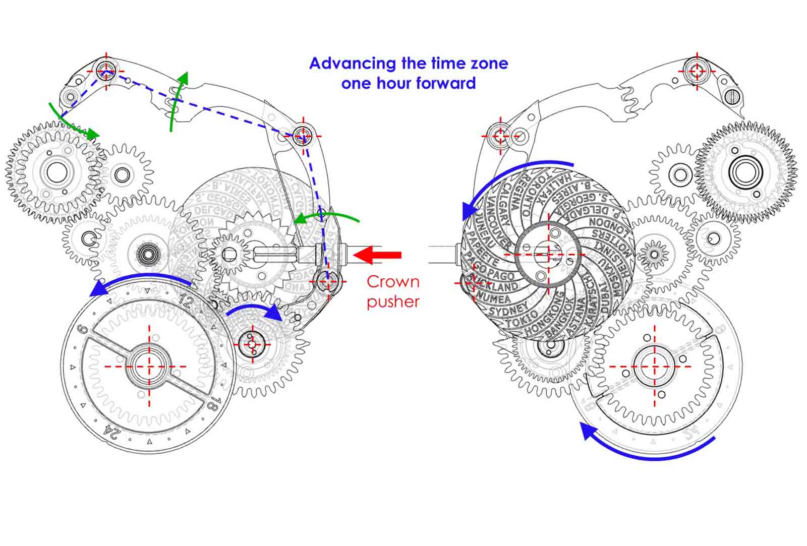
Diagram – Voutilainen
While the cities disc adds 0.8mm to the movement height, the case visually retains the same thickness thanks to a custom, raised lip around the sapphire window of the case back, increasing the effective height underneath the sapphire back. From the front, the GMT-Villes looks like a stock GMT-6, with identical dimensions.
Nevertheless, one downside to this design is the relatively small size of the cities disc, which impacts legibility. To improve readability slightly, the cities are arranging in a spiral, reminiscent of how it’s done on the Greubel Forsey GMT.
The reason for the compromise on the size of the cities disc is to ensure the rest of the movement, which is lavishly finished, can be admired in all its glory. And to keep the cities disc as flat as possible, Kari used German silver for its ridigity.
The drawing for the cities disc, compared with the real thing
To read the selected city, an elegantly curved steel pointer is installed over the centre of the movement, around the jewel for the centre wheel. Illustrating Kari’s attention to detail, this diminutive part could have been done with a dab of paint to form an arrow, but instead it is steel and finished with anglage and straight graining, retaining the signature styling of Kari’s movements.
I also had input on the decorative style of the movement. Kari usually favours finishing his movements in rose gold plating, and so do I. But customers can also specify other types of plating, including rhodium or yellow gold, or more modern finishes like ruthenium that is dark grey.
I was initially undecided about the main decoration of the movement. Having read once that Kari personally does the Geneva stripes on his movements, I tended towards that finish in order to get more of his personal touch in the watch.
Even after being told that an employee was responsible for the stripes as well – which are done with a wood disc and abrasive paste, and not with abrasive paper or a CNC mill – I was still enthusiastic about the decoration, and Kari endorsed my choice.
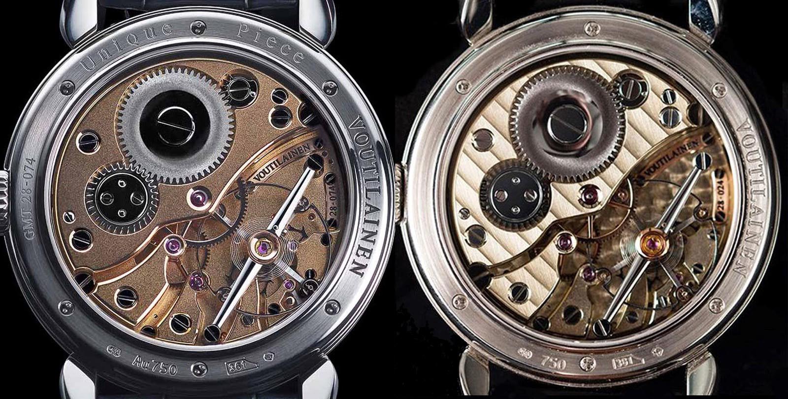
Two styles of cal. 28 finishing
After the meeting, as I was driving home from Môtiers, I thought through the discussions we had and suddenly had a feeling of doubt about what Kari himself really likes. After telephoning him the next day, my instinct was confirmed.
Kari prefers his movements to have a frosted surface. The frosting is done by a rotating steel brush, and also hardens the surface of the bridges. Because the frosting is done free-hand, it requires more feel and experience than applying Geneva stripes that are done with fixed tools. And the more common technique of glass-bead blasting creates a surface too regular and too matte for his taste.
The combination of rose gold plating and a frosted surface highlights the anglage as well as the black polished steel parts like the balance bridge and the screw heads, which makes the movement livelier in Kari’s view. Knowing this, my specification was changed.
With that in mind, I also got rid of the perlage on the base plate, since this surface decoration is a pet peeve of mine anyway. This also made me realise how silly my original idea of a “signature” watch was. Why try to predict someone else’s preferences instead of relying on my own taste and my own ideas?
That is especially so given that Kari can be relied on to seek the ultimate quality in every aspect of the watch, right down to the smallest part.
For instance, to ensure the quality of screws, Kari produces them himself, and also does his own heat treatment for surface hardening. This allows him to use harder steel than the watch industry norm, which is softer in order to make polishing easier.
The screws used in Voutilainen movements are polished by hand one at a time, resulting in screw heads that are absolutely flat. This contrasts the industrially finished screws found on most industrially produced watches, which may appear flat but are actually slightly domed upon closer inspection.
Several watchmakers are fully occupied with polishing the tiniest parts going into a Voutilainen.
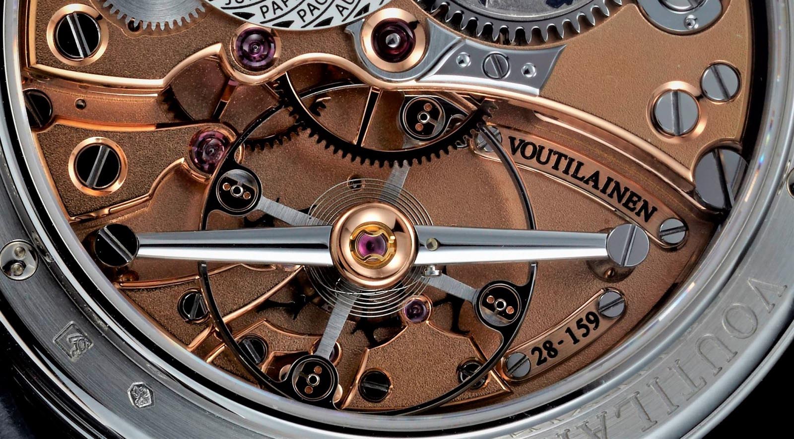
Captured inside the GMT-Villes movement: the anglage, which includes the screw head slots, and the polished steel parts become more prominent on a rose gold background. And the big steel balance wheel with its four gold inertia-blocks to adjust the daily rate is another signature feature of the Vingt-8 calibre.
Detail of the GMT-Villes movement
The back of the GMT-Villes: an imperceptible lip raises the effective height of the case back. Also visible are proprietary case back screws, preventing unwanted access by inexperienced watchmakers.
The artisans
To stay within the world time theme, my initial idea was to have the barrel ratchet wheel decorated with a stylised depiction of a world map, specifically one done by Unryuan, the Japanese maki-e lacquer artist who frequent works with Kari.
But Kari did not share my enthusiasm for this decoration, so I felt something must be amiss. I interpreted it as a gesture to not overburden a first-time customer with a outlandish extra charge for a tiny detail.
So I moved on to another idea: an engraving similar to what Antoine Preziuso uses as a world time display on his Transworld watch, but reduced in size and executed by Eddy Jaquet. Now I had Kari’s support, despite the challenge of modifying the movement to accommodate such a decoration.
Hand-engraving such small steel parts is almost impossible, and steel cannot be enamelled, which is why an insert of gold was required. The insert in turn fits into a recess milled out from the steel wheel. For a more pleasing look that maximised the size of the engraving, Kari produced a custom made, smaller-than-standard ratchet wheel screw.
The decoration of the bridge and ratchet wheel by Unryuan (left) is based on gold powder, gold leaf and shells from the great green turban and abalone. Antoine Preziuso uses a rotatable dial centre on his Transworld model (right) for the indication of world time.
Once my watch was delivered, I was curious about Kari’s ambivalence, or even opposition, to the maki-e decoration on the movement, so I asked. His response: it made no sense to combine the Western dial decoration by Eddy Jaquet with Japanese art on the back, and doing so would only create a clash of styles.
I figured he must have really made bad experiences with thin-skinned customers for him not to say this right away; I would have readily agreed with him in any case.
But that is understandable, because for Kari, respect for everyone, from employees to artisans to clients, is paramount. While his longtime employees can interpret a slight change of timbre in his usually calm voice, customers have to rely on more non-verbal communication.
Since Kari always pays attention to what the customer desires, there is no point in repeating something that has not provoked a reaction. If there’s no reaction, Kari probably doesn’t like it, and the client’s idea might be rubbish – but he’s just too polite to say so. A customer should therefore maintain the same level of attentiveness in communicating with Kari in order to build a good working relationship.
That being said, sometimes the opposite is true. On stage receiving his awards, Kari expressly thanked the two customers who commissioned the Voutilainen watches that won prizes in the Grand Prix d’Horlogerie de Geneve 2019 – the Men’s Watch prize for the 28Ti and the Artistic Crafts prize for the Starry Night Vine – noting their “strong insistence” helped to “push” him and his crew. So customers truly convinced of their ideas shouldn’t give up too easily when met with some initial resistance.
For bespoke engraving, Kari likes to work with the Eddy Jaquet, despite the long delivery times due to the high demand for Mr Jaquet’s work. Mr Jaquet learnt his craft engraving medallion, which honed his ability to sculpt objects and figures in relief, creating a prominent 3D effect.
Eddy Jaquet at his workbench. Image – Eddy Jaquet
For my barrel ratchet decoration, Mr Jaquet provided an initial illustration that included names of continents.
Again, I was not at all keen to have any labels on this small disc and suggested an engraving with hints of the main elevations on the landmasses, to create a third dimension of sorts. This was incorporated in the second illustration.
While this disc has no function, I like it for the colour and additional interest it brings to the back side of the watch.
The evolution of the disc. Illustrations – Eddy Jaquet
Kari offered to decorate this small disc with translucent enamel. All enamel work is done by local artist Inès Hamaguchi. Like other specialists she is working on her own at home, which allows for direct communication between her and Kari, which helps to avoid misunderstandings.
Later, Ms Hamaguchi told me how concerned she was about enamelling such tiny and thin parts – namely the barrel ratchet disc and the day-night inserts – and at first expected it to be impossible.
To avoid distortion of the dial disc during firing, dial enamellers insist on minimal thicknesses of the metal part as well as space on the back to apply counter-enamel that prevents warping. Fortunately, Ms Hamaguchi’s first trial run for the enamelled parts, which did not have these safety elements, were successful.
Kari’s preference of working with artisans skilled in a particular field is evident even in the watch box.
An award-winning cabinet maker located near Kari’s workshop, Cédric Vichard, creates Voutilainen boxes using vacuum-moulded birch wood veneers, with a locking mechanism inspired by those found on small lacquer boxes Kari had discovered on a trip to Japan.
Mr Vichard loves to incorporate curves that bring softness or tension into his creations, allowing the play of light to highlight the materials. To add further interest, the box is decorated with patterned African ebony, then covered by ten individually polished layers of lacquer, and supplemented with gold-plated brass fittings.
Cédric Vichard at work. Images – Cédric Vichard
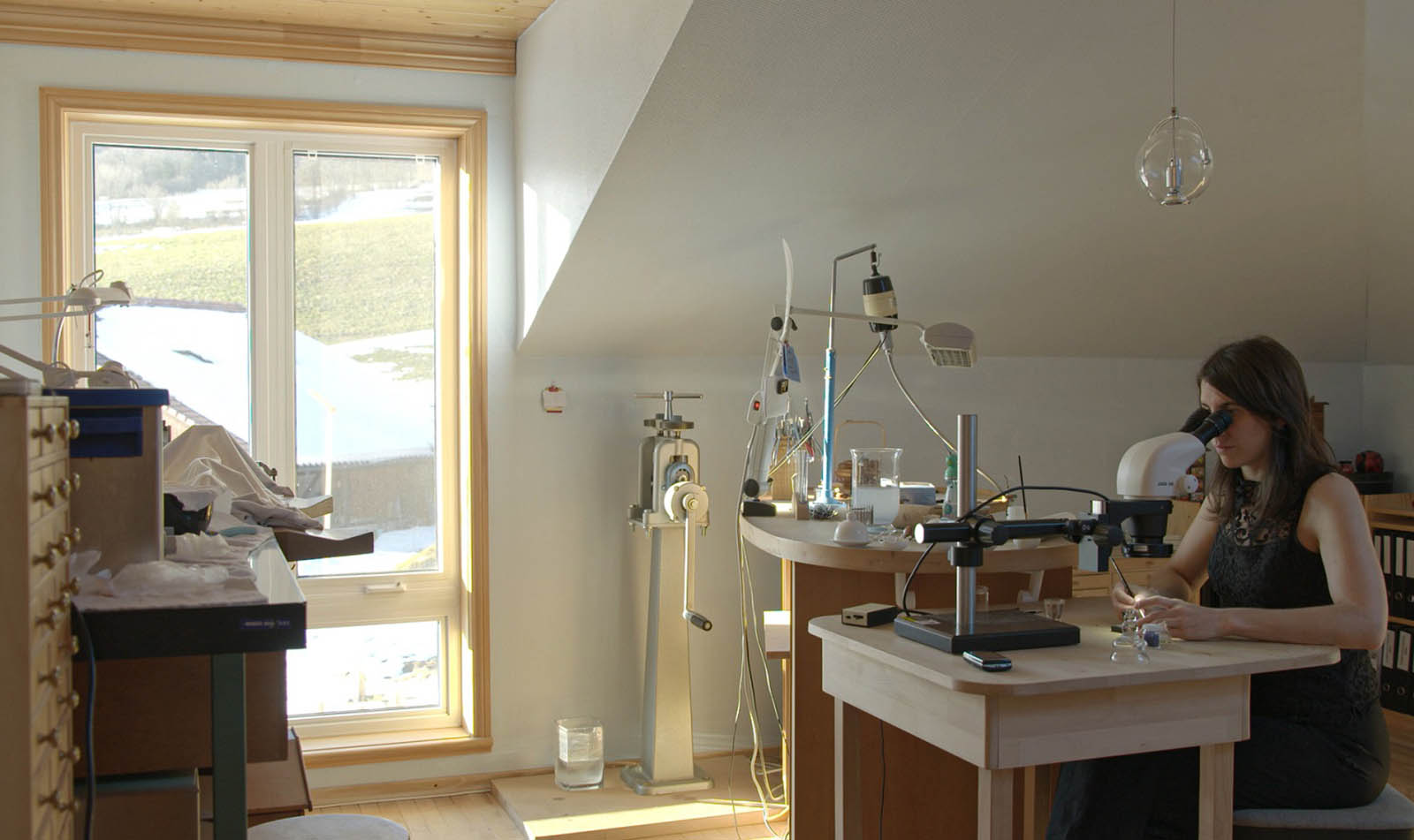
Inès Hamaguchi inside her home workshop. Image – Inès Hamaguchi
The execution and production of my watch was straightforward. I received the design proposal for the time setting disc as well as the draft illustration for the hand engraving on the ratchet wheel, so it was easy to make definitive decisions and give the approval.
Regularly seeing Kari at trade shows and staying in contact through emails and calls, meant that I always knew how the watch was coming along.
Applying translucent enamel on top of the hand engraved disc inserts creates a sparkling feature on the GMT-Villes dial
Fine finishing inside the GMT-Villes – the teeth of the ratchet and barrel wheels as well as on the click are fully polished
I never had a problem with the wait for a watch to arrive in my hands – it took 27 months from the first down payment to delivery. Kari had to wait some time to get the engraved parts from Mr Jaquet, but I had already known before placing my order that engraving would be a production bottleneck.
I had always stressed to Kari I was not in a hurry to get the watch, but rather preferred perfect execution. For maximum enjoyment of the finished watch, I needed to know that nothing could be be improved on the finished watch.
To achieve this, I believe the watchmaker deserves a generous time window, to encourage him to propose changes to my specifications if a good idea arises later on or when he gains a better understanding of my taste.
Kari mentioned how customers often don’t fathom what it takes to create a bespoke watch. Consequently, he must rush to avoid a nasty situation or even clients backing out of orders. If the client is in a hurry, the watchmaker will avoid suggesting decorations or solutions he does not have absolute control over in terms of production, and as a result, that means the customer is depriving himself of choice.
The Result
When I received the first photo of the finished watch, I immediately responded by requesting the removal of “Hand Made” on the dial. Since this watch did not have to sell itself in a shop window, or any of my watches for that matter, I regard such written declarations on the dial as borderline insulting – I would certainly remember buying a hand-made watch.
The dial was, of course, redone without objection, which also gave me the opportunity to have “Voutilainen” printed in blue instead of black.
At the same time, I also learned how important these written proclamations are to Kari. When I asked if his customers really appreciated, or needed, the obvious stated on the dial, he responded that it was important to differentiate his watches from industrial products. And he believes it was indeed important to point that out regularly given the widespread industrialisation in the watch business today.
In a custom-made watch, probably the only element precisely known in advance is the quality and artisanal craft; defining the final result in all its detail when the order is first mooted is not possible.
Nevertheless, as a customer I wanted a sense of financial security with a price that is set at the beginning. Here, the only change from the first quote was an additional 6,000 Swiss francs for the platinum case I wanted to replace the original proposal in white gold, which was less than 5% of the total cost. But no written contract was required – mutual trust carried the day.
At the same time, I believe the customer should also be transparent in his negotiations. I never haggle about the price with commissions from a watchmaker. Either I judge the offer as fair, or I walk away without further discussion.
Creating these watches includes many time-consuming details that I would never be able to specify in advance. Since there is no free lunch, I would jeopardise my goal of getting the best possible watch within my defined parameters by trying to negotiate a discount after the ironing out the specs of the watch.
In dealing with a gentleman like Kari, I found our agreement generously interpreted, usually to my advantage. In my opinion, I got more than I had bargained for, for instance with the translucent enamelling on the day and night disc, and also in the first platinum crown Kari has made, instead of the usual white gold crown he uses on platinum cases.
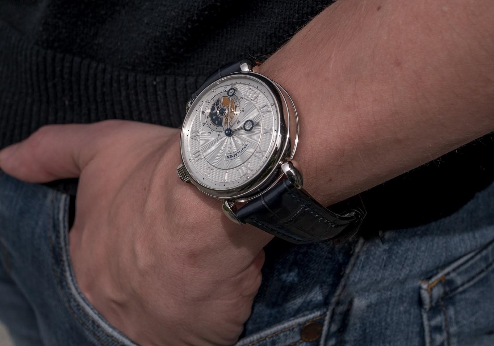
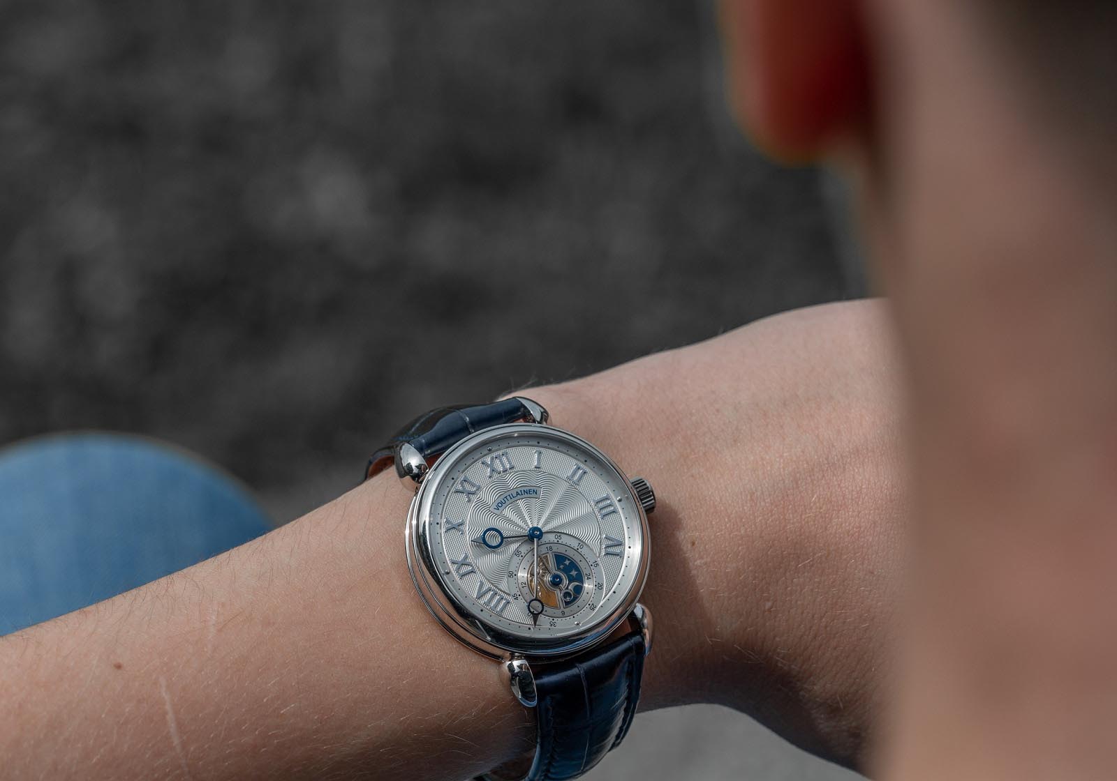
The GMT-Villes on the author’s wrist
The enjoyable experience of creating the watch will always stay with me. The watch itself is also a dream become real. And it is practical.
The bold design of dial and hands make it easy to read the time, while I can easily read the setting disc on the back for the second time zone in sunlight, though not so much in low light.
A case thickness of 12.2 mm, including the crystals, and striking teardrop lugs create an excellent presence on the wrist. Despite being weighty, the watch sits perfectly balanced, without any tendency to slide down the side of the wrist even when the strap is quite loosely fastened.
Winding the watch is a tactile joy, smooth but with a marked need to apply torque. When winding the watch, the recoil of the crown evokes the feeling of a supple and solid mechanism. When I asked Kari about the technical reasons for this unusually pronounced recoil, he explained it was the design of the winding click.
And, finally, there is another crucial aspect, described by auctioneer Aurel Bacs in an interview with Europa Star magazine as the “fourth dimension” of a watch, which includes “the origin, the history, the uniqueness”. With commissioned pieces from independents I get not only uniqueness, but I am actually part of the origin and creation, and thus history of the watch.
And if I ever had any doubts about my original specifications, I can rectify them easily.
Kari offers additional dials at a reasonable price, so correcting the most heavily customised detail of the watch is easy. I ordered a more extravagant dial as an extra, to create a different character for the watch, should the lust for change arise later.
Unfortunately, I have not yet received a concrete proposal from Kari for this second dial. Now I wonder if he is hinting that my idea surpasses his threshold of taste.
Back to top.