Up Close: Vacheron Constantin American 1921 Collection Excellence Platine
Gorgeous and quirky.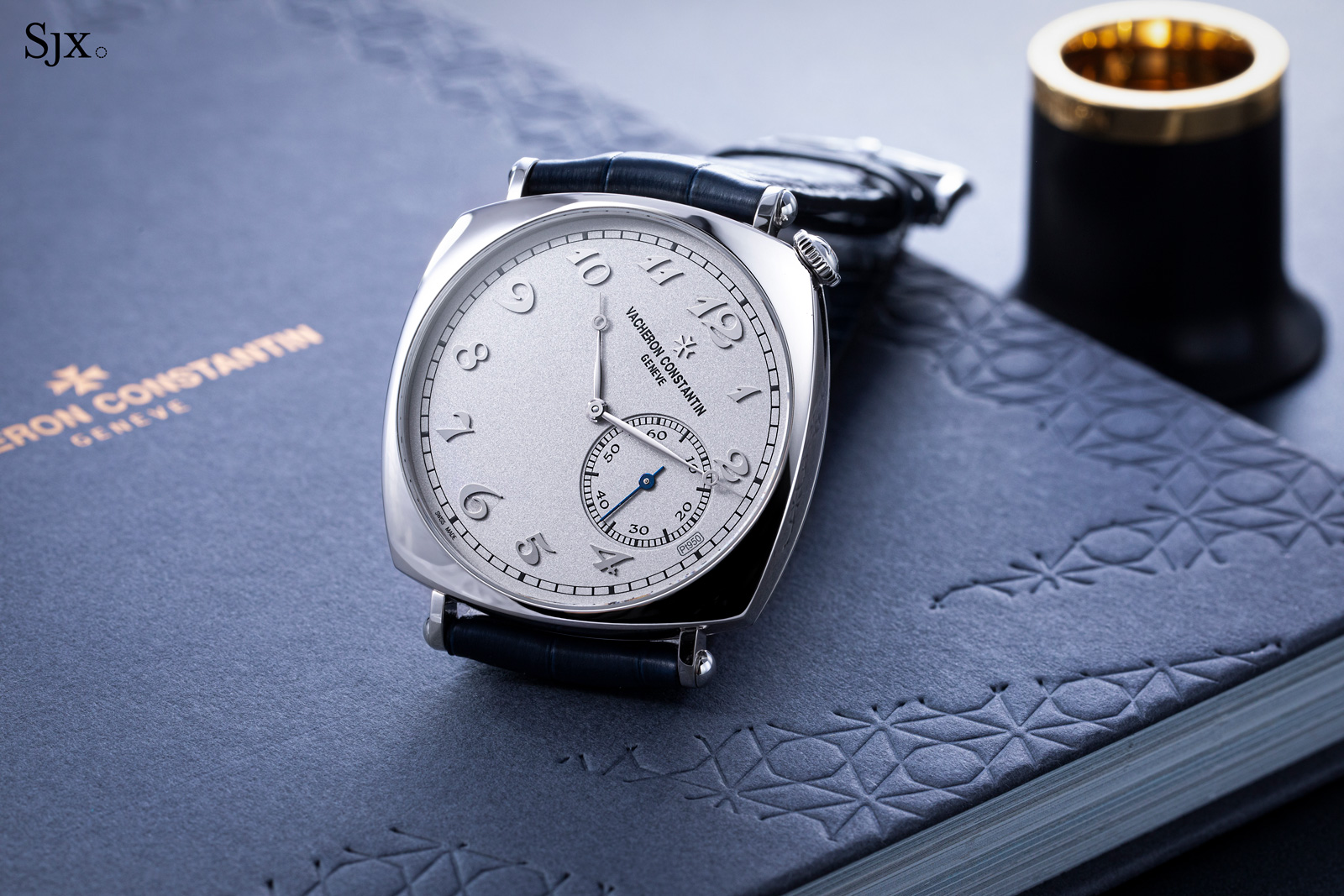
Unveiled just recently at Watches & Wonders 2021, the American 1921 Collection Excellence Platine is the newest – and best – iteration of Vacheron Constantin’s most distinctive Historiques wristwatch.
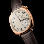
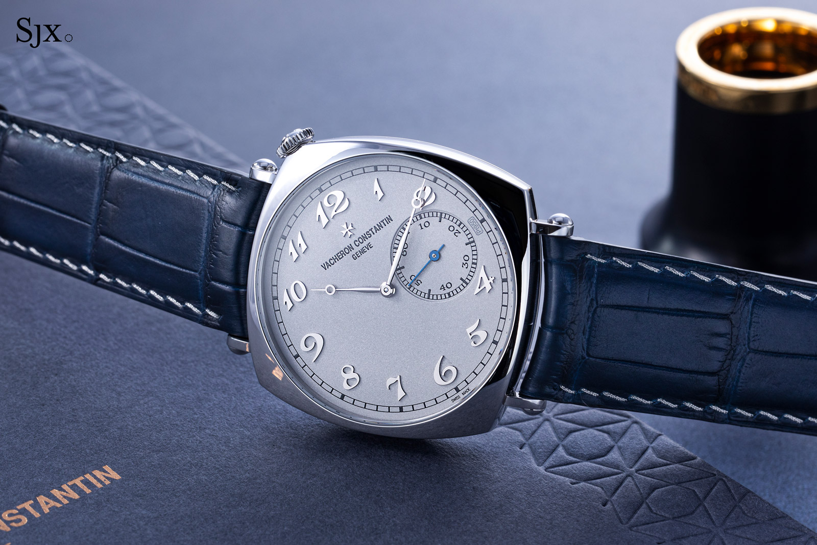
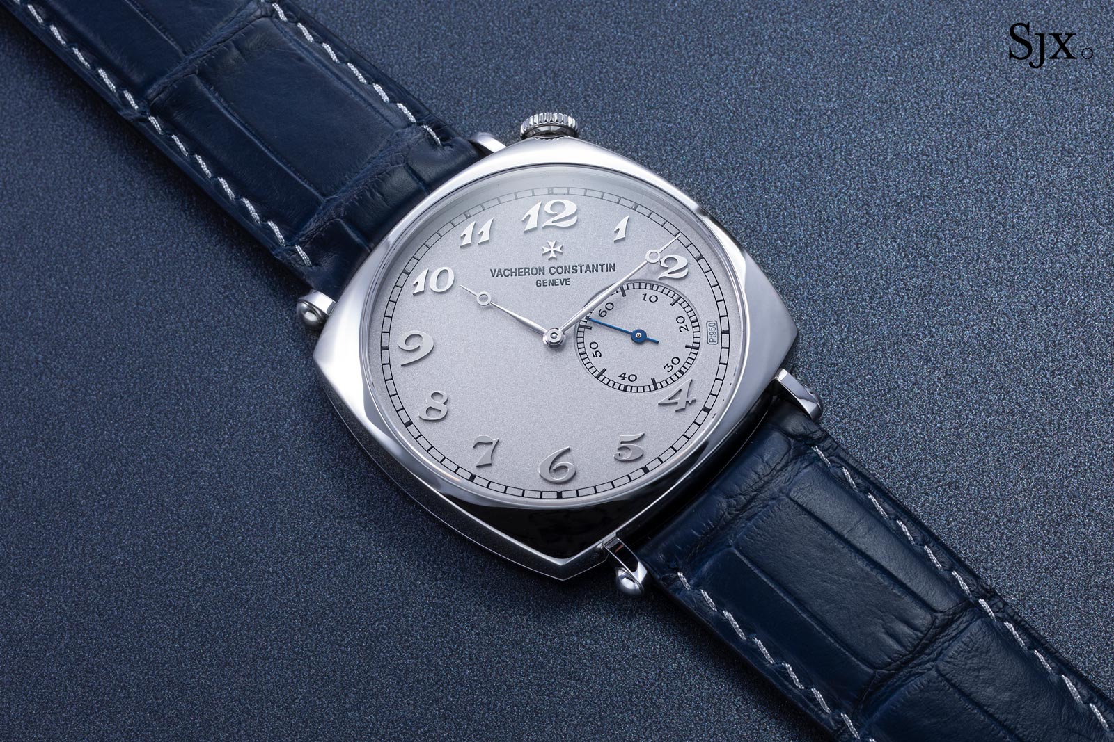
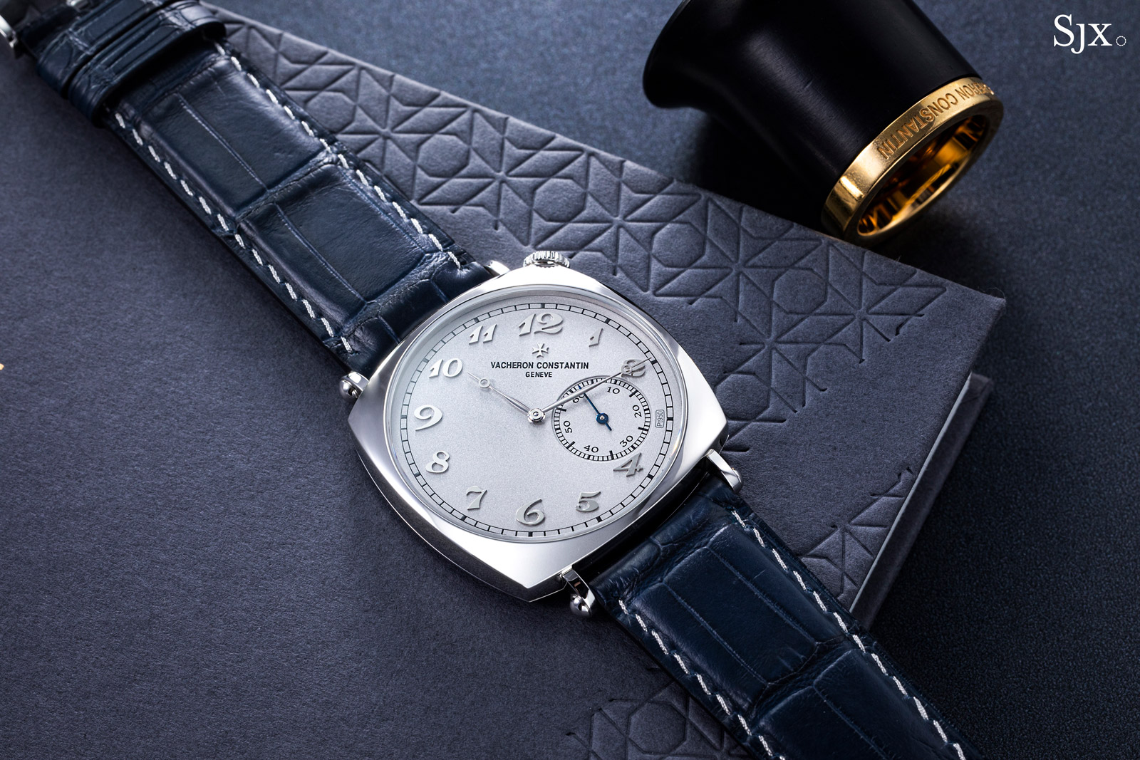
Modelled on a 1920s wristwatch with a dial rotated 45 degrees off the vertical, the American 1921 has long been available as a standard-production model in pink and yellow gold, as well as platinum.
The new American 1921 Collection Excellence Platine (CEP) is a limited edition of 100 pieces with the same idiosyncratic design, but with the enhancements typical of the CEP editions. That means a solid platinum dial along with platinum threads for the strap. Crucially, the 1921 CEP has applied numerals, a bonus found on none of the other versions of the 1921, which makes a good design even better.
Initial thoughts
Having been launched just over a decade ago, the American 1921 is a familiar watch. I’ve examined the different versions at length, and also wore one for a short period for a review. The 1921 gets most things right – design, details, and size – and looks good on the wrist.
The 1921 CEP is unquestionably the best looking iteration of the model to date. Even though the aesthetic changes are modest – primarily the addition of applied hour numerals – the 1921 CEP looks strikingly different. The dial has less contrast but more depth, which results in a more refined appearance.
It is, however, pricey. Already the standard version of the 1921 in platinum is a pricey US$46,600. The 1921 CEP retails for US$51,000 – which is a relatively small premium for the fancier platinum dial.
But it is expensive next to comparable models: the 42 mm Patrimony CEP with the same movement costs US$39,200, while the 38 mm Traditionnelle CEP, again with the same movement, is US$36,500.
The cal. 4400 AS in the 1921
When I first covered the 1921 CEP during its launch, I felt it was an expensive watch. And it is, but the price is probably justified. Good design does have value, and the 1921 CEP combines the unique style of the model along with the additional platinum bits to create an extremely good-looking watch.
While the 1921 isn’t a well established design icon like, say the Audemars Piguet Royal Oak or Cartier Tank, it is still a distinctive design that is instantly recognisable as a Vacheron Constantin. So while the price of the 1921 CEP is rich, it’s arguably worth the stretch.
Platinum inside and out
The 1921 looks like a big watch, but it is actually fairly compact. Its cushion shape is typical of early wristwatches, with the short, narrow lugs making the case seem larger than it is.
The case is just 40 mm wide, though it has a bigger footprint than an identically-sized round case. And it is a slim 8.06 mm high, giving the 1921 an elegant profile on the wrist.
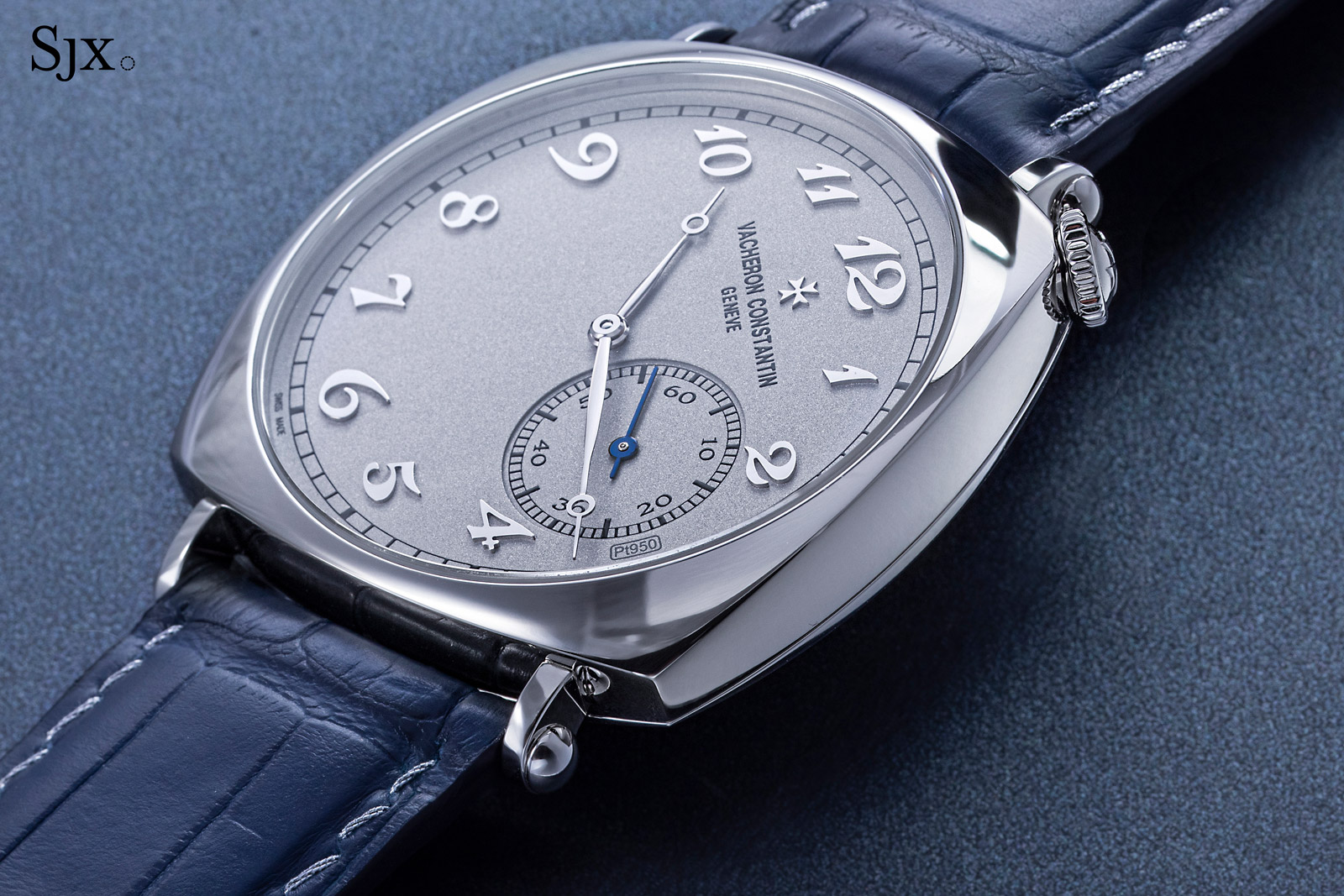
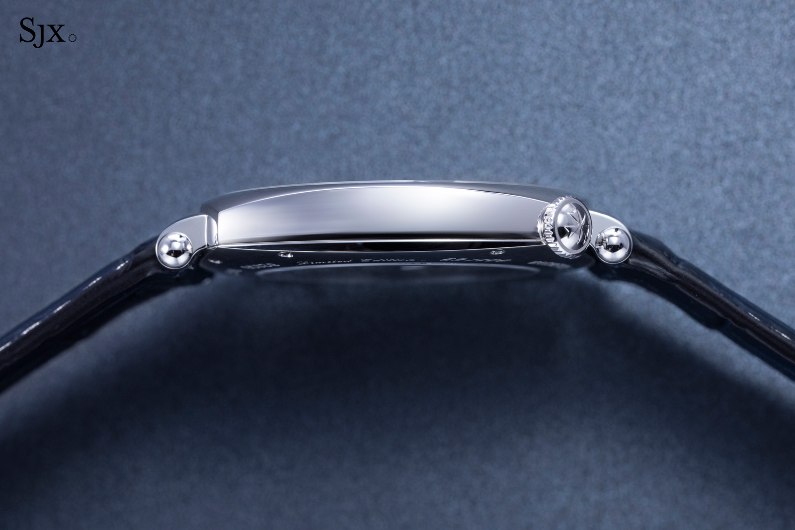
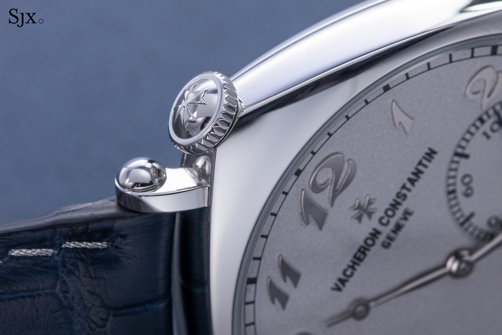
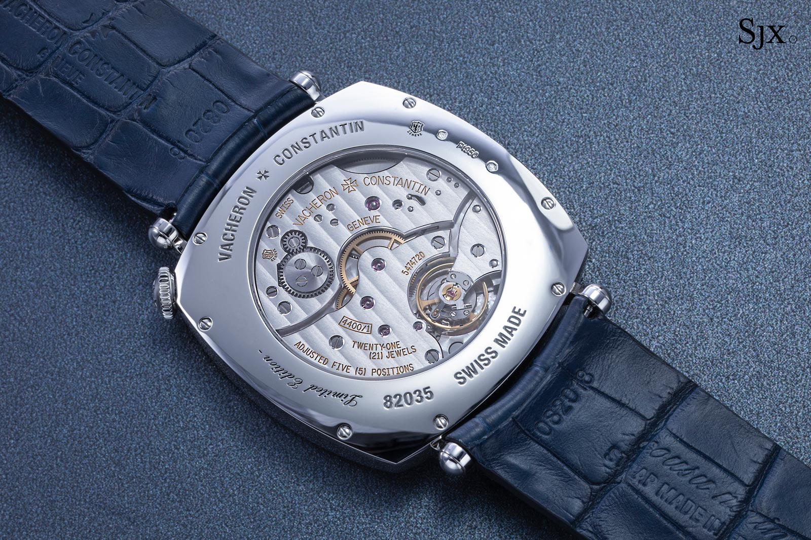
Mirror polished on all surfaces, the case is finished simply, but appropriately for the style. Details like the cabochons on the edges of each lug, as well as the relief Maltese cross on the crown, given it an added bit of refinement.
Still, the case is no different from that of the standard 1921 in platinum. The CEP is special because of its dial.
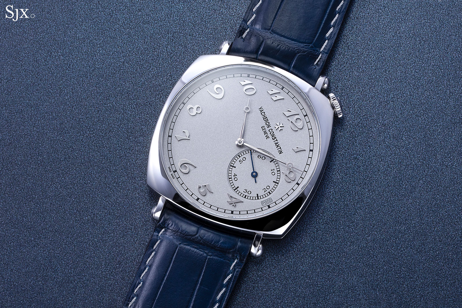
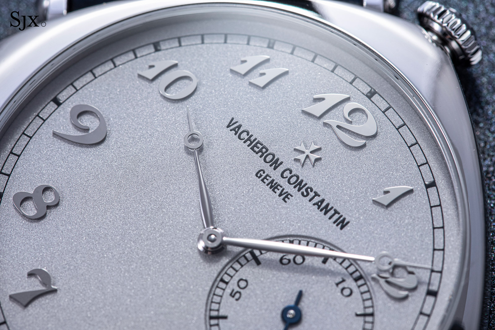
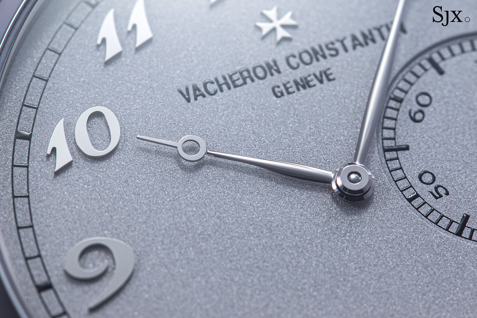
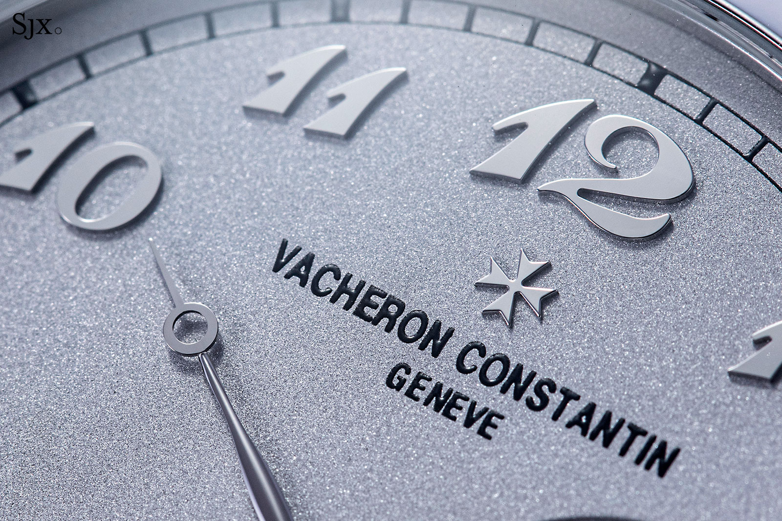
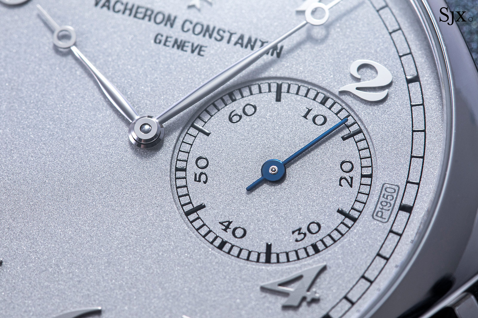
Though simple in design, the dial is executed expensively, as is tradition for the CEP. Like the other CEP editions, the dial is solid platinum with a bead-blasted finish that gives it a finely granular surface. All of the applied elements of the dial – the numerals as well as Maltese cross – are white gold, as are the Breguet-style hands.
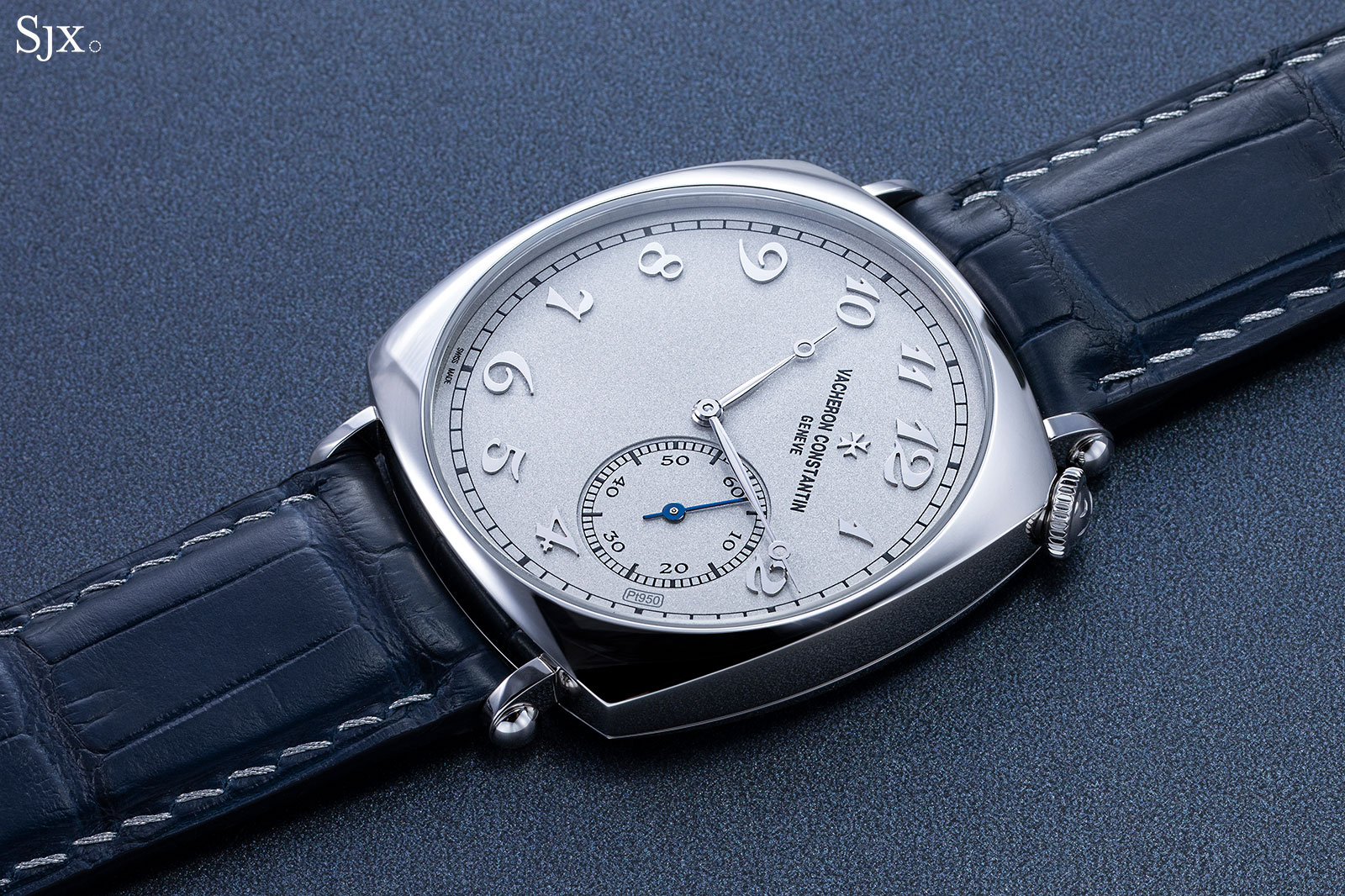
Finished with a mirror polish, the applied Breguet-style numerals are fairly substantial and sit quite high above the dial, setting the 1921 CEP apart from the standard models, all of which have printed numerals. Although the applied numerals are the only significant difference between this and the standard models, they make all the difference, in part because the design is simple to begin with.
At the same time, the applied numerals bring to mind early 20th pocket watches with similar dials, which enhances the vintage feel of the design.
Right beside the seconds sub-dial is the “Pt950” hallmark that refers to the dial material, a standard feature on all CEP editions. Though it’s apparent in pictures, the hallmark is not obvious on the wrist, because of its size and colour.
Instead of being rotated 45 degrees off the vertical as the dial is, the seconds register is upright – a conscious design decision for a bit of irony. According to Vacheron Constantin, “the design team decided to keep the small second as usual to accentuate the [design] twist”.
Notably, the seconds hand is blued steel. While it does add a dash of colour to the dial, I have a nit to pick: I would have preferred it to match the hour and minute hands, or failing that, to have all the hands in blued steel. Having the seconds hand in a different colour doesn’t really make sense since there’s no functional purpose to it, unlike on a chronograph or central-seconds dial.
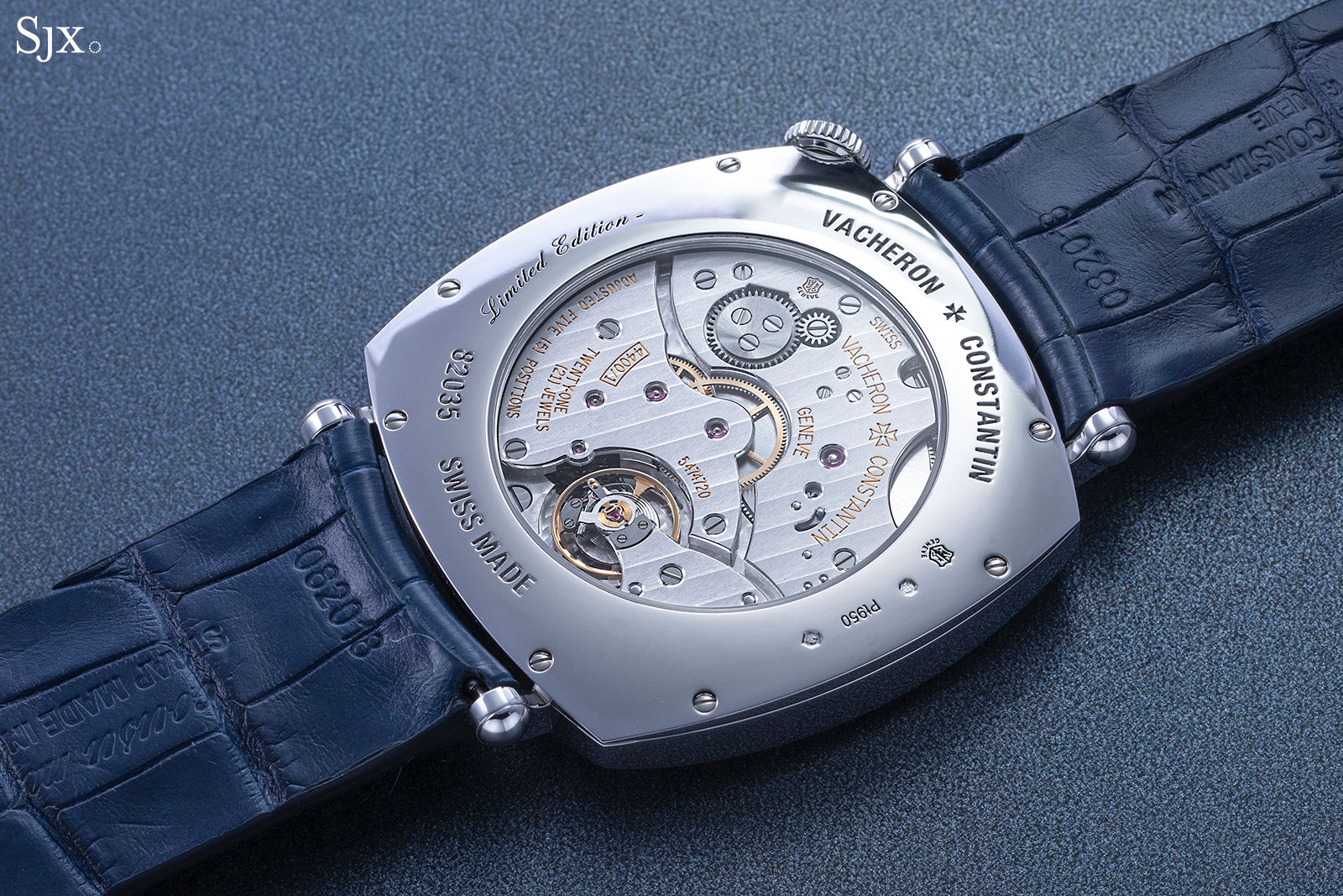
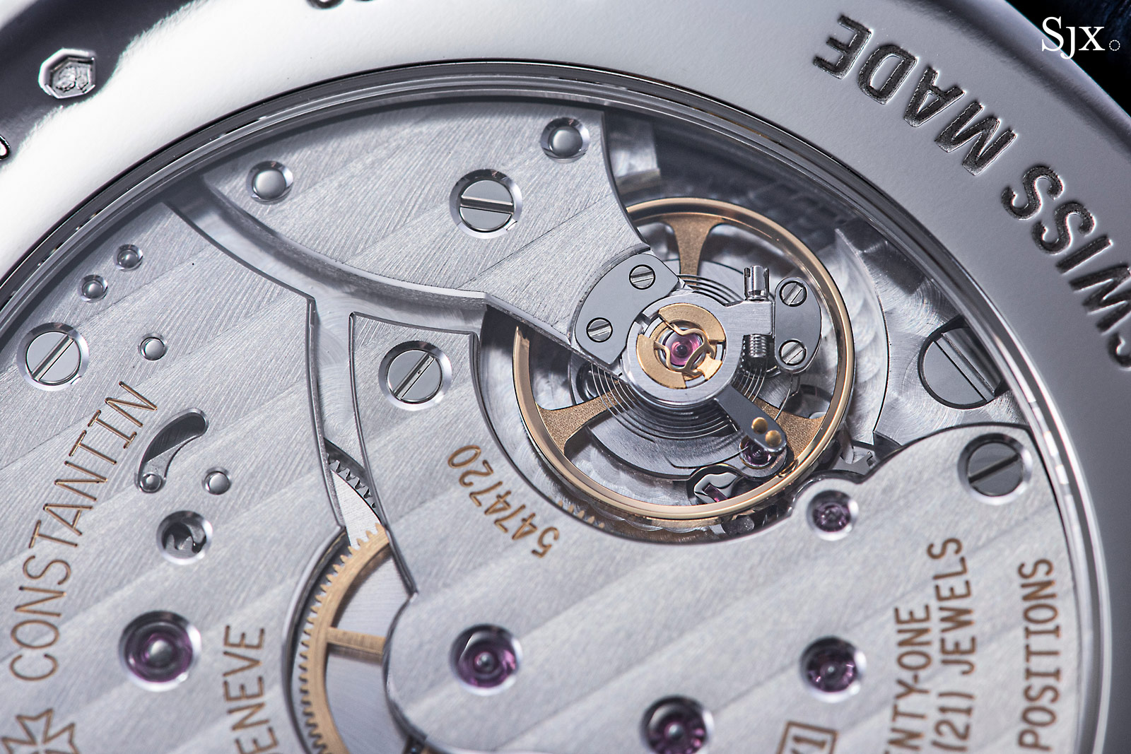
Cal. 4400 AS
A wide, thin movement, the cal. 4400 is found in many of Vacheron Constantin’s time-only watches. Bearing the Poincon de Geneve, or Geneva Seal, the movement is finished well, with all details are attended to correctly and cleanly. And it has a useful 65-hour power reserve.
As is expected, the movement is decorated finely and consistently in a manner that’s comparable to the competition, namely high-end brands that produce on a large scale like Patek Philippe and Audemars Piguet. While various elements are executed differently between the brands, the overall level of care and effort taken is similar.
The bridges do incorporate a few sharp inward and outward angles along their bevelled edges, though the angles are not as sharply defined as one would find on a movement with artisanal decoration, like from Voutilainen or Akrivia for instance. But such angles are not a given in movements from establishment brands, which makes them good to have.
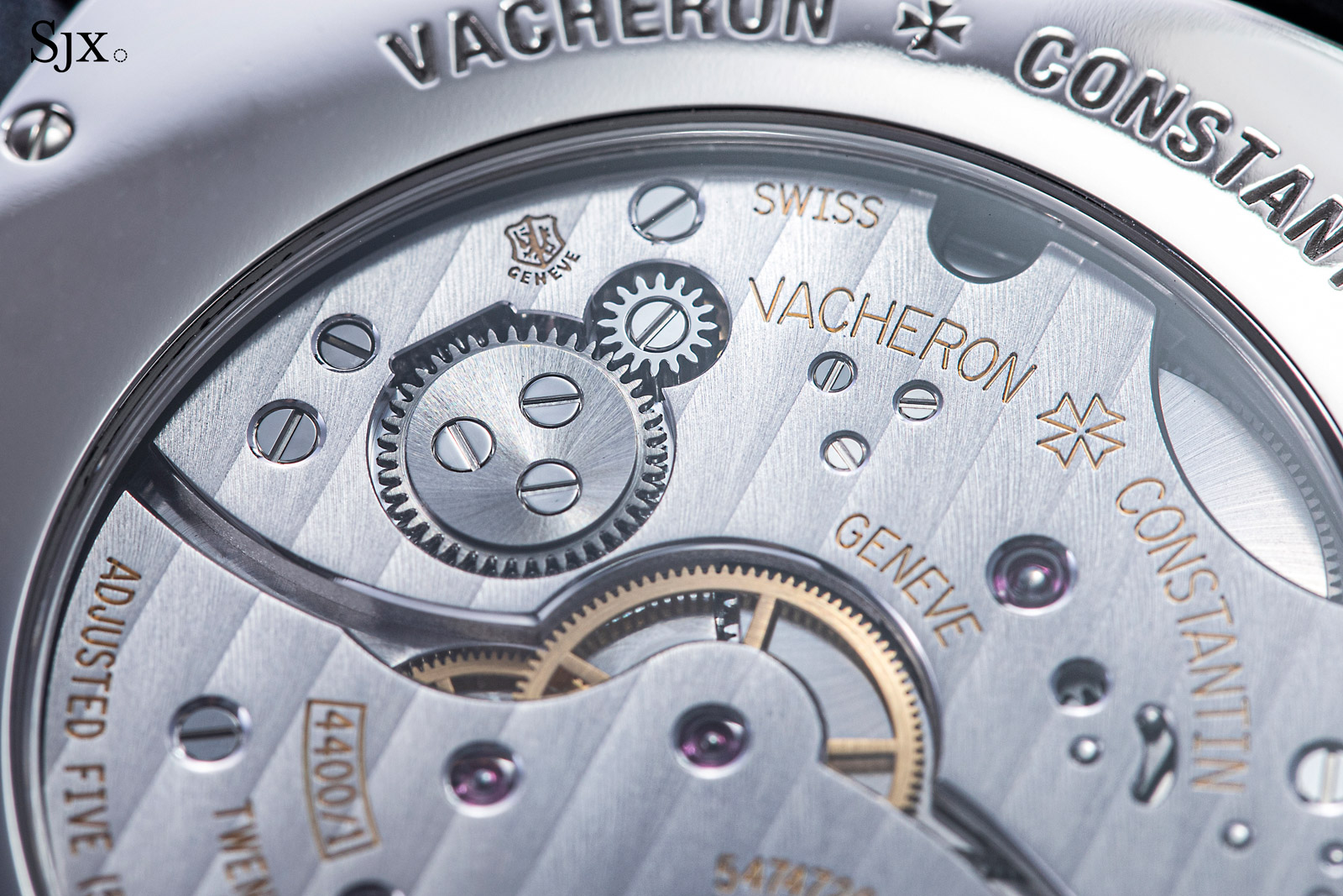
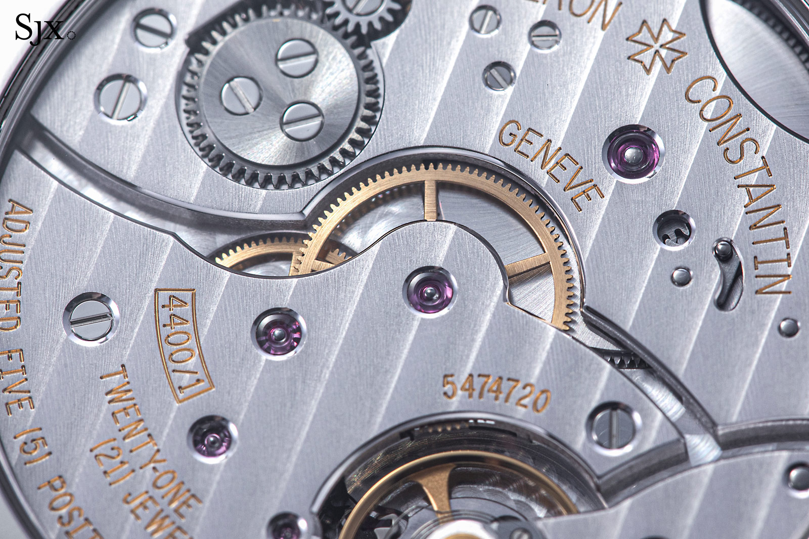
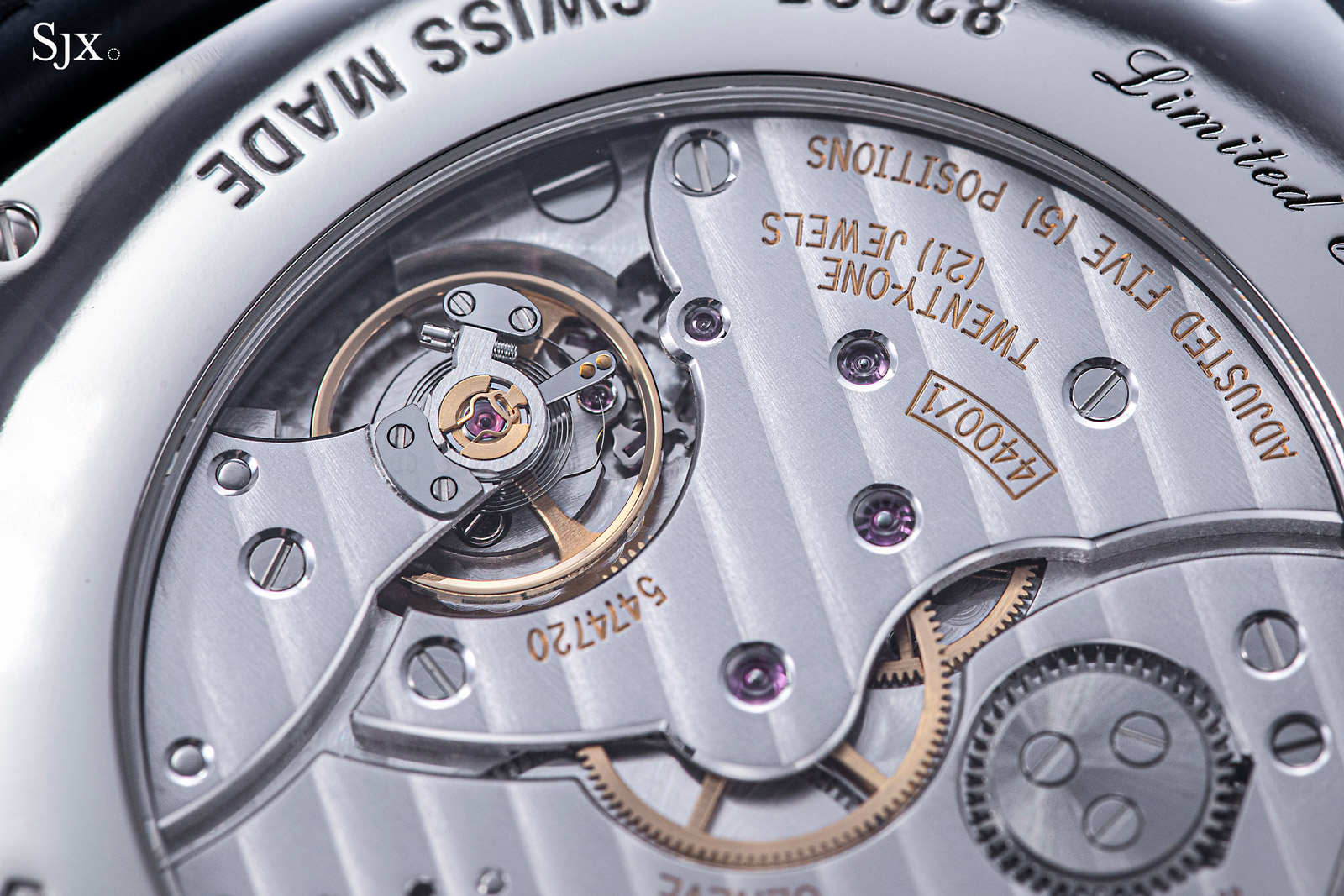
Stylistically, the cal. 4400 is clearly a modern movement. The view of the movement is dominated by two large bridges, one for the barrel and the other for the going train, along with the balance cock at the base. It’s a contemporary look that doesn’t quite suit the retro aesthetic of the 1921, which would have been better matched with something more traditional in style (which Vacheron Constantin doesn’t have, at least for the case size of the 1921).
Arguably the only substantive improvement due here is a free-sprung balance. Besides the improved stability of timekeeping, the aesthetics of a screwed balance wheel would suit the 1920s design perfectly.
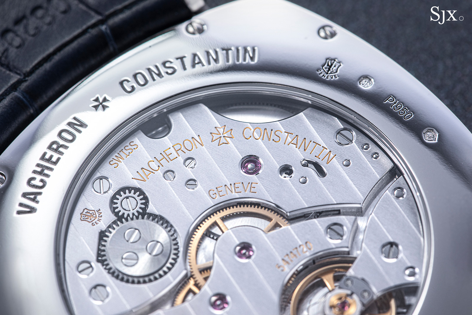
The barrel bridge
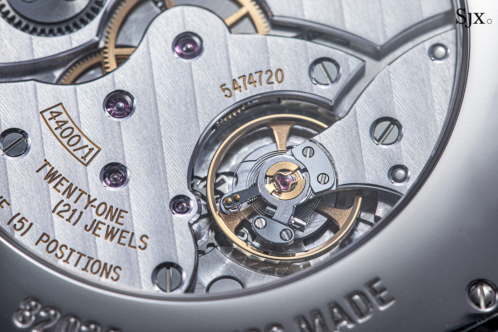
The going train bridge and balance assembly
Concluding thoughts
The 1921 is an unquestionably beautiful watch. It manages the uncommon feat of being thoroughly classical yet distinctively quirky. And in its CEP rendition, the 1921 only gets better. The platinum dial is appealing, while the applied numerals elevate it to another level.
Admittedly, the 1921 CEP is expensive, but that can be justified – with some effort – by the sheer appeal of the design and the small number produced.
Key Facts and Price
Vacheron Constantin American 1921 Collection Excellence Platine
Ref. 82035/000P-B748
Diameter: 40 mm
Height: 8.06 mm
Material: Platinum
Crystal: Sapphire
Water resistance: 30 m
Dial: Platinum with white gold applied numerals
Movement: Cal. 4400 AS
Functions: Hours, minutes, and seconds
Winding: Hand wind
Frequency: 28,800 beats per hour (4 hz)
Power reserve: 65 hours
Strap: Alligator with pin buckle
Limited edition: 100 pieces
Availability: Only at boutiques
Price: US$51,000; or 73,500 Singapore dollars
For more, visit vacheronconstantin.com
Addition May 3, 2021: Included a sentence about the “Pt950” hallmark on the dial in response to questions.
Addition May 11, 2021: Reason behind the alignment of the seconds register included.
Back to top.