Up Close: Rexhep Rexhepi’s Improved Chronomètre Contemporain
Good gets better.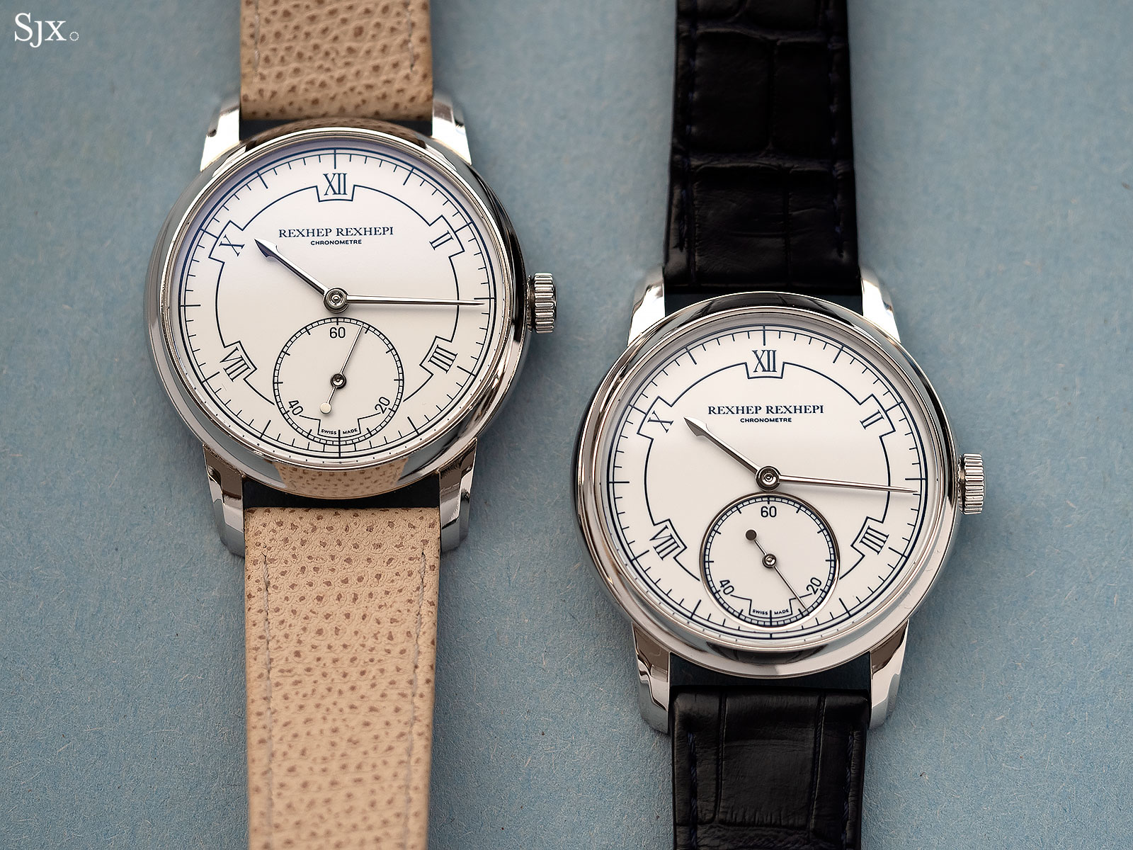
Launched at Baselworld 2018, the Chronomètre Contemporain by Rexhep Rexhepi – founder of watch brand Akrivia – swiftly became a collector favourite for many reasons, including the fact that the movement is wonderfully decorated. The watch went on to win the Men’s Watch Prize at the Grand Prix d’Horlogerie de Genève, an annual watchmaking award in Switzerland, marking the swift rise of a watchmaker who is just 31 years old.
Faced with such rapid success, a watchmaker of less personal fortitude might have been been tempted to hike the retail price, buy a Ferrari, and call it a day. Mr Rexhepi has instead spent most of the year artfully refining the Chronomètre Contemporain in many surprising and delightful ways.
Compared here are the first prototype, the same watch shown at Baselworld, and the final prototype that is almost identical to the watches that will be delivered soon.
Good, and better
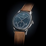
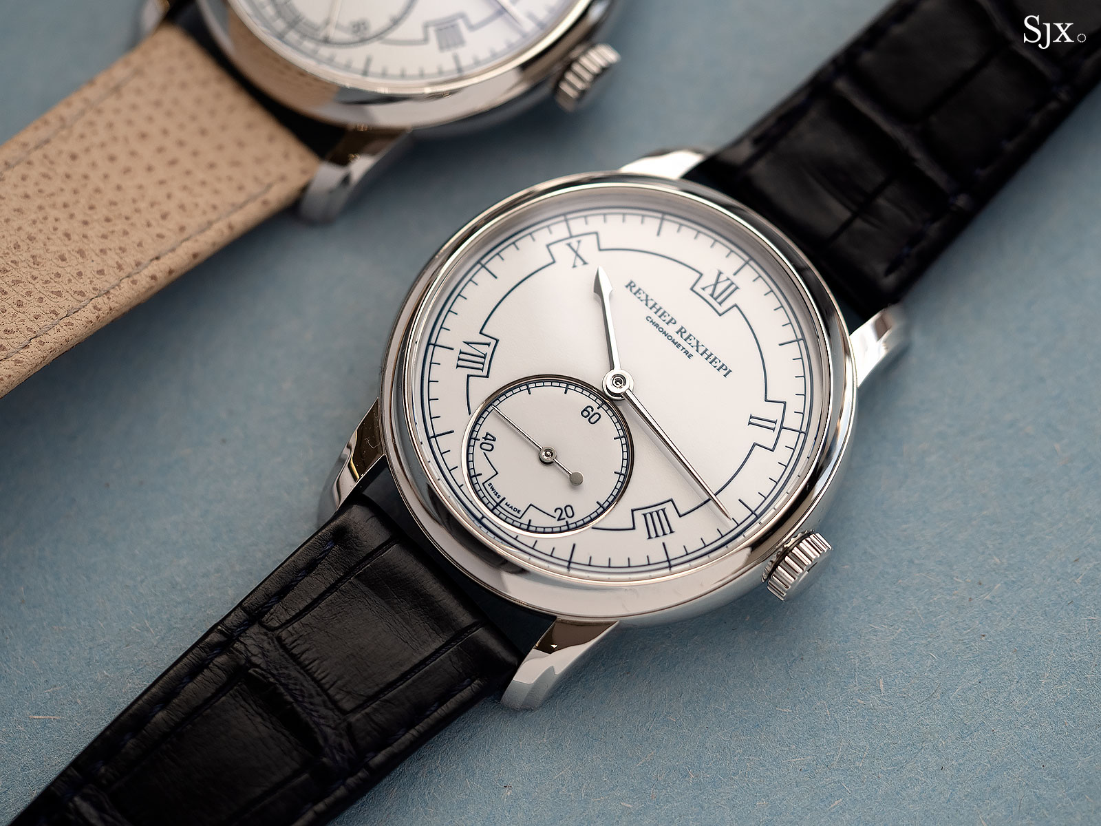
The improvements to the Chronomètre Contemporain are subtle but substantial, demonstrating Mr Rexhepi’s keen aesthetic sensibility. While the overall design of the watch has remained the same, both the dial and case have been altered.
Originally a flat, single piece, the dial is still fired enamel, but now in two parts, with the seconds sitting in a recessed counter with a gilded rim. This instantly gives the dial a greater depth and refinement.
At the same time, the enamel printing on the dial has been made slightly heavier, giving the dial a more defined styling.
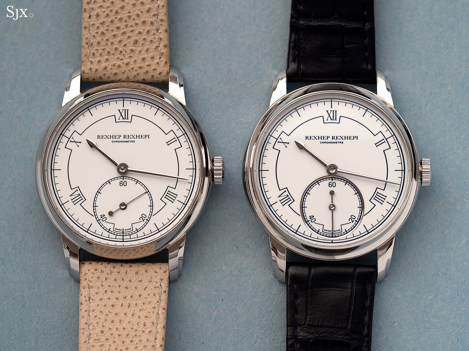
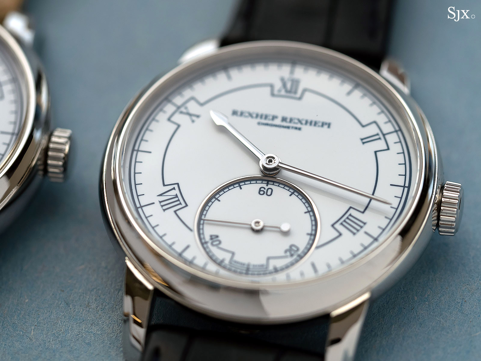
The new dial
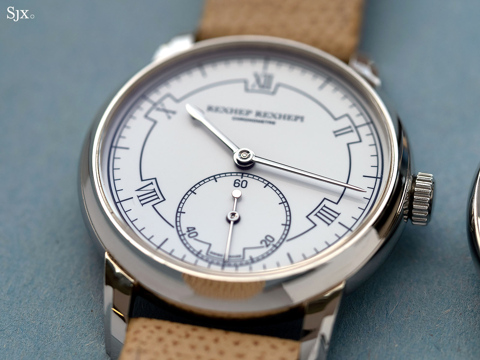
Old dial
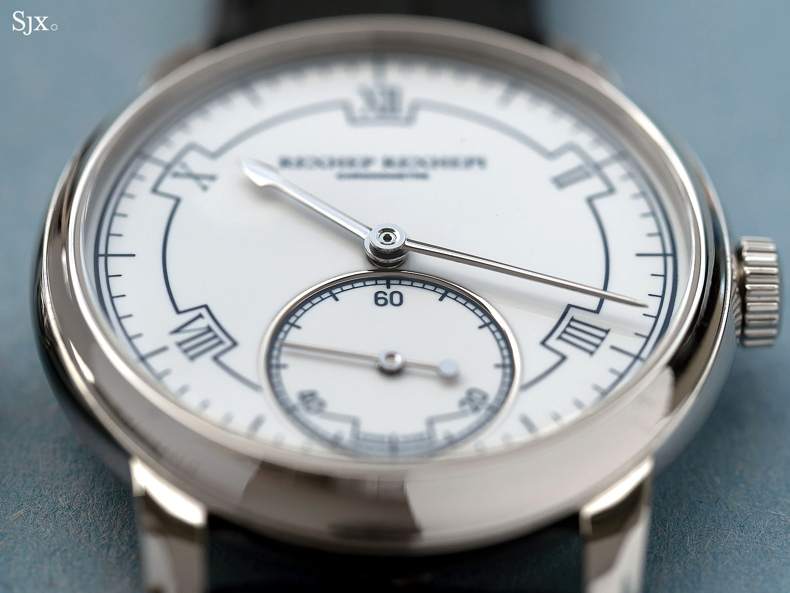
The dial is made by a Geneva enameller who was once a student of the late Dominique Baron of Van Cleef & Arpels
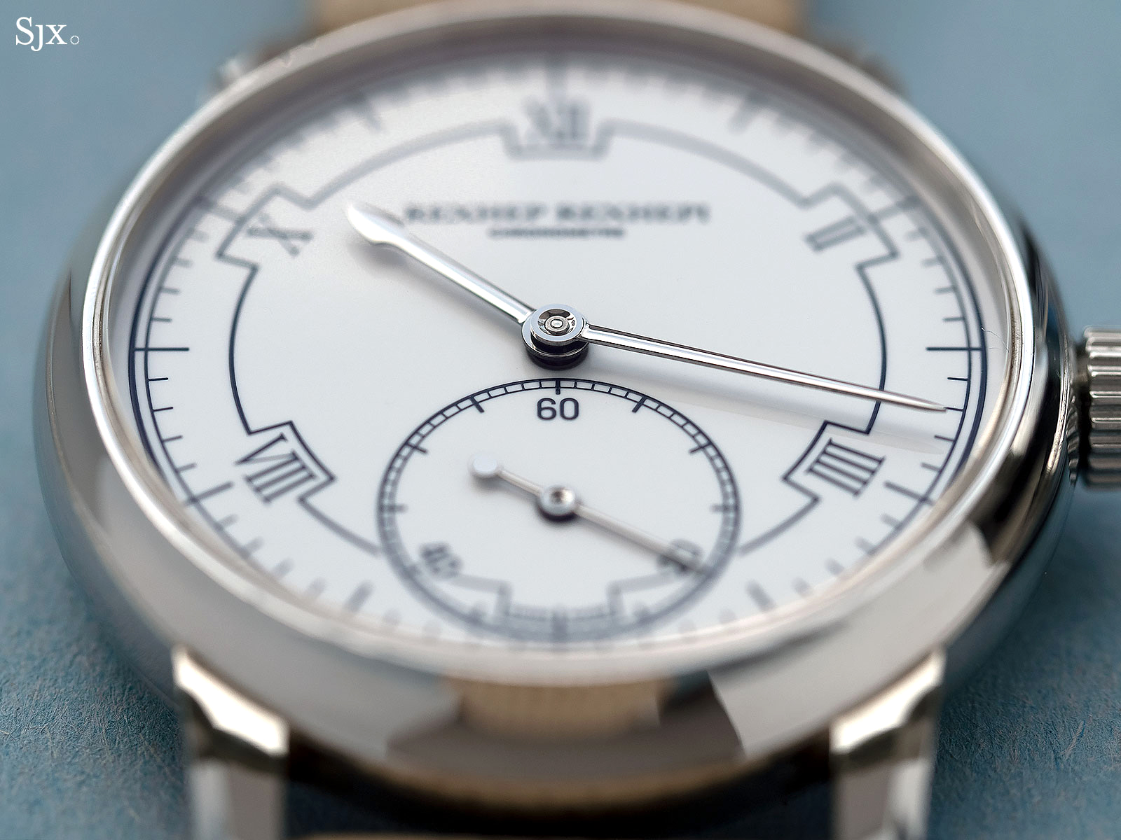
Flat seconds
Similarly, the case remains the same compact, elegant form that’s 38mm in diameter and 9.5mm high. But the lugs has been stretched and sharpened, while the asymmetry of the bezel (which is wider at top and bottom) is now more pronounced.
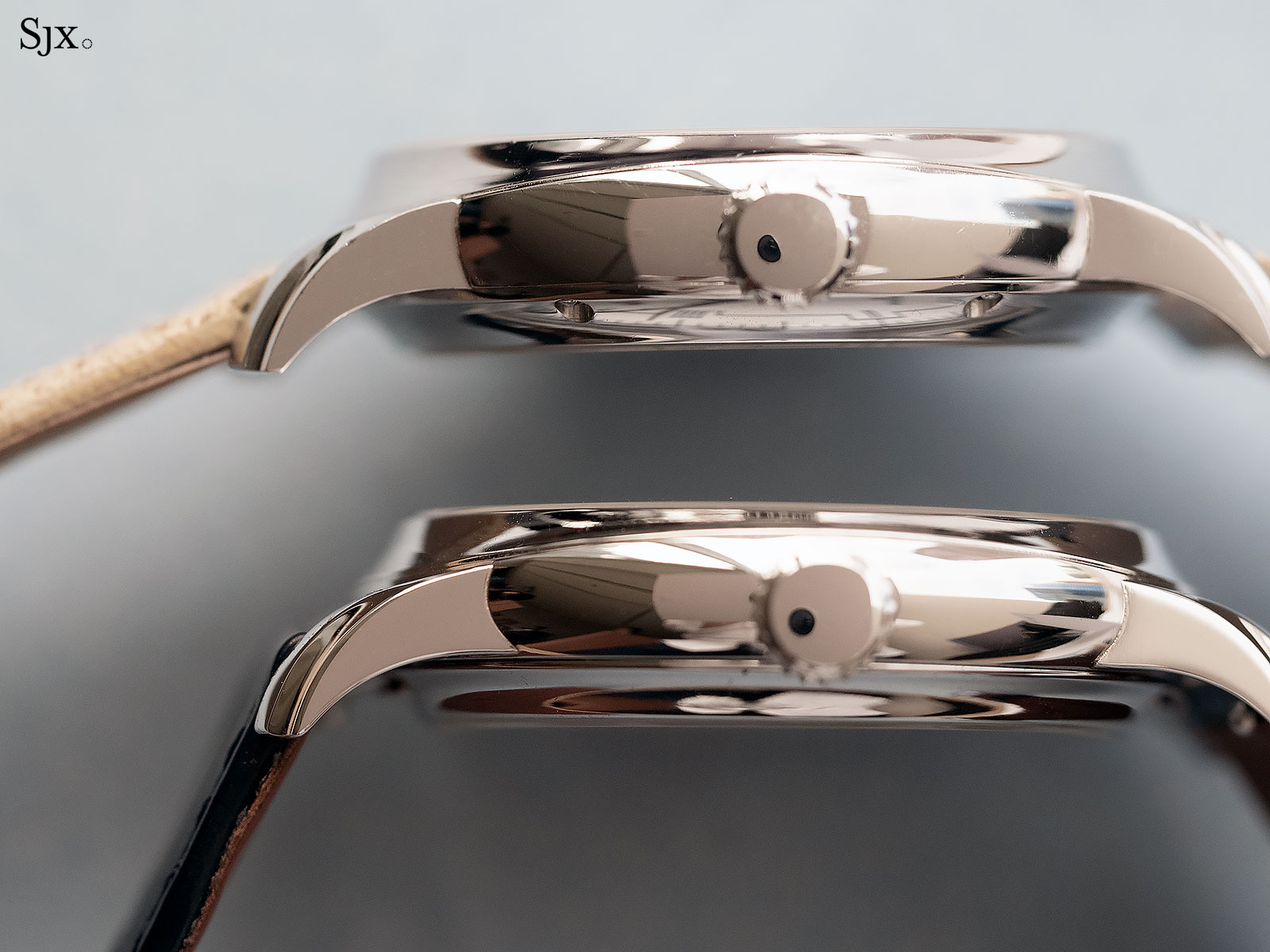
The first prototype above, and the refined lugs below
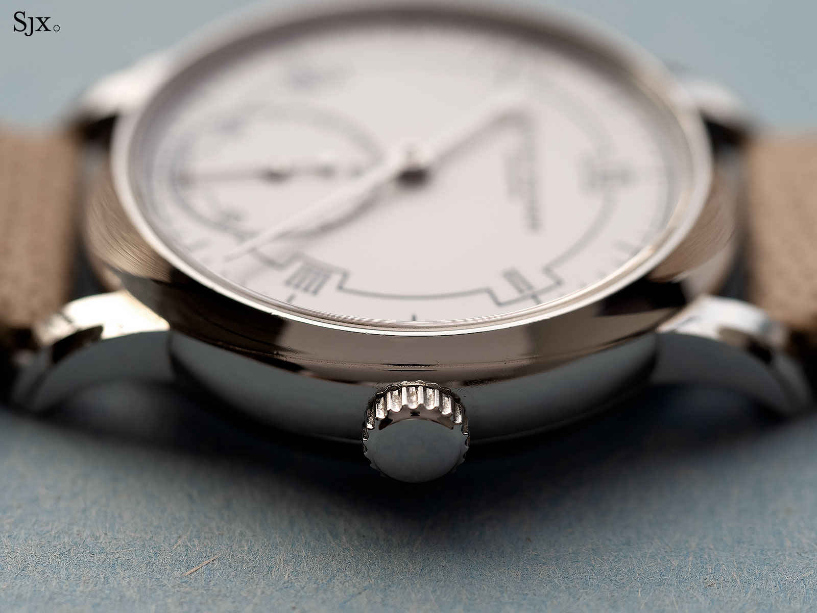
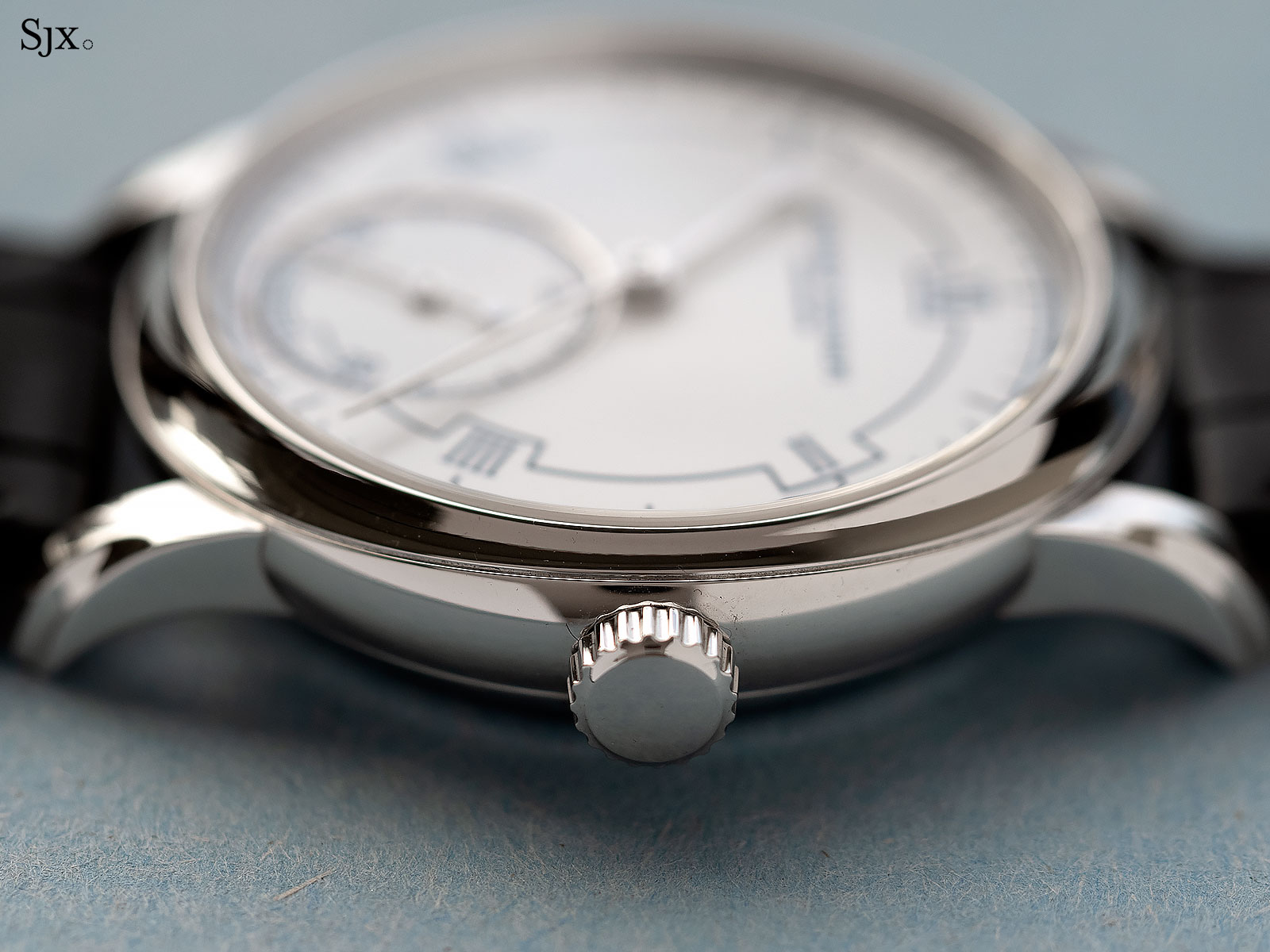
Note how the bezel at three o’clock has become narrow to accentuate its shape
Even better inside
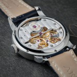
But the real magic takes place within, visible only from the back. Again, the movement remains fundamentally identical, but is significantly better.
Note that the two watches pictured have different sapphire backs (the first prototype has an antireflective coating while the second does not), which is why the colour and brightness of the movements differ. In reality both have the same colour and shine, but the second prototype has far better details.
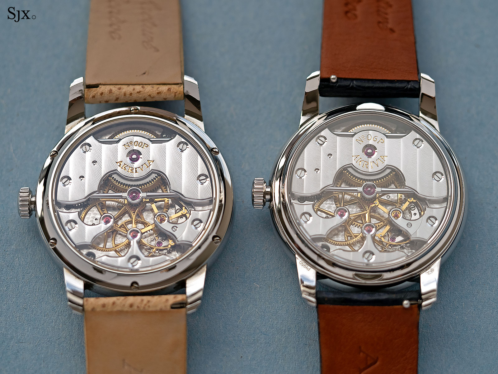
Original prototype (left), and the improved prototype
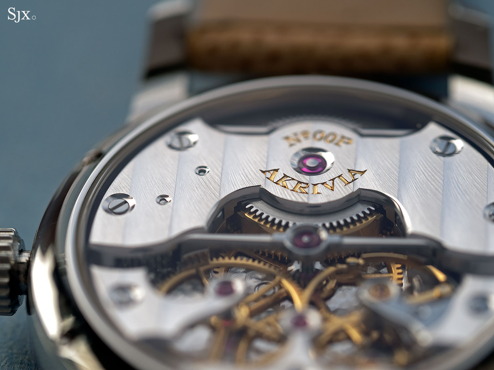
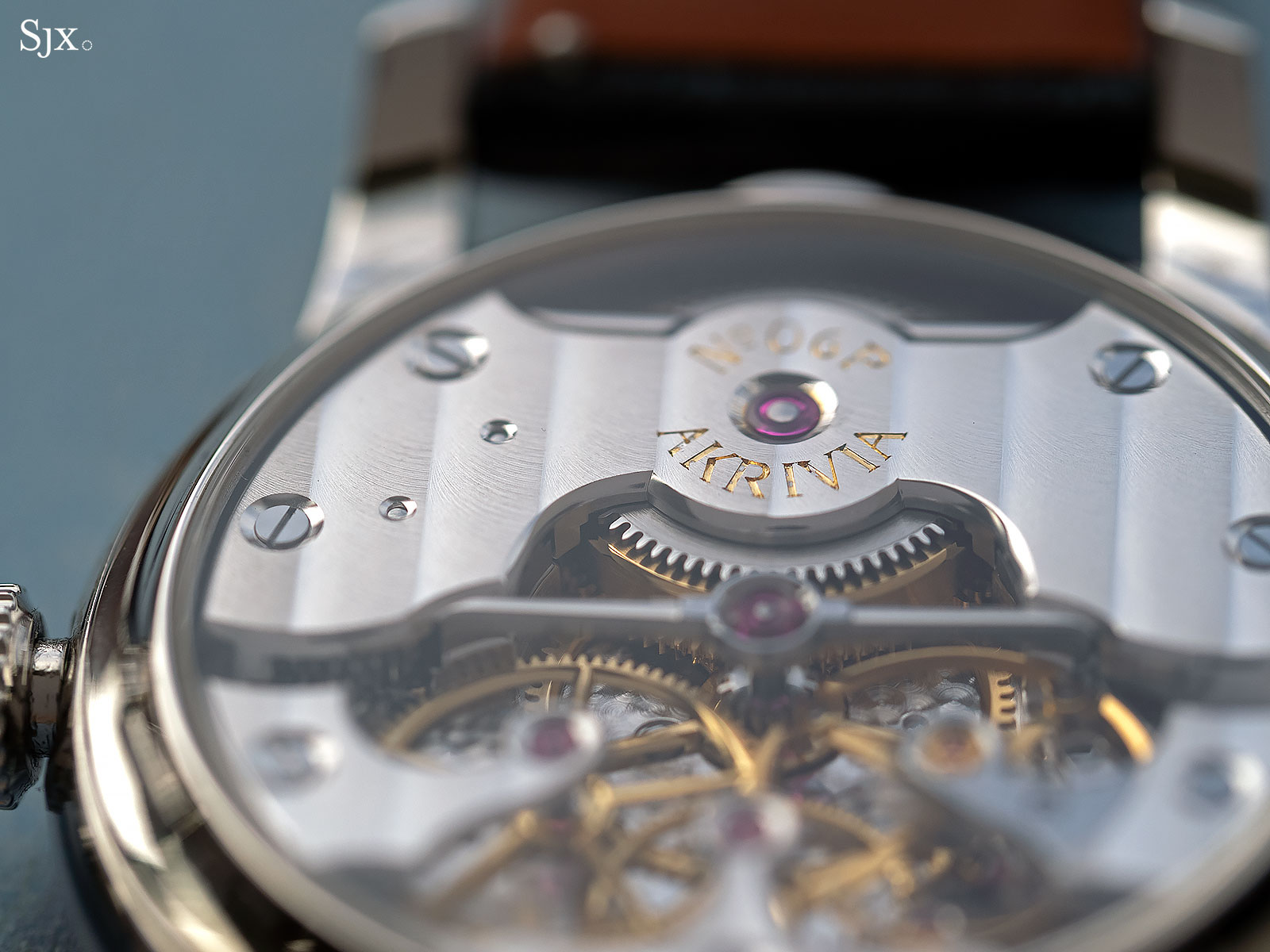
The most obvious change is the Cotes de Geneve. While the striping on the original prototype was already impressive, Mr Rexhepi decided he could do better, and he did. The new bridges have softer, more lustrous stripes that are inclined at a gentler angle while also having more defined borders.
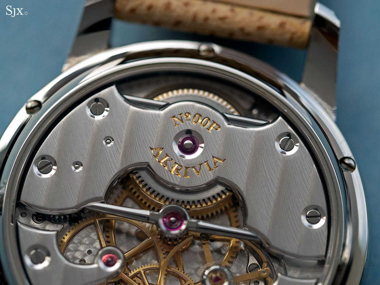
The original prototype
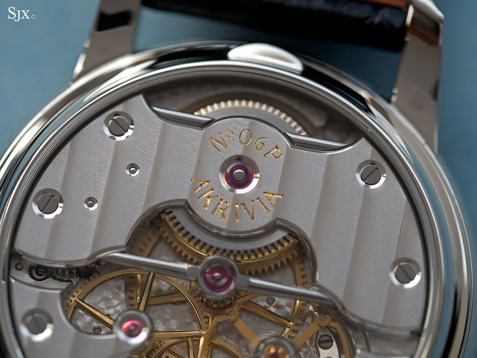
Now improved
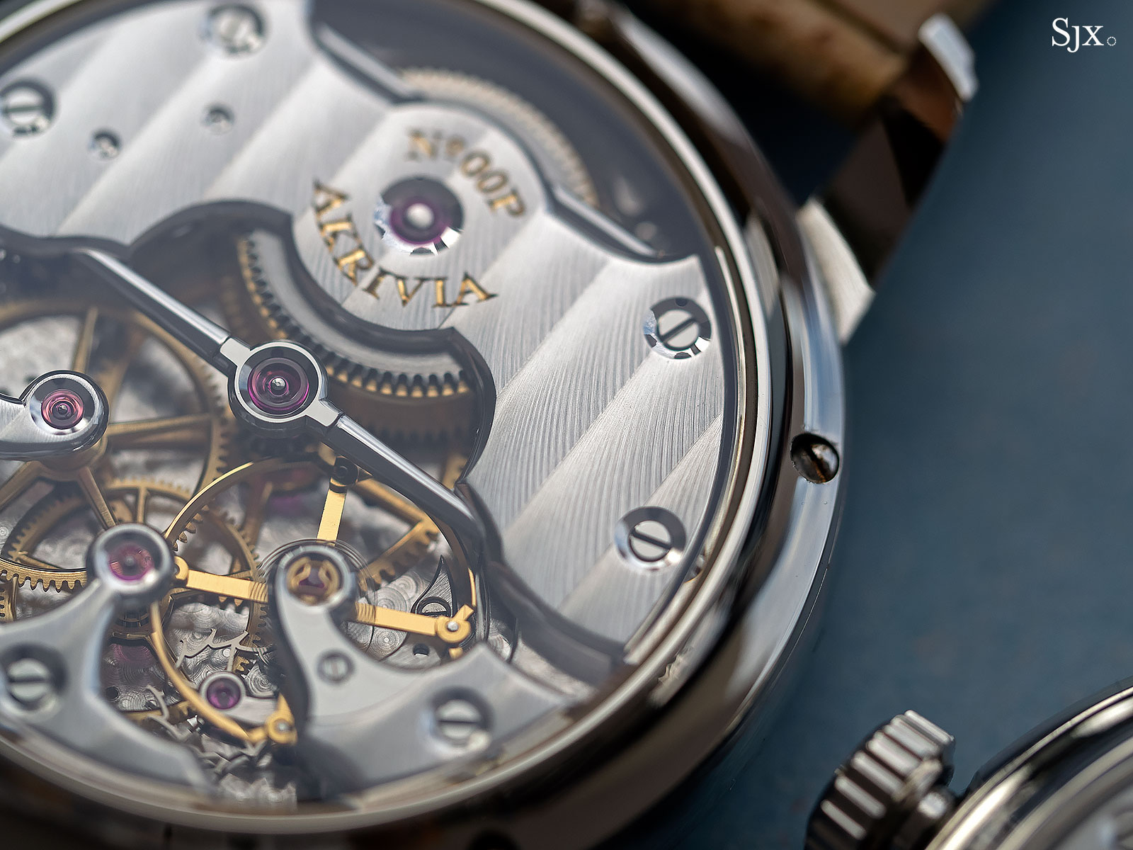
Note the pronounced, slightly deeper striping
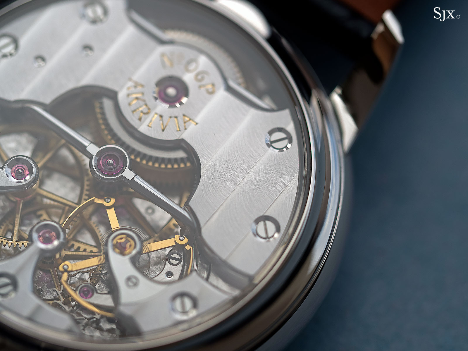
The striping is now light and almost airy
The edge of the bridges, between the flat top surface and polished bevels, has also become more defined, eliminating some of the softness found on certain edges of the first prototype.
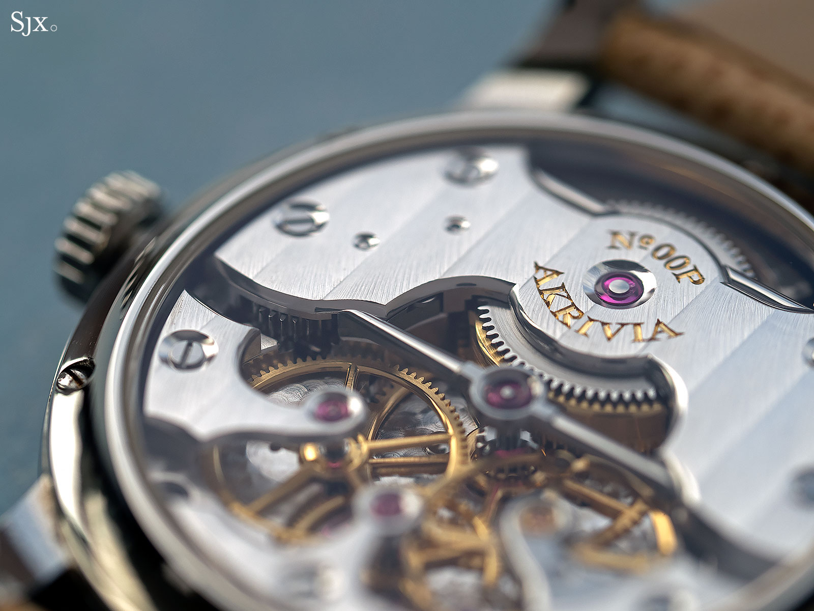
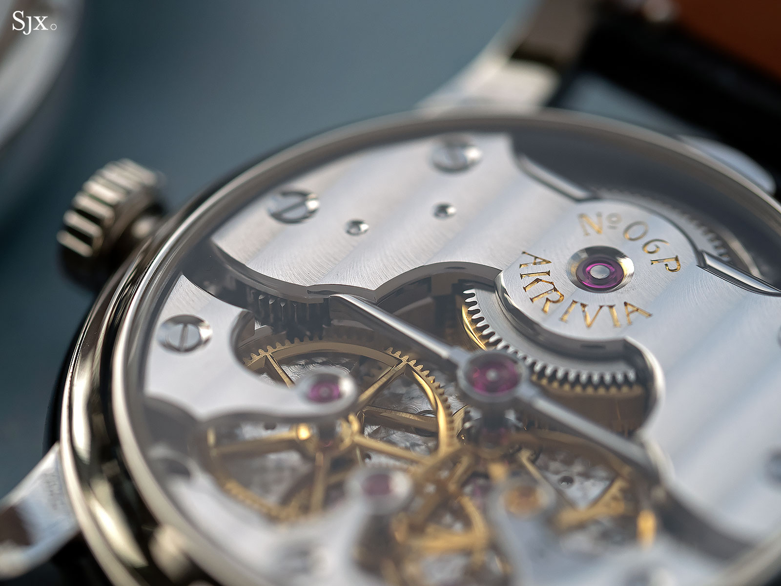
Similar improvement is found in the inward and outward corners of the bevelled edges, which are now sharply defined.
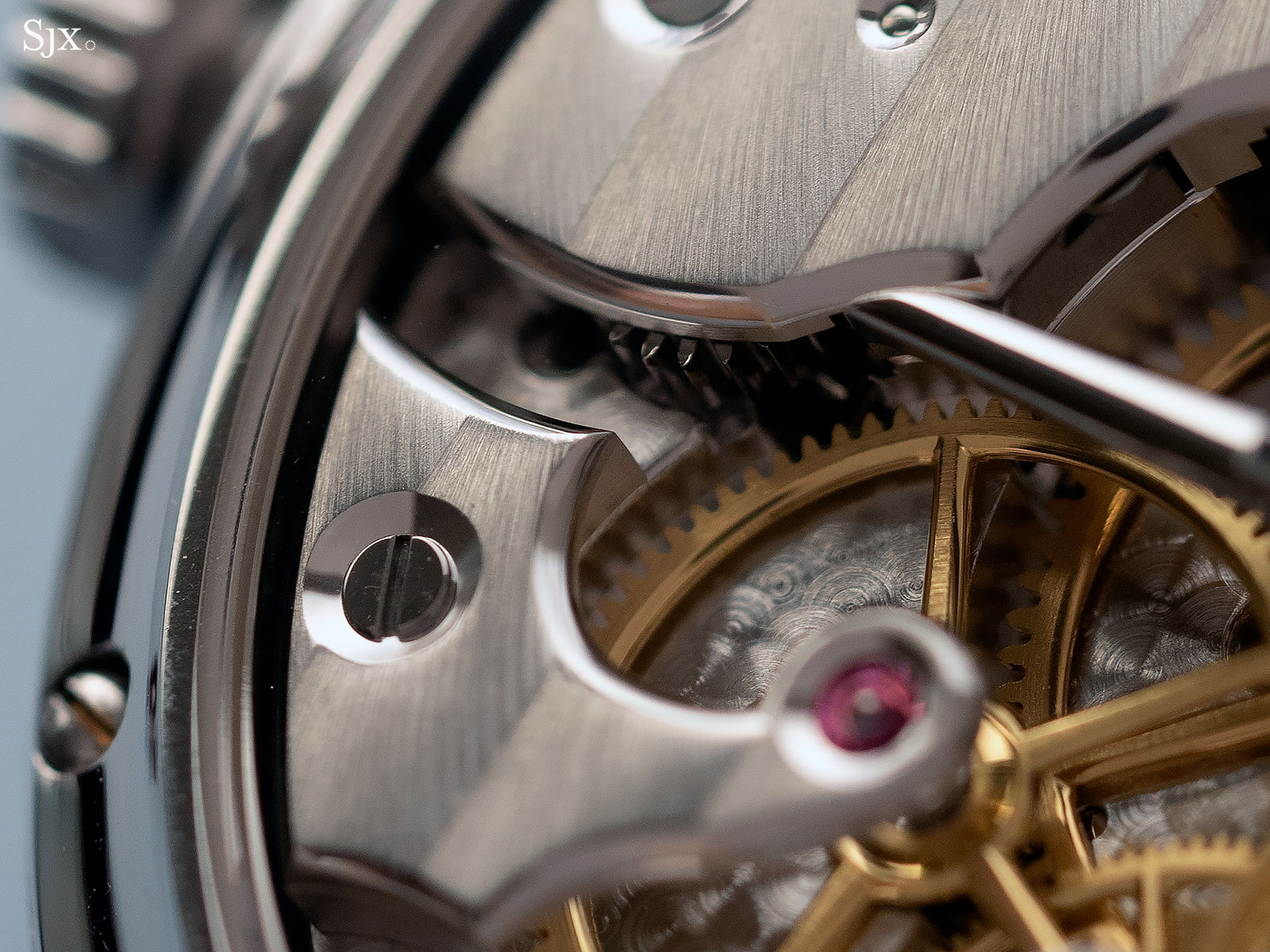
The original with its slightly rounded top edge
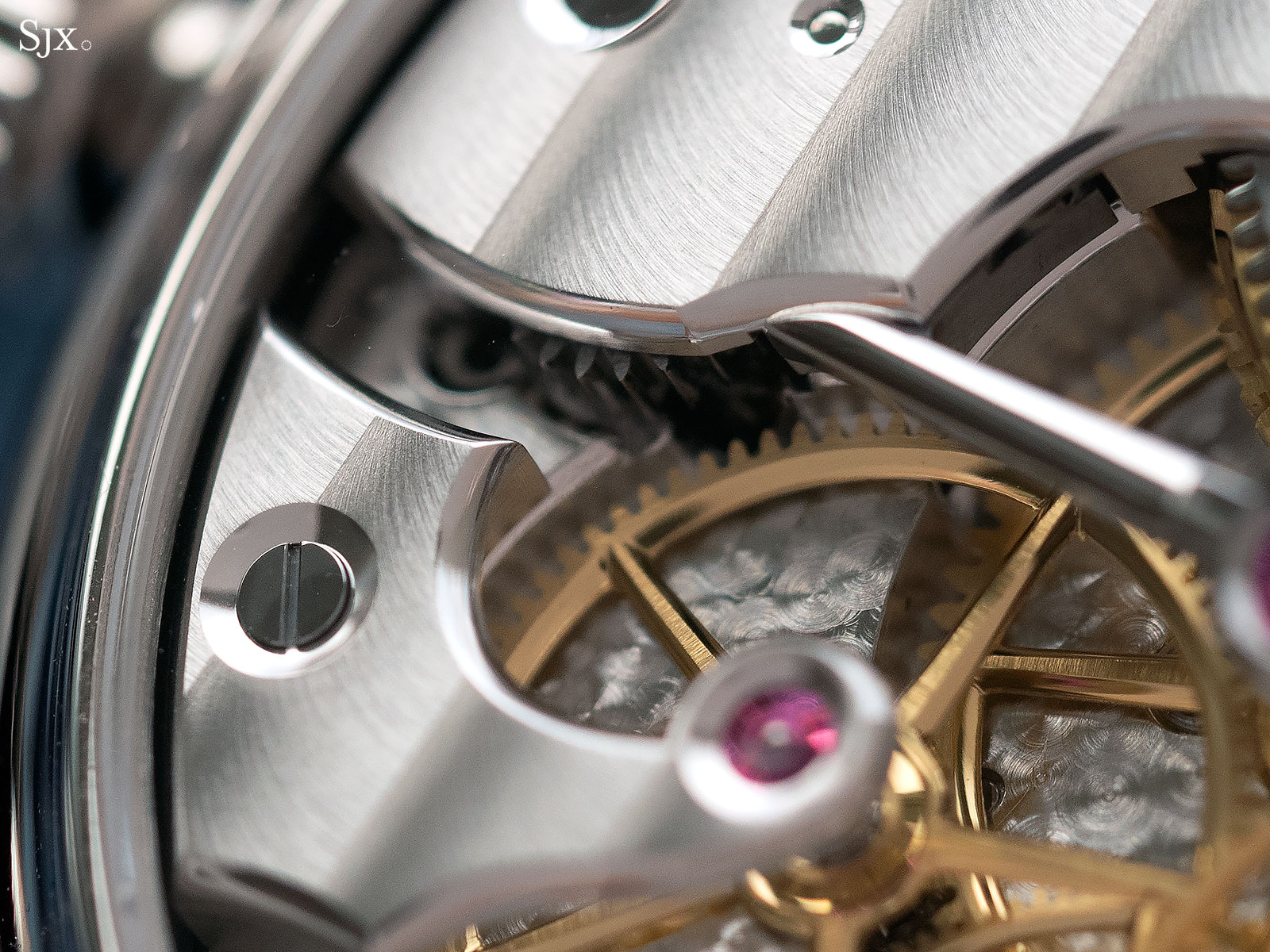
Compared with the angular corner on the new prototype
Mr Rexhepi has also tweaked his black polishing technique, resulting in steel parts that are slightly more mirror-like, though the difference is barely discernible and invisible in photos. This is most obvious, but still barely so, on the steel cap for the balance cock, which is the largest flat steel component in the movement.
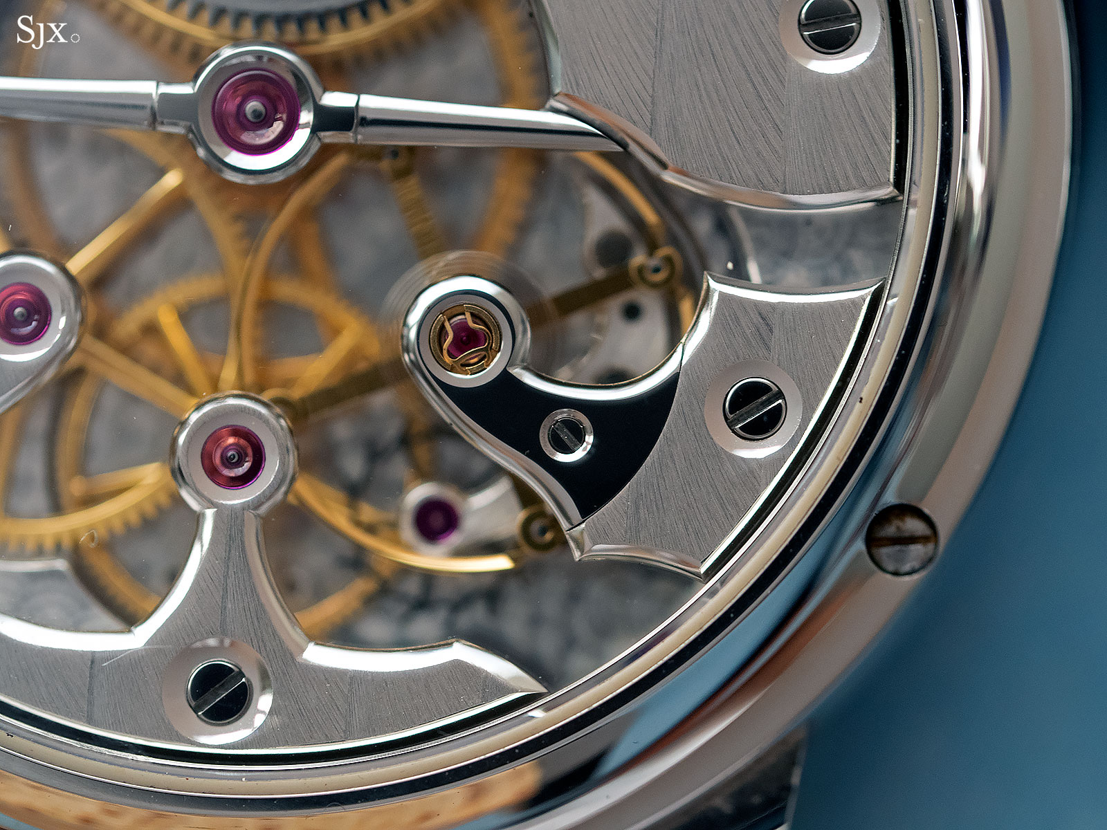
First prototype
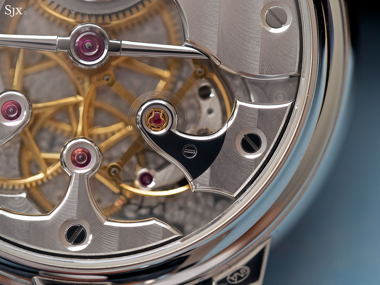
The improved steel cap
Attention has also been paid to an area that is rarely examined: the base plate under the visible parts. The perlage, or spotting, on the base plate now has a smaller grain. Smaller spots means more time and effort is needed to cover the same area, but it also results in a more intricate and detailed finished. That being said, the perlage can be made even finer by bringing the centre of each circle right next to the edge of the next. Though that might be akin to an annoying 16th century art critic telling Mr Da Vinci to redo the background of the Mona Lisa.
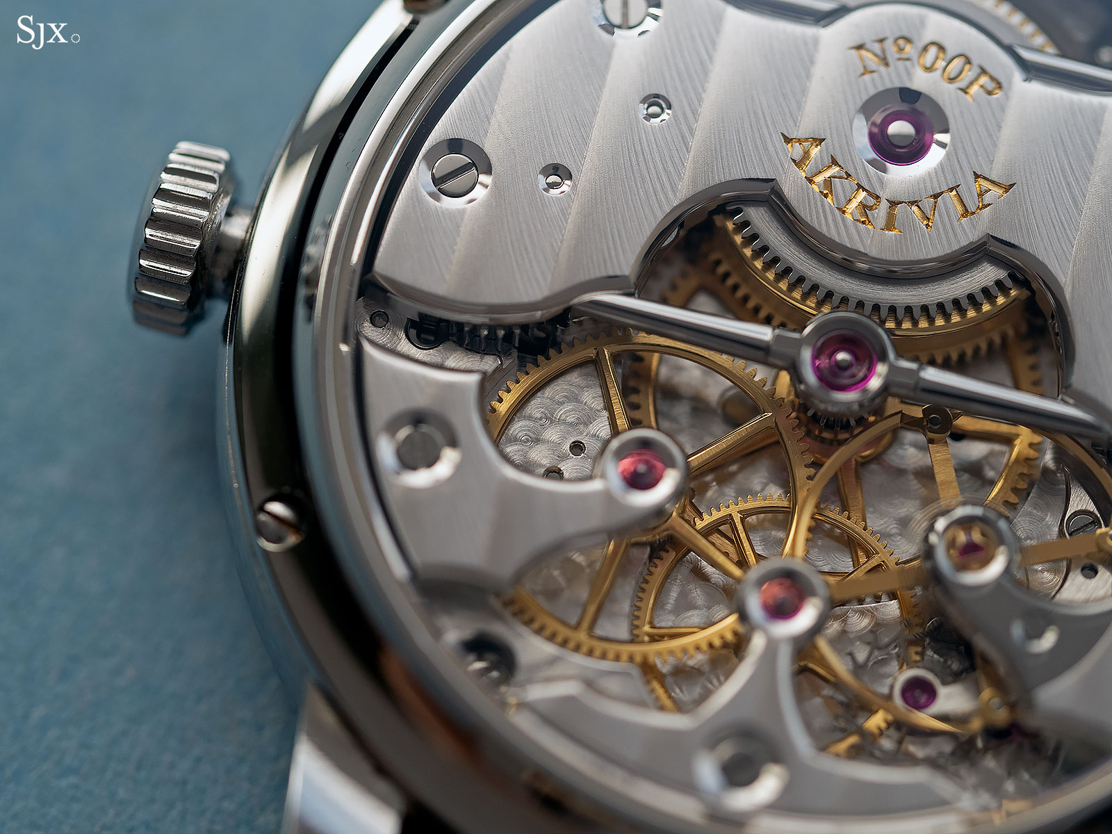
Small perlage
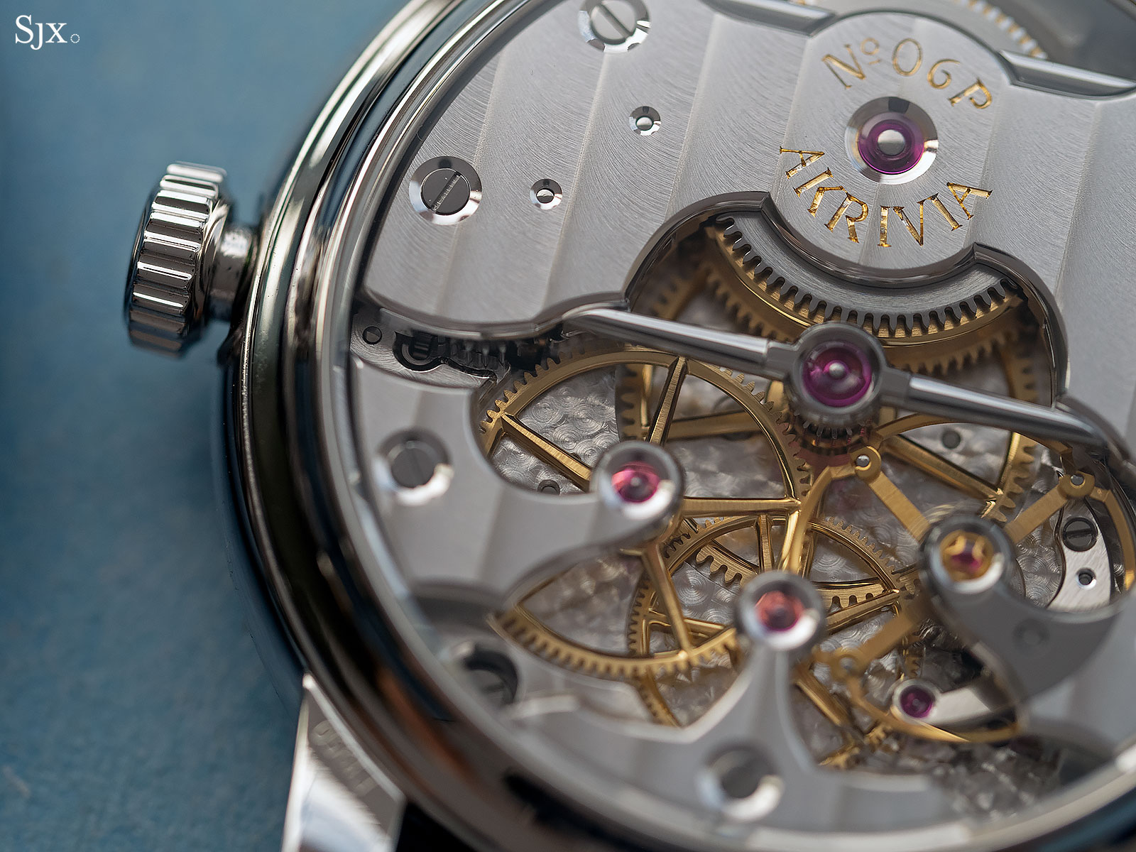
Smaller perlage
Even on the smallest of parts the edge bevelling has been improved. Compare, for instance, the escape wheel bridge that sits under the balance wheel. The latest version has a wider, polished countersink for the escape wheel jewel, while also having a finer straight graining on its top surface.
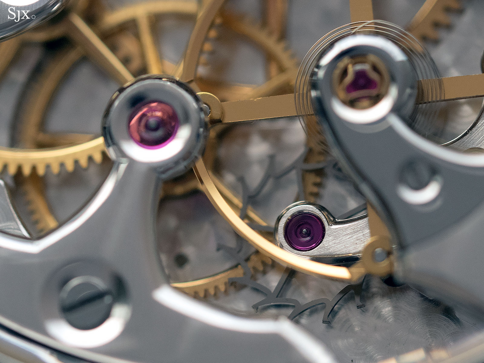
The escape wheel jewel has a shallow countersink
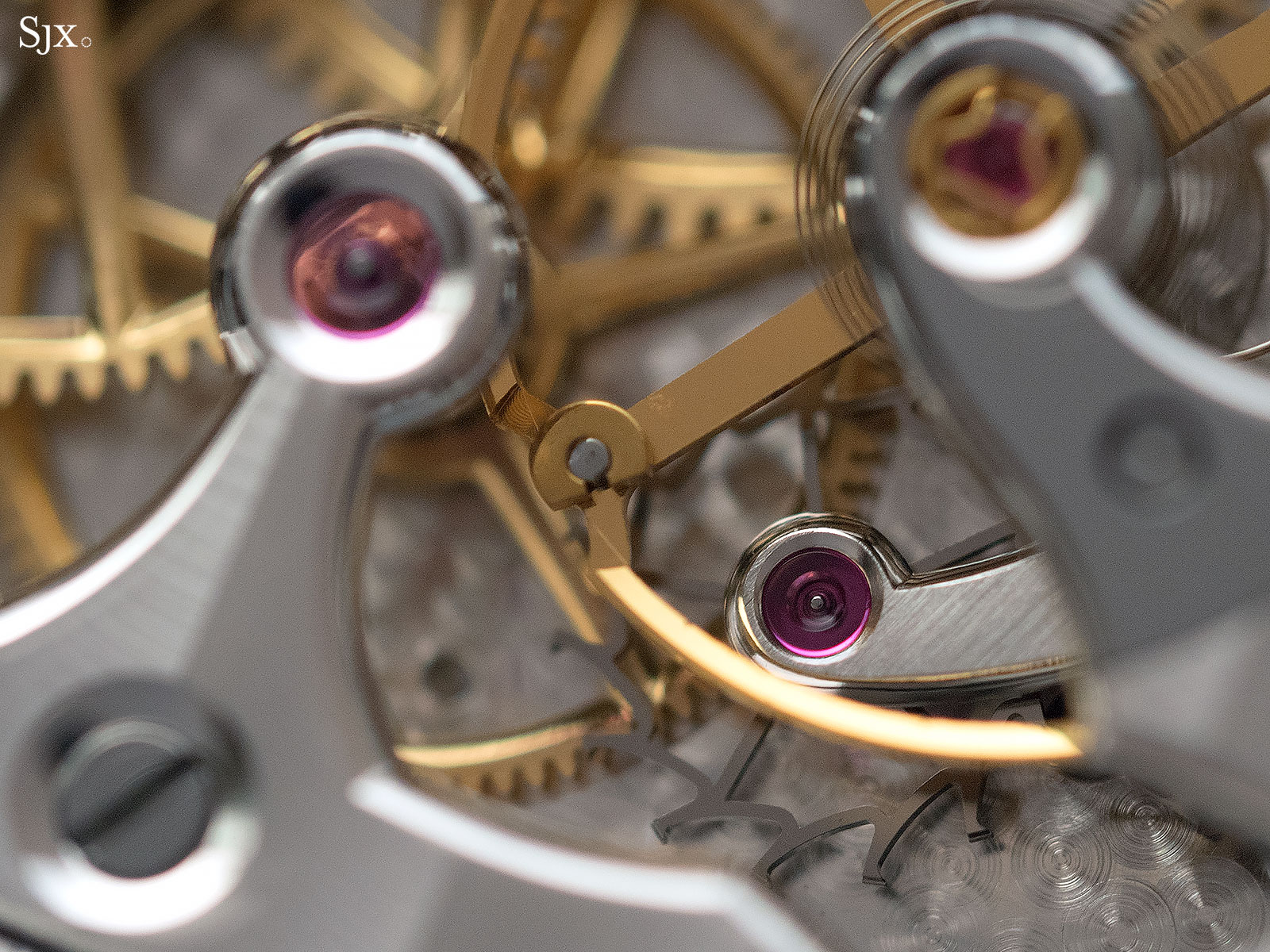
Now the countersink is now wide and polished
But not everything on the new prototype is perfect. Mr Rexhepi experimented with a new typeface for the engraved lettering on the barrel bridge, which was not successful. The new typeface is too narrow, and the production watches will have a broader type similar to that on the first prototype. All in all, however, the finished watch promises to be magnificent.
Mr Rexhepi expects the first batch of watches, a half dozen or so, to be delivered very early in 2019, after they have completed chronometer trials at the Besançon observatory.
Back to top.

