A comparison of the new and old Rolex Explorer II

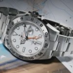
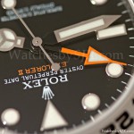
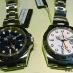
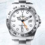
I’ve compared both the white and black versions of the new Rolex Explorer II ref. 216570, so here’s a look at the new and old – the white dial Explorer II ref. 16570 and the current, 42 mm black dial Explorer II.
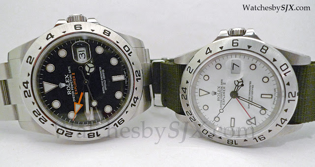
Between the two I prefer the old version by a small margin. The new Explorer II has the current generation spring-loaded clasp bracelet which is a superb piece of engineering. That stands in stark contrast to the rinky dink stamped metal bracelet of the old Explorer. But bracelet aside, in most other respects I prefer the old version.
One key reason the 16570 appeals more is the case which has a more detailed finish, most obviously in the bevels of the case and bezel. The new Explorer II, as well as all the current Rolex models, have simpler case finishing for easier refinishing; that’s most obvious in the Daytona case which is entirely polished. In contrast, the classic 20th century Rolex case had pronounced bevels, especially on the lines of the lugs – I find that exceptionally attractive.
.jpg) |
| Notice the polished bevels on the 16570 |
And in terms of aesthetics the previous generation Explorer looks better proportioned. The new Explorer is not a bad looking timepiece for sure, but the increased size just looks a tiny bit exaggerated.
The new Explorer is almost certainly a better watch – it is sturdier and will likely keep better time thanks to the new movement. But the discontinued Explorer II has more charm.
– SJX
.jpg)
.jpg)

