A Collector’s Perspective: The Cartier Crash
Fulfilling a special-order dream.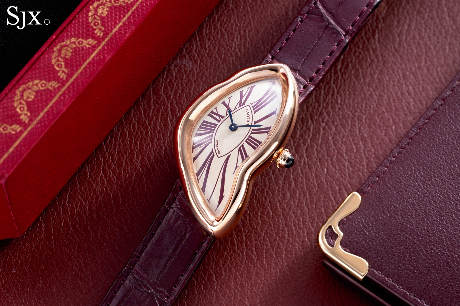
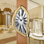
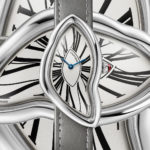
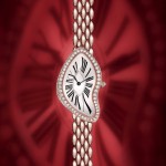
A fever dream — form that bent and curved the very idea of what a wristwatch could be. The Cartier Crash, born out of myth and mystery, is no conventional timepiece. As established notions of purpose and design in watchmaking, the Crash exists at the intersection of watchmaking and sculpture.
To the uninitiated, the Crash may seem bizarre, wildly eccentric for the sake of it, but to those steeped in horology, it is an icon. For me, Crash was more than just an addition to my collection; it was the culmination of years of passion, patience, and persistence.
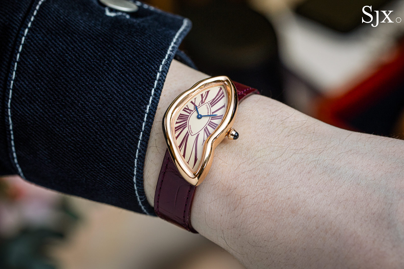
The author and his special order Crash
A product of Swinging Sixties London
There are watches that tell time, and then there are watches that tell stories. The Crash belongs to the latter category. Beyond its appearance, the allure of the Crash also stems from its founding myths.
Introduced in 1967 by Cartier London – the jeweller was then three separate companies in Paris, New York, and the British capital – the Crash is easily the most avant-garde watch design ever produced by Cartier. Its warped, melted form defies the conventional standards that most watches adhere to, making it as much an artistic statement as a timekeeper.
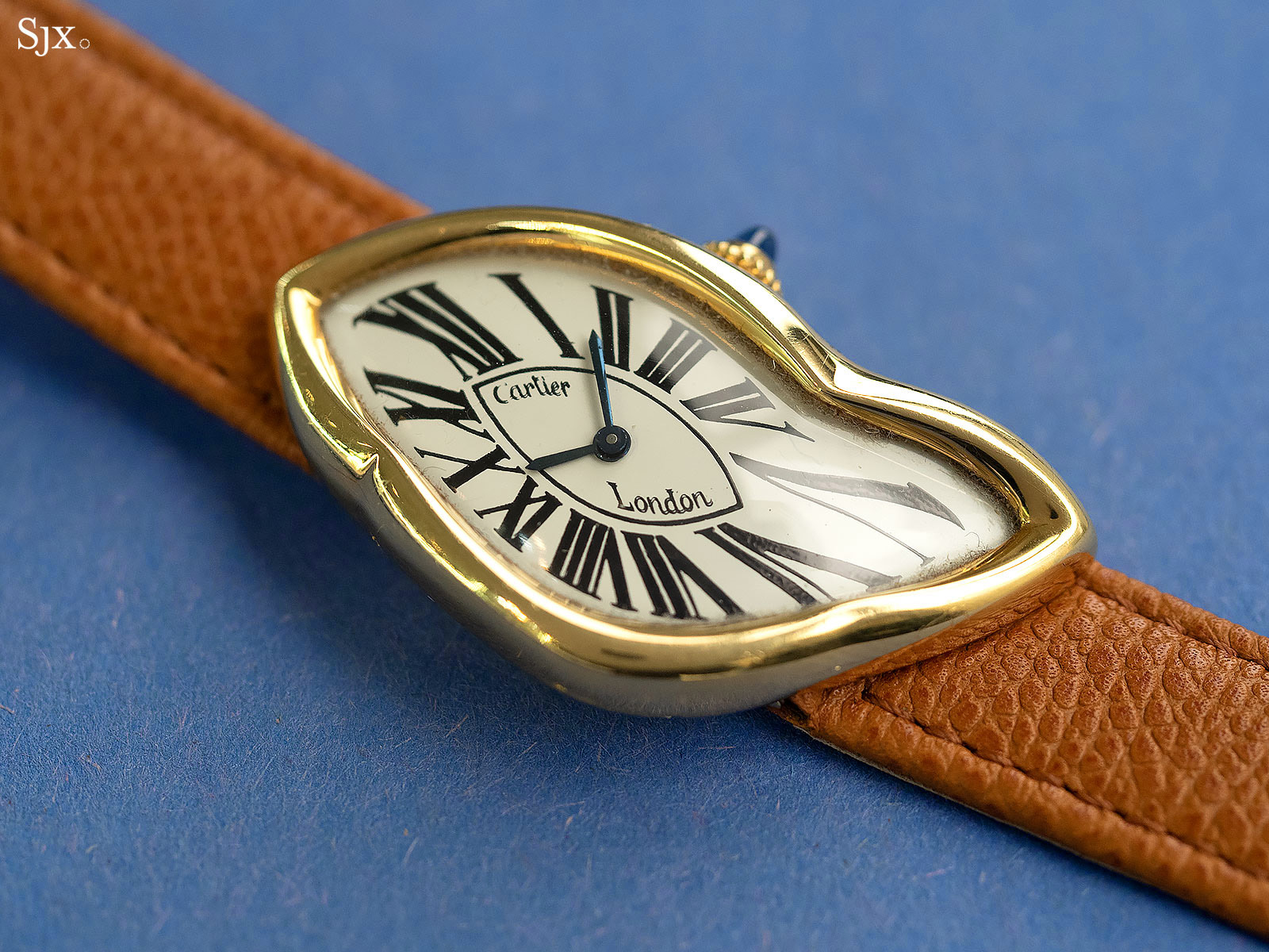
An example of a vintage London Crash
To truly appreciate the significance of the Cartier Crash, one must delve into its history, which is almost as enigmatic as the watch itself. One popular origin story is macabre: a Cartier client wearing a Baignoire Allongée was in a car crash that damaged the watch enough to warp its shape. When the wrecked watch was returned to Cartier for repair, it inspired Jean-Jacques Cartier, who then helmed Cartier London, to create a timepiece with a similarly distorted form.
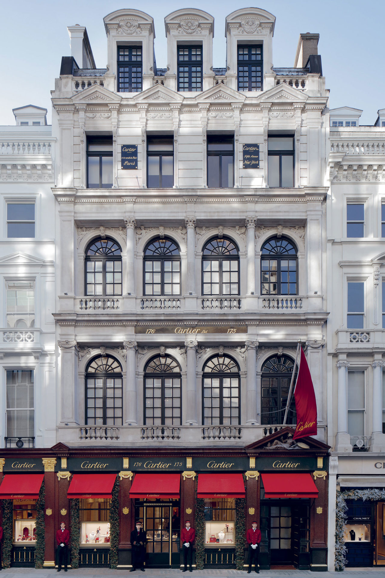
Cartier’s historical store in London located at 175-177 New Bond Street. Image – Cartier
However, the reality is somewhat less dramatic but equally fascinating. According to The Cartiers: The Untold Story of the Family Behind the Jewelry Empire by Francesca Cartier Brickell, a descendent of Jean-Jacques Cartier, the Crash was born from a creative collaboration between Jean-Jacques Cartier and Rupert Emmerson, the longtime designer for Cartier London.
At that time, the jeweller’s London workshop (which was located just above its store) was experimenting with new and daring designs that catered to the tastes of the Swinging Sixties, an era of cultural and artistic upheaval. The Crash, with its distorted, free-form appearance, was a symbol of creative freedom that perfectly captured the zeitgeist. Another London creation of the period was the Pebble wristwatch that arrived a few years after the Crash.
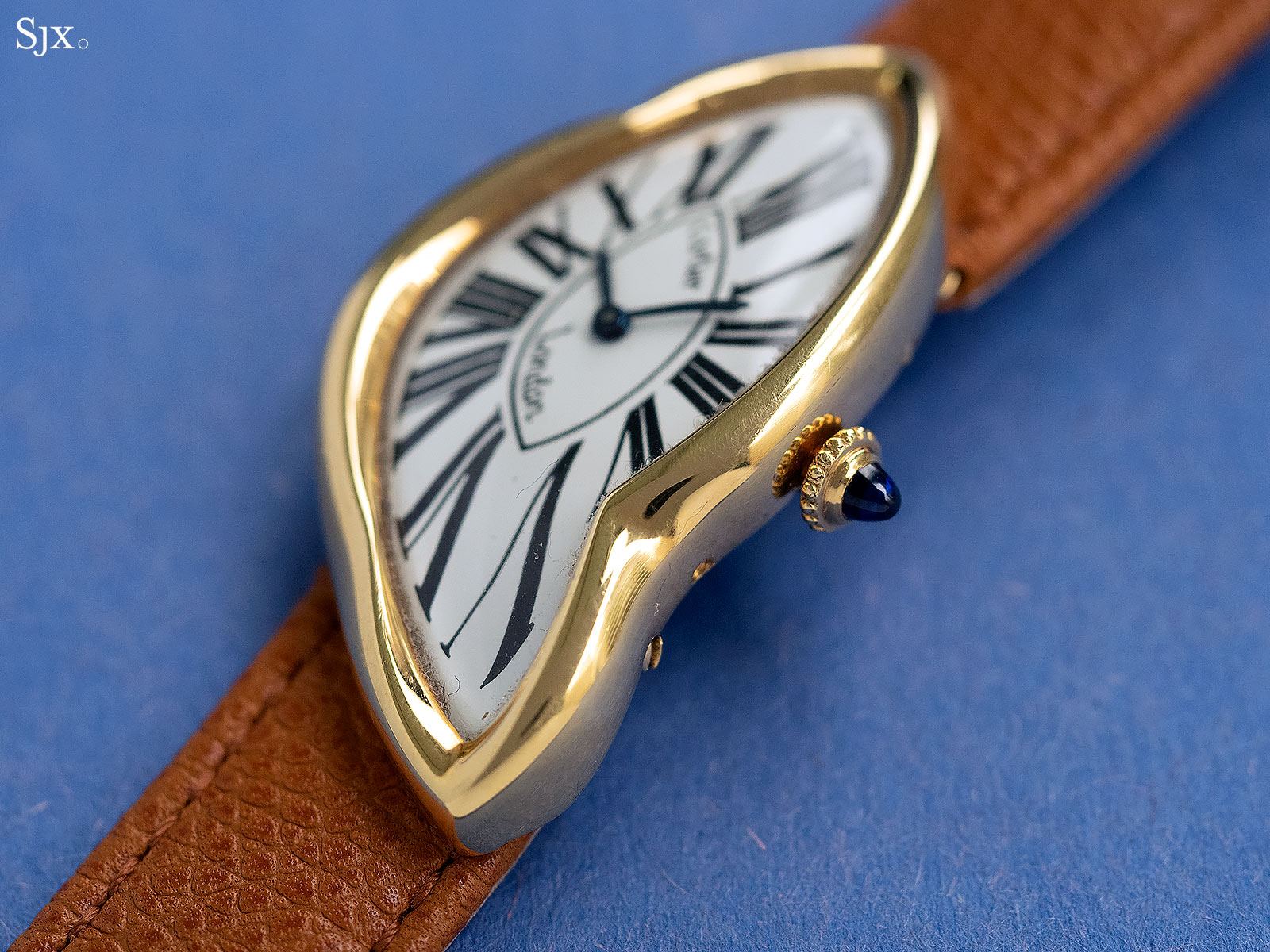
This London Crash dates to 1990
Intrigue and appeal
At first glance, the Crash elicits intrigue. Its asymmetrical and sinuous form seems distorted. There is simply no mistaking this watch for any other – that is what first drew me in. But even before the Crash, I was already a devoted lover of Cartier timepieces.
Despite the many unique and diverse case shapes, all are still instantly recognisable as Cartier, highlighting the strong design principles of the brand. I feel the Crash perfectly encapsulates the eccentricity and the “different-ness” that I most adore about Cartier. It is the poster child of asymmetrical watches.

A Paris Crash in platinum from the 1990s
The Crash has been in production, more or less continuously, albeit in small quantities, since its introduction. But it was only in the last three years that the Crash experienced a resurgence in popularity, with celebrities and enthusiasts vying to acquire one of these elusive timepieces. But what makes the Crash special, and why is it generating such hype?
For starters, rarity is a major factor. Cartier has always kept production of the Crash extremely limited. It was primarily a limited- or special-edition, examples include the Crash Tigrée or the more recent London Crash in platinum, and occasionally a special order. Today, most Crash specimens are special orders.
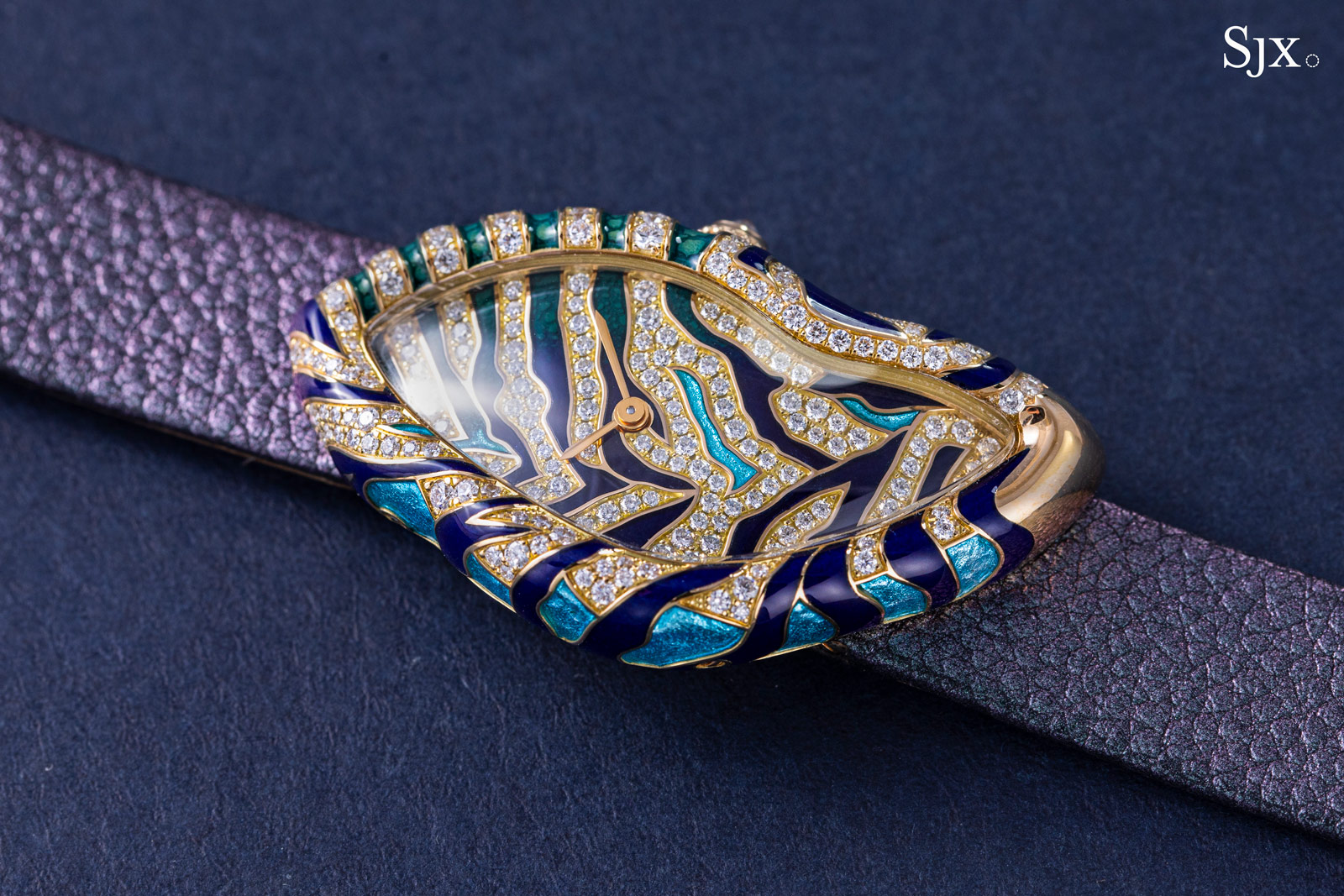
The Crash Tigrée
For me, the appeal of the Cartier Crash lies in the fact that that it’s more than a luxury watch — it is also wearable art. While many high-end watches prioritise technical prowess and complications, the Crash stands out for its bold design that is minimalist yet powerful. Its asymmetry challenges the eye, and the flowing lines of the case are jarring and captivating in equal measure.
The Crash encapsulates Cartier’s mastery of fine jewellery and horology. Describing itself as the “Watchmaker of Shapes”, Cartier has long been renowned for its ability to marry form and function. The Crash is a strong expression of that philosophy.
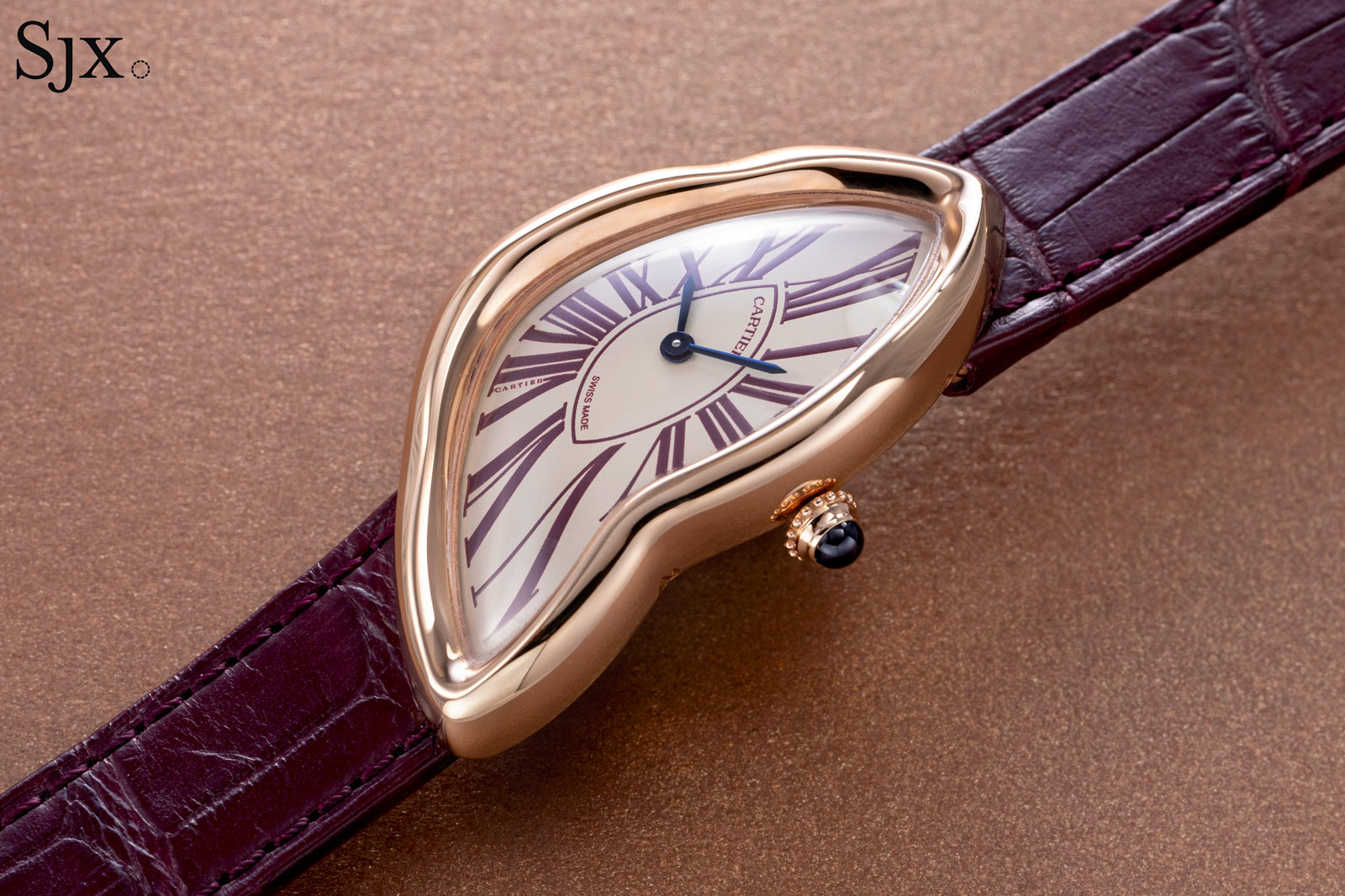
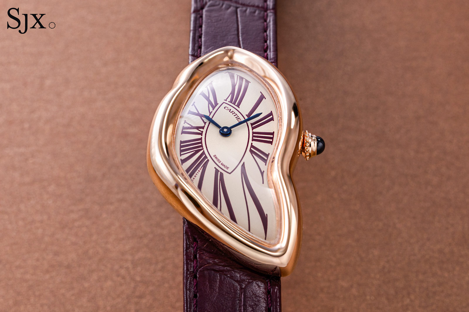
The author’s Crash in pink gold
Special order
Acquiring a Crash is no simple task. This is not a watch that sits in a boutique window. My passion for Cartier timepieces that paved the way in my journey to the Crash.
After first laying eyes on the Crash, I instantly knew it is a watch I wanted to add to my collection. I also knew that getting one would be an arduous task. My love for Cartier, as well as the difficulty in acquiring it, made the Crash the only watch I’ve ever truly considered to be my “Holy Grail”.
Before the Crash, I had been collecting Cartier watches for about six years and documenting my collection as well as publishing thoughts on Cartier in general on my Instagram account @watchrology. When I started, I was the one of few collectors in Singapore to actively promote Cartier watches in social media.
Cartier soon noticed my social media activity and got in touch. I then entered the world of Cartier. Some of my most memorable Cartier experiences include attending Watches & Wonders in 2022 and then visiting the Cartier manufacture and Maison des Métiers d’Art in La Chaux-de-Fonds.
Later that year, I was given the opportunity to commission a Crash through the new special-order (NSO) programme – I was ecstatic. A dream had been realised, as prior requests had been denied. With some persistence, as well as the assistance of the team at Cartier Singapore, a Crash was finally becoming a reality.
My communication with Cartier on the special order was straightforward and hassle-free. I started the design process with thinking this would be my one-and-only Crash. I relayed two ideas that I had in mind, then Cartier sent over renderings and I made the choice without hesitation.
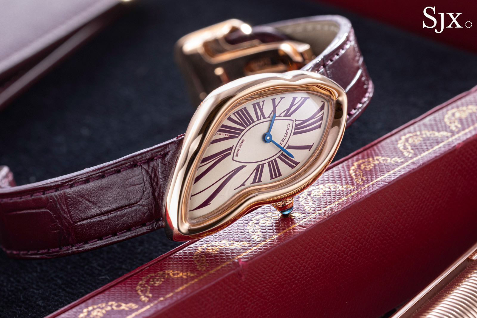
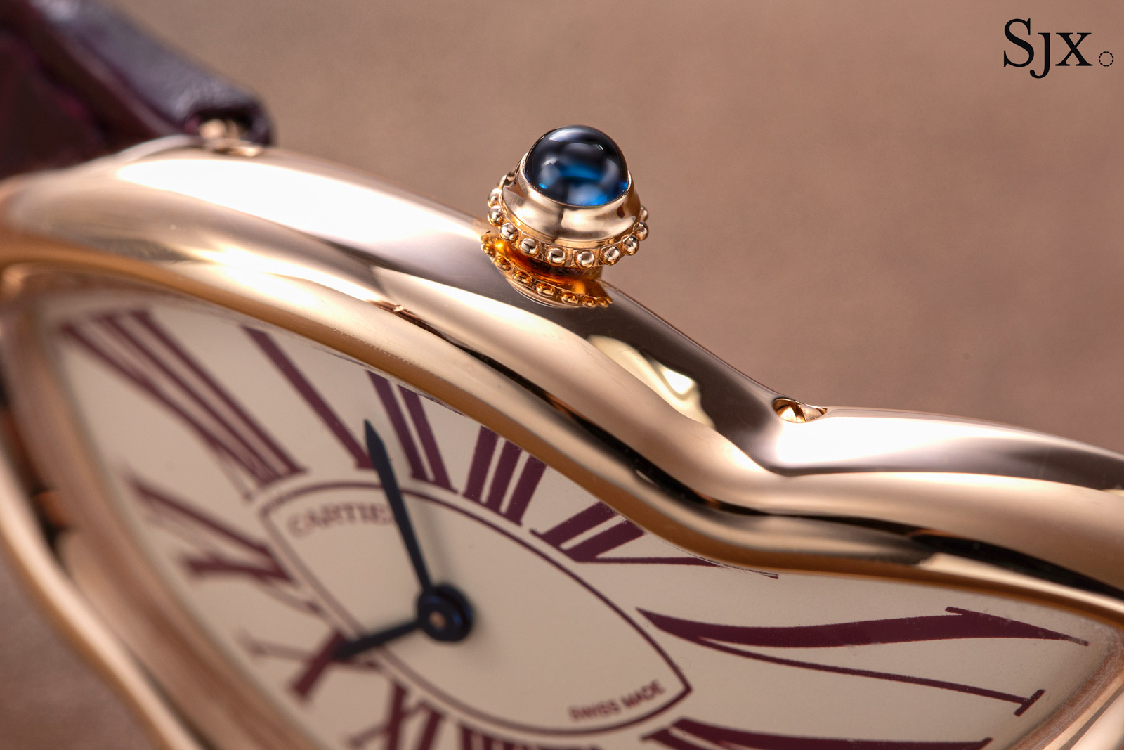
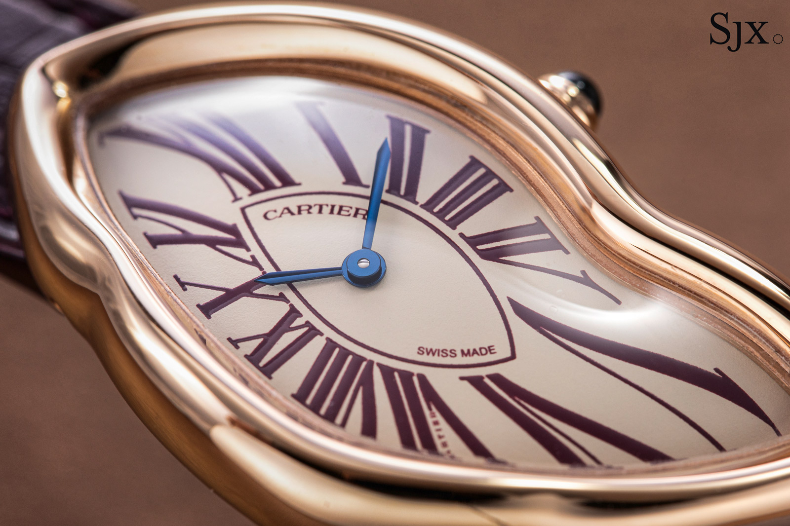
I decided to go for a timeless look – an eggshell dial with blued steel hands and Roman numerals in burgundy (my favourite shade and a nod to Cartier’s house colour) in a pink gold case. This combination has a warm aesthetic that I adore.
My other idea was a burgundy sun-ray dial and gold Roman numerals, but it felt too modern for my taste and lacked timelessness.
Once the design was finalised, it was a year’s wait before I finally took delivery of the Crash in late-2023. When I first opened the box to reveal the watch, it was a euphoric moment: the watch was much more beautiful than I expected. My dream of owning a Crash had finally come true.
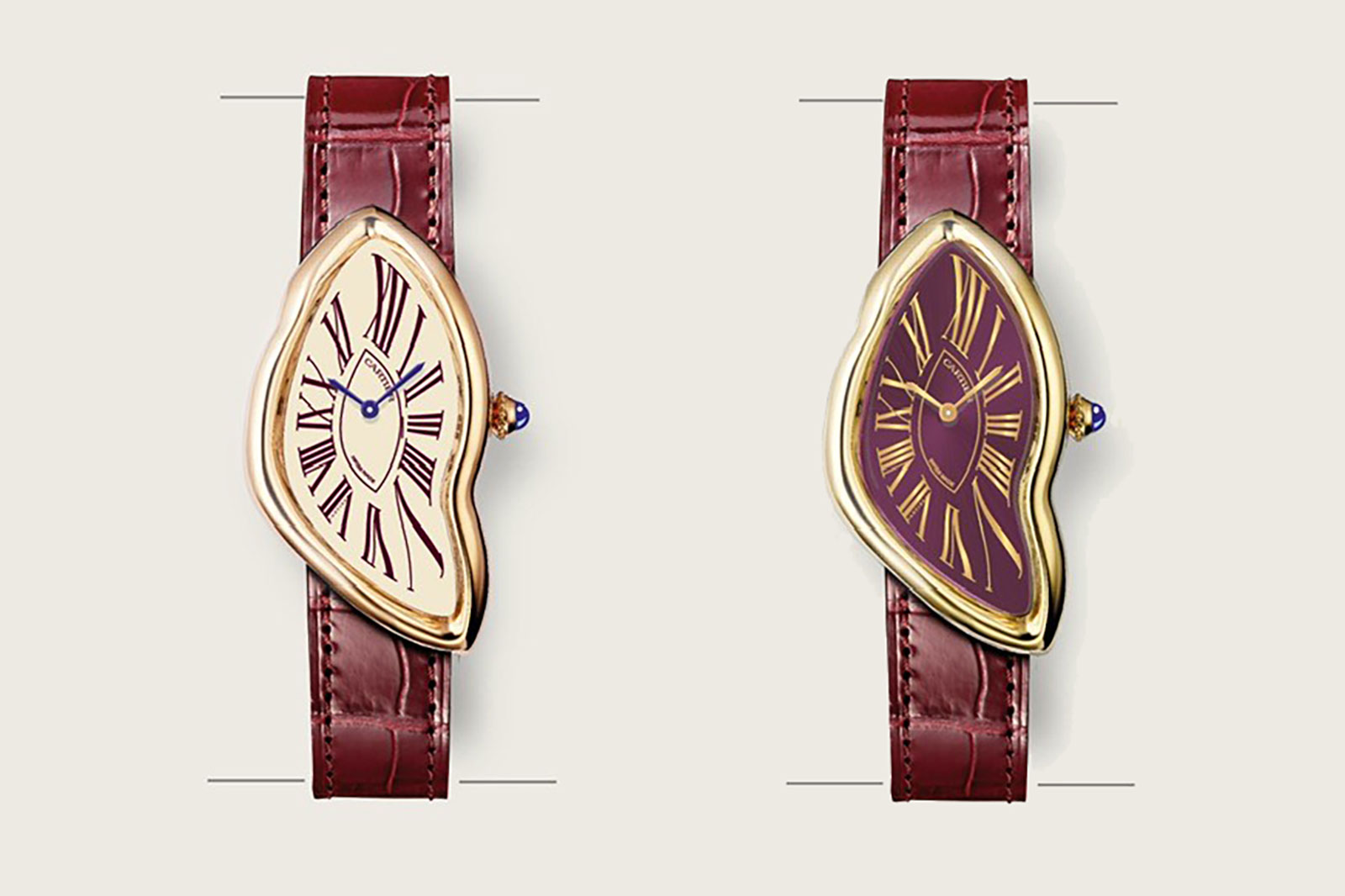
Renderings of the author’s Crash (left), and the alternative
A year with the Crash
My experience with the Crash for the past year has been magical. I can vividly remember the first time I strapped it on my wrist; it was otherworldly, the surreal and fluid form felt very different from other watches. Despite its daring asymmetry, the case has a delicate balance in proportion and curvature that allows for a comfortable wearing experience.
As the months passed, I found myself increasingly enamoured with its peculiar charm. The Crash is more than a watch, it is also a great conversation starter as it doesn’t look like a watch. There’s a confidence in its strangeness as it reveals itself to be more than just an abstract, whimsical play on shape.
The sinuous presence of the watch is more than the case case, but also the Roman numerals. Elongated towards the edges of the curved dial, they evoke a sense of movement even when the watch is still.
Also remarkable is its versatility. The Crash never fails to dress up any outfit, casual or formal. It possesses a subtle elegance that complements almost any look.
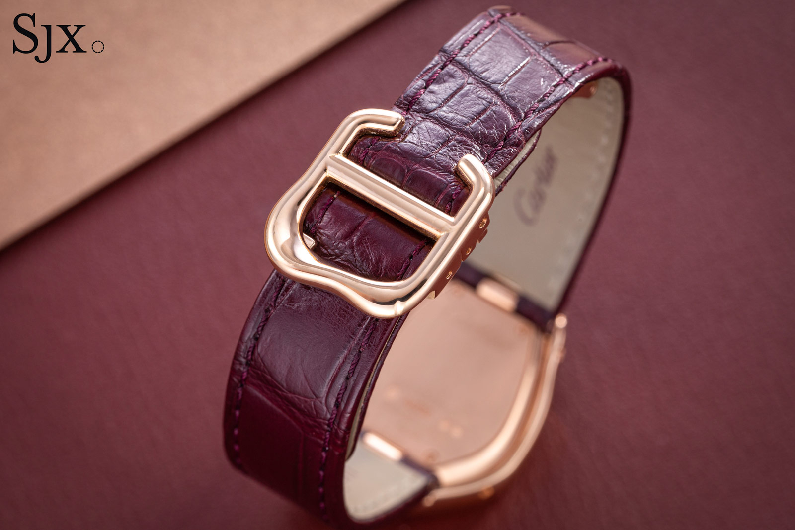
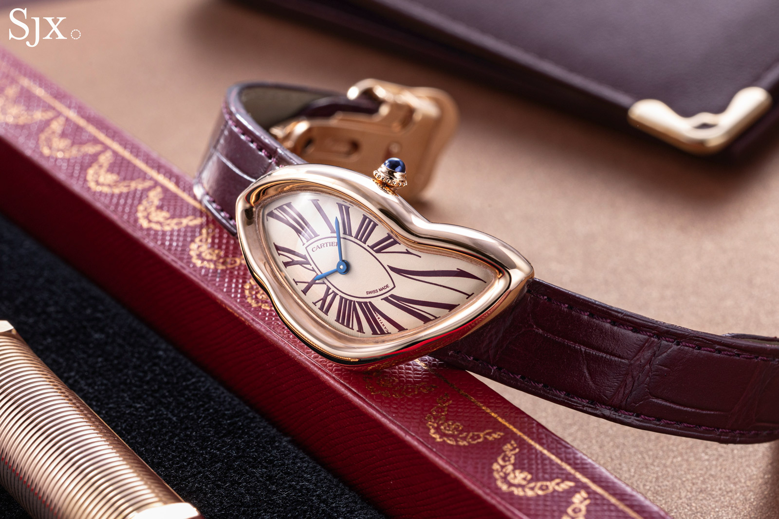
The modern-day Crash is matched with an equally misshapen buckle
Concluding thoughts
The Crash is not a watch for everyone, but that is precisely what makes it special. For those who understand the history, artistry, and its place in horology, the Crash is a bona fide icon. It tells the time, yes, but the Crash also invites us to find beauty in the unexpected.
The Crash is the crown jewel of my collection and will likely be so for a long time. Beyond the watch itself, it’s a reminder of my journey with Cartier and a reflection of my passion for the brand. It’s also reminder of everything that I love about Cartier — a daring embrace of the esoteric that makes every moment with the watch a little more extraordinary.
Back to top.

