Making a Mark: Understanding the 1931 Alphabet Typeface by Jaeger Le-Coultre
An Art Deco collaboration.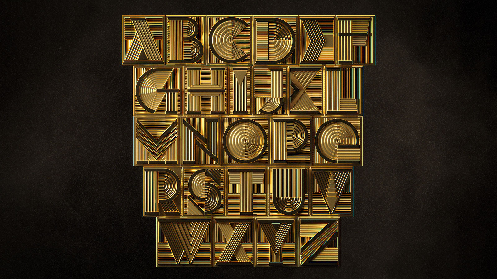
Watchmakers have long embarked on collaborations with artists, from Geneva jeweller Gilbert Albert and his Brâncuşi-inspired designs for Patek Philippe to the Zen creations by the Japanese architect Tadao Ando for Bulgari. Such collaborations are amongst the best ways for a watch brand to broaden its appeal.
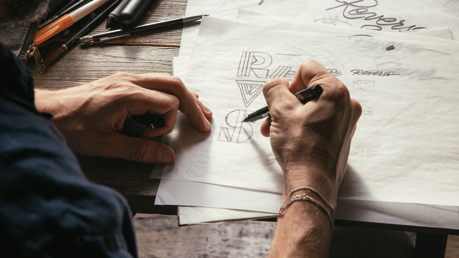
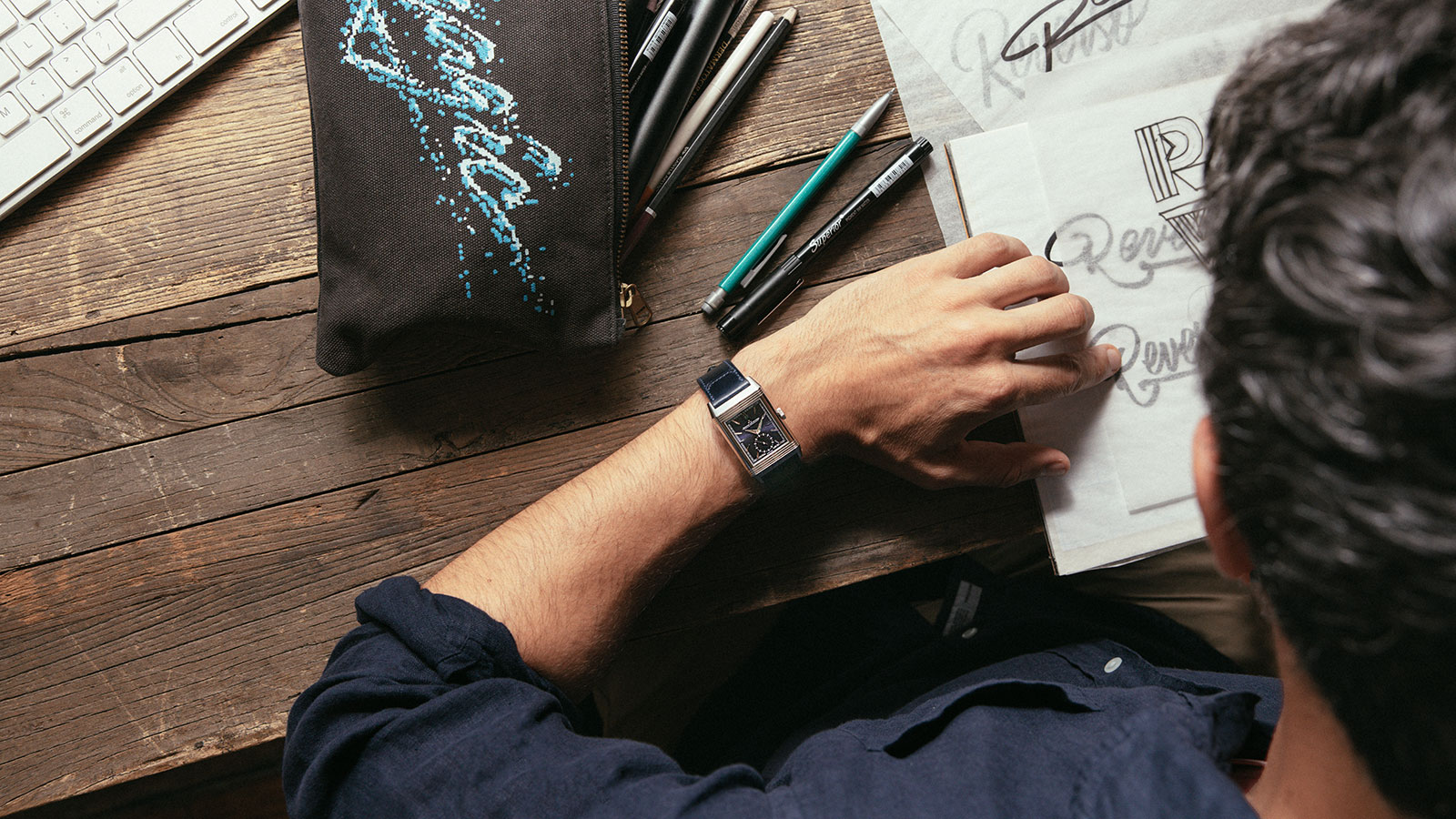
Jaeger-LeCoultre (JLC) has been exploring such relationships with “Made of Makers”, an initiative made up of collaborations with varied designers and artisans from other disciplines, including mixologist Matthias Giroud and the Michelin-starred pastry chef Nina Métayer. Its latest partnership is with Spanish typographer and illustrator Alex Trochut, who has penned a font specifically for the brand, the 1931 Alphabet.

Alex Trochut
Initial thoughts
On its face, this might sound like the typical artistic collaboration embarked upon by a watchmaker. But this has a subtle twist in engaging with watch enthusiasts as it’s all about personalisation of the watch.
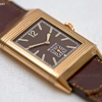
The 1931 Alphabet can transform a stock Reverso into something unique and something that would not be out of place Jay Gatsby’s wrist. It’s a prime example of typography as a decorative art in watchmaking. The attention to detail in the font design is evident in the kerning of the letters, which includes the use of negative space to create balance.
The 1931 Alphabet
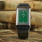
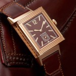
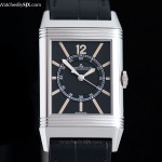
Given this typeface’s strikingly bold design, it is a perfect pair for the Reverso. Since its introduction in 1931, the model has evolved from a sports watch for polo players to an elegant timepiece that’s also a blank canvas for artistic expression.
Mr Trochut was inspired by his home of New York City with its many Art Deco skyscrapers. Art Deco was also the genesis for the Reverso design, leading Mr Trochut to envision a marriage between the watch and the skyline of his home city. As a result, the 1931 Alphabet is characterised by sharp, angular shapes and solid lines.
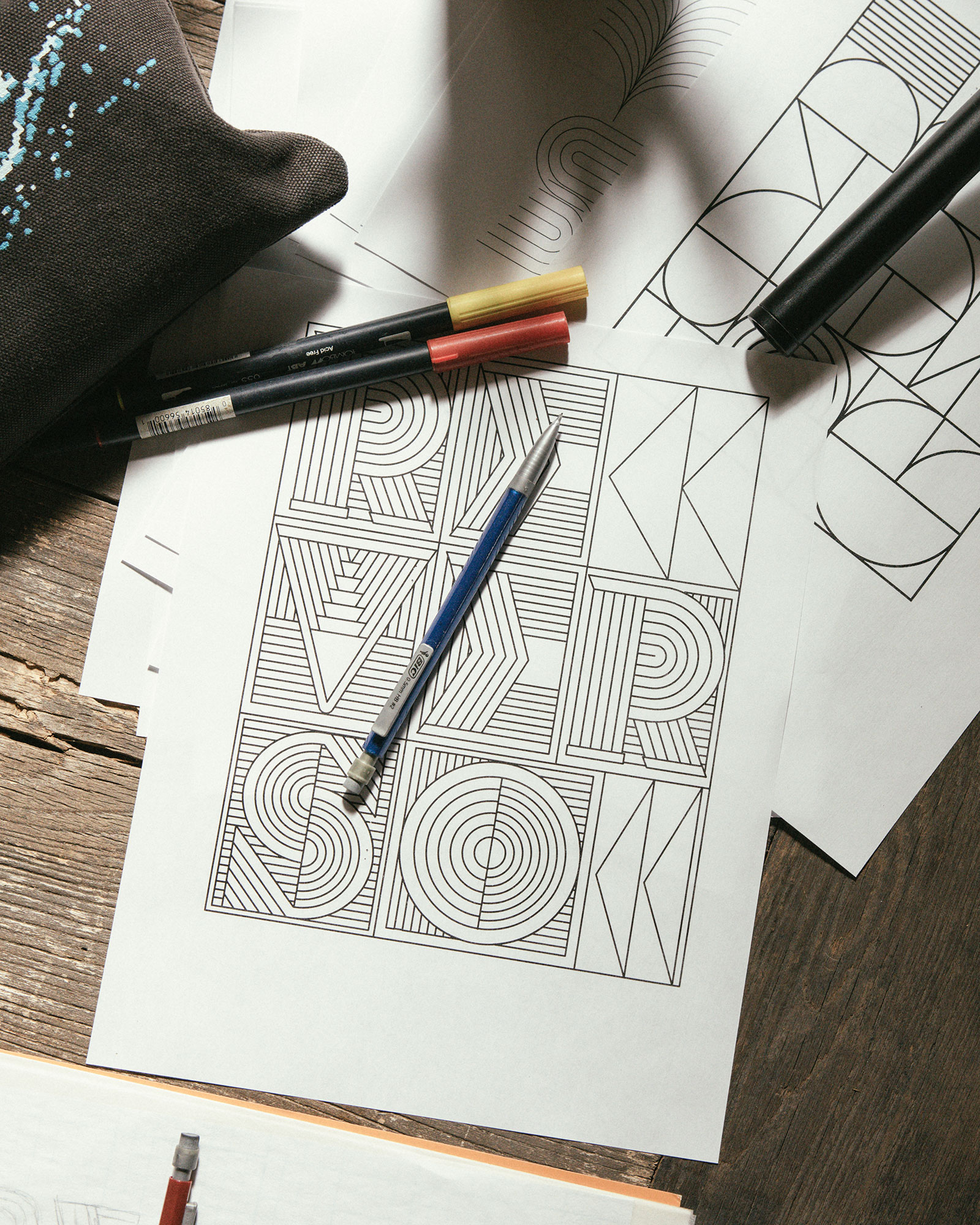
“As I started creating the designs, a concept emerged that would unify Art Deco and Jaeger-LeCoultre’s craft of watchmaking,” explains Mr Trochut, “I wanted these letters to feel physical and expose their intricate parts equally as functional and decorative, giving the sense of a moving machine.”
The 1931 Alphabet is unique it is made up of only upper-case letters, limiting its use to specific purposes, most obviously for personalisation on the obverse face of the Reverso.
According to JLC, the 1931 Alphabet will soon be available as an option for engraved initials on the Reverso case back. It will be called into use on watch dials as well, for instance on future dress watch models.
For more, visit Jaeger-LeCoultre.com.
Back to top.