Interview: Marie-Laure Cérède, Cartier’s Watch Design Chief
On bridging the past and the future.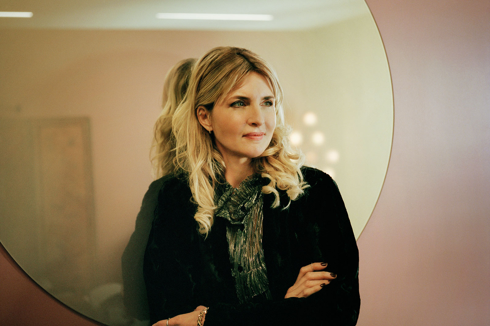
Cartier has enjoyed industry-beating growth since current chief executive Cyrille Vigneron took over in 2016, with demand for both its watches and jewellery rising at a steady clip.
One of the individuals behind the success of Cartier’s watch division is Marie-Laure Cérède. Having started her career at Cartier, she spent a dozen years at Harry Winston, before returning to the French jeweller in October 2016 as the Deputy Creative Director of Watchmaking. And in May 2017 she was elevated to the top job in design, making her ultimately responsible for the aesthetic of Cartier’s watchmaking.
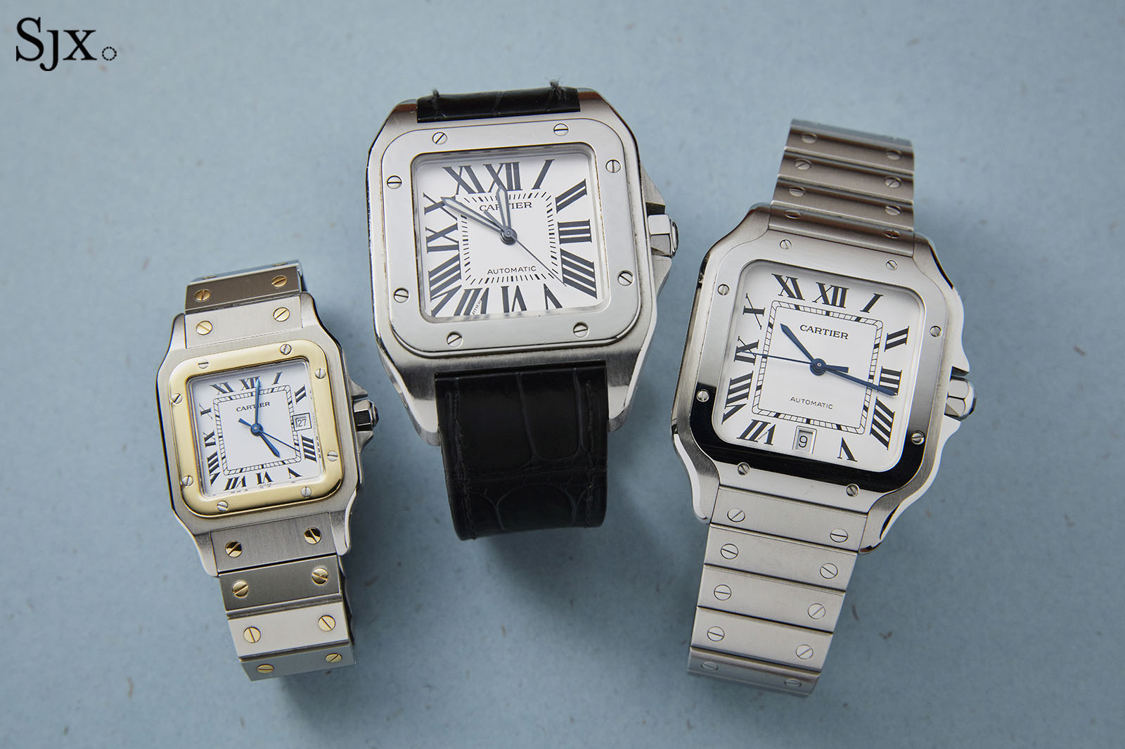
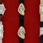
One of the first redesigns during Ms Cerede’s leadership was the Santos, which has evolved from the Santos launched in 1978 (far left), to the Santos 100 of the 2000s (centre), and finally the present model
Her tenure has been marked by a steady stream of hits, ranging from collector favourites like the Tank Cintree to the trendy Tank Must. In that time, Cartier has reimagined most of its trademark watch lines, including the Santos and more recently, the Pasha.
I spoke with Ms Cérède earlier this year to uncover the secret behind her successful rejuvenation of Cartier’s diverse line-up. Also present during the interview was Anne Charrier, the public relations-strategy manager for jewellery, watches, and accessories.
The interview was edited for clarity and length.
SJX: Cartier has a strong collection this year, both for men and women. And for a few years now, you have had strong offerings that were commercially successful but also well received by enthusiasts. How do you create that kind of success and momentum?
Marie-Laure Cérède (MC): I hope everybody thinks like you. [laughs] I think it’s our consistency over the last two years. Creatively speaking, everything is a balance between relaunching icons, but also introducing new signatures for the vocabulary of tomorrow. It’s all about working on this balance, with the aim of not remaking icons simply like there were before, but also improving them.
SJX: You have successfully relaunched some of these icons, Santos, Pasha, and so on, while balancing between old and new like you mentioned. You retain the iconic style yet these are clearly new watches. How do you keep the familiar look while creating an entirely new watch?
MC: It’s hard to answer that question because we don’t have any magical recipe. For every launch, we work with a made-to-measure creative process. But knowledge is a prerequisite to creation – we need to master our heritage. The first steps for each relaunch is clearly to consult the archives.
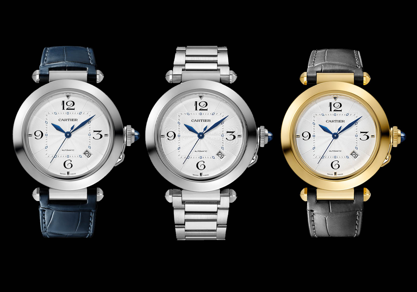
With the Pasha for instance, we went to the historical collection where we were able to measure and understand the volume of all the Pasha models over the years.
I thought that the Pasha is a “UFO” because within the watchmaking industry, you have two types of round watches, either classical or sporty. Pasha is neither, which is why it’s a UFO. It has extravagant attributes, like the push buttons, the crown and everything.
So we decided to look at Pasha as a combination of different pieces, to capture the best of its heritage within each little piece. We separated the pieces, isolated them, and then worked on each piece. And at the end, we gathered everything, put the pieces together back, and this became the new Pasha.
The Pasha launched last year. Photo – Cartier
SJX: With the new Pasha, you went beyond just the look. You incorporated the easy-to-remove straps and bracelets. Is how the wearer interacts with the watch also a key part of the design process?
MC: You’re right, we were thinking of this as well. We didn’t want to just relaunch this icon, we wanted to add something more connected to the current generation [of buyers].
For instance, the interchangeability of bracelets and straps was very important because it’s really a desire of the current generation to wear your watch on either leather or bracelet. Same thing with Smartlink [the mechanism to remove bracelet links] – the ability to easily adjust the bracelet to give your watch to your wife or someone else is also what the current generation wants.
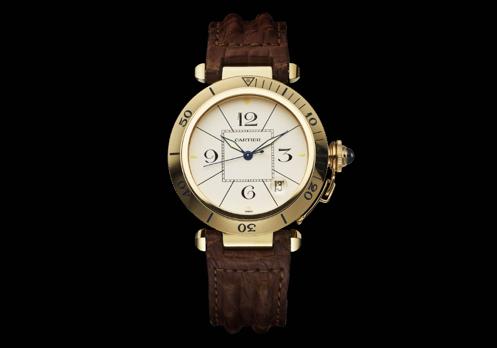
From the archives, the original Pasha of 1985. Photo – Cartier
SJX: You launched the Pasha chronograph this year. It’s a complicated watch. Most, well, all of Cartier’s classic designs are simple watches. How do you incorporate complications into such designs without losing the original style?
MC: Working on small or high complications is sometimes a way to give the product another face. We took the opportunity with Pasha the chronograph to be bolder, compared to the hour-and-minute Pasha of last year that was sober and elegant.
With the chronograph, we have something very bold, very assertive, because we wanted to the audacity of the 1980s when the Pasha was first launched. For instance, we choose to take the oversized pushers of Pasha Golf for the chronograph. You see what they did with the Golf in 1987; it was a conscious choice to make the buttons oversized. So we reaffirm that boldness today.
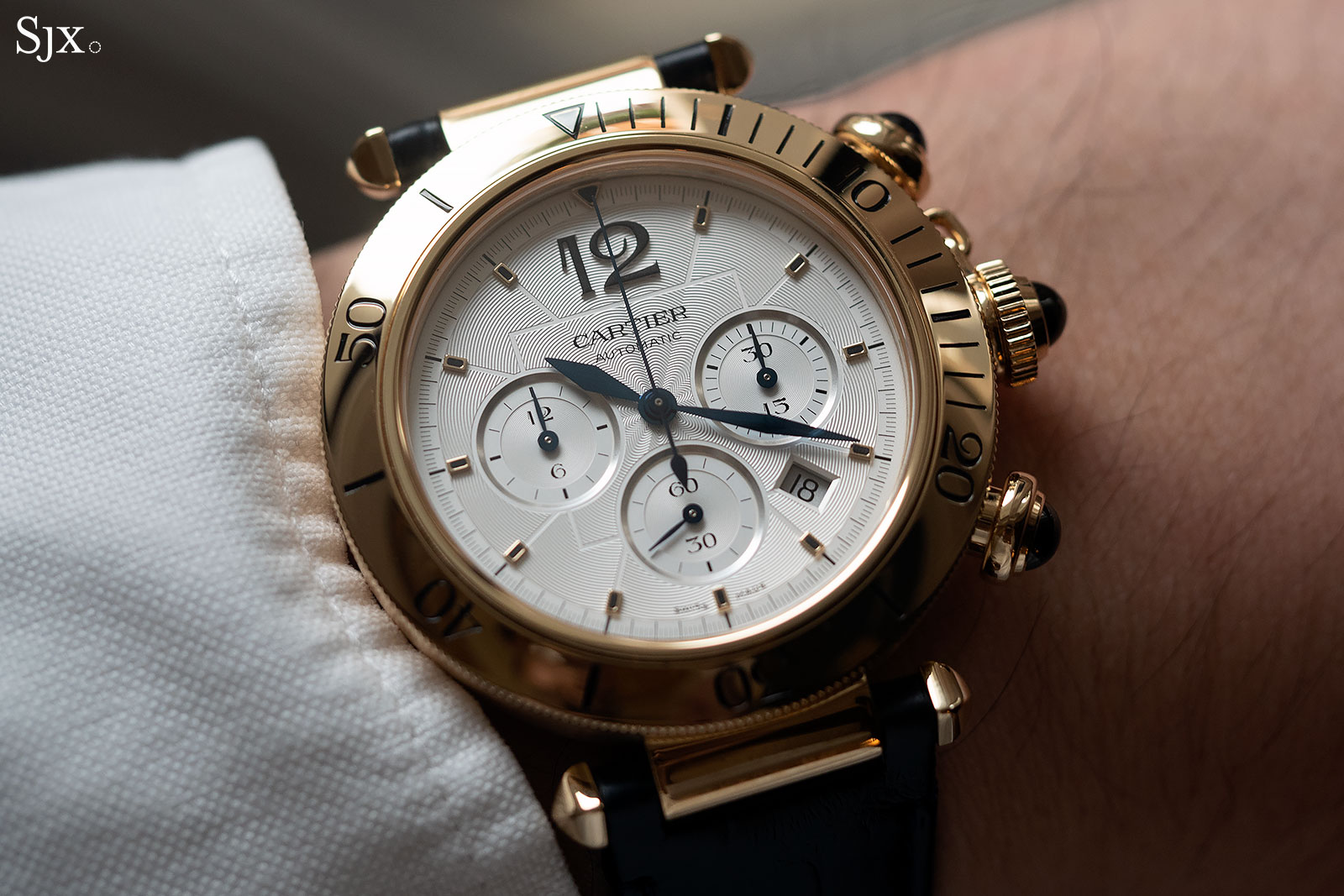
Evoking the heady 1980s, this year’s Pasha Chronograph in 18k yellow gold
SJX: You mentioned the 1980s, a historical era and spirit contained in a watch. Is this historical feeling something you think about when designing different watches?
MC: For sure, because I think every Cartier watch has a mythical dimension, and we need to contribute to the myth and be connected to its dimension.
For the Pasha, we have the myth of Wall Street [a film that captures the period]. Such a watch was empowering, a symbol of success of the time. But not on the hour-and-minute version, which we wanted to be refined and elegant. On the chronograph, why stay sober and pure when you have the energy of the 1980s that you can inject into the chronograph?
SJX: So are there any other historical periods that you enjoy or appreciate that you plan to use for future watches?
MC: I think about the watch and try to capture the most emblematic era of each watch. We did that for Tank Must; the watch was relaunched this year, but it was long awaited.
What I love in the Must is the energy of the 1970s. The original Must was the moment when Cartier brought an end to the old, conservative idea of luxury, and replaced it with new luxury, where elegant models were offered at affordable prices.
And I think one of Cartier’s talents is really to know the right moment to launch an icon. Relaunching the Must right now? Considering the context of the pandemic, the economy, lockdowns – I think it really resonates.
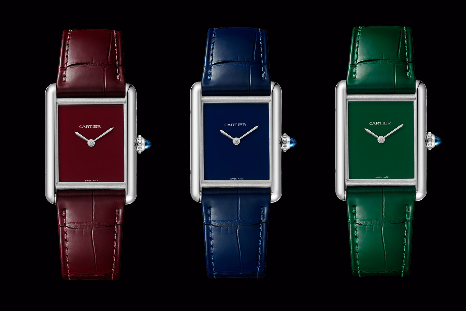
Perfect for the moment, the bestselling Tank Must with solid-colour dials. Photo – Cartier
SJX: We have discussed the icons, classical designs that are famous, but sometimes Cartier launches new designs like the Drive, an entirely new model. How do you decide to look in the archives or start from scratch?
MC: It’s not a choice between either, it’s more that we have to do both – we don’t have to choose between the past or the future. We have to reinterpret our past by relaunching icons, but we really have the duty to introduce the vocabulary of tomorrow. But even with our newest designs, they have to be imbued with the past and reflect our archives.
Imbued with the past – the Cloche de Cartier that’s based on a 1920s design
SJX: In some other product categories, Cartier took inspiration from specific countries, like India for its Tutti Frutti jeweller. Do you also look to fields outside watches when you design watches?
MC: We’re spoke a lot about our relaunches, but we are also working on the future. The Mitten Watch is incredible but very simple; it really bridges jewellery and watchmaking. It’s a glove of gold mesh, so it moves on the hand, much like a golden fabric.
It’s really interesting for me because of the innovation, and not only in terms of technical know-how. But for sure the know-how was there: we were 3D-printing the golden mesh, so it could be thin and supple, and the diamond setting was also difficult – the true work of a jeweller.
But it’s also an innovative way of thinking of time. Because it’s easy to think of another way to wear a watch, by making a pendant or a brooch. But to have a new way of reading the time on the wrist is much more difficult. So this mitten introduces one of our visions of the watchmaking’s future.
SJX: And this was inspired by what era?
MC: No era. [laughs] It reflects a concern we have, one that is quite conceptual, but I will share it with you. I would like to introduce a [new paradigm] for watchmaking at Cartier.
In the future watches won’t be an instrument to read the time, because we can read the time everywhere. And a jewellery watch will be predominantly defined by its aesthetics.
So we need to find a third object bridging watches and jewellery, because we were a jeweller before becoming a watchmaker. And I wanted to introduce something very disruptive and shocking, to open the way to this [new paradigm].
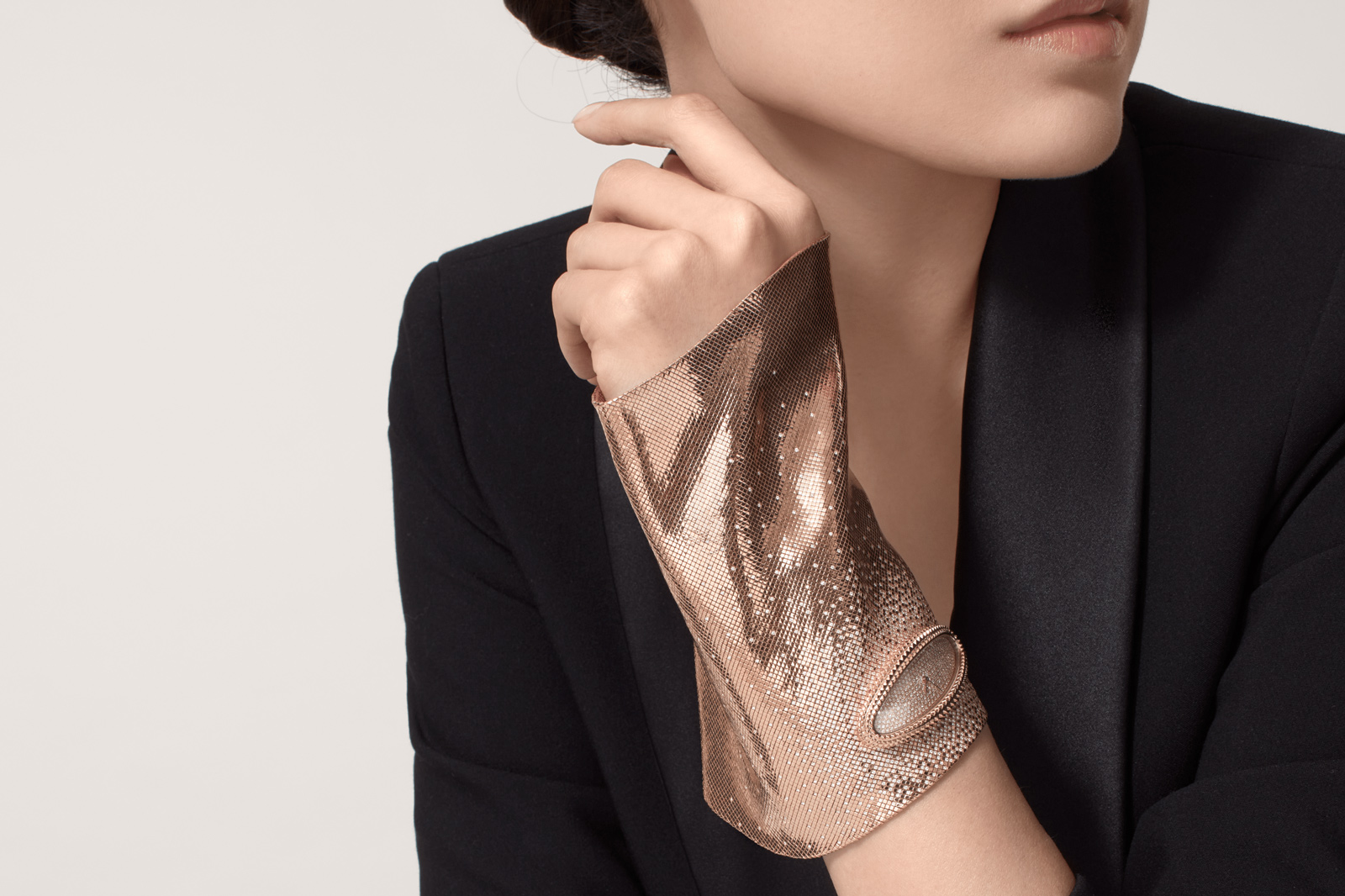
The incredible Mitten Watch. Photo – Cartier
SJX: Now that you mentioned it, I realised the new Tank Must with its solar-powered movement and non-leather strap is a watch of the future that is radically different from traditional Cartier watches. Why was it created?
MC: Indeed, it was the ambition to have a fully-integrated product. I told you we relaunch our icons, but we do it differently. Just having a better design is not enough.
We wanted the watch to reconnect with the younger generation. And we saw that the solar movement and non-leather strap was really a way to have a sustainable product while bringing a new combination into the alchemy of price and the design. We have the three main elements here: sustainability, affordability, and an elegant, improved design compared to the Tank Solo – this can bring the young generation into watchmaking.
SJX: That brings me to my last question. Is Cartier going to make a Tank or Santos smartwatch?
MC: [Laughs]
Anne Charrier: [Laughs] We cannot speak about future creations for sure. It’s too early and we don’t know.
SJX: Thank you for answering my questions.
Correction October 2, 2021: The leftmost Santos (second image from the top) was launched in 1978, and not in the 1980s as implied in an earlier version of the article.
Back to top.