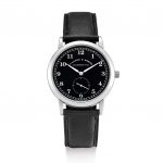
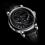
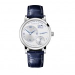
Understanding Watch Design at A. Lange & Söhne, With Help From the Experts
We speak to three award-winning designers and Anthony de Haas.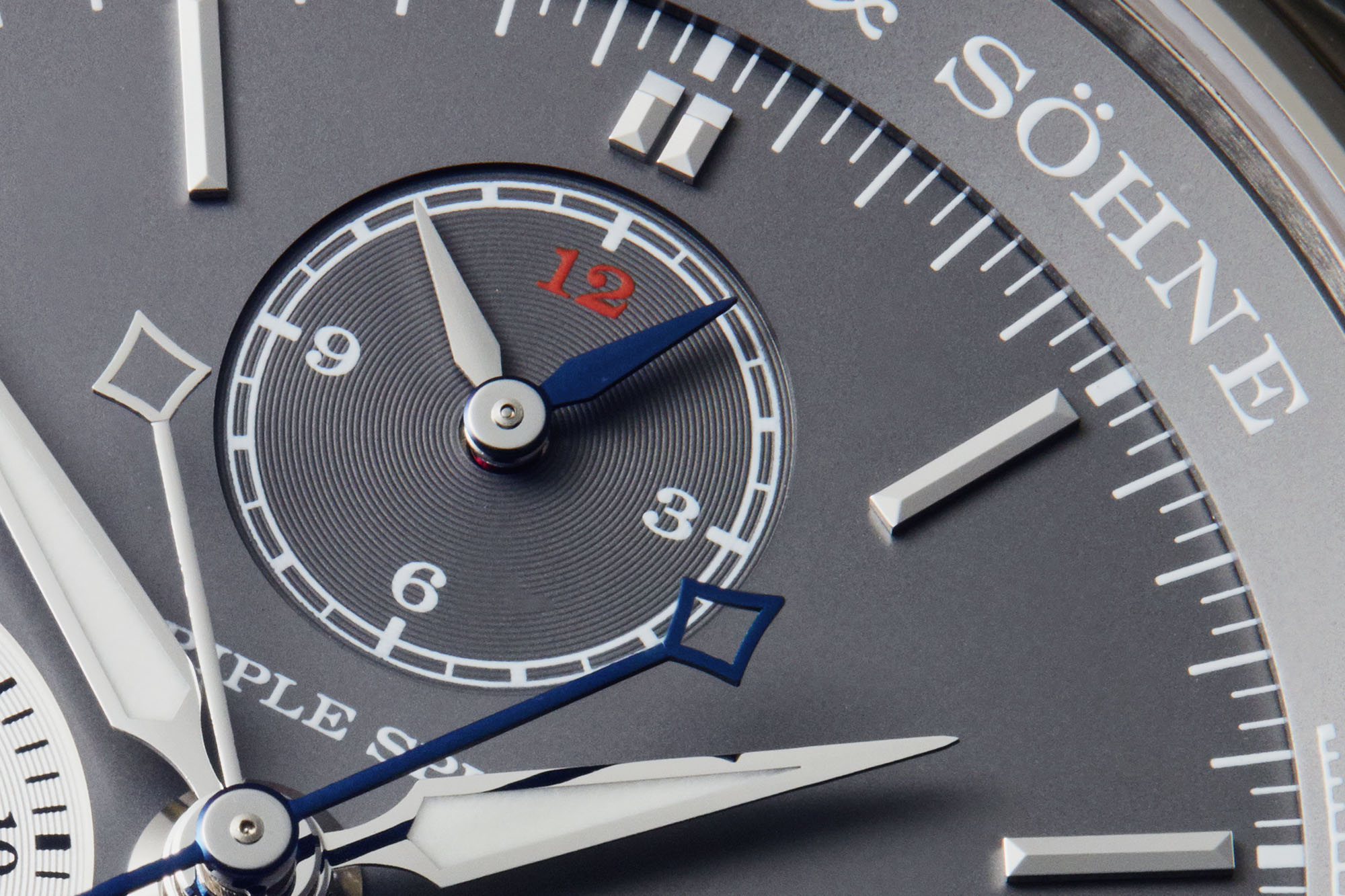
When the revived A. Lange & Söhne unveiled its first wristwatches in October 1994, reactions from the press and collectors were unanimously positive.
Lavish praise was heaped in particular upon the newly developed movements, then unparalleled by virtue of their decoration and construction. Twenty-four years ago, even the calibre inside the simplest model in the inaugural collection, the original Saxonia, was a revelation.
And the reasons for the acclaim are universally known today – the untreated German silver three-quarter plate, gold chatons secured by blued steel screws, and an elaborately engraved balance cock.
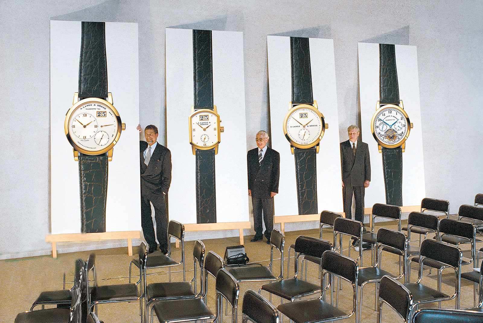
The now famous picture taken at Lange’s relaunch in 1994, with Günter Blümlein (left) and Walter Lange (middle).
Less obvious then, and even still now, was the design language. Lange wristwatches have a distinct look and feel that’s tangibly exemplified by watches like the Datograph and Lange 1. But the Lange style is not patently obvious in the sense of the Royal Oak, or classically recognisable as Breguet.
To unravel the crucial elements of design at Lange, we turned to the experts: three of Singapore’s leading designers, all past winners of the President’s Design Award, the city’s top prize for design. Each of their video interviews follow below.
And for the insider’s perspective, we spoke to Anthony de Haas, Lange’s chief of product development, to understand how it all came about. Together the perspectives help piece together how the foundational elements of design at A. Lange & Söhne have been refined in the years since 1994.
Larry Peh – Founder, &Larry
Founder of design and branding agency &Larry, Larry has done work for clients like Louis Vuitton, Tumi, and Herman Miller – and he also designed this very site.
Importantly, Larry has been a Lange aficionado for several years, with a collection that includes both the Lange 1 and Datograph. In contrast to most collectors who are mechanically inclined, Larry came to the brand primarily thanks to its design – specifically its typography – instead of the mechanics. He even co-wrote, along with your correspondent, an extensive exploration of Lange’s typeface, which can be found here.
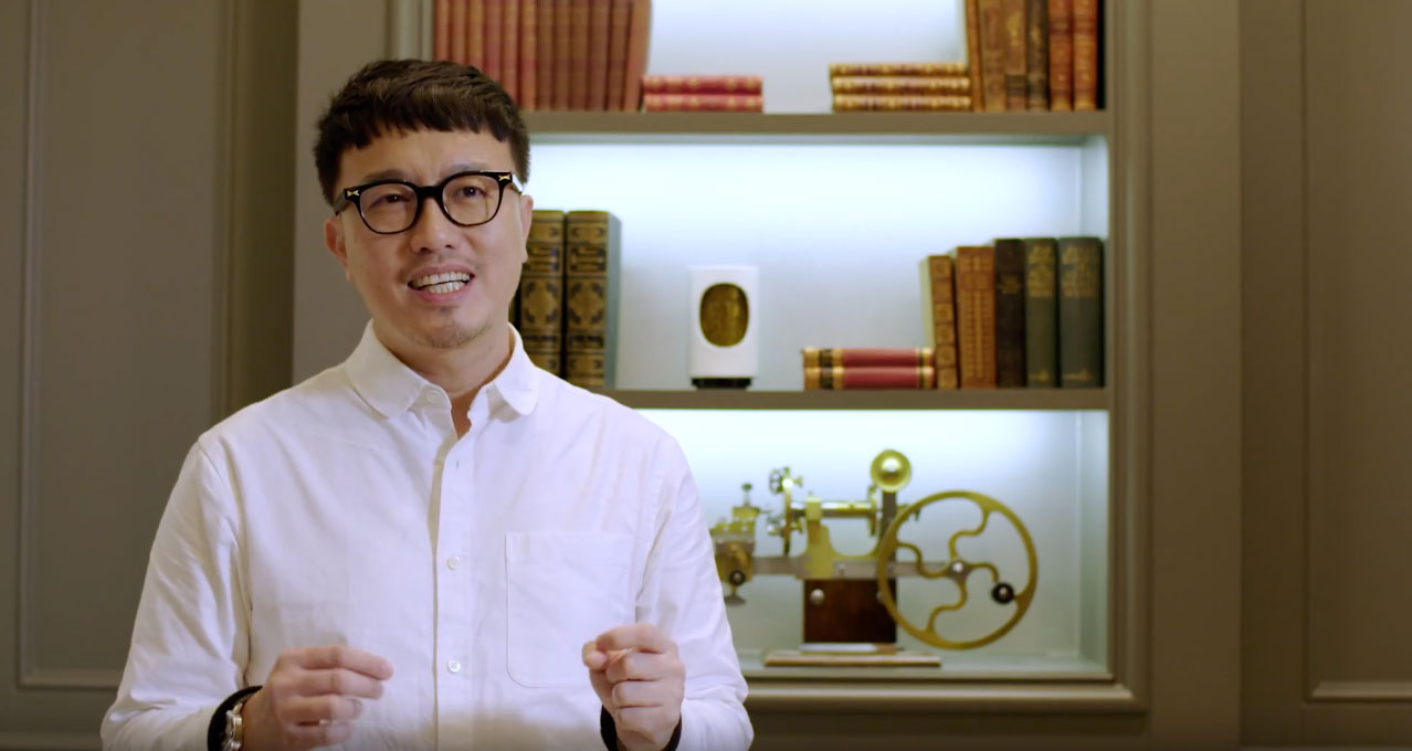
Lange’s unusual font is unusual in watchmaking, according to Larry, being perfectly executed on almost every level: size, weight, kerning and position. Nearly all of Lange’s rivals, in contrast, rely on stock typography that is out of place on something as crafted as a high-end wristwatch.
In fact, Larry points out the attention to typography extends to Lange’s printed materials, for instance with the alternating use of serif and sans serif typefaces
And typography matters, because typefaces subtly convey the feel of the brand, explains Larry, which is something he strives for in design. Lange’s use of a tweaked Engravers font, for instance, font points to a classical spirit with a contemporary twist.

The official logo is always curved, except when to fit a specific type of dial design
How that perfect typography came to be starts with the very foundations of the brand, according to Anthony de Haas. And the credit largely goes to the wide-ranging genius of Günter Blümlein, the remarkable leader who co-founded the modern day Lange enterprise, while simultaneously overseeing IWC and Jaeger-LeCoultre, before he prematurely passed away in 2001.
“Blümlein paid attention to everything,” says Anthony, “90% of everything came from him, the lugs, the case, the fonts, and even the guest toilets [in the factory].”
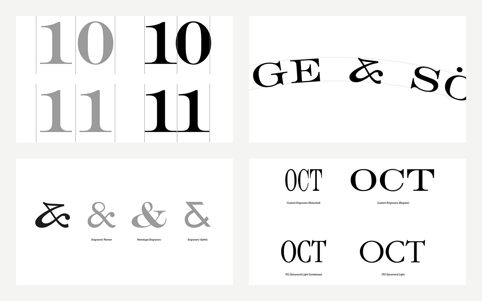
The details of the Lange typeface. (Credit &Larry)
Mr Blümlein, together with Walter Lange and formidable colleagues that included the likes of Kurt Klaus of IWC and scholar Reinhard Meis, managed to conceive an enduring look and feel of quality, of which fonts were just a small, but crucial, part.
“The A. Lange & Söhne of 1948 [before it was nationalised by the Communist authorities] only made pocket watches,” explains Anthony, “So they had to create a new identity from scratch… Blümlein knew the face was important in capturing attention.”
Casual observers today might notice striking details on Lange watches, some conceived on a modest budget almost 30 years ago, and praise them as outstanding, yet struggle to explain why. Larry’s training, on the other hand, allows him to explain them.
Take the lowered sub-dials of the Datograph, which are widely known to be in that position to accommodate the outsized date display. But there is an aesthetic logic behind that. Like how photographs are often composed in a similar manner, the position of the registers provides a sense of visual comfort. They establish the visual horizon, because “gravity has a consequence in a lot of designs”, says Larry.
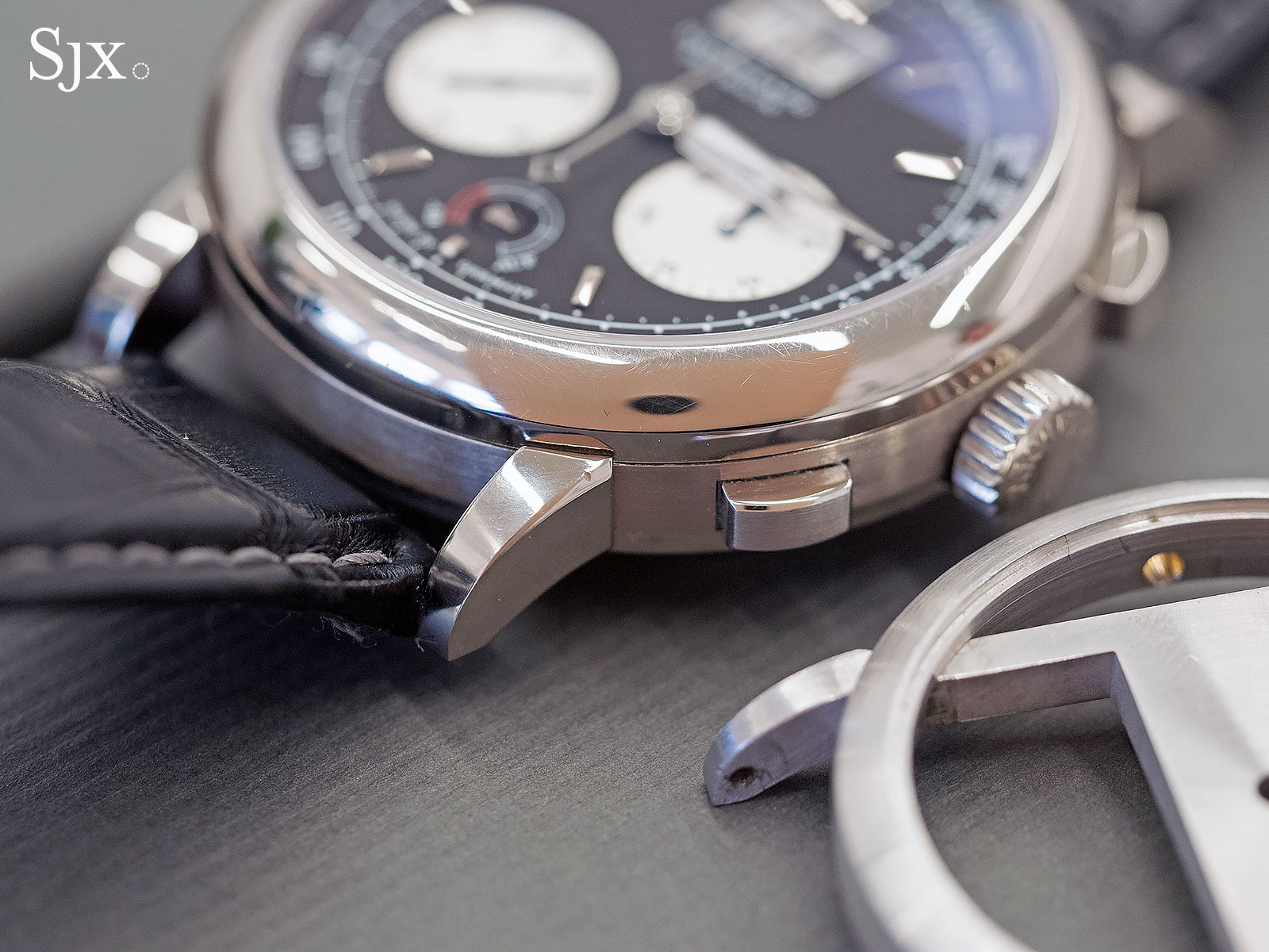
And then there are the notched lugs that are characteristic of all Lange watches, which have become a hallmark of the brand’s design. It was one of the elements that caught Larry’s eye when he first encountered the brand.
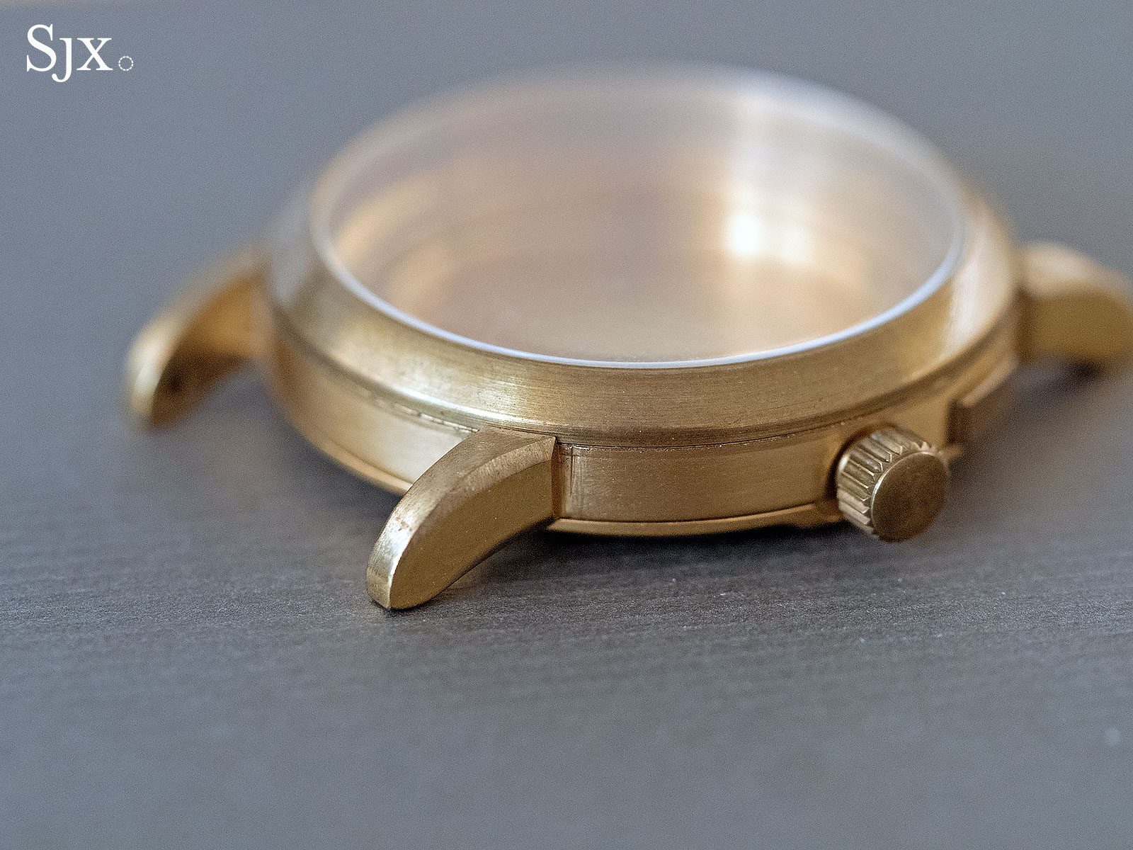
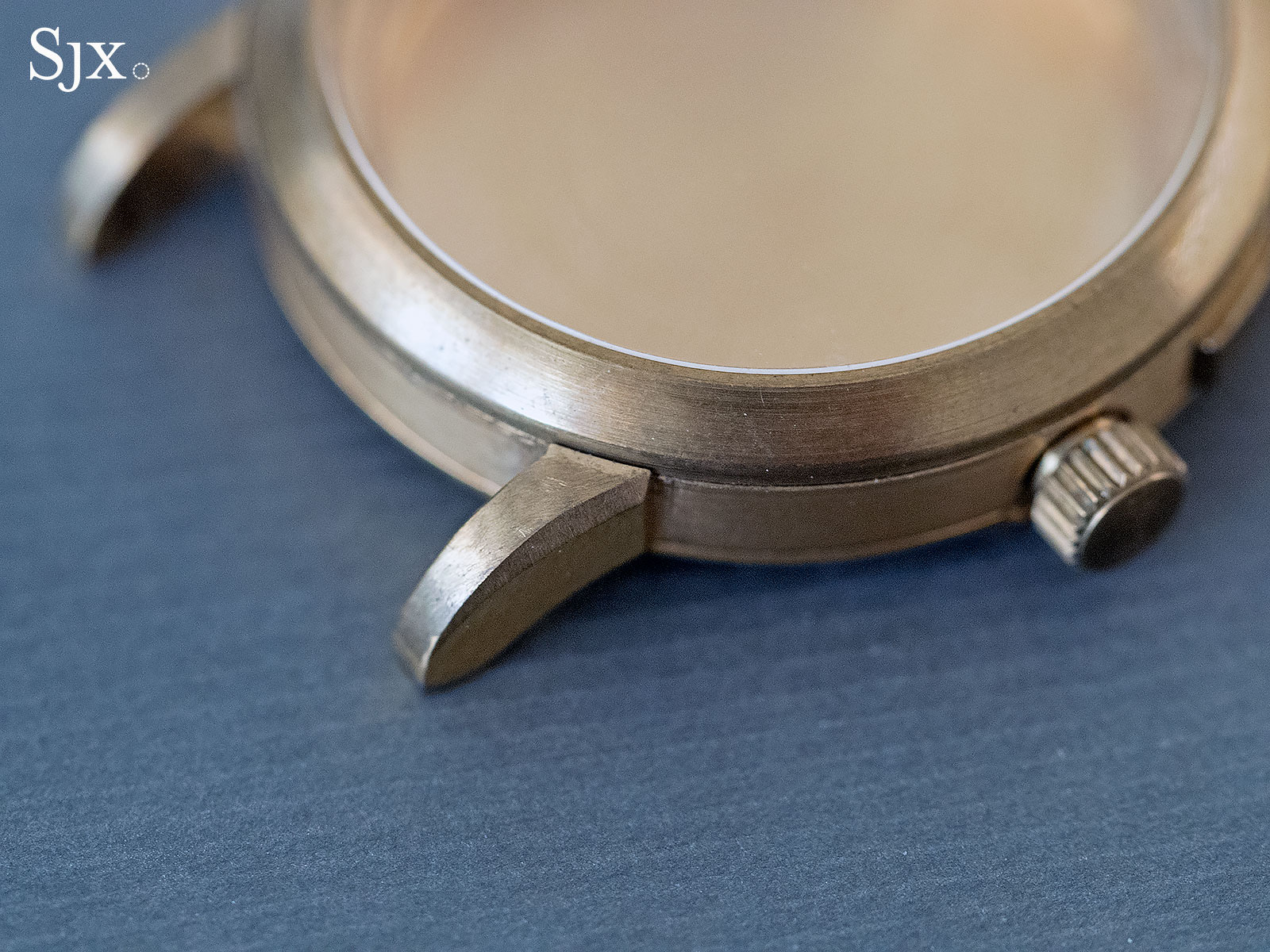
A brass case prototype
“[Günter] Blümlein himself took a file and made the angle” on the early brass prototypes produced by a Swiss case maker, explains Anthony de Haas, who adds that the late Mr Blümlein was especially particular about Lange wristwatches being tangibly different from its rivals, and no Swiss watch had lugs like that.
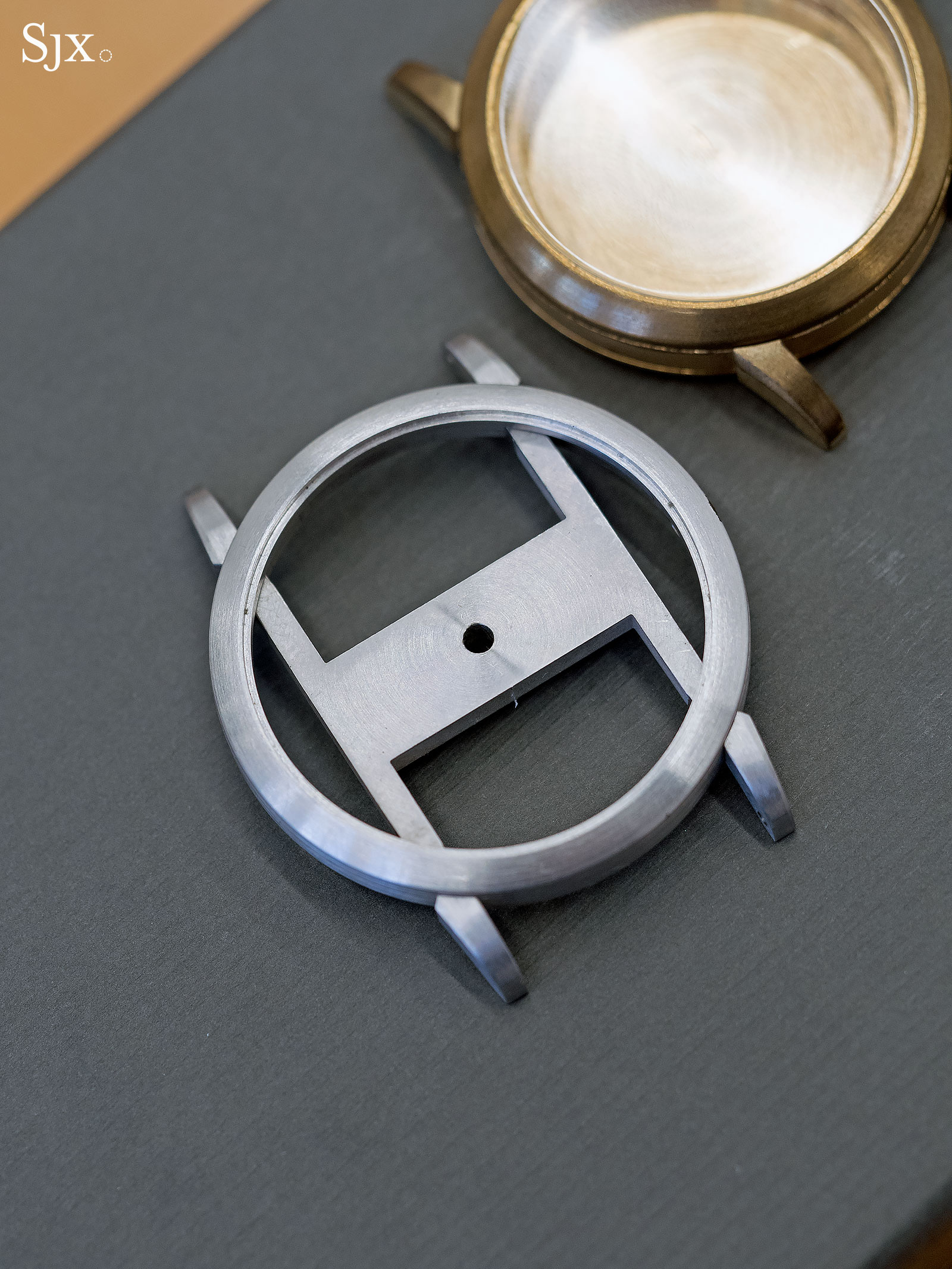
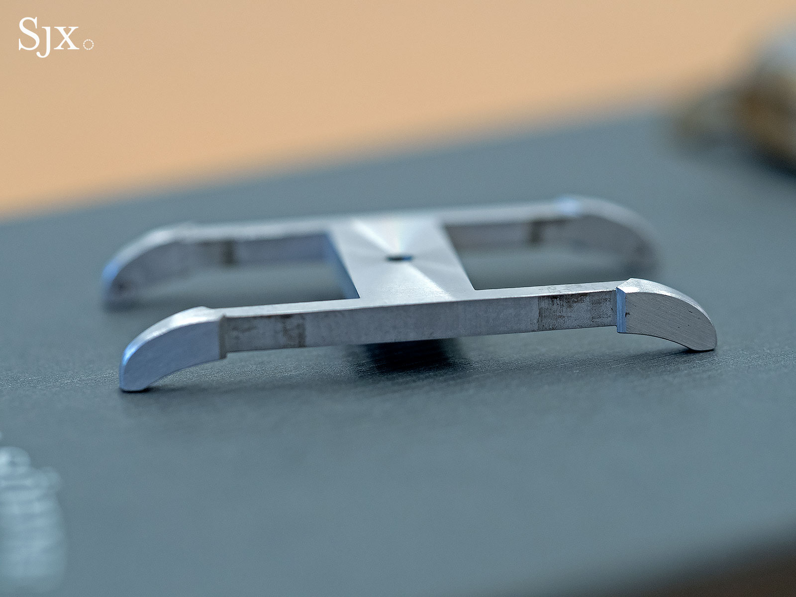
An early 1815 case prototype made to explore the shape of the lugs
Mr Blümlein also specified the notch had to be mirror-finished, which meant the lugs and case middle had to be finished separately and then soldered together. That construction, in turn, led to Lange cases being thicker and heavier than the average luxury watch of the day, another vital factor in the brand’s tactile differentiation. Mr Blümlein was prescient, for “polished and refined… rock” is how Larry describes the typical Lange wristwatch.
Patrick Chia – Founder, Design Incubation Centre, National University of Singapore
An industrial designer by training, Patrick founded Singapore’s first industrial design research centre in 2006, developing it into one of the leading design laboratories in Asia. His intuitive sense for design led him to acquire several notable watches, including the Rolex GMT-Master “Batman” and Seiko “Turtle” despite not being an aficionado. Patrick wore a Lange 1 Moon Phase, on loan from Lange for a week, for some insights into the watch and the brand.
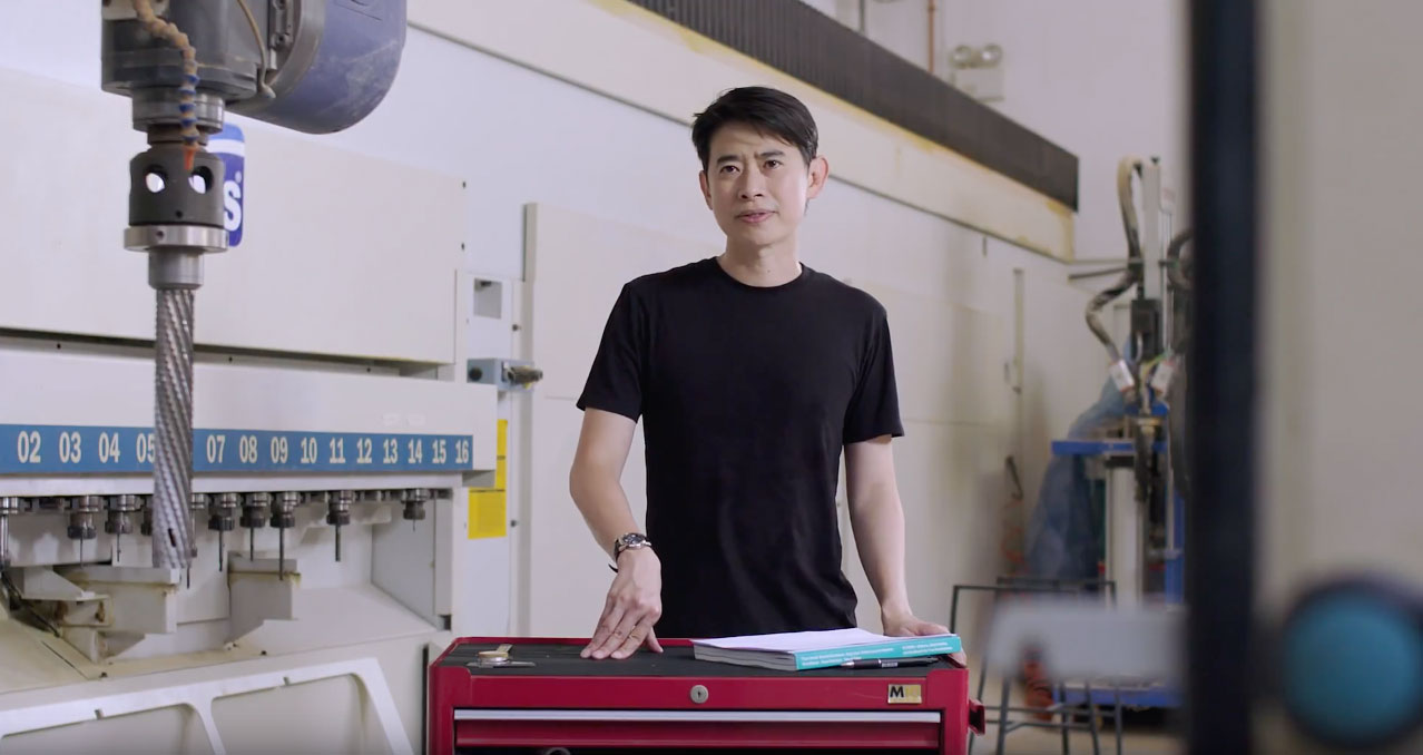
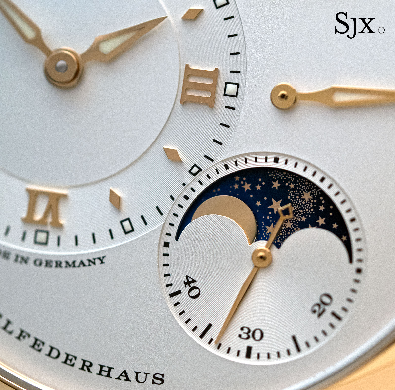
While at first glance its design feels handsome and formal – the dial is after all laid out according to a gird – the Lange 1 reveals itself in its details, according to Patrick.
Industrial design typically calls for design “optimisation”, making something cheaper, faster, and more useful, as Patrick puts it. The Lange 1 Moon Phase, however, is not optimised in any way or form.
Patrick notes that the minute, even miniscule, elements on the front and back – applied Roman numerals, stars on the moon disc, chatons on the three-quarter plate, the engraved balance cock – are exceptionally fine.
Particularly striking to him, especially since he frequently does prototyping in the design lab’s workshop, were the sharp corners of the frame of the date window. A rounded corner would have been more optimised, so to speak.
Such details make the watch a very personal experience, in Patrick’s opinion, revealing itself only up close, and at unexpected moments, when driving for example. To the casual observer, such details are practically impossible to examine with magnification, which makes one wonder why.
The answer, as it turns out, lies in how the brand’s foundational design has been gently evolved since 1994.
“Over the years, more and more elements joined the mix, but Lange remains very pure in its look,” says Anthony.
“Each product family has key characteristics, like Arabic numerals on 1815, which then cannot have an outsize date because the date clashes with the numerals,” explains Anthony, “While the Richard Lange is all Roman numerals.”
“We want to be tighter in terms of design language and create a collection that is clearer.” Consequently, differentiating Lange model lines relies on subtle cues, rather than overt features like the case form or bezel. And more differentiation means sharpening the details.
“We applied the hour markers of the Saxonia on the [second generation] Datograph…” says Anthony, “Internally, we refer to the Datograph Up/Down as a Saxonia Datograph.”
These fine distinctions even extend to the men’s and ladies’ versions of the same watch: “Applique hour markers at the quarters are angular on men’s Lange 1, but they have softer corners on Little Lange 1,” says Anthony.
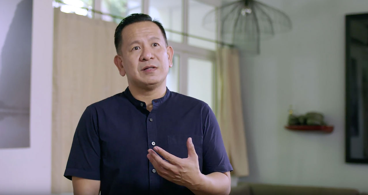
Nathan Yong – Founder, Nathan Yong Design
Furniture is Nathan’s specialty, often crafted with traditional materials and techniques. He often blends old school craft with pop culture in his designs: one of his latest projects is the Star Wars quartet hewn from natural marble, which includes a TIE fighter-inspired stool and a side table shaped like the AT-AT “walker”.
Nathan favours classic watch designs, the sort he defines as “timeless”. Watches in that category include the Girard-Perregaux 1945 and the Junghans Max Bill. Nathan wore the 1815 Chronograph for a week.
Unsurprisingly, heft matters to Nathan, who considers it an old-fashioned mark of quality.
Coincidentally, three decades ago, when Mr Blumlein and his colleagues designed the first Lange watches, weight was a crucial parameter. Not just for the watches themselves, but even the buckles for the straps.
When quizzed about the myserious horizontal bar on Lange pin buckles that seem to serve to serve no purpose, Anthony explains it was to give the buckle stability and solidity, “a typically German thing, done since the beginning”.
Weight is also something that consumers often equate with longevity, but good designs are genuinely durable. The very best, according to Nathan, will last long enough to become part of the owner’s life.
This means not just tangible quality, but also styling that has permanence. Designs with recognisable classical elements, says Nathan, tend to have an ageless appeal.
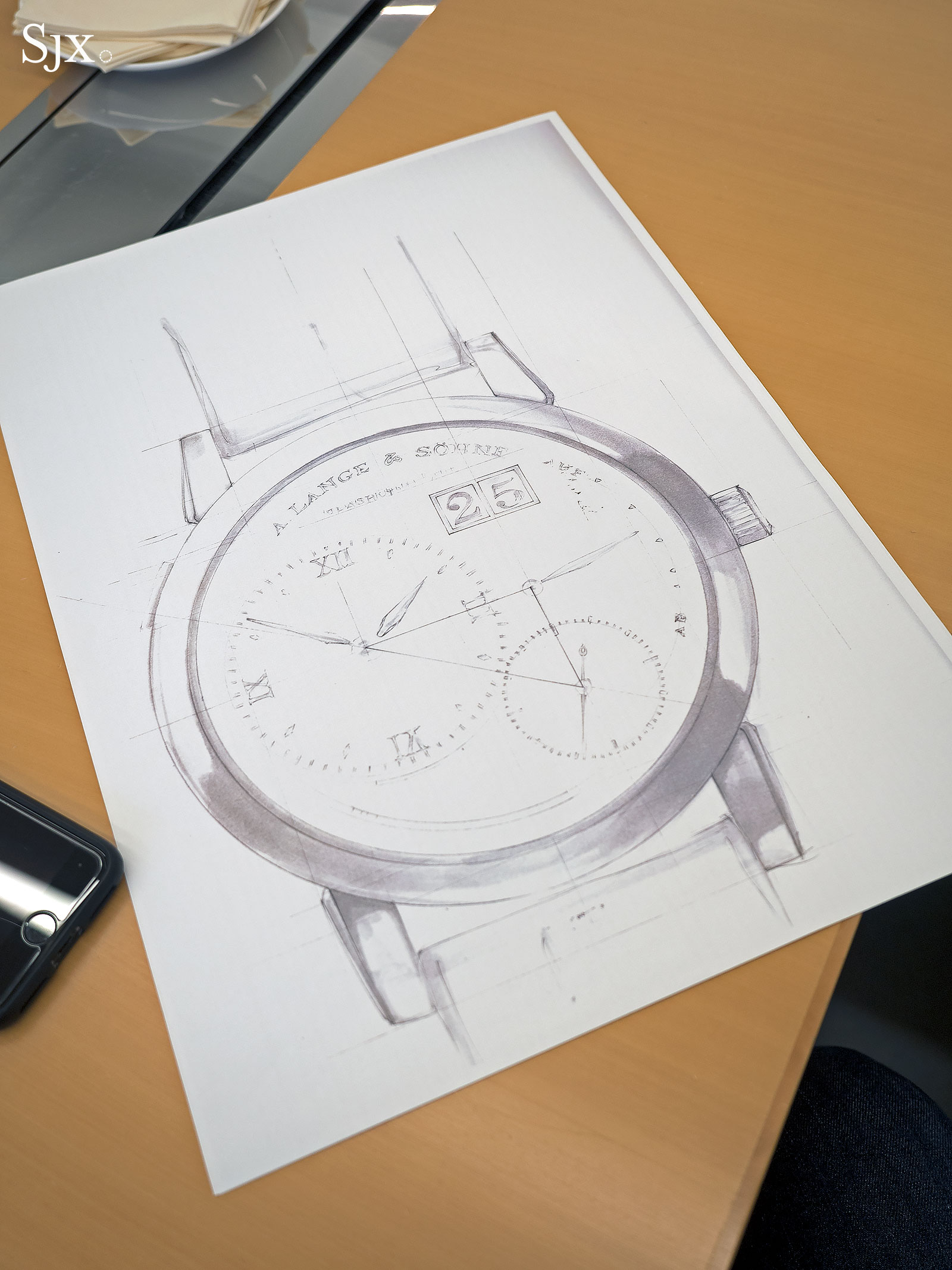
Anthony points out Lange goes to great lengths to keep its classics, well, classic. When the second generation Lange 1 was designed, the typeface was revised, although all the text on the dial remained identical.
“The new Lange 1 has much finer print than the old model,” says Anthony, “It has been refined, but the classic look remains.”
Coda
When Lange set out to make the best watches in the world in 1994, much of what it did drew on historical inspiration, like putting the chain and fusee mechanism in a wristwatch for the first time.
Yet Patrick says designers must never forget the forest for the trees. A critical challenge with such artisanal products like fine watches is keeping them relevant to today’s consumer. No matter how magnificently crafted, Patrick points out, watches have to be able to slip effortlessly into people’s daily lives. Otherwise watchmakers run the risk of becoming a “conservation effort… [of an] artefact”.
It’s a challenge the product development team at Lange is mindful of. “We want to modernise, but it cannot be forced,” says Anthony, “The Zeitwerk is an example of that – digital time indication but made traditionally.”
“Our people are influenced by the modern world, by reading, seeing things online, so some of it will go into the watches, but Lange watchmaking will always be classical.”
Video interviews produced with the support of A. Lange & Söhne.
Back to top.
