EDITORIAL: Why Fonts and Typefaces Matter in Watch Design
Typography is a minor but critical component of watch design that is often neglected; but the right font can work strikingly well, creating a whole that is greater than the sum of the parts.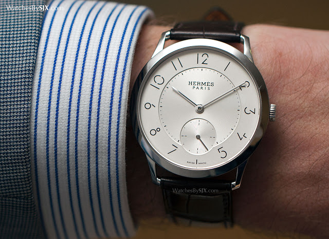
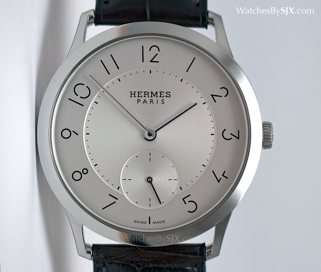
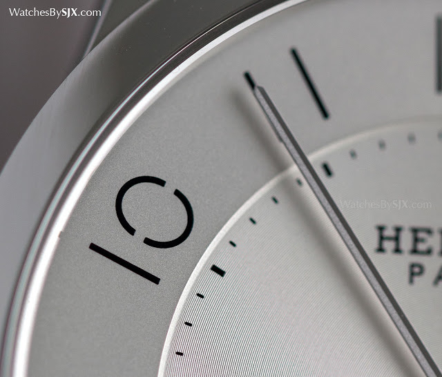
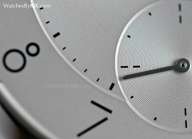
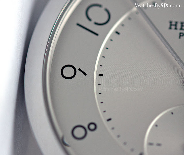
Fonts and typefaces are important. They can make or break a logo, or even tell a story. The same applies to typography on watch dials. In fact, good typography is usually a necessary, but not sufficient, factor in a good design. But sometimes not enough attention is paid to it. But when done correctly, typography can make all the difference in the world. Take for instance the recently introduced Slim d’Hermes. Because the Slim d’Hermes is a simple, time-only wristwatch, the devil really is in the details, which in this case is mainly about the typeface.
It’s no ordinary typeface. Hermes engaged graphic designer Philippe Apeloig, whose work is in the collection of MoMA, to create a custom font specifically for the line of timepieces. A brand with a widely admired aesthetic sensibility, Hermes’ attention to the font indicates its importance.
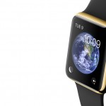
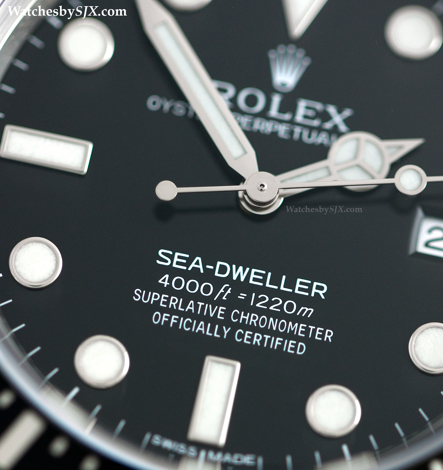
The typography on a dial often indicates an attention to detail. Apple naturally gave the Apple Watch has a custom designed font known as San Francisco. Nothing in a Rolex watch is unplanned or accidental, including the typefaces. Rolex highlights “Sea-Dweller” with capital letters, but also with a different font from the chronometer text below. (And of course in vintage Rolex collecting the obsession with fonts reaches new heights, not for aesthetics but to determine authenticity.)
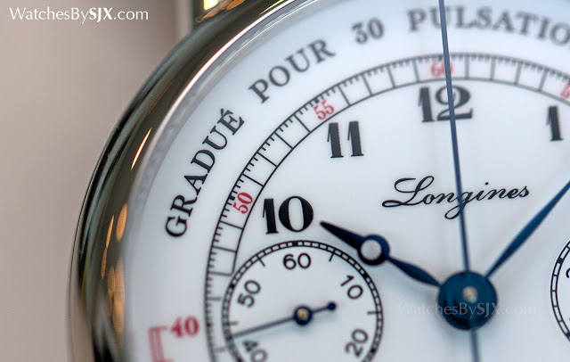
In historically inspired watches a period correct typeface is important as the Longines Pulsometer Chronograph demonstrates, being based on a 1920s singe-button doctor’s watch.
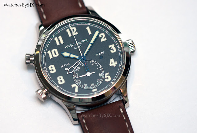
Sometimes dials can share the same typeface for historical reasons. The controversial Patek Philippe Pilot Travel Time Ref. 5524G is often likened to Zenith’s numerous pilot watches, but that can be reasonably explained by the fact that aviator’s timepieces from the 1930s had a generic look.
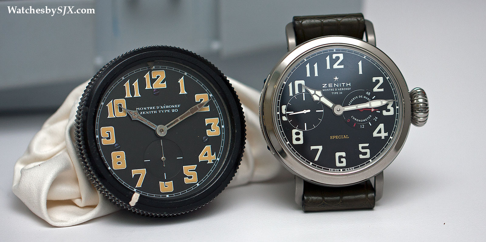 |
| Zenith aviator’s timepieces old and new |
The Patek does resemble the Zenith, not because it’s a copy, but because they are based on the same historical timepieces. In fact, many modern pilot’s watches either mimic the 1930s look with its distinctive numerals (as Patek and Zenith have done) or the later British air force watches as personified by the IWC Mark XI.
 |
| Patek Philippe Pilot Travel Time |
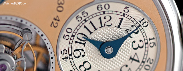
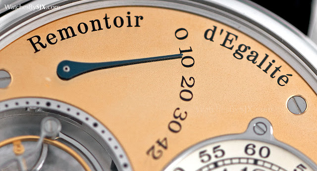
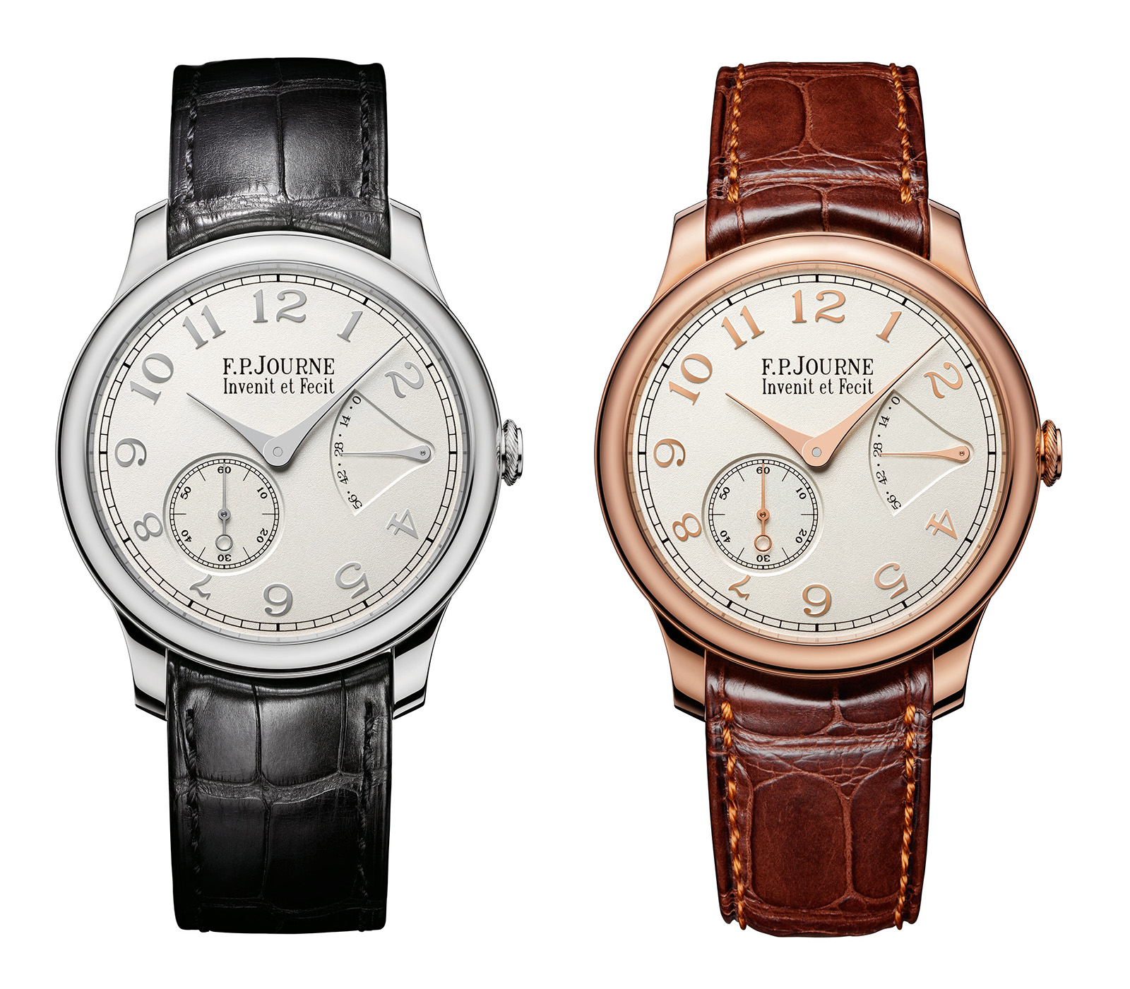
Fonts can also become synonymous with the brand, as with F.P. Journe. The same font is used for all its timepieces, even the sports watches like the Centigraphe Sport. It is difficult to imagine a Journe wristwatch with numerals in another typeface.
 |
| The F.P. Journe Tourbillon Remontoir d’Egalite |
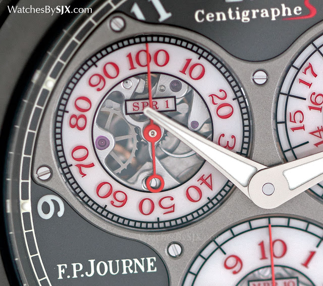 |
| Centigraphe Sport |
F.P. Journe is worth singling out not just for the font but also its size. Also notice how the hour numerals are reduced for seven and eight in the Chronometre Souverain, so as not to overlap with the seconds.
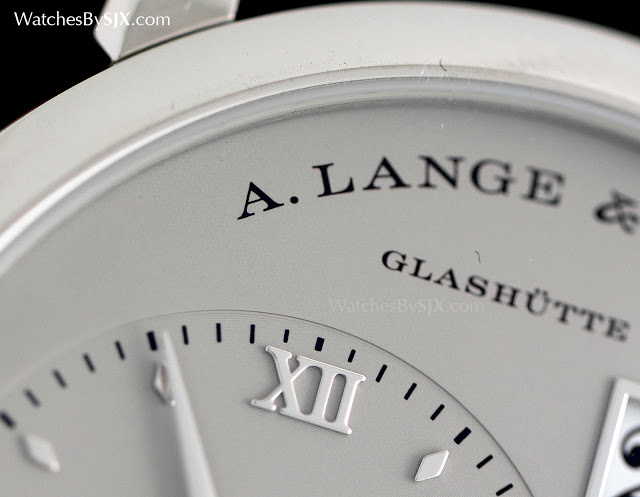
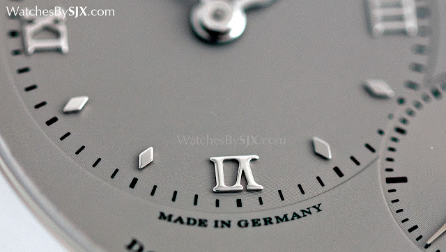
Another example of a brand that synonymous with its font is Lange, which uses the same serif font on all its dials, which suit the seriousness and technically inclined nature of the brand.
.jpg)
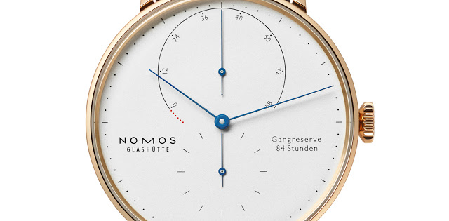
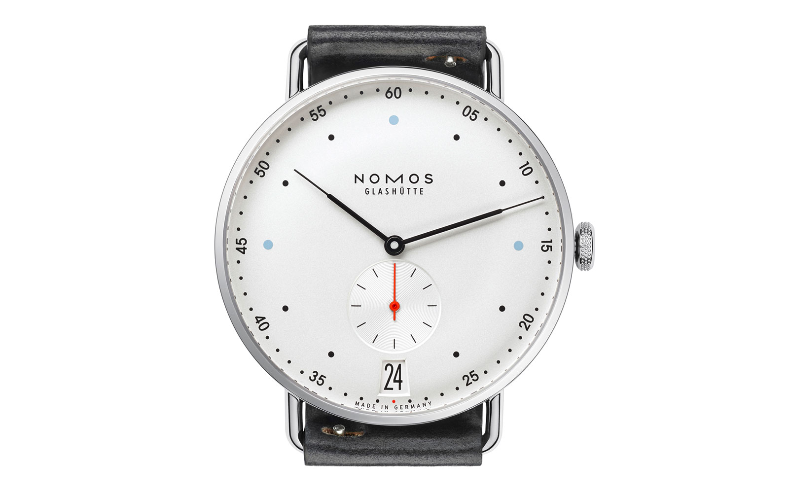
And Lange’s neighbour in Glashütte is equally cognisant of the importance of typefaces, particularly since Nomos timepieces are minimalist. Notice the elongated “M” in Nomos.
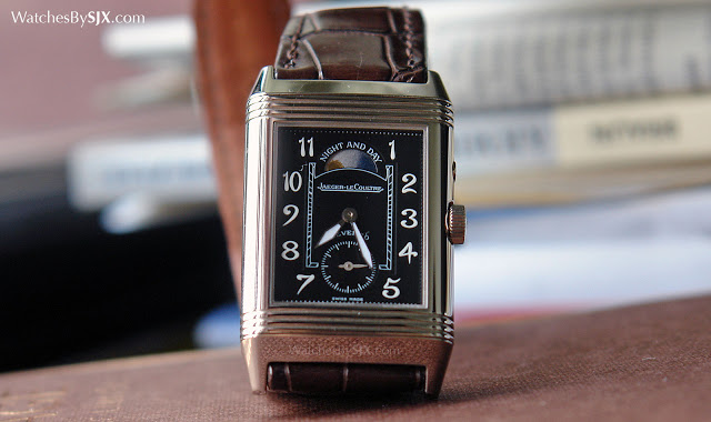
On occasion the font used can contradict the style of the watch to pleasing effect. Despite the Jaeger-LeCoultre Reverso being a distinctively Art Deco design, the Art Nouveau numerals found on certain models in the mid to late 2000s work extremely well. Nicknamed “Chinese” numerals, they resemble brushstrokes.
 |
| Jaeger-LeCoultre Reverso Duo |
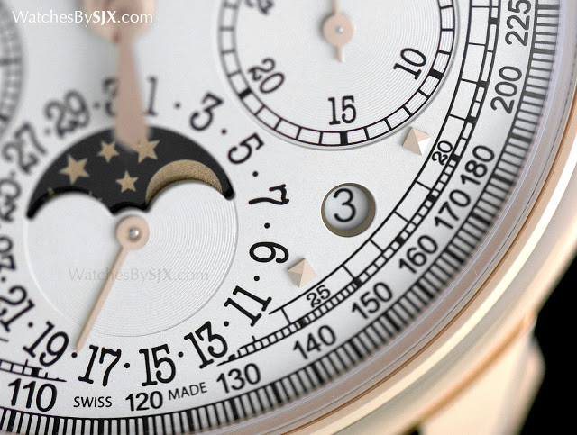
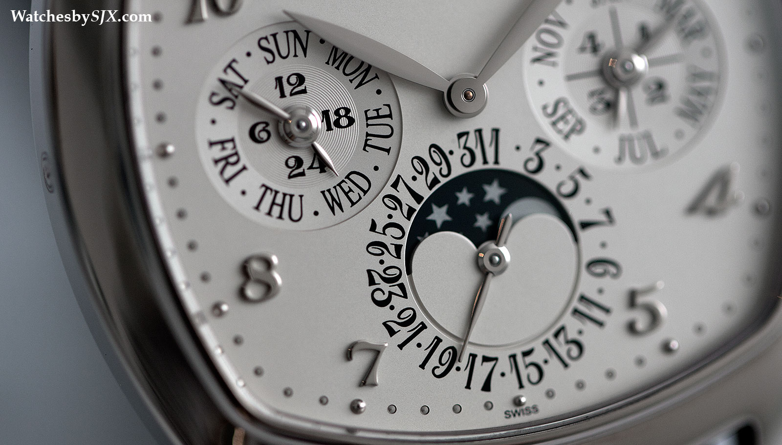
This pair of Patek Philippe perpetual calendars demonstrates how fonts make the difference to the whole. The Ref. 5270R chronograph with perpetual calendar appears more functional and legible – sensibly given the complexity of the dial – compared to the Ref. 5940G.
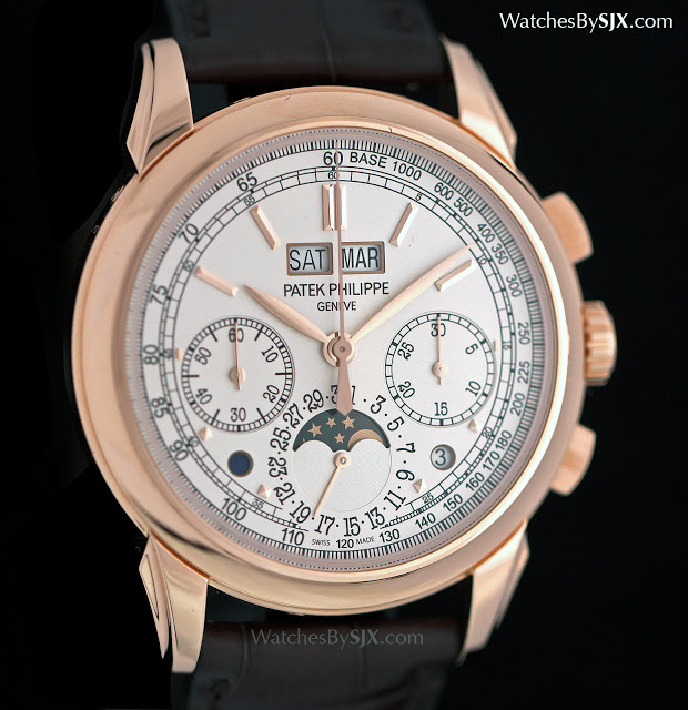 |
| Ref. 5270R |
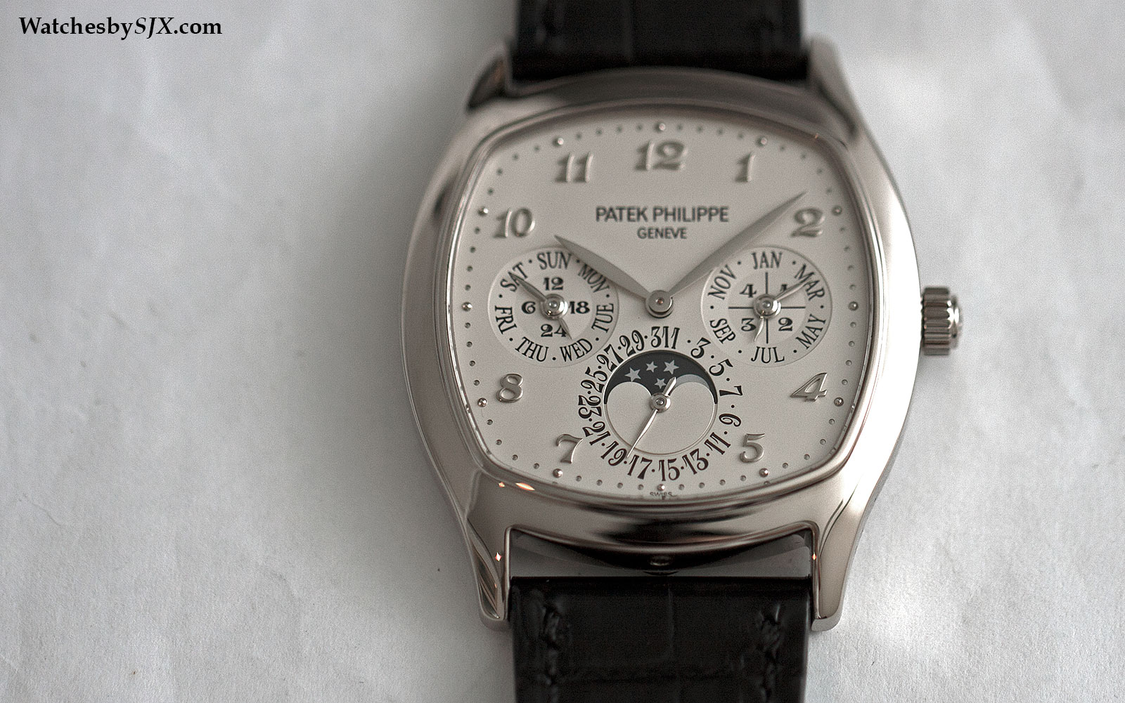 |
| Ref. 5940G |
Though the sub-dial at six o’clock performs the exact same function in both watches (date and moon phase), they look completely different.
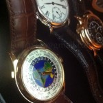
But sometimes Patek Philippe’s choice of fonts can be questionable.
.jpg)
.jpg) |
| Patek Philippe Ref. 5131J |
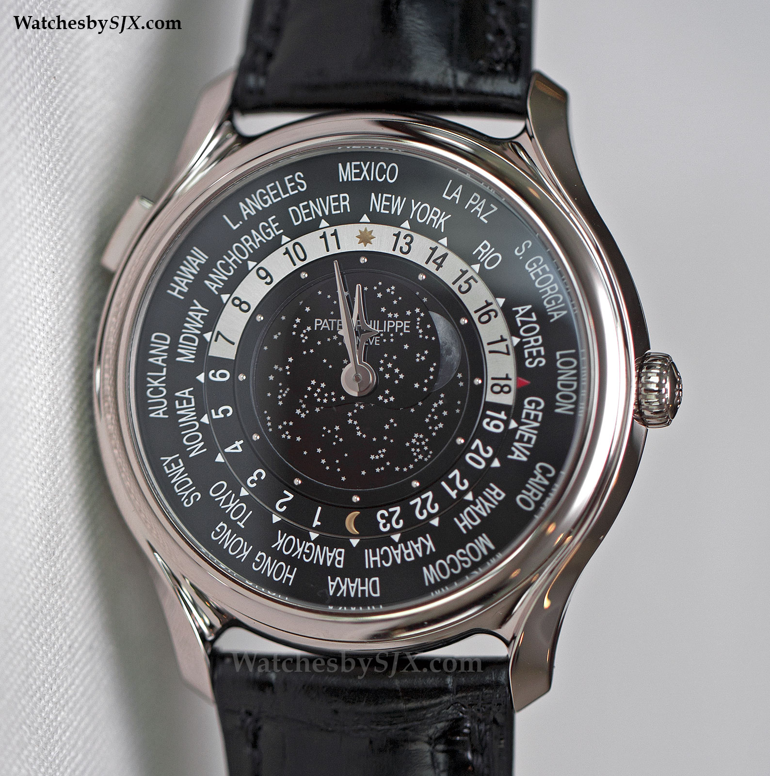
The italicised font for the Ref. 5131 cloisonné world time above contrasts with the no-nonesense, functional font used for the Ref. 5575G World Time Moon.
Some watches have fonts that just lack imagination, as on the Cartier Astrocalendar.
.jpg)
.jpg)
The bottom line: typography matters. Watch designers should remember that.
Back to top.