Recommended Reading: Deciphering the Typography and Fonts of A. Lange & Söhne
Award winning designer Larry Peh explores the evolution and use of typefaces in Lange wristwatches.
Founder of design agency &Larry, Singapore-based Larry Peh is the designer of SJX Watches and also an enormous fan of A. Lange & Söhne. A key intersection of watch design and Larry’s profession is typography, or the style and arrangement of the text on watches, front and back.
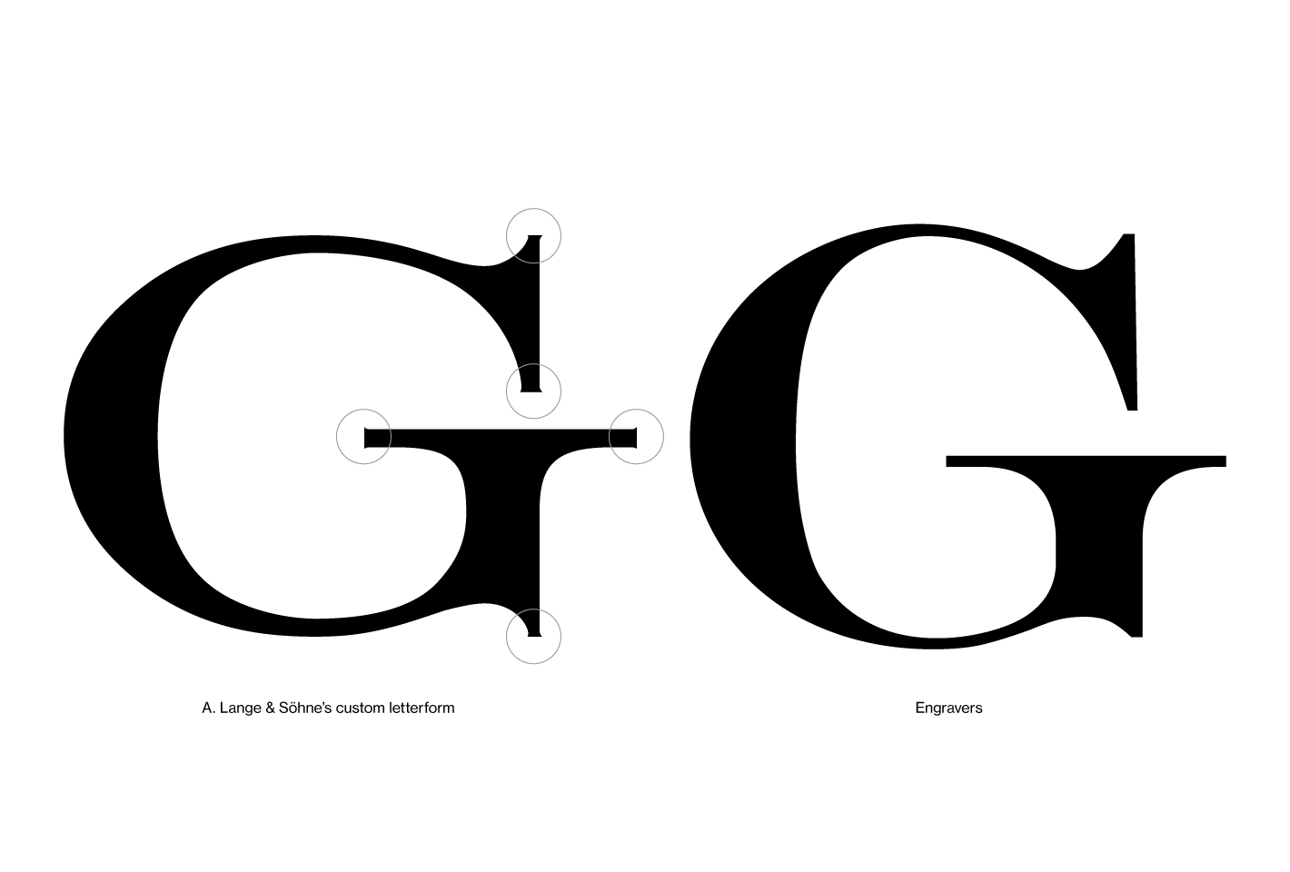
Larry has long admired the careful manner in which Lange scripts it watches, resulting in an in-depth investigation of the fonts used and how they have evolved since the watchmaker was revived in 1994. Though the font used by Lange is based on the serif Engravers typeface, it has been subtly but significantly tweaked for its timepieces.
The article is a fascinating exploration of a narrow but vital aspect of watch design, and includes Larry’s musings on how to improve typography in timepieces. Read Larry’s article here.
Back to top.