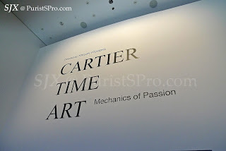
 Three days ago Cartier Time Art opened in Singapore. An amazing collection of 159 watches and clocks are on display at the lotus-shaped Art Science Museum in Marina Bay Sands until Feb 12, 2012.
Conceived by award-winning designer Tokujin Yoshioka, Cartier Time Art spans the company’s history as a watchmaker and includes the earliest known Cartier timepiece, a chatelaine watch dating from 1874.
.jpg) |
| The Art Science Museum at Marina Bay Sands |
.jpg)
An incredible selection of timepieces is on display, demonstrating Cartier’s history as a watch and clock maker.
.jpg) |
| Cartier chatelaine watch c. 1874 |
.jpg) |
| Egyptian Temple Gate striking clock |
.jpg)
.jpg)
.jpg) |
| Egg shaped clock in guilloche enamel |
.jpg) |
| Portico Mystery Clock |
.jpg) |
| The Billiken figure that sits on the Portico clock |
.jpg) |
| Screen Mystery Clock |
.jpg) |
| The classic Model A Mystery Clock |
.jpg) |
| Jump hour pocket watch with rock crystal case |
.jpg) |
| Tortue minute repeater |
.jpg) |
| Tank Cintree |
.jpg) |
| Crash |
I managed to see the exhibition on the morning before the press conference, meaning I was fortunate to be amongst the first people in the world to see this fantastic show. My comprehensive photo report on the exhibition, with over 200 photos, is on the Cartier forum I moderate.
– SJX
Back to top.

 Three days ago Cartier Time Art opened in Singapore. An amazing collection of 159 watches and clocks are on display at the lotus-shaped Art Science Museum in Marina Bay Sands until Feb 12, 2012.
 .jpg)
.jpg)
.jpg)
.jpg)
.jpg)
.jpg)
.jpg)
.jpg)
.jpg)
.jpg)
.jpg)
.jpg)
.jpg)
.jpg)
.jpg)







.jpg)
.jpg)
.jpg)
