Inside the Patek Philippe Service Centre in Singapore

A commitment to longevity.

Patek Philippe is one of the most revered watch brands but an outlier amongst its peers in relying almost entirely on independent retailers to sell its watches. Of the hundreds of Patek Philippe points-of-sale around the world, the brand owns just three.

But the converse is true for its after-sales service where the brand is almost entirely vertically integrated. Patek Philippe will soon own and operate ten service centres in key cities around the world, backed up with four of its own watchmaking institutes. The Geneva watchmaker does this to fulfil its pledge of being able to repair and maintain “all timepieces ever made by Patek Philippe since production began in 1839”.

Consolidation and consistency

In pursuit of a uniformly high standard of service across the world, Patek Philippe is in the process of consolidating its service network from a peak of 59 service centres worldwide, some of which were run by independent retailers, to just ten key locations.

Amongst the regional centres are one each in Germany, France, and the United States, but most will be located in Asia – the brand’s biggest market – in China, Hong Kong, Japan, Taiwan, and Singapore. All of the ten will be run by Patek Philippe itself, or more specifically, its regional subsidiaries.

The Singapore service centre, for instance, is run by Geneva Master Time (GMT), Patek Philippe’s subsidiary for Southeast Asia. GMT also has a smaller service centre in Bangkok, a necessity given that Thailand is amongst the brand’s ten largest markets worldwide.

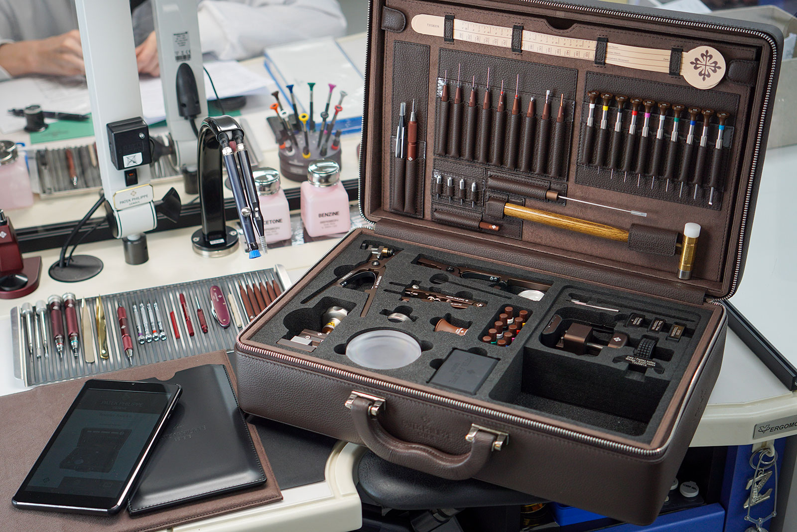
The condensed watchmaking kit given to all Patek Philippe points-of-sale that allows staff to perform simple tasks like changing straps and sizing bracelets. Notably it includes a custom-made tool to neatly slice the rubber strap for the Aquanaut.

The scale and resources of Patek Philippe also means that the brand has its own training regimen for its watchmakers and service centre personnel. Four Patek Philippe Institutes, located in Geneva, New York, Shanghai, and Singapore, dispense knowledge across the spectrum of watchmaking. They conduct training for specialties ranging from case polishing to minute repeater repair.

But arguably the most fundamental work of the four institutes is training watchmakers from scratch. Starting as apprentices – as Rexhep Rexhepi of Akrivia did as a teenager – would-be watchmakers undergo a two-year programme to qualify them as a watchmaker. The graduating class of 2022 from the Patek Philippe Institute in Singapore comprised five watchmakers, two from Singapore and three from Thailand, who will then go on to the service centres in each country.

A walk around

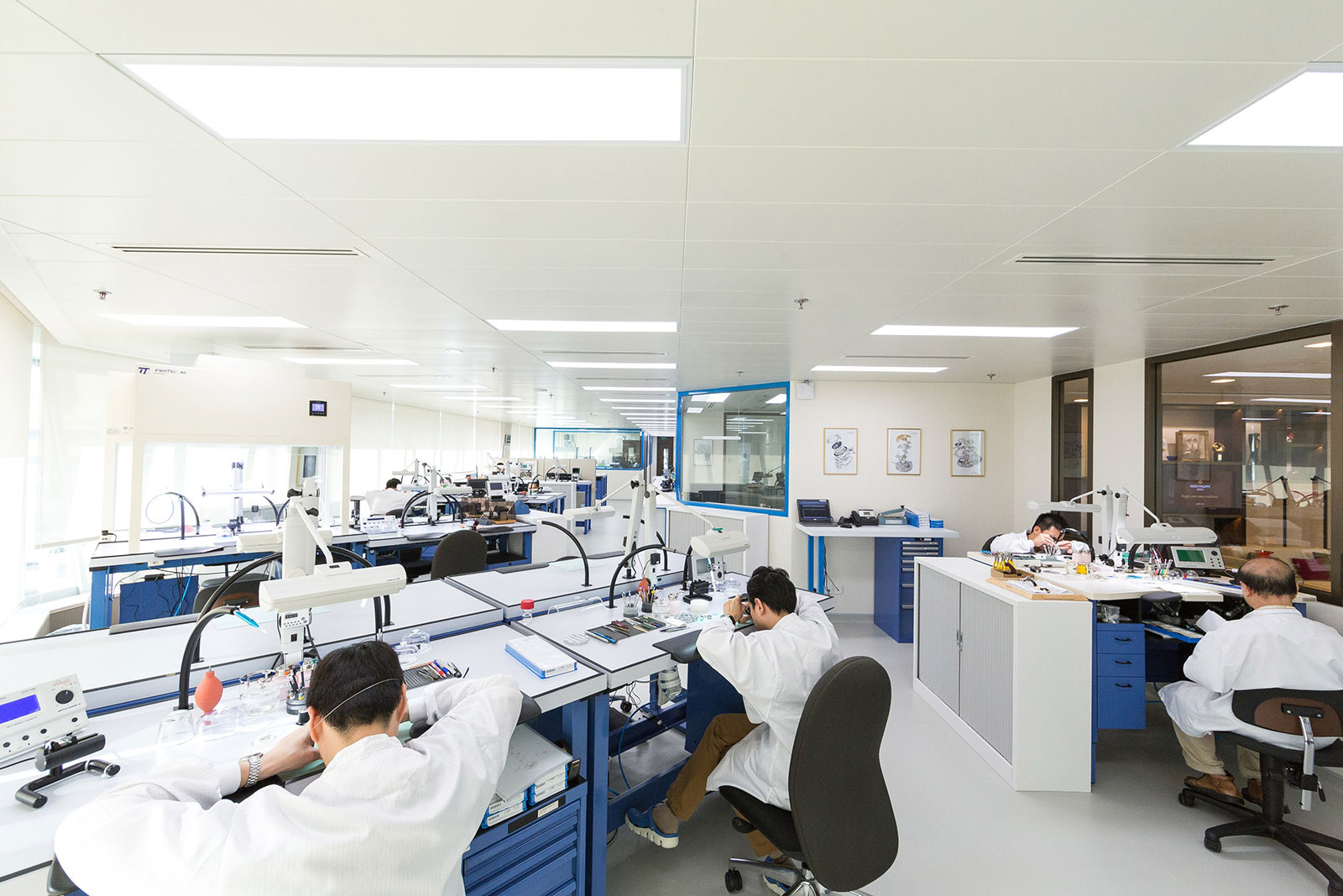
To illustrate the depth and breath of Patek Philippe’s service centre in Singapore, a handful of journalists were recently taken on a tour of the facility. The tour guide was Gerald Then, an industry veteran who’s the brand’s Regional Customer Service Manager.

Since 2015, the service centre has been located on the 16th floor of Wheelock Place, a mall along Singapore’s main shopping strip. The Singapore service centre can be summed by in a few numbers:

  • 10,000 is the number of spare parts, straps, and other items in the service centre’s inventory
  • 4,200 watches taken in annually, 60% of which undergo a full service
  • 400 square metres, or over 4,000 square feet
  • 55 operations to polish a Nautilus case and bracelet, the most laborious across the brand’s watches
  • 21 technical personnel, mostly watchmakers but also a pair of polishing specialists, along with eight support staff
  • 10-15% growth in volume of watches serviced a year
  • 7 levels of training from time-only with calendar to perpetual calendar with retrograde date
  • 7 hours is required to service a basic watch with time and date, starting with disassembly and ending with casing
  • 4 hours is what it takes to polish a platinum case, compared to 60-90 minutes for a similar case in gold

To ensure globally consistent service, the Singapore outpost operates on a set of procedures and processes that are similar across all of Patek Philippe’s service centre according to Mr Then.

For instance, each service centre can only service watches up to a certain level of complexity. In Singapore that is “Level Advanced Module C”, which means a manual-wind chronograph movement. Anything more complicated, which includes the chronograph with perpetual calendar, has to be returned to Geneva.

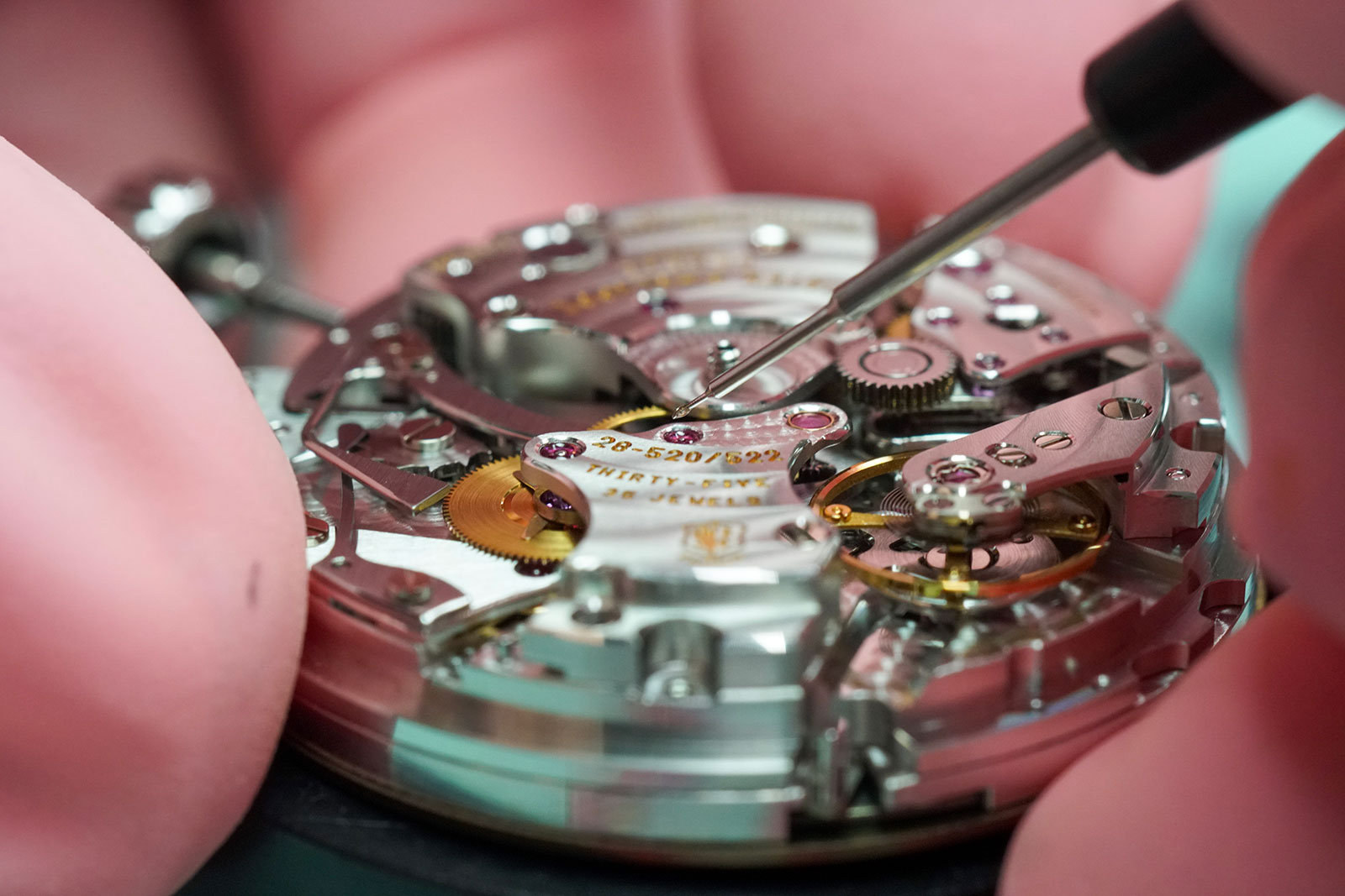
The automatic chronograph cal. 28-520 that’s amongst the calibres serviced in Singapore

All watches that can be serviced at a regional service centre should be serviced locally, with a few exceptions.

They include a client expressly requesting servicing in Geneva with good reason, or vintage watches made dating from before the 1970s. Watches that also require replacement parts that have to be fabricated from scratch are also returned to Geneva.

Every watch serviced in Geneva, however, is still tested over several days after it returns to Singapore, just in case something goes amiss during the trip back.

Minute repeaters are serviced in Geneva…

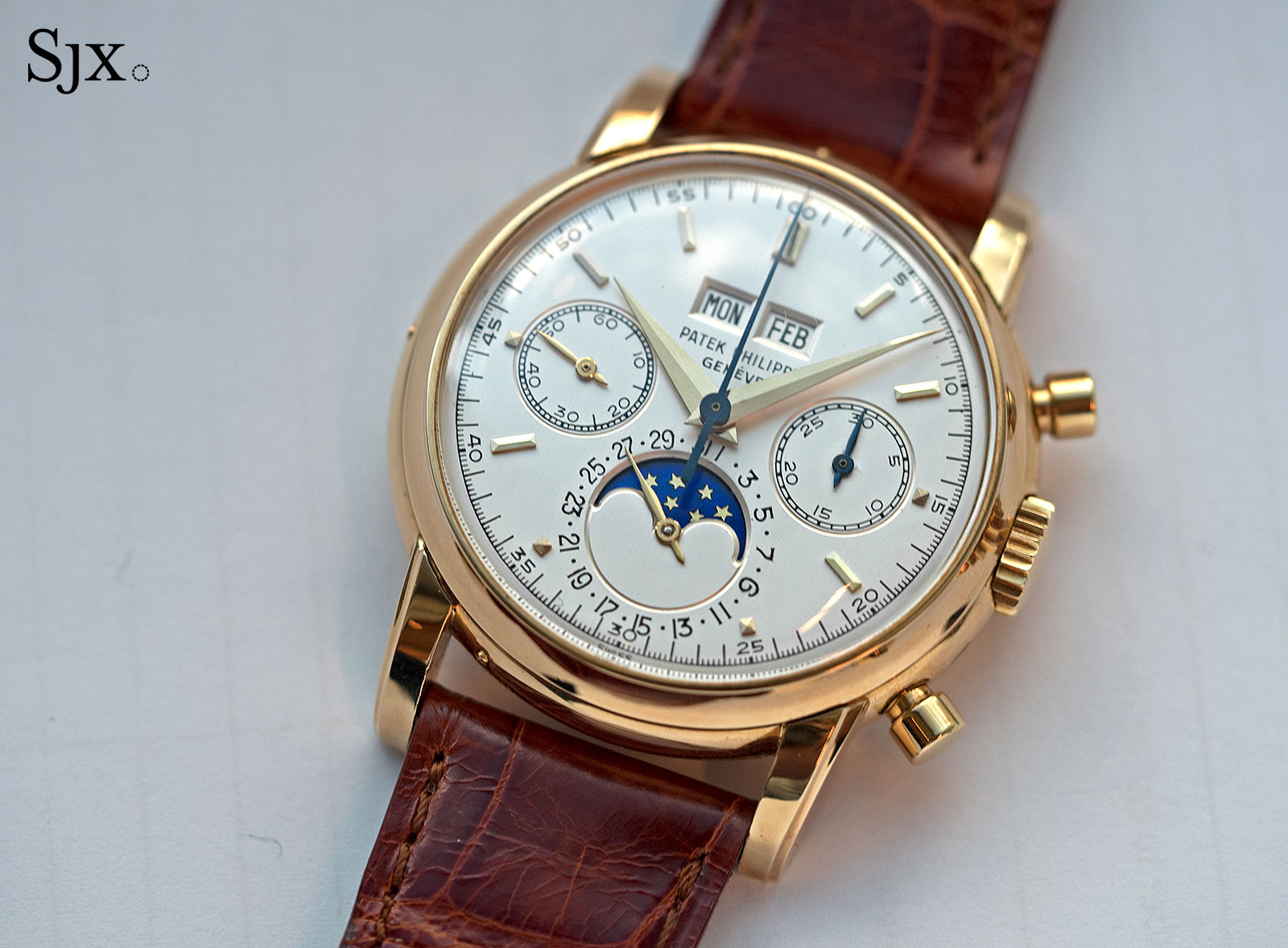
As are vintage watches like this ref. 2499, regardless of complexity

But regardless of whether servicing is done at a regional service centre or back in Geneva, it is performed in a same way thanks to rigorous training and thorough guidelines. Functional upgrades to a movement, for example, are applied to every watch. Such upgrades would include wheels with new teeth profiles for instance.

In fact, mechanical or technical upgrades are mandatory according to Mr Then, who adds that this ensures that watches that have been serviced will function as best as possible. On the other hand, cosmetic upgrades or fixes are optional.

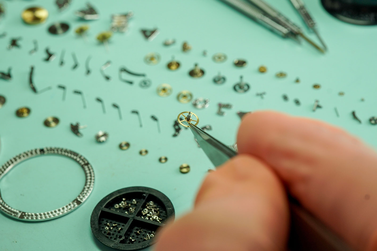
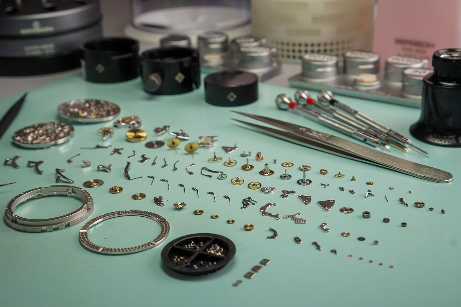
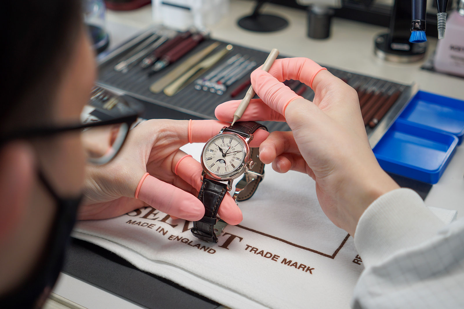
But despite the guidelines all of the watchmakers have to follow, their job is not merely exchanging parts. Replacing parts in complicated calibres usually entails substantial manual adjustment and finishing for the new component to fit seamlessly.

One of the most labour intensive jobs in the service centre is polishing, which is done by two ladies who have almost 50 years of polishing expertise between them. Both graduated from the 18-month polishing course conducted by Patek Philippe.

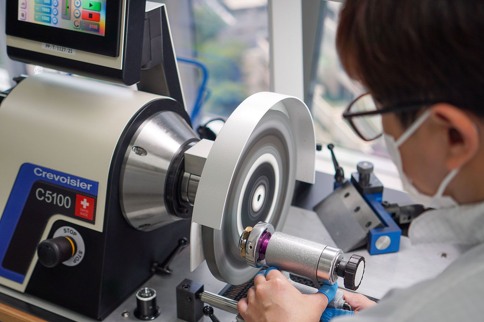
Armed with a variety of abrasive pastes, polishing wheels, masking tape, and a blasting cabinet, the pair polish watches of all metals. But gem-set timepieces or watches that require laser welding to fill in dents are not within their repertoire, instead these have to be worked on in Geneva.

According to the senior polishing specialist, the most complex case to refinish is the Nautilus, while the most challenging metal is platinum. She explains that her job is essentially to leave a watch looking as new as possible without changing too much the geometry or edges of the case or bracelet.

Fifty-five steps to achieve this famous form

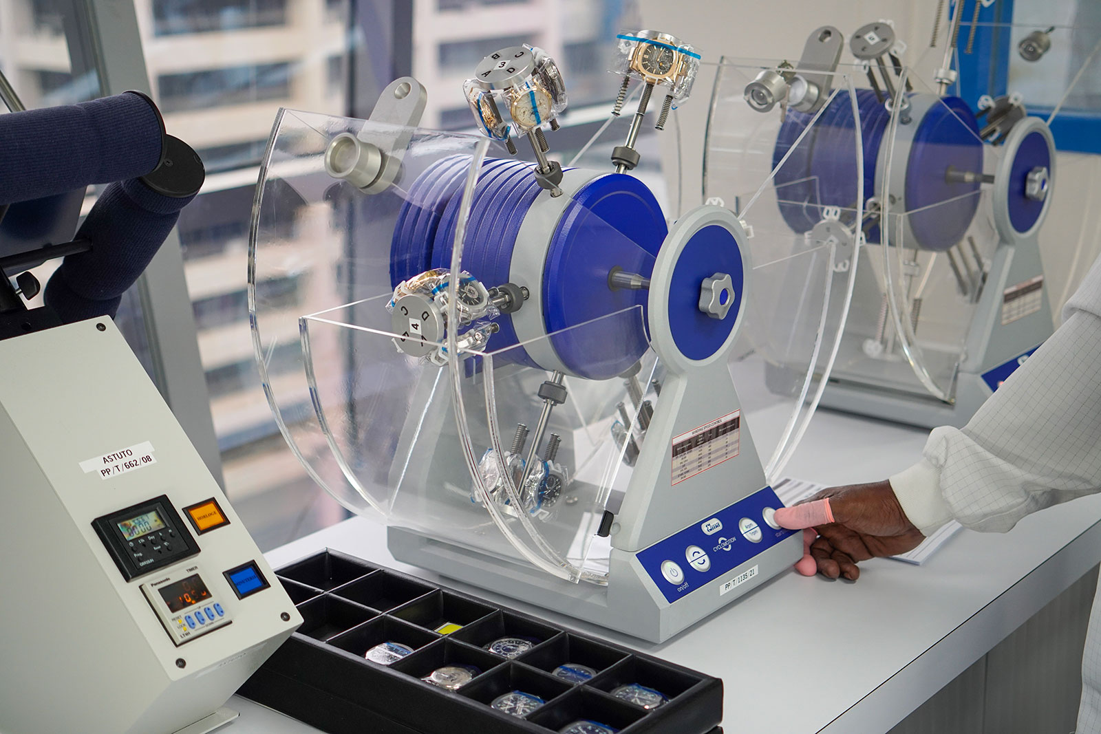
Polishing is usually the final stop in the service centre before quality control – every watch has to run within -3/+2 seconds a day to pass.

Broadly speaking, quality control is a seven-step process, but it varies on the complexity of the watch. A perpetual calendar, for instance, is tested to ensure that all calendar indications change within the specified window, with all calendar hands aligned within fixed tolerances.

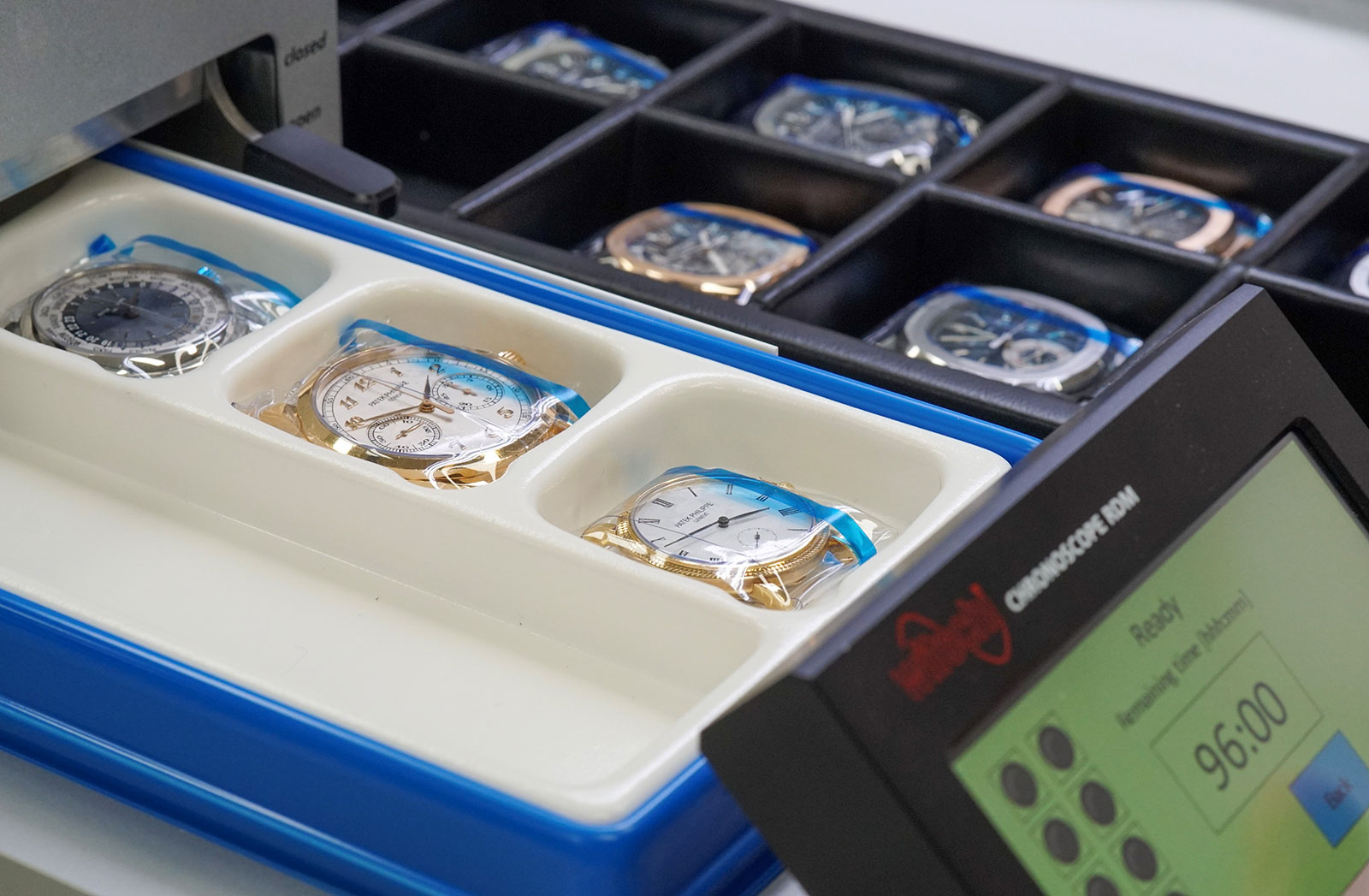
Once a watch has passed quality control, it is sealed in the (in)famous Patek Philippe plastic wrap and then boxed.

This packaging, however, is fleeting, like tears in the rain. The sealed bag is cut open before the watch is handed back to the owner.

Parting thoughts

The integration and consolidation of Patek Philippe’s after-sales service is an endeavour that will surely translate into an offering that is consistently high quality regardless of geography.

Granted, some enthusiasts and collectors might gripe at the standardised processes that leave less room for individual requests. For instance, the only option to fix a scratched bezel might be polishing rather than replacement.

But brand’s considerable investment in after-sales service is a testament to the brand’s commitment to doing more than just getting watches out the door. “Restoring our watches is just as important as the competence needed to craft new watches,” says Patek Philippe president Thierry Stern – a belief that takes tangible form in the constellation of service centres around the world.


Back to top.

You may also enjoy these.

The SJX x Kudoke “Zodiac” Nominated for GPHG 2022

A contender in "Artistic Crafts".

The preeminent – and perhaps only international – awards for watchmaking, Grand Prix d’Horlogerie de Genève (GPHG), has just announced the competing timepieces of 2022. We are please that one of own editions, the Kudoke 2 “Zodiac”, is competing in “Artistic Crafts”.

Created last year for the 10th anniversary of SJX Watches, the Kudoke 2 “Zodiac” is a candidate alongside marques like Voutilainen and Hermes in a category that calls for “exceptional mastery of one or several artistic techniques such as enamelling, lacquering, engraving, guilloché (engine-turning), skeleton-working, etc.”

The Zodiac is all about engraving – done by hand naturally – with both the front and back decorated in relief and textures. Both the dial and movement are fully engraved by the hands of the skilful artisans at Kudoke. The hand engraving is extensive and complete, with is nothing on the dial or movement that is engraved by machine – even the brand name on the dial is executed by hand.

But the Zodiac is more than just artisanal technique. It is also an artistic creation: the hour symbols on the dial were commissioned especially for the watch and drawn by Canadian illustrator Lee Yuen-Rapati, who’s now the in-house designer at Fears. He cleverly combined both a sign of the zodiac and Roman numeral into each hour markers. The marker at ten, for instance, is Aquarius but also contains “X”, the Roman numeral for “10”.

To echo the celestial theme on the front, the movement decoration was similarly designed by Mr Yuen-Rapati. The three-quarter plate bears a motif incorporating symbols of the zodiac on a stylised cosmic background.

The hours are represented by custom zodiac symbols designed specifically for this watch

The finalists in each category will be selected by members of the GPHG Academy and announced in September. And the winners being selected by the jury in November, just before the awards ceremony in Geneva on November 10, 2022.

For the full list of competing watches in all categories, visit gphg.org.


Back to top.

You may also enjoy these.

Equation of Time Introduces the Fat Arrow Collaboration

A multitude of arrows, broad and thin.

Conceived sub-brand of RGM, one of the original independent watchmaker in America, Equation of Time is a maker of affordable watches often created in collaboration with collectors, with the latest being the Fat Arrow Collaboration Watch.

The dial of the watch reproduces a 2015 artwork created by watch photographer Atom Moore that’s a riff on the pilot’s wristwatches supplied to the Royal Air Force in the 1950s by brands like Omega and IWC. Like the military-issue originals, the Fat Arrow Collaboration is a compact, hand-wind timepiece with the feel of a vintage remake, but st apart with a dial that’s clearly modern and definitely original.

Initial thoughts

The Fat Arrow Collaboration (FAC) is one of many watches inspired by vintage military timepieces, but it is cleverly different. It utilises the historical arrow emblem used to mark British military equipment as a decorative element.

Mr Moore’s original artwork, Fat Arrow, is an artistically-altered photography of a CK 2777 “Fat Arrow” wristwatch, one of many that Omega supplied to the Royal Air Force starting in 1952. The FAC retains the feel of the vintage original with an identically-sized case, but with Mr Moore’s Fat Arrow mashup as the dial. That makes the FAC different enough, in fact, to be interesting despite being a no-frills watch.

Fat Arrow by Atom Moore

The dial is covered with both the “Fat Arrow” and “Thin Arrow” in all their respective iterations. That might sound excessive, but it achieves what the FAC sets out to be: something lighthearted that’s rooted in military-watch history but different from its vintage-inspired peers. Military-watch enthusiasts appreciate the vintage original – and have a sense of humour – will find this interesting.

The FAC is priced at US$2,995, which is affordable but fairly steep compared to similarly priced watches, many of which have superior movements (the FAC is powered by a manual-wind Sellita). However, the small-batch nature of the FAC – it’s a run of just 99 watches – along with its creative aesthetics make it unique enough that’s it’s appealing.

Broad Arrows

Military equipment owned by the British military, including all wristwatches supplied to the Royal Air Force (RAF), were historically marked with a broad arrow. This practice began in the 16th century and continued until the 1980s. As a result, all of the best known British military timepieces sport the broad arrow on their dial or case back, or both.

The size and style of the broad arrow has varied over time. Mr Moore selected five different styles of the broad arrow for his artwork, with the most prominent being the “Fat Arrow”. The repeating motif is one that Mr Moore has used to good effect on his other work as well.

Omega originally delivered the CK 2777s with “Thin Arrow” dials, most of which were later replaced with dials bearing the “Fat Arrow” after the luminous material was upgraded from radium to tritium.

The  vintage watch depicted in Fat Arrow was an example with a tritium dial bearing a “Fat Arrow” above six o’clock. In a nod to that, the “Fat Arrows” on the dial are printed in Super-Luminova so they glow in the dark.

Despite the fancy dial, the rest of the watch is no-frills and compact. The case is just 36 mm in diameter, just like the CK 2777. But while the vintage original was entirely brushed, the FAC can be had with its bezel and crown in either a brushed or polished finish. While that might be seemingly trivial, the finishing of the bezel in particularly is crucial in the overall appearance of a watch.

Inside the case is a Sellita SW-210, a small, hand-wind movement based on the ETA 2801-2. It’s gently dressed up with Geneva striping on the bridges as well as blue screws, which gives it a bit of colour and justification for the open back.


Key facts and price

Equation of Time Fat Arrow Collaboration Watch

Diameter: 36 mm
Height: 12 mm
Material: Steel
Crystal: Sapphire
Water resistance: 50 m

Movement: SW-210
Functions: Hours, minutes, and seconds
Frequency: 28,800 beats per hour (4 Hz)
Winding: Automatic
Power reserve: 42 hours

Strap: Fabric strap with pin buckle

Limited edition: 99 pieces
Availability: Now from Equation of Time with delivery starting in September 2022
Price: US$2,995

For more, visit eotwatches.com.


Correction July 26, 2022: Fat Arrow was created in 2015, and not 2021 as stated in an earlier version of the article.

Back to top.

You may also enjoy these.

Up Close: Yosuke Sekiguchi Primevère Prototype

Classical inspired and exceptionally executed.

Though born in Japan, Yosuke Sekiguchi is steeped in the tradition of Swiss watchmaking. He moved first to France and then Switzerland some two decades ago, and is today fluent in French and skilled at watchmaking.

After a career at complications specialists like Claret and La Joux-Perret, Mr Sekiguchi established his own brand in 2020 with the goal of building a historically-inspired timepiece of extremely high quality. The concept is a familiar one that has been interpreted in various ways by others, but Mr Sekiguchi arguably succeeds far better in both paying tribute to the historical inspiration and achieving impressive, artisanal quality.

His first watch is the Primevère, which made its debut just earlier this year. It is an elegantly designed and clearly rooted in 19th century pocket watches, but also novel in several ways, reflecting Mr Sekiguchi’s unusual approach to the concept. Amongst other things, it is robustly constructed and larger than such wristwatches typically are. And while the movement resembles its vintage inspiration, it is fabricated and decorated in a finer, more artisanal manner than the 19th century original.

NB: The Primevère pictured here is the first complete prototype with a gold-plated case, so it still reveals several obvious imperfections in the movement decoration. Mr Sekiguchi promises the the final product will be perfectly finished and I believe that it will be.

Initial thoughts

Although it appears to be a pocket watch reproduction, the Primevère is an interesting proposition. Watches with comparably classical movements typically use vintage ebauches, as Atelier de Chronometrie does for instance.

In contrast, the movement in the Primevère is a modern-day calibre constructed to resemble a vintage movement that’s also fabricated and finished by hand. In fact, the movement looks like a vintage pocket watch calibre at a distance. Only a closer inspection reveals that it’s a modern creation that’s more refined and sophisticated than the original in its details.

Besides the artisanal quality of the watch, its most apparent feature is its size. Even though the Primevère is not a large watch, it feels substantial. But dimensions of the watch make sense given its inspiration, which is a vintage pocket watch re-cased into a wristwatch.

The adherence to historical inspiration – but executed to an even higher level than the original – is an approach that is distinctly Japanese. It’s the same approach taken by Japanese artisans who make highly desirable products in other categories, ranging from Native American jewellery to English leather goods to fountain pens.

With that in mind, the only reasonable criticism that can be levied against the Primevère is its lack of novelty, which only matters to someone who wants something that is obviously 21st century. The Primevère is a handsome and beautifully finished watch, but it does resemble an antique.

Fortunately for anyone who wants something more modern looking, the Primevère is available in other variants that do look more contemporary, like the black enamel dial for example.

That said, it is still a compelling watch because in terms of execution and quality, the Primevère certainly lives up to its ambitions and also easily justifies its price.

At about US$57,000 in steel and about 10% more in gold, the Primevère is modestly priced considering to its artisanal manufacture and high quality. And compared to the general price level in today’s frothy market for independents, it is something of a value proposition.

Variants of the Primevère in steel (left) and pink gold

The inspiration

For those with an interest in vintage Swiss pocket watches, the Primevère movement might seem familiar. That’s because Mr Sekiguchi modelled it on the so-called “Jürgensen” calibre.

Distinguished by its bridges with rounded ends, elongated regulator index, and long pallet fork, the Jürgensen calibre was actually a generic style popular in the mid 19th century according to watch expert Philip Poniz. For that reason says Mr Poniz, it is more correctly known as calibre ponts arrondis or calibre ponts ronds, which translate as “movement with rounded bridges”.

The Primevère (left) and the re-cased Jürgensen movement from 1871

The style of movement sold well enough during that period that it was produced by a number of movement makers and found in watches made by a variety of brands, including Jules Jürgensen.

Mr Sekiguchi’s inspiration was an 1871 Jules Jürgensen pocket watch that he restored and then re-cased into a wristwatch. That re-cased timepiece because the basis for the Primevère, which retains the overall style but executed with more sophistication and finer details.

The re-cased watch has more prominent lugs as well as hands obtained from Urban Jürgensen

With obviously modern proportions and heft, the Primevère (left) is thicker and more substantial in all respects than the re-cased watch

Classical styling

Interestingly, its proportions give it a sturdy, robust appearance. Even though the watch pictured has a gold-plated case, it still felt solid in hand.

It measures 39.5 mm in diameter and 12 mm high – relatively large for this type of watch. This was intentional according to Mr Sekiguchi, who wanted to recreate the robustness of the vintage Jürgensen pocket watch.

But the elegant form and details of the case are immediately obvious. The soldered lugs are gently curved, as is the tall and subtly concave bezel. Even the case back is finely executed with its domed shape that ends in a polygonal screw-down back.

Mr Sekiguchi designed the case, but turned to Stila for its manufacture. Located in La Chaux-de-Fonds, Stila is a well-known maker of cases and its director, Julien Vallon, also happens to be the owner of Juval Horlogerie, the vintage watch store that is one of two retailers of the Primevère, the other being Koyanagi in Japan.

Email grand feu

The natural choice of dial for the Primevère is an old-school fired enamel dial. And so it is – a two-parter in glossy enamel with Roman numerals, a railway minute track, and typography that would not look out of place in the 19th century.

Like the case, it was designed by Mr Sekiguchi but produced by a specialist, this time Donze Cadrans, one of Switzerland’s biggest maker of enamel dials.

While the dial might seem to be a generic pocket watch face at a glance, it features several tasteful details. One is the proportions of the Roman numerals – they are narrow and tall, which emphasises the elegance of the design. Another is found on the subsidiary seconds, namely the quirky dots to mark the five-second intervals.

And the same can be said for the hands, which are hand made by Mr Sekiguchi. He uses a saw and file to form the shape, then polishes and rounds them. They resemble hands found on high-end vintage pocket watches, except scaled down to fit a wristwatch.

The seconds register is soldered to the main dial

The brand’s logo is heavily retro in its ornate italic style but it suits the aesthetic of the watch perfectly

The hand-made spade hands

The “Jürgensen” calibre

The quality of Mr Sekiguchi’s work is most apparent in the movement, which is almost entirely made by him with traditional techniques. The bridges, for instance, are cut with a saw and then decorated. One of the few components not made by him is the pallet lever.

His goal when building the movement was not only to replicate the style of the calibre ponts ronds, but to create a movement with the solid construction of vintage pocket watch calibres. The movement looks the part: even though it is elegantly designed with several refined details, it looks robustly constructed with notably thick bridges.

While the overall aesthetic certainly sticks closely to the calibre ponts ronds style, the movement has been refined with both impeccable finishing and a handful of decorative flourishes. Despite this being the first prototype, the movement decoration is excellent.

All of the defining elements of the calibre ponts ronds are present. The bridges are arched and rounded, but feature neater forms and sharper outlines than the vintage original. While some vintage pocket watches with this style of movement look like mid-range watches at best, the calibre inside the Primevère is evidently precise and refined in its construction as well as design.

The same is true for the details. More slender than that on the vintage original, the elongated regulator index is in black-polished steel. The pivot jewels for both the escape wheel and pallet lever are secured by gold caps, which are echoed by the gold chaton for the centre wheel jewel.

The keen eyed will spot the bimetallic balance wheel, an antiquated element that will not be found on the production version of the watch. Mr Sekiguchi reused the balance from a vintage pocket watch for the prototype, but will instead use a balance wheel of his own design for the production watch.

Similarly, the jewel bearings used in the prototype are “new old stock” vintage parts. But unlike the balance wheel, the vintage rubies will also be used in the production version.

Made by Mr Sekiguchi himself using manual methods, namely a saw and file, the bridges are German silver and finished with a fine, circular brushed graining. The brushed finish is perhaps the finest example of this style of decoration I have seen.

The most intriguing aspect of the bridge finishing is the direction of the graining. Instead of being consistent on each bridge and radiating from the centre wheel as is convention, the graining echoes the most prominent edge of each bridge. As a result, the graining goes in different directions on each bridge, which in theory makes it sound like a mess, but the result is pleasing and interesting in the metal.

The winding wheels are frosted but have mirror polished chamfers on their teeth

One of the most beautiful details in the movement is the omega-shaped winding click spring. While the average calibre ponts ronds has a straight steel spring, Mr Sekiguchi has transformed it into a miniature work of art with a round arch forming the flexible point of the spring.

Even on the prototype the spring is intricately finished, with a black polished top surface and fine bevelling on all edges. Most impressive is the tapered bevelling that narrows towards the opening in the arch.

Concluding thoughts

The Primevère is a beautifully executed watch that succeeds in being what it wants to be – a historically inspired wristwatch with eminently classical details and exceptional quality of finish.

It’s a brilliant first watch from an obviously talented watchmaker, who I expect will go on to do more interesting things. Mr Sekiguchi has hinted something more complicated – but equally classical – is on the horizon.


Key Facts and Price

Yosuke Sekiguchi Primevère
Ref. 39RG-WHBL (rose gold)
Ref. 39SS-WHBK (steel)

Diameter: 39.5 mm
Height: 12 mm
Material: Rose gold or stainless steel
Crystal: Sapphire
Water-resistance: 30 m

Dial: Grand feu enamel

Movement: YS-Y01
Functions: Hours, minutes, and seconds
Frequency: 18,000 beats per hour (2.5 Hz)
Winding: Hand wind
Power reserve: 40 hours

Strap: Alligator with pin buckle

Limited edition: Approximately 20 a year
Availability: From Juval Horlogerie in La Chaux-de-Fonds, Switzerland, or Watch Shop Koyanagi (Carillon Co.) in Nara, Japan
Price: Rose gold is CHF60,000 or JPY8.5 million; steel is CHF55,000 or JPY7.8 million (prices exclude taxes)

For more, visit Koyanagi-tokei.com.


Back to top.

You may also enjoy these.

Roger Dubuis Introduces the Excalibur Sorayama Monobalancier

Sleek and mirrored.

Having made it a point to collaborate with contemporary artists – last year the brand recruited tattooist Dr Woo to design a watch – Roger Dubuis has now turned to Hajime Sorayama.

Best known for his mirrored, metallic female robots – which were the centrepiece of Dior’s 2019 men’s collection – the Japanese illustrator applied his aesthetic to Roger Dubuis’s signature time-only wristwatch to create the Excalibur Sorayama Monobalancier.

The Excalibur is perhaps the quintessential face for the Roger Dubuis of today. Skeletonised and sharply sculpted, the watch – as well as its movement – have been reworked by Mr Sorayama in the manner of his trademark robot drawings. Both the watch case and movement gain the rounded, mirror-polished finish that define Mr Sorayama’s work, which extends to depictions of Mickey Mouse and dinosaurs.

A typical Sorayama work: Untitled, 2018. Image – Art Basel

Initial thoughts

Roger Dubuis’ current offerings are ultra-modern timepieces that are done well in both construction and finish, but they are often overshadowed by their traditional predecessors. That’s a shame because watches such as the Monobalancier are amongst the better examples of a sporty, skeletonised watch.

Already original and creative in both the movement and case, the Monobalancier is now made more appealing with the Sorayama touch. The artist has given the watch a makeover that’s subtle yet significant, reshaping some elements and giving most of the rest a polished and rounded form. The trademark Roger Dubuis star-shaped bridge, for example, has been made more sculptural and entirely mirrored. The result still has looks like an Excalibur, but one that’s different, with greater depth in its movement.

The Sorayama edition also sports several features that are new for the brand, such as the fully-polished titanium bracelet equipped with a quick-release mechanism for easy interchangeability with a strap.

At US$64,500, the 28-piece Sorayama edition is reasonably priced, both when compared against high-end, sporty skeleton watches as well as the brand’s other offerings. In fact, it costs less than the Excalibur Spider Pirelli, which also had a titanium case but lacked the bracelet.

The titanium bracelet is comprised of rounded polished links that echo Mr Sorayama’s robots

Sculptural mechanics

The case dimensions of the Sorayama edition are identical to that of the standard model, so it’s a wide 42 mm in diameter but thin on the wrist. It also lives up to its sporty looks with a water resistance rating of 100 m.

Even though the case has been given the Sorayama treatment with its many mirror-polished surfaces, the key feature is the movement. Already airy in its standard form due to the slender, minimal bridges, the RD720SQ within the new Monobalancier contrasts with the dense, intricate appearance of most automatic skeleton movement, like that in the Royal Oak Extra-Thin Openworked for instance. And thanks to the Sorayama makeover, the movement in the new Monobalancier is even more sleekly skeletonised.

Here the bridges stand out even more than on the standard model, with the centrepiece being the five-armed star that spans the dial. With its raised, contoured profile and mirror-polished surface, the star bridge gains even greater contrast against the rest of the movement.

Perhaps the most recognisable element of Roger Dubuis’ design, the star-shaped bridge is a notable feature as figurative bridges are uncommon in modern-day skeleton watches, which tend to be either traditionally engraved or highly mechanical in appearance. A similarly interesting but perhaps more sophisticated implementation of the figurative bridge are the Roman numerals that form the base plate of Cartier’s skeleton movements.

Next to the bridge is the redesigned micro-rotor that now takes the form of a turbine with densely spaced blades. Also a “mystery” rotor since its weighted half is hidden, the micro-rotor will create a near-hypnotic visual effect when its spins freely (only in the direction that doesn’t wind the movement), which certainly adds to the hyper-modern aesthetic of the watch.

In terms of technical performance, the RD720SQ ticks all the boxes. It runs at 28,800 beats per hour, or 4Hz, a high frequency that’s suited to a sports watch. Notably, the power reserve is a generous 72 hours. And as is usual for Roger Dubuis, the movement has been decorated in an attentive, careful fashion – albeit with the aid of hand-held mechanised tools – to qualify for the Poincon de Geneve hallmark of quality.


Key facts and price

Roger Dubuis Excalibur Sorayama Monobalancier
Ref. RDDBEX1013

Diameter: 42 mm
Height: Unavailable
Material: Titanium
Crystal: Sapphire
Water resistance: 100 m

Movement: RD720SQ
Functions: Hours and minutes seconds
Frequency: 28,800 beats per hour (4 Hz)
Winding: Automatic
Power reserve: 72 hours

Strap: Titanium bracelet

Limited edition: 28 pieces
Availability: Starting in Japan before arriving in other countries
Price: US$64,500, or 93,000 Singapore dollars

For more, visit rogerdubuis.com.


Back to top.

You may also enjoy these.

Hands On: IWC Portugieser Automatic 40

A concise and value-minded take on a classic.

Launched in 2020 as a more wearable version of IWC’s signature large-format dress watch, the Portugieser Automatic 40 is a no-frills three-hander executed in a solid, workmanlike manner that is typical of the brand.

Though novel for the current Portugieser line – it’s the smallest model in the lineup – the new automatic isn’t a wholly new idea. IWC did offer a “small” Portugieser some two decades ago, but Portugieser watches since then have been well over 40 mm in diameter.

The large size of the various Portugieser models result from the movements, which either have a seven-day power reserve or chronograph, plus a few others that are even more complicated.

That left a gap for a “small”, uncomplicated Portugieser. And so it has returned, combining the typical restrained aesthetics of the Portugieser line and the technical quality expected of IWC.

Initial thoughts

The Portugieser Automatic 40 is a wearable watch with a distinctive but classical aesthetic. Unlike its larger and more complicated counterparts in the Portugieser line, the 40 mm automatic is simple but still has the same recognisable aesthetic as well as a solidly engineered movement.

It’s moderately sized, though a little thick due to the movement inside. The movement is a good one, which makes the case height acceptable, though a slimmer case would certainly be more appealing and also echo the vintage original more closely.

The cal. 82200

Importantly, it is also eminently affordable. Considering the appealing, historically-rooted design and excellent execution, the Portugieser Automatic 40 is a value proposition in steel with its US$7,450 price tag. But it costs more than double that in gold, so the precious metal model less compelling.

The Portugieser Automatic 40 range has five different dials available, including a fashionable metallic green and the classic silver with gold numerals that’s the newest addition to the range (that’s not pictured)

The familiar style

At 40 mm, the Portugieser Automatic 40 is a good size, but it is thick at just over 12 mm high, which is unusually tall for a time-only watch. In fact, it’s thicker than several high-end chronographs like the Patek Philippe ref. 5170. And the Lange 1815 Rattrapante is only 0.2 mm taller.

As a result it has stout dimensions, making it more of an everyday watch that leans towards being a dress watch. The case height is a necessity due to the robustly-built movement inside so it is justified.

The watch doesn’t feel too big on the wrist, but the case height is obvious. While the Portugieser Automatic 40 looks like a Portugieser and has all the trademark design elements, it lacks the slim proportions of the vintage original, which is a bit of a shame.

The case quality is typical IWC – it feels solid and the surfaces are all sharply finished. Although simple in form and finish, it is solidly and neatly executed. One upside of the case thickness is the screw-down back, which is a nice touch though it doesn’t make it better or worse than a watch with a press-on back.

Although the case is mostly conventional, one detail does stand out – the polished, concave bezel. It’s a detail found on other Portugieser models, but not too common at the price range of this 40 mm automatic..

Because this has the classic Portugieser aesthetic, it is a handsome watch. None of the design elements are unique individually, but together they form a look that is instantly recognisable as a Portugieser.

So what makes a Portugieser? Arabic numerals, leaf-shaped hands, and a prominent minute track.

Here the traditional look has been slightly tweaked with a railway minute track – now standard for most modern Portugieser models – as well as applied five minute markers, which give the dial a slightly fancier look.

Because the dial is smaller than other Portugieser models, the applied markers for both hours and minutes make it look slightly busier, compared to the Portugieser 7 Days for example.

The dial is available in a variety of colours, including the newest variants in green or blue, but all versions share the same details.

Notably, the applied numerals in blue are PVD coated rather than heat treated, as the flanks of the numerals are not blued. The gold applied numerals, on the other hand, has numerals that are entirely plated.

Pellaton of course

The cal. 82200 inside the Portugieser Automatic 40 is part of the 82000 family of mid-tier in-house movements. It’s not as basic as the 32000 family of movements, but not as fancy as the 52000 family of seven-day automatics. Considering the price of the watch, the cal. 82200 does well. It offers substantial technical features and adequate decoration.

Even though the cal. 82200 is a simple, time-only calibre, it incorporates a few notable features, including a free-sprung balance. More significant, at least from a historical perspective, is the Pellaton winding mechanism, which is quintessentially IWC.

The free-sprung, adjustable mass balance attached to a flat hairspring

IWC’s signature winding mechanism was invented in 1946 by its longtime technical director Albert Pellaton. He devised a bidirectional system that relies on a heart-shaped cam and two pawls – a simple and efficient setup that does, however, require space to implement, so it will never be found in an ultra-thin or ultra-small movement.

The operation of the Pellaton mechanism is straightforward. As the rotor oscillates, the cam swings between two jewelled rollers secured by a Y-shaped bridge. This in turn causes the bridge to swing back and forth, transferring energy to a pair of pawls that push and pull against the teeth of the barrel ratchet wheel, winding the mainspring.

The cal. 82200 contains the latest-generation Pellaton system that has the same fundamental layout but most of its parts, namely the automatic wheel, pawls, and cam, are in ceramic, which is wear-resistant and needs no lubrication.

All in black ceramic – the twin pawls and winding wheel of the Pellaton mechanism

The cal. 82200 continues the brand’s current house style for its movements, which means open-worked bridges and a fancy rotor. The barrel bridge has cut-outs to show the barrel, gear train, as well the Pellaton mechanism.

And the details of the movement are typical of IWC. Everything is executed in a practical, professional manner, with some modest decoration to dress it up. It is all done industrially, which is how IWC has done it historically.

Set into the rotor a gold medallion bearing the IWC emblem

Some steel parts are stamped but nonetheless nicely done

All the bevelling is done with a CNC mill

The engraving on the bridges is gold-plated, giving the movement a good amount of colour

Concluding thoughts

The Portugieser Automatic 40 is appealingly for its simplicity. It focuses on a few things and does them well. The styling is clear and recognisable, while the quality of execution is uniformly workmanlike.

Overall, it lives up to IWC’s historical strength of watches that are smartly engineered, industrially executed, and reasonably priced.


Key facts and price

IWC Portugieser Automatic 40
Ref. IW358303 (Steel with silver dial and gold numerals)
Ref. IW358304 (Steel with silver dial and blue numerals)
Ref. IW358305 (Steel with blue dial)
Ref. IW358306 (Pink gold with silver dial)
Ref. IW358310 (Steel with green dial)
Ref. IW358312 (Steel with silver dial and steel bracelet)

Diameter: 40.4 mm
height: 12.3 mm
Material: Steel or 18k rose gold
Crystal: Sapphire
Water resistance: 30 m

Movement: Cal. 82200
Features: Hours, minutes, and small seconds
Frequency: 28,800 beats per hour (4 Hz)
Winding: Automatic
Power reserve: 60 hours

Strap: Alligator leather with folding clasp, or bracelet for steel model

Availability: Now at boutiques and retailers
Price:
Steel on strap – US$7,450 or 11,000 Singapore dollars
18k rose gold on strap – US$17,400, or 24,700 Singapore dollars

For more, visit IWC.com.


Back to top.

You may also enjoy these.

Citizen Introduces the Promaster Diver 200m “Green Anaconda”

A striking, Asia-only edition.

Introduced just last year, the Promaster Mechanical Diver 200m is an distinctive and compelling “tool” watch with an over-the-top style and impressive specs that include a hardened titanium case and magnetism-resistant movement.

Now the watch returns in even more striking livery in a limited edition that will be available only in Asia. Dressed in green and gold, the Promaster Mechanical Diver 200m Asia Limited Edition “Green Anaconda” has a hobnailed dial and bezel, while the case, bracelet, and bezel are all black coated.

Initial thoughts

The original model was easy to like, especially if you like chunky dive watches. Its technical features are amongst the best in at its price segment, while the slightly exaggerated styling also helps it stand out in the crowded segment of affordable dive watches.

What the first version lacked, however, was flair. Thought the watch was big and hard to miss, it was dressed almost entirely in shades of grey, which felt too restrained for the size and design. The “Green Anaconda” certainly took that lesson to heart with its striking colours that leave the hobnail patterning seem even more obvious than before.

The colours and textures are brought out even more by the contrast with the black-coated case and bracelet. They are finished in diamond-like carbon (DLC), resulting in a charcoal finish that’s slightly glossy. The dark finish also makes the watch look smaller than it is, which is useful given its 46 mm diameter.

With its sculpted lines and facets, the case is identical to the original but all black

Though the Green Anaconda is largely a change of colours, it is decidedly more attractive than the muted original. The appealing look does come at a price – the Green Anaconda retails for about 50% more than that of the original model.

But the price is justified by a couple of things. For one, the original was supplied on a rubber strap instead of a bracelet. And it also did not have a DLC coating.

While the Green Anaconda is not as much of a value proposition as the original, it is still fairly priced. . And it is certainly more appealing given its design and relative scarcity (since the edition is a 500-piece run). More broadly, it remains a value buy when compared to the competition, since similarly priced watches have less impressive specs, while similarly spec’ed watches usually cost more.

An emerald serpent

While green is a faddish colour and more common than it should be, it is still attractive when applied in the right context. The Green Anaconda gets it right in both tone and complements.

The dial is in a verdant green that’s nevertheless livened up with by the warm, gold-tone accents on the hour markers and hands, which are echoed by the two-tone bezel with an insert of Duratect Gold, essentially hardened titanium coated with gold. The gold-plated insert has DLC-coated studs and sits within a DLC-coated bezel ring for pleasing contrast.

The domed sapphire crystal is uncommon at this price and is highly attractive

Fortunately, the case and bracelet opt for a restrained, brushed finish with a DLC coating so the watch doesn’t seem over designed. But the case and bracelet aren’t just merely conventional titanium. Instead both are made of Citizen’s proprietary alloy known as Super Titanium, which is lighter and harder than the common alloys used in watchmaking.

And they are further treated with Duratect MRK, a surface hardening process that allows the hard DLC coating to better adhere, boosting scratch resistance.

The clasp is equipped with both micro-adjustment system as well as a wetsuit extension. Notably, the micro-adjustment mechanism can be engaged with the watch on the wrist, so the bracelet length can be adjusted on the fly

Inside the watch is the Miyota cal. 9051, a significantly improved version of the standard 9000-series movement.

The cal. 9051 is magnetism resistant thanks to its balance spring and escapement parts that are made of non-magnetic alloys, giving it magnetism resistance of 16,000 A/m. That’s more than three times the minimum dictated by the ISO standard for an anti-magnetic watch (which is pretty much most conventional watches).


Key facts and price

Citizen Promaster Mechanical Diver 200 m Asia Limited Edition “Green Anaconda”
Ref. NB6008-82X

Diameter: 46 mm
Height: 15.3 mm
Material: Super Titanium with Duratect coating
Crystal: Sapphire
Water resistance: 200 m

Movement: Cal. 9051
Features: Hours, minutes, seconds, and date
Frequency: 28,800 beats per hour (4 Hz)
Winding: Automatic
Power reserve: 42 hours

Strap: Super Titanium bracelet with diving extension

Availability: Starting August 2022 at Citizen boutiques and retailers
Price: 2,354 Singapore dollars, or about US$1,670

For more, visit Citizen.com.sg.

This was brought to you in partnership with Citizen.


Back to top.

You may also enjoy these.

Rune Bakkendorff Introduces the Moonwork Pendulum Clock

A minimalist, modern timekeeper.

The result of a collaboration between a Danish clockmaker and design studio , the Moonwork is a tall, sculptural clock that stands almost two meters high. It’s an old-school pendulum clock in function but entirely contemporary in expression, from the thin, minimalist frame to the clever time display without hands.

Danish clockmaker Rune Bakkendorff worked together with fellow Danes of design studio Ahm&Lund to create the clock, which made its debut late last year at the Cabinetmakers Autumn Exhibit 2021, a Scandinavian furniture fair that took place in Copenhagen.

The Moonwork at the furniture exhibition. Photo – Scandinaviandesign.com

Initial thoughts

A thoughtfully designed object, the Moonwork is attractive on several levels. At first glance, it is slender, simplistic, and hardly resembling a clock save for the pendulum. But paradoxically it is a clock, making the featureless time display is immediately intriguing.

It is a clock, but not quite. The Moonwork does away with the conventional telling of the time and instead displays the lunar cycle – the moon phase is projected onto the white porcelain dome that forms the dial. An impractical but beautiful solution, this makes the Moonwork more of a sculpture that indicates the passing of the time.

Remove the white porcelain dome and the entirely mechanical workings of the clock are revealed, although moon phase projection relies hundreds of LED bulbs that are hidden behind a silver sphere that rotates slowly to cast a shadow

But having been constructed by a clockmaker who also restores of antique clocks, the Moonwork contains traditionally and elegantly executed mechanics. Amongst its notable features are the constant-force spring with a stopwork, giving the movement an accuracy of within a minute per lunar cycle (which is about a month). And as expected for such artisanal work, the components of the Moonwork are almost all made by Mr Bakkendorff in his Copenhagen workshop.

Lunar time-telling

The creators of the clock, Mr Bakkendorff along with Ahm&Lund, devised the clock to challenge the “traditional perception of time by placing it in a different and larger context, as opposed to the stress and bustle of everyday life.”

In so doing, they eliminated everything found in a conventional clock – seconds, minutes, and even the hours – but the Moonwork still conveys time, albeit on a different scale. That explains its visual subtlety.

Since it is a moon phase, it keeps time on a monthly basis, with the display having a period of about 29.5 days – it indicates the progression of a month and only that. Appropriately enough, the clock has a month’s power reserve when fully wound.

A comparable complication in a wristwatch would be the weekly calendar, which provides the month of the year but also the approximate time of the month.

But the Moonwork is no ordinary moon phase display. It avoids the usual one-dimensional display of a slowly rotating disc but instead utilises light and shadow to show the age of the moon. In fact, the display is a more accurate reproduction of the Moon’s motion from a conceptual standpoint, since the Moon itself can be seen observed due to the interplay between light and dark.

As a result, the clock requires some electrical components as a light source. Traditionalists might raise their eyebrows at the LED bulbs, but they are a discrete addition to the 337-part movement, which is entirely mechanical and key wound as is traditional. The movement is regulated by a pendulum and slowly rotates the silver sphere, creating a shadow that varies over the month.

The hand-hammered silver sphere that creates the moon phase shadow

The endpoint of the gear train is the Graham escapement that does without a balance wheel, but instead comprises a pallet fork linked to the pendulum; each swing of the pendulum releases a tooth on the escape wheel

Made of traditional materials like brass and steel, the movement is finished simply but cleanly

The parts are made with a mix of traditional and modern techniques like CNC machining and hand filing

Natural materials

Thanks to the sharp eye of Ahm&Lund, the Moonwork is unusually minimalist in both design and construction. Interestingly, the outline of the clock is modelled on a chair designed by Ahm&Lund, which was named after its founders Isabel Ahm and Signe Lund, a furniture designer and cabinetmaker respectively.

The selection of materials gives the simple and plain Moonwork textures that are evident on closer inspection. The rear of the clock, for instance, is actually a large disc of clay that was moulded by hand to create an organic, cracked pattern. It was then fired and lastly oiled to bring out the nuances in its texture, which evokes the Moon itself.

On the front is a dome made of Parian Porcelain, which is translucent when fired at high temperatures. It has a slightly textured surface with a glazed finish, again bringing to mind the lunar surface.

Finally the base of the clock is made of Swedish basalt, a rock formed from solidified lava – which is also found on the Moon, albeit not in its Swedish form. Securing the clock to the base is a thin, stainless steel frame that has been coated black.

The pendulum comprises a bronze disc and a rod of carbon fibre


Key facts and price

Rune Bakkendorff Moonwork

Height: 190 cm
Diameter of base: 60 cm
Thickness: 33 cm
Materials
: Parian porcelain, black clay, Swedish basalt, silver, brass, steel

Movement: Moonwork
Functions: Moon phase
Winding: Key wound
Power reserve: One month

Limited edition: Unique piece
Price: DKK450,000 excluding taxes (equivalent to US$61,000)

For more information, visit Bakkendorff.com.


Back to top.

You may also enjoy these.

A. Lange & Söhne Introduces the 1815 Rattrapante in Platinum

Svelte (for a Lange).

Launched as part of the “Homage to F.A. Lange” 175th anniversary collection in HoneyGold two years ago, the 1815 Rattrapante was the the only one of the trio that was all-new model. In fact, it was the German watchmaker’s first pure-play split-seconds chronograph, and surprisingly svelte by its standards.

Though the anniversary edition sold out swiftly, the watch is making a comeback with a platinum case and silver dial. A pleasing and familiar combination most often seen on its simpler models, the silver-and-blue livery is uncommon for Lange chronographs, which tend to have dark-coloured dials, making the new split-seconds unusual.

The anniversary 1815 Rattrapante

Initial thoughts

Essentially variation of the original with different case and dial, the new 1815 Rattrapante is still noteworthy because the original in HoneyGold was limited to only 100 pieces but deserved a broader audience because it was appealing on several levels. The watch is thin and understated, unlike most Lange complications, but nevertheless boasts a movement with the visual depth and impeccable decoration typical of the brand.

While the new model has the standard movement decoration instead of a frosted finish, the most obvious difference between the two is on the front. The platinum version has an understated, tone-on-tone look that I prefer over the high-contrast look of the anniversary model. While the all-silver look may seem too simple at a glance, it’s been given a bit of life with red accents and blued steel hands.

That said, the red accents are unnecessary and perhaps too much. I would have preferred the dial markings in blue to match the hands, or even just removing the red markers for a uniform colour. That also makes sense from a functional perspective, since the red accents mark out the quarters on the seconds scale, which are not an especially useful piece of information for the chronograph.

Though both the movement finish and case material are conventional – and the edition size is double that of the HoneyGold version – the platinum Rattrapante costs about 10% more than its predecessor. It is still reasonably priced as such things go.

In fact, the watch arguably offers a better price-to-quality ratio than similar offerings from both establishment and independent watchmakers. For example, the Vacheron Constantin Traditionnelle Split-Seconds Chronograph is comparable in style and function, but it has a movement that’s slightly more complicated and perhaps more appealing, but costs twice as much.

Split-seconds

Though the German watchmaker has long had a split-seconds chronograph in its catalogue, it was always combined with other complications, resulting in watches that were bulky and pricey.

That changed when the 1815 Rattrapante came along. The watch is a unique proposition for Lange, being the brand’s first straightforward split-seconds. Because of its concise movement, it is notably wearable, standing just 12.6 mm tall.

It is also visually distinct with the vertical arrangement of its counters, which stand in contrast with the horizontal twin counters that define all other Lange chronographs.

The vertical layout of the counters give away the origins of the base movement, the L101.1 of the 1815 Rattrapante Perpetual Calendar. The L101.2 in the 1815 Rattrapante removes the calendar mechanism for a thinner movement, while still preserving the intricate chronograph works visible through the back.

While the L101.2 is mechanically identical to that movement in the anniversary edition, it is finished differently. Instead of the frosted decor reserved for limited editions, the bridges are decorated with the usual Glashütte striping, giving it the typical Lange aesthetic.

The case back view is definitely the highlight, as is the case for any Lange chronograph. Even more complex than the quintessentially Lange Datograph, the L101.2 shows off the components of the split-seconds mechanism, such as the pincer-shaped clamp for the split-seconds wheel.

That said, the L101.2 lacks the overly-engineered approach that’s customary for Lange. It does without an isolator for the split-seconds – the mechanism that reduces drag when the seconds are split – while also relying on a cylindrical coil spring for the reset mechanism. Both are acceptable sacrifices for thinness, and overall the movement is executed to a very, very high standard.


Key facts and price

A. Lange & Söhne 1815 Rattrapante
Ref. 425.025

Diameter: 41.2 mm
Height: 12.6 mm
Material: Platinum
Crystal: Sapphire
Water resistance: 30 m

Movement: L101.2
Functions: Hours, minutes, seconds, and split-seconds chronograph
Frequency: 21,600 beats per hour (3.5 Hz)
Winding: Manual wind
Power reserve: 58 hours

Strap: Alligator leather with pin buckle

Limited edition: 200 pieces
Availability: At A. Lange & Söhne boutiques only
Price: On request

For more, visit alange-soehne.com.


Back to top.

You may also enjoy these.

Sarpaneva’s Latest is a Glow-in-the-Dark Fairytale Landscape

The Nocturne in resplendent Super-Luminova.

Finnish independent watchmaker Stepan Sarpaneva has once again turned to a Finnish artist for the Nocturne, a wristwatch that combines the technicolour luminosity of the brand’s Moomin editions with its trademark complication.

Starkly monochromatic during the day, the multi-part dial comes to life at night, thanks to the nine colours of luminous paint that fill the hundreds of tiny apertures all precisely cut by laser. And sitting in the an window that occupies a third of the dial is a huge moon “face” that instantly marks this out as a Sarpaneva.

Initial thoughts

Though the Nocturne looks quite different from the brand’s past watches yet quintessentially Sarpaneva in style and execution. Although it relies on a similar decorative technique as the earlier Moomin edition, the Nocturne is far more distinct. And the slightly gothic style suits the Sarpaneva aesthetic perfectly.

I like the design and being familiar with Sarpaneva’s other watches, I expect the quality of the dial to be excellent. In all tangible terms the watch is winner. But then there’s the price, which is substantial.

The Nocturne costs €19,000. That’s within the ballpark for the brand’s moon-phase models, with the premium justified by the fancy dial. And compared to the broader market – especially with the current hype around independent watchmaking regardless of quality or provenance – it’s still a reasonable proposition.

But it is pricey compared to Sarpaneva’s earlier offerings that were heavy on lume. The first Moomin edition was just €5,000, though it was an S.U.F., the affordable, sub-brand of Sarpaneva, meaning it had a simple case and plain movement. More comparable is the second Moomin edition, which has the same case but no moon phase display; it was priced at €12,000. Even with the moon phase and fancier dial, the Nocturne still feels expensive next to that.

A theatrical dial

According to Sarpaneva, the dial of the Nocturne was inspired by the puppet or shadow play travelling theatres of Europe. The motif was conceived with the help of Ville Tietäväinen, a Finnish graphic designer and comic book artist.

Depicting an owl looking out to sea with trademark Sarpaneva moon “face” looming over the scene, the dial is cut by laser and then finished by hand, just like on the earlier Moomin models. It’s actually comprised of six parts to create the depth and layers that are evident even at arm’s length.

There are 233 apertures on the dial and most of them have been filled with Super-Luminova. Nine colours of the luminescent paint are applied to every dial, resulting in a brilliant miniature landscape in the dark.

The key feature of the dial is the moon phase display, a complication almost synonymous with Sarpaneva. Mechanically the moon phase is simple – essentially a replacement disc for the date mechanism – and it takes 29.5 days to complete one cycle. As the moon phase disc moves over the course of the month, the background of the dial gradually shifts from the moon “face” to a shooting star.

The display during a full moon

And a new moon

The case of the Nocturne is the standard Sarpaneva case, although there’s nothing standard about its design or quality. Featuring flared lugs and “ears” on both flanks, the case has an unconventional form that calls for careful finishing to create the alternating brushed and polished surfaces, some of which are concave.

And it is fabricated from steel sourced locally, specifically the SUPRA 316L/4435 alloy made by Outokumpu, the Finnish steel giant that’s the largest maker of stainless steel in Europe.

Two versions of the Nocturne are available, differing only in the colour of the moon “face”. The White Glow Moon has the moon in white Super-Luminova, while the Orange Glow Moon has it in orange, inspired by the harvest moon, the orangey full moon visible in the Northern hemisphere in late summer and autumn. Each is limited to 30 pieces.

The two versions in orange and white


Key Facts and Price

Sarpaneva Nocturne

Diameter: 42 mm
Thickness: 11.4 mm
Material: Steel
Crystal: Sapphire
Water resistance: 100 m

Movement: Soprod A10
Functions: Hours, minutes, and moon phase
Winding: Automatic
Frequency: 28,800 beats per hour (4 Hz)
Power reserve: 42 hours

Strap: Alligator leather with pin buckle

Limited edition: 30 for dial type
Availability: Direct from S.U.F. Helsinki, with delivery in 2-6 months from order date
Price: €19,000 before taxes

For more, visit Sufhelsinki.com.


Back to top.

You may also enjoy these.

Welcome to the new Watches By SJX.

Subscribe to get the latest articles and reviews delivered to your inbox.

Exit mobile version