The power of colour

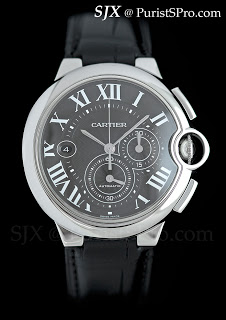
Colour has been somewhat cheapened in recent years because many brands have overused the colour palette by creating multiple variants of the same watch in multiple colours, sometimes with multiple shades of the same colour. But colour is actually powerful. Take for instance this Cartier Ballon Bleu chronograph in steel.
The original Ballon Bleu chronograph launched some years back is in the classic Cartier style, a silvered, guilloche dial with blued steel sword hands. Recently Cartier presented a new version of the watch, identical in all respects to the earlier variant, except it has a slate grey dial with white numerals and white gold hands.
Every other detail – proportions, layout, guilloche, shapes and even the strap – remains exactly the same. But the colours have changed. The version with slate grey dial looks monochromatic, contemporary and slightly sporty, while the original looks formal and more expensive.
Think of a Ferrari – the traditional bright red Ferrari looks and feels very different from a slate grey Ferrari, even if everything else about the car, model, specs etc, remains the same. And if you change the texture of the colour – a matte grey Ferrari – it changes the whole even more.
Marketers, like Paco Underhill, have long understood that colour, amongst other factors, can subtly influence our perception of objects and places. That is the power of colour and it holds true for watches as well.
And I also take a closer look at the Ballon Bleu chronograph on the Cartier forum.
– SJX